yes, I have a 27" monitor hooked to my laptop. I do know that it helps to be adjustable for everyone’s needs. My point was, I personally would just like the BE having the option to save the layout, once adjusted to a user’s liking.
Hey there,
Would you mind sharing it, by any chance?
The logo is just a color wheel with an emphasis on magenta, cyan and yellow, which are the colors for printing (hence the pinl and blue in much of the branding). I personally don’t get where you get that “amateurish” feeling. I’ve seen a few logos that I found myself amateurish/ugly/not modern enough, but Krita one isn’t one of them.
Also what is a “schwarz nazionalist” brush? Why did you call it like that? It’s just a black brush so it’s clearly recognizeable on a lighter background.
We don’t target photographers or other non-painters. If Krita is useful for them, it’s great, they are welcome to use it. If they want to contribute in any way, including new features, that’s also great, we might merge it in, why not, some features for photographers are useful for painters too. But we target painters, and we adjust Krita for painters. See mission statement here: Welcome to the Krita 5.2 Manual! — Krita Manual 5.2.0 documentation
Kiki is only shown on the promotional material, and on the splash screen. You can start Krita without a splash screen using a desktop shortcut if you want. It shouldn’t make it more difficult to use Krita and it shouldn’t “influence users through the artistic direction”. And you don’t need to relate to it or to this style of art, it’s just a pretty picture for marketing.
I don’t think Kiki necessarily associates Krita with the furry community. There is plenty of animal/antropomorphic characters out there not associated with furries. I mean, just look at Disney. Or mascots in general - like this list of mascots of US colleges, many of them being animals or antropomorphic character - List of college mascots in the United States - Wikipedia (For instance, Princeton University, one of the Ivy League universities, has a sports team with a mascot The Tiger: Princeton Tigers - Wikipedia and I don’t see it losing reputation because of that). Humans used animal or anthropomorphic characters in art or literature for thousands of years, we can’t be forced to stop using them because what if someone associates them with a niche community that is perceived as maybe a bit eccentric.
Also, this is a discussion about the interface, not branding.
Thank you for these answers!
Without knowing what really is meant with that “schwarz nazionalist”-thing, I can imagine the connection of the color black in a few nations with the fascistoid right wing communities, like in Croatia, Bosnia, Serbia, but for instance in Germany this community is connected to the color brown, and this is exchangeable around the world, these communities use even more colors, but to connect Krita, because of a black brush used in one of Krita’s logo’s/identifiers, with that or whatever else ideologies feels extremely strange.
Michelist
Titan’s suggestions are spot on. If Krita were truly “skinnable and adjustable to one’s own requirements,” as some users claim, it would be a dominant force in the digital art space just as Blender has become in the 3D world. Let’s be honest: would users really shell out money for the same features they can get for free? If Blender is anything to go by, they won’t. They’ll use the free, powerful option if it delivers.
So why, then, do people keep choosing Photoshop, Clip Studio Paint, Procreate, and Affinity Photo all paid options over Krita, a free one? The answer’s simple: Krita doesn’t compete where it needs to.
Titan is right Krita feels dated. The interface feels like flash-era software, and the lack of meaningful UI customization is baffling. You can’t reorganize the toolbox or even hide tools you don’t use? That’s not “adjustable” it’s rigid. And the absence of a dedicated tablet mode? That’s a major oversight in today’s mobile and hybrid device landscape.
Krita needs to step up if it wants to stay relevant. People will support quality look at Blender. I personally donate $200 a year to Blender and have bought the full Affinity Suite. I’d gladly support Krita too, but in its current form, it’s just not efficient especially on a 2-in-1 laptop.
Make it competitive, and the support will follow.
A new skin and UX workflow to Krita would be a game changer. Like Blender did a while back
But this is a gigantic job that needs a lot of effort \ time (aka money)
Affinity annouced they are going free today btw.
Affinity won’t be open though
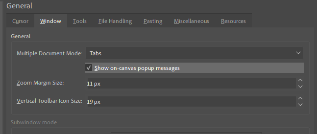
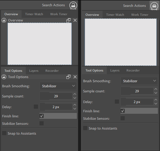
However, for PCs, the Krita facade is good, but perhaps there are too many windows. It is true that there is a tab key that hides them, but if it were possible to hide only the ones that are not currently needed, I would do a bit like the LibreOffice Navigator which is found to the right of Writer, with vertical icons but which, what is different, has multiple selection and also, above this column on the right, put the function that is used with the tab which hides all the windows at the same time and makes them appear by re-clicking.
Create a Workspace with the dockers you want to have available in Canvas Only Mode, then, always before switching to Canvas Only select that Workspace. So, now you only must have done one additional thing in Krita beforehand, that is found under Settings → Configure Krita → Canvas-only Settings where you have to set the hook in front of Toolbox and dockers. Now, Krita will show the dockers you have configured for your Canvas Only-Experience when you change to Canvas Only. And after leaving Canvas Only, select your standard docker configuration, that’s it.
By the way, in one of Krita’s next releases Krita will allow calling every docker via Krita’s PUP, a simple RMB on your canvas, and you are set.
Michelist
Love the work you put into making your custom Krita UI.
I also removed the krita logo for tabs and flattened how sliders appear with plugins. I don’t understand the reasoning behind having the krita logo be on all tabs when the logo is already prevalent on the top-left of the program’s titlebar. It seems more relevant for the user to see more of their file name in a tab rather than the krita logo taking up some of that space.
One thing I couldn’t do with plugins was make toolbars look like the default toolbox in terms of how large the icons are since they’re not adjustable. I think a setting like this or being able to right-click a toolbar similar to toolbox would be a convenient option for users to make their toolbar icons easier to see.
I have it implemented as a setting in my copy of Krita so with everything combined it looks like this:
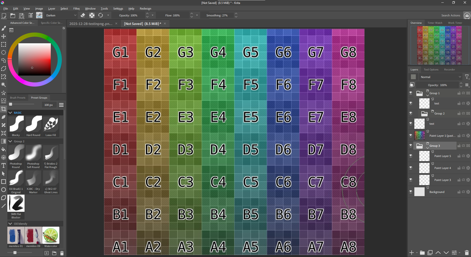
Turning groups into folders like Photoshop to make them easier to distinguish from regular layers was a turned down proposal so that also required changing Krita’s source code to make it possible.
The redundant names for docker title bars also bugged me. It seems like you’ve removed the contents of the title bar but not the space itself (to be able to still drag dockers I assume).
I also did a similar thing with a plugin where if I click a toolbar button it prevents all dockers from being moved/resized but it removes all titlebars and their residual space.
The layout you’ve created for yourself looks incredible! I’d say it’s one of the most appealing ‘modern UI’ interpretations of Krita’s interface I’ve seen on the forums so far, I would love to see something close to what you have become the standard for the program in the future. I fully agree with your suggestions, they seem very simple and actionable
Thank you! It’s taken a lot of work to get it to look like this but I’m very happy with it.
I’ve been thinking of sharing my copy of Krita 5.2.14 publicly with these UI/UX improvements along with other features that Photoshop users may appreciate like shift for angle snapping lines. If you’re on Windows and interested in trying it out first, feel free to message me.
Related to the propsal, here’s more observations I’ve noted while I’ve been tinkering with Krita.
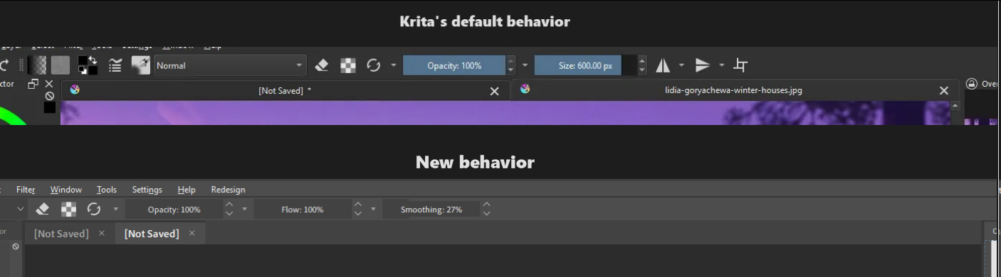
- Tabs for are always expanded to its maximum width instead of only whats necessary to show the full file name. Having tabs look like browser tabs (Which PS and CSP do) is much more intuitive.
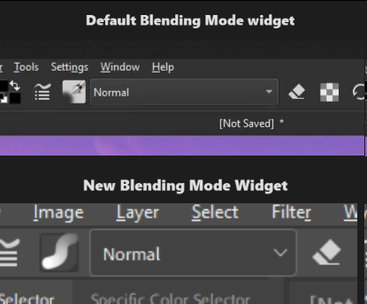
- Blending mode in the toolbar takes more horizontal space than necessary. In most cases artists are using the “Normal” mode with their painting. In edge cases when someone is using “Lambert Lighting (Gamma 2.2)” for their blending mode, perhaps auto expand the blending mode widget or truncate the name instead.
- Active and inactive parts of the UI are both colored. The designers of Krita’s UI didn’t question “What’s more important for the artist to see while painting?” and more so went with “How can we make this UI unique?”.
art in screenshots by @Sad_Tea
When you select a brush preset that preset’s icon is highlighted blue which makes sense since you need to see which brush you’re currently using. However, if you look at your Opacity and Flow sliders in your toolbar you aren’t always dragging and moving them around yet they’re always blue.
You could argue that it’s part of Krita’s identity and it’s always done this but I think this only serves as a distraction and gets in the way of more important visual cues an artist needs to see when they’re painting. It’s like trying to put highlights everywhere in a painting, it loses meaning and significance.
This combined with Krita’s logo appearing on every tab makes the program unnecessarily showy and cramped.
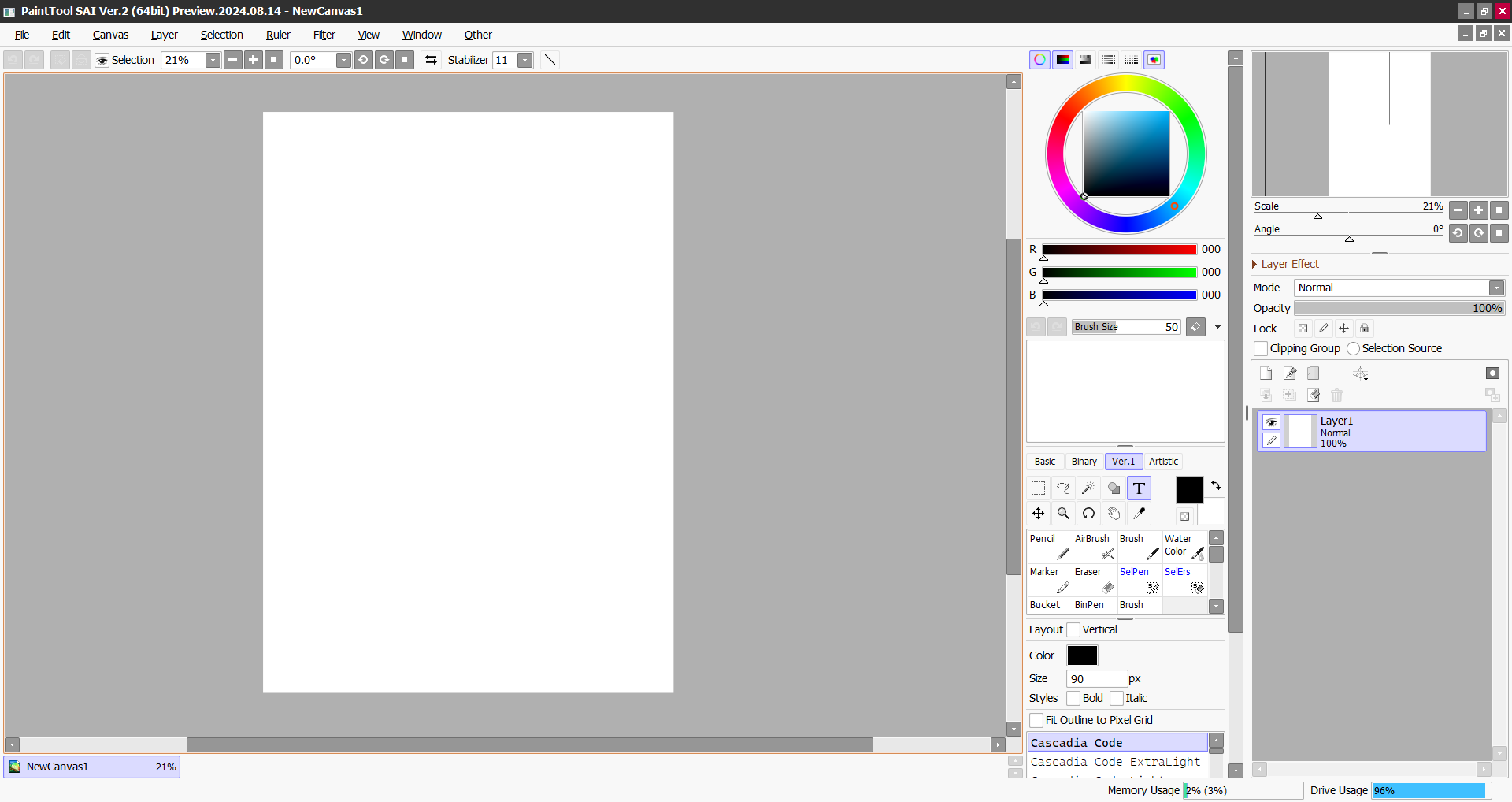
I like some parts, but I think it’s too flat, so some parts can be confusing. I think it’s important to define some things. For example, SAI is quite simple, but it defines its interface very well:
If you think that part of the interface is large, you haven’t seen it in Spanish haha. The size is so long because one of the blending modes has a long name. I remember reporting this, saying that it could be made to a standard size that wasn’t too long or too short, since the size will vary depending on the language.
That blending mode needs an acryonym in Spanish haha.
By “too flat” and “important to define some things” do you mean it needs more outlines? SAI is also very flat but it uses outlines to define buttons clearer. Photoshop also does it in a subtle manner:
![]()
The interface you made is very beautiful. I’m looking forward to using it in the future.
Regarding the interface UI, I have a suggestion. The option buttons in the layer bar can be set to be either at the bottom or the top. The reason is that when I use a digital screen for painting, if I need to click these buttons, I have to move my elbow. If they are at the top, then I only need to rotate my forearm. This feature is not very important but it can enhance the user experience for some people.
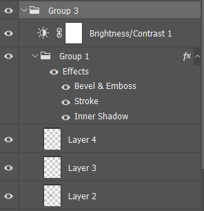
Regarding whether the layer groups should be changed to icons, I think it would be a good thing to do so. In my experience, the thumbnail display of layers in Krita is extremely slow. I don’t look at the layer thumbnails. The layer groups are too similar to the layers, making me have to carefully distinguish them every time. Now I have made the thumbnails very small so that I don’t get distracted by them. The tree-like indentation has been improved, and I give a color to the layer groups each time I create them, so that I can easily distinguish between layers and layer groups.
I remember something, to open the layer groups, one must precisely click on the narrow rectangular area where the small arrow is located. Other positions are for changing the layer names. I think the click area is too small, and the position of the layer thumbnails, in my intuition, I think it should be the layer properties (or layer styles).
Regarding the rejection of the conversion of grouped layers into icons, I feel disappointed. I read that post and I need to clarify one thing. In PS, CSP, and ArtRage, grouping is also a layer, with filters, masks, and blending modes.
Regarding the rejection of the conversion of grouped layers into icons, I feel disappointed. I read that post and I need to clarify one thing. In PS, CSP, and ArtRage, grouping is also a layer, with filters, masks, and blending modes.
I’m also still disappointed with the response and feel that I shouldn’t have settled for a workaround and taken the time to make more of a point that this should be an accessibility option. While I understood that seeing all the changes in a group compiled into one thumbnail may be useful, Krita isn’t really doing anything extraordinary compared to other art programs as you mentioned. You can add advanced “layer” styles just like Krita in Photoshop
From the proposal:
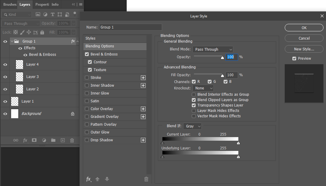
Groups are much more closer related to layers than to anything that is a folder. For example: Groups can have filters, masks and blending modes,
Groups in Photoshop are also treated like layers, they have blending modes, masks and you can apply filters to a specific group by nesting it within another group. Photoshop users have the same advanced capability of editing groups yet they don’t complain about not seeing a thumbnail for their group, probably because it makes more sense to see them as folders.
Here I applied a style to a group and also applied a filter on top of it:
The whole response to the proposal was “It is just how krita works”. This response and settling for workarounds is not the way to go if we want Krita to garner more attention, be used by more people, recognized by professionals, and be appealing to contributors.
I feel sry, that the response you wanted for your feature request did not turn out the way you imagined, but this is how a feature request works.
You request a feature, and then you wait for people to see it. If they decide they also want that, they vote for your feature request. And if you get many votes, the priority of this feature request rises. If the developers then look for new features to implement they sort the feature requests in order of the most voted to the least voted. And maybe your feature request will be picked.
So please don’t say that you’re disappointed in the community because the response to your request was underwhelming. It is not like it was rejected, it is just not the priority and most users care about other feature requests more.
I feel like you should add your points to your original request, as this thread is a dump for UI ideas if there is one day, when krita 6 is ready for production and a developer needs ideas for how the UI should look like.
I’m aware of how a feature request works. I was expressing disappointment because it’s an important feature for a small niche (most people don’t care) and because I didn’t elaborate or go in-depth earlier noting how Photoshop and Krita’s groups have similar functionality. It’s not purely a dig at the community as you imply and I’m aware my request could’ve been improved.