Hey do not worry about the responses. Please do put forth more points in the other thread for group layer. I do feel that group or any type of layer should be highlighted more clearly. Perhaps we can achieve highlighting group layers more clearly without sacrificing the thumbnails. Thumbnails are not the issue, the issue is that groups are not highlighted properly.
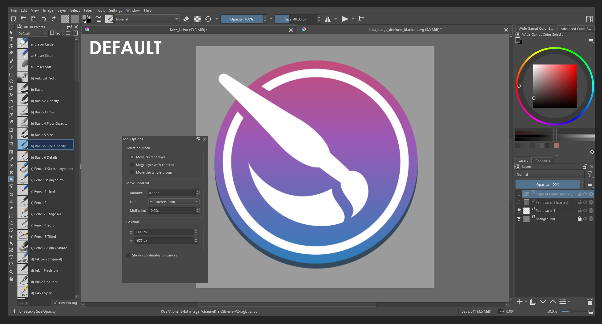
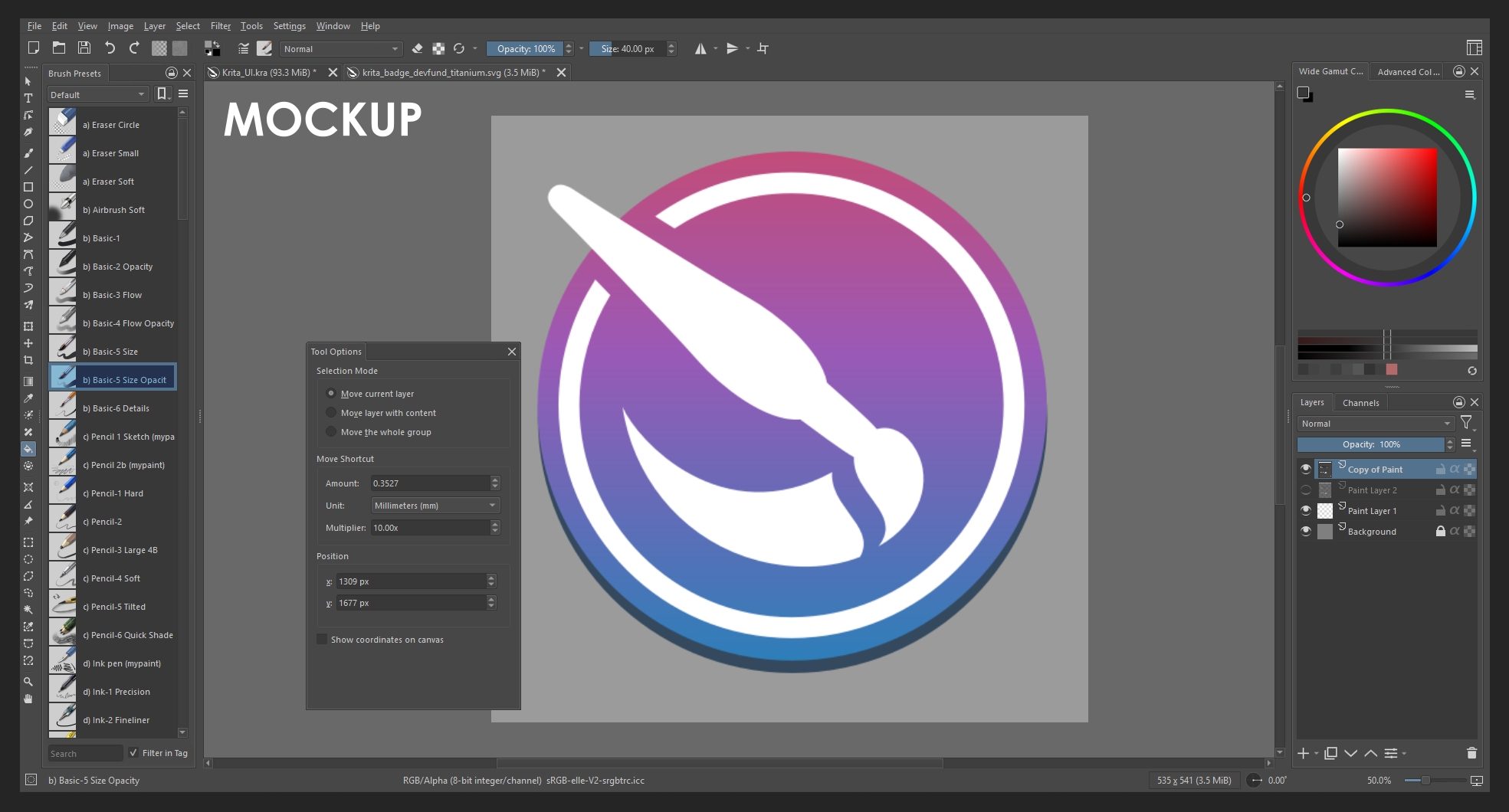
Hello, I have modified your mockup. I believe it is important that not everything is gray, since having everything share a single palette makes it difficult to understand what is active and what is not. It is very useful for highlighting certain parts, and I also added borders to the boxes, which I think helps a lot as well.
I also believe that with themes, everything can be made more monochrome or not; that will depend on the user.
Nice changes! It looks much more polished now. The widget outlines are subtle but help a lot with readability. Looking back I was just sharing my personal taste on the theme colors but as you mention they can easily be modified anyways so there would be no point in making Krita’s default theme monochrome.
Yes, I think that if Krita could achieve a design similar to this, it would be more comfortable for many users and even a little more popular.
I dont want to be a snotty brat. But i was checking the ui files a while ago and i must say most of them need some kind of tweak here or there to be uniform and efficient.
Like all behave different and overly relay on spacers instead of using the variable that does that work, it multiplys the number of elements needed and considering how they are placed how little the window will scale down and their spacing. Making the ui unconsistent. To fix this there would not be needed any new modules just reviewing stuff. Anf fixing it would simplify the reskin attempts and the number updated elements.
To illustrate the gravest ui files i saw was like a spacer pushing another spacer in the same line ( just use one spacer ). Or having a grid layout next to another grid layout and matching the spacing and faking if they were the same grid layout ( just use one grid ). Or having a piramid of layouts and spacers to do the work of one single layout ( just use a singke layout). Using 4 spacers to do the work of margins ( just use margins ).
Cleanning these oddities would simplify any coding work to manage the ui.
If it happened here or there i would be like it maybe there is a reason for this one to be the odd one out. But it is more than 80% doing mental math here. It is really a too many chefs in the kitchen situation. Because there are a couple that are looking really solid unlike the others. I would suggest making a design guide for ui elements so they all look the same and not need a dozen spacers per layout.
I could fix a bunch of them but i cant build krita on windows.
Why not make these change to the codebase and create a merge request in Krita’s Gitlab page? If you create one, a Linux and Windows build will be made for you so you don’t have to build it yourself.
Would not that be considered spammy though ? Making a merge request of something i am still not sure it even works yet that is. I would need to check the build if something breaks.
It just looks too old. I know people love this about Krita but I feel like Krita must be something more than a nostalgia. As an artist from a country that struggles with economy, it would be literally impossible for me to draw with a decent drawing app if it wasnt for krita. I appriciate it so much and I want it to look as good as it actually is.
Ui isn’t hard. The hard part is the logic of program, tools, optimization, etc.. Ui is just looks. I KNOW it’s not hard to make it somehow relatively more intuitive and cleaner. So I’m sure that the team behind krita wants to protect it’s nostalgic and “different” vibe from other drawing apps. But it kinda just looks a mess
If you work on a pc try the Touchify Plugin - Tablet / Touch Friendly Accessibility & More - #258 by KingKrouch . With that, you can modify the ui to some extend
@skullsnspines I moved your comment into an existing feature request regarding Krita’s UI.
You said UI is easy so that makes me think you have some concrete ideas to share in a mockup.
Please vote at the top of this discussion
I did
To me It sounds like you have absolutely no idea about UI design or how software development works. If things were easy someone would have already done something. Kirta is Open Source and it doesn’t have to be the core team that has to do this. Yet, no one did.
I’m not a programmer so there’s just as much as I can know but I’m sure that if people could code krita they can absolutely code a new ui too. Making ui of something is way easier than coding what those ui’s do am I wrong? And krita is an art program so I’m sure it also has many ui designers in the community that would volunteer
UI design and art design are pretty different disciplines with different goals. Just because you can paint, or design a flyer for a product or company, doesn’t mean you can design a good user interface too. There goes a lot of thought into creating a good interface other than just code. For a reason there are developers specializing in that specific field. I say that as someone who created a few user interface in my life. It has nothing to do with nostalgia (I don’t even know on what basis you claim that). It’s because it’s hard work and has to be done carefully. But I’m always open to being proven wrong.
Wow, didn’t expect the first reply to be that negative ! and it comes with accusations too …
Although I love open source software like Krita, blender, Inkscape
The gatekeeping problem is real. Your post is a prime example
I hope, we’ll be more welcoming to suggestions and discussions.
Even if new comers are used to “new design” that the old users don’t like, it is important to be more open minded
We see these kinds of topics pop up pretty regularly, maybe not every month but way too often, and if you check out the user profile of wannabe Titan_Tech_games_master, the person who started this topic, and see that he has only opened this topic and made a single post in the forum, then it becomes clear that this was solely and exclusively about stirring up the forum and watching from the outside as users who don’t see through this tactic get worked up and put on a great show for such jerks.
Well, unfortunately, I have to say that far too many users fall for this time and time again.
Michelist
This topic has the most replies and views about the UI…
that’s why I was curious if there a healthy discussion about it.
The first reply …. isn’t up to any standard (very hostile)
Assuming the worst about the person who posted. (even in the trolling world of the internet) This attitude won’t help much.
I, also, one-post on forums. No need to have written a massive amount of posts to ask a genuine question.
Now I’m very hesitant to post any request or engage