i think the UI looks great and easy to navigate, but i like krita’s original brush icon better. i don’t find them outdated; they seem more lively than just simple icons.
Since they never logged in after making the initial post, I have my doubts they are interested in actually doing anything anymore regarding this. Even in the Matrix chat group they went quiet after proclaiming they can single-handedly redesign and implement the UI in within a year. So I don’t even believe they were actually interested in community contributions anyway.
Which is sad, some of us here (including me) have poured designs and I am afraid this will be lost.
@raghukamath, can something be done? I would be happy to manage OP but not sure starting a new thread is a viable option.
When you use the forum search and search for “UI redesign” or “interface redesign” or anything along the lines you will see that basically at least once a year someone promises a “modern” and “sleek” design that is somehow simpler and more professional while at the same time being more user friendly to beginners and advanced users alike. And then often it’s not even a mock provided or any mention about how these goals can be met. The community gets hyped and everyone posts their ideas with complete disregard of the initial goal and what is technically possible in a reasonable amount of time and at the end everyone is disappointed because it never leaves the “design phase”. This happened so many times before, even before we had this forum (check Twitter or Reddit), therefore my initially skepticism as seen in my first post on this topic.
In my opinion, the topic should not even have been a feature request because it is only a list of demands without any ideas on how the result might even remotely look like, it should be a general discussion topic instead were the proposal gets refined before it’s made into a feature request.
I understand the pessimism, and I also feel the pain because this is the second time I am proposing a UI change.
However this time I see that @BeARToys has come up with good idea and I have tried to reimagine things too. I am really hoping that whenever someones tries to implement the “actual design”, they may refer to this thread for some user-inspired proposals. So I hope these ideas are preserved somehow.
Last time I got small UI feature request implemented thanks to freya, and accordingly, I am hopeful for future.
Aye, this came out better than i anticipated. Kudos!
You caught the essence right and actually improved it.
which software did you use to design the interface? great design btw!
We are using penpot at the moment.
What about using the Breeze style, I mean Breeze has long been renewed, and I had read not long ago that breeze currently no longer caused problems with Krita, I think it would be a good idea to try.
I think that would help a lot to make Krita look much better.
It might be rude from a newcomer but I’m all for a redesign. Krita’s UIX is nice actually, the GUI isn’t horrible either, but it feels claustrophobic and inconsistent. I’m not judging, it’s the many hands nature of the project.
So, one thing missing in the mockups though are panels. Panels are where the work happens when you’re using a program and they’re the hardest to design. When I think about Blender’s UI I don’t think about large empty tabbed workspaces, I think about the panels with consistent hierarchy, spacing, iconography, and user experience.
I feel that’s how a redesign should go, from inside out, the most challenging parts first.
Guidelines, maybe?
What reads as modern is subjective but functionality isn’t. I also feel we should agree on guidelines of what concrete things the design is expected to do before jumping into mockups. To me:
- It should be done with a smallest possible font and icon size in mind to ensure everything is crisp and properly spaced, with users given the option of scaling them up as they desire. By convention that’s 16px icons (that’s how Blender was redesigned).
- It must also facilitate the differentiation of controls and various elements of the UI. You should be able to tell your tools apart from a glance and that’s done not only through the appearance of the button but through the margin or padding between controls too.
- Screen real estate is expensive, every element must earn its right to be on the screen. The space they take must be consistent within their category (eg combobox, sliders) and take their function into account.
- At the same time the design must facilitate the user’s workflow. It can’t add extra steps to painting, the main functionality of Krita. Basic painting controls can be hideable, but must not be hidden in submenus unless for a very good reason. They can’t be hidden in a way the user can’t opt for having them visible at all times.
- Any deviations of the established design for a category must have a good reason to happen. Eg: A checkbox can be positioned differently from the others to indicate it’s a suboption of the control above, thus a different category in the panel hierarchy. It shouldn’t be positioned differently just because it’s a different panel and no one checked what they look like in the rest of the UI.
- Functionality trumps aesthetics. If it’s pretty but makes UIX worse then an alternative must be found.
Impressions about the current GUI
- It mostly lacks negative space. Eg text in dockers run right up to the edges. That’s not efficient use of space when the user has to pause an extra second to parse what they’re looking at.
- Elements are large but not necessarily more accessible for it. Because they’re tied to icon sizes and icons are unusually large you end up with large sliders (QDoubleSpinBox) with tiny control buttons. Add to the lack of margins and padding and that’s where the claustrophobic feel comes from.
- Icons, due being designed at large sizes don’t read well at smaller ones. Many end up blurry at 16px, and they’re thick, taking a few extra moments to parse due the lack of negative space it causes. The iconography itself is good, it only needs to be reworked to be crispier.
- Thumbnails in the layers panel are also too large in their smallest size (20px). Because the rows height is determined by them they end up too tall. There’s no harm or reason to not allow the user to go smaller to the 10’s to reduce the amount of time they spending scrolling if they wish.
- Layer panel rows have mixed input coloring. The background changes to show a layer state (selected, active, not selected) but also user-set categories, and when they’re colored the color won’t take over the entire row. It’s very inconsistent.
- Tabbed dockers have redundant title bars. You don’t need to read it’s a “Layers” docker twice. You don’t even need to see the lock icon when it’s locked, contextual icons that only appear when you hover with the mouse/tap would be better. This is one of the big challenges of panels I mentioned, deciding when, where and how such controls are visible.
- Undocked dockers need to have some border or dropshadow to indicate they’re not part of the docked UI. They just meld into the background right now.
- The toolbox is serious business, it’s the kind of UI element you don’t touch at all without a very good reason… which I believe we have because raster and vector tools are all mixed.
- Whenever possible controls should adapt to to the panel size. Side-by-side control and label sets should fall into different rows if width goes < some number. Yes, it’s a lot of work, trust me I know because I’ve been altering my own Krita’s GUI.
UIX snags
- By convention program shortcuts should be disabled when text inputs are active. That’s not what happens in Krita. Eg, start renaming a layer and move the cursor to the canvas area. See what happens when typing.
- Text inputs also aren’t responding properly to Esc (cancel), Enter (apply changes) and clicking outside them (cancel). The latter almost works in the layer panel as long you click outside the row you’re editing but still inside the panel.
- Having to right-click on text inputs in sliders (QDoubleSpinBox) instead of double-clicking is also not in line with the conventions nor with the other text inputs present in the GUI. The method to make them editable should be consistent.
- Sliders would be better served by working like in Blender: Click anywhere inside them and drag horizontally to increase or decrease values. Right now as soon as you click inside them the value will change to the position of the cursor, erasing the previous value. Most users won’t have an absolute sense of position to click right where they need. By not immediately changing the value it would also solve the issue above of making them editable by double-clicking like other inputs. Right now you can’t because that’d change the value.
- It’d be useful to have explanative tooltips over controls and icons in layer rows. Example: “Enable Inherit Alpha” over that icon, “Hide Layer” over the visibility, “Vector Layer” over the layer type decoration. For that work the layer thumbnail tooltip can only appear when hovering the thumbnail and text which is likely more than enough.
- Layers also lack bulk-setting. Example: Clicking on a visibility icon and dragging down to set the visibility of all layers you pass the cursor over.
- Dragging a layer up and down beyond the panel’s edge to make it scroll up and down to the position where you want to drop that layer is not a smooth experience. You can’t use the mouse wheel to scroll into position either when dragging a layer. When you can’t reposition layers easily it makes working with many of them very hard.
- The toolbox doesn’t play well with other dockers in the same column. It’s an easy fix, it only needs a max-height (which you can derive from the current height) to allow the user to dock stuff above and under it.
GUI Examples
I’ve written a extension to alter the GUI. This is not a mockup, that’s how my Krita copy looks at the moment. It’s a work in progress full of brainstorming and should not be taken as a suggestion of design, more like a illustration of points above, not all implemented yet.

And an actual mockup of a panel to show the impact of margins, hierarchy, alignment, with underlying arrangement rules borrowed from Blender.
I really like that you worked with the current design and refined several parts of the interface, I like that approach of refining the existing and not wanting to change everything.
Bigger aesthetic changes are so much easier when you figure the small thorny details first.
If a redesign happens it could be done with the aim of also having more settings to configure the GUI or extend it through the API so it looks just right for each user.
One challenge I’m facing is that some things are completely out of reach in Python. Taking care to keep data accessible and repaint elements in proper methods would be very helpful in the goal of facilitating users’ re-skinning of their Krita copies.
Very comprehensive and useful i must say. Design coherence is essential and well covered. Wish this could be pinned
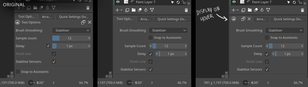
Some of these look nice. Usually with trying to implement these changes it is good to slowly try to introduce and change them while having a discussion. For example, you have some nice inputs and drop-down styling controls.
![]()
and the style changes to the scrollbars
Even trying to do a PR/change request for these items would be a good step. Is there stylesheet or code changes you can share for that? We will need to make sure it works with different themes in the end.
If you want a challenge with UI/UX we really need to update and improve the brush editor. We never really designed that. It was always just coders slowly adding more and more stuff to that as the years went by. We have tried doing minor fixes with hiding things, but it really needs to be thought about to give a better experience. A lot of people want to easily edit certain settings while they are painting instead of having that giant window.
The mock up don’t seem to be paying their Qt taxes.
You can do almost anything with Qt but then you can’t change things and Krita is editable.
Am I the only one that can’t keep the Presets and Scratchpad opened and adjusted the way I want them? Every time I close Krita, I need to reopen the Presets in BE and adjust the Scratchpad (even after I switch brushes). Other than that I like the BE, but I don’t see anything wrong with the UI.
Maybe you have a decently large screen. There have been complaints that the brush editor windows if very inflexible and cannot be resized or positioned very well to work with. Either with desktop, or trying to use it on something like an Android tablet.