Yes yes, wow this is looking so much better. I have more ideas. Hang on.
Sorry if i am asking too much ![]()
![]()
Yes yes, wow this is looking so much better. I have more ideas. Hang on.
Sorry if i am asking too much ![]()
![]()
Ok on top i would like to have the burger menu on the left and settings icon on the right. Just like your mockup.
The right pane seems too thin and empty, not sure what to do with that. Thoughts?
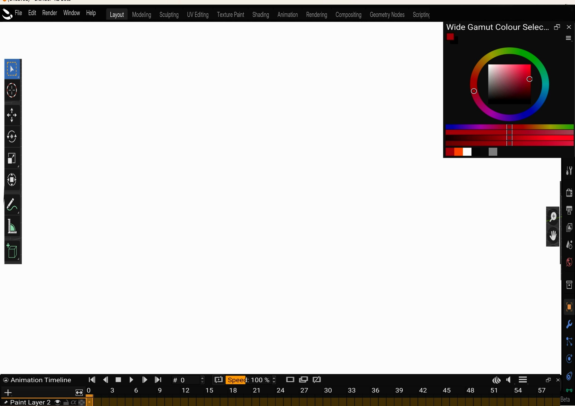
Alright, mock up number 2. This time i used blender as base.
I again propose tabs for krita (and i hope a compositor like non destructive post process effects makes an appearance)
Animation tab would pop up animation bar
I am afraid I don’t understand what you want krita to look like. That is just a screenshot from blender, at least it looks like that to me.
This tabs are workspaces?
Let me try something, but I don’t think it will be as you imagine it…
Well i am happy with last style which still retains some of krita’s elements.
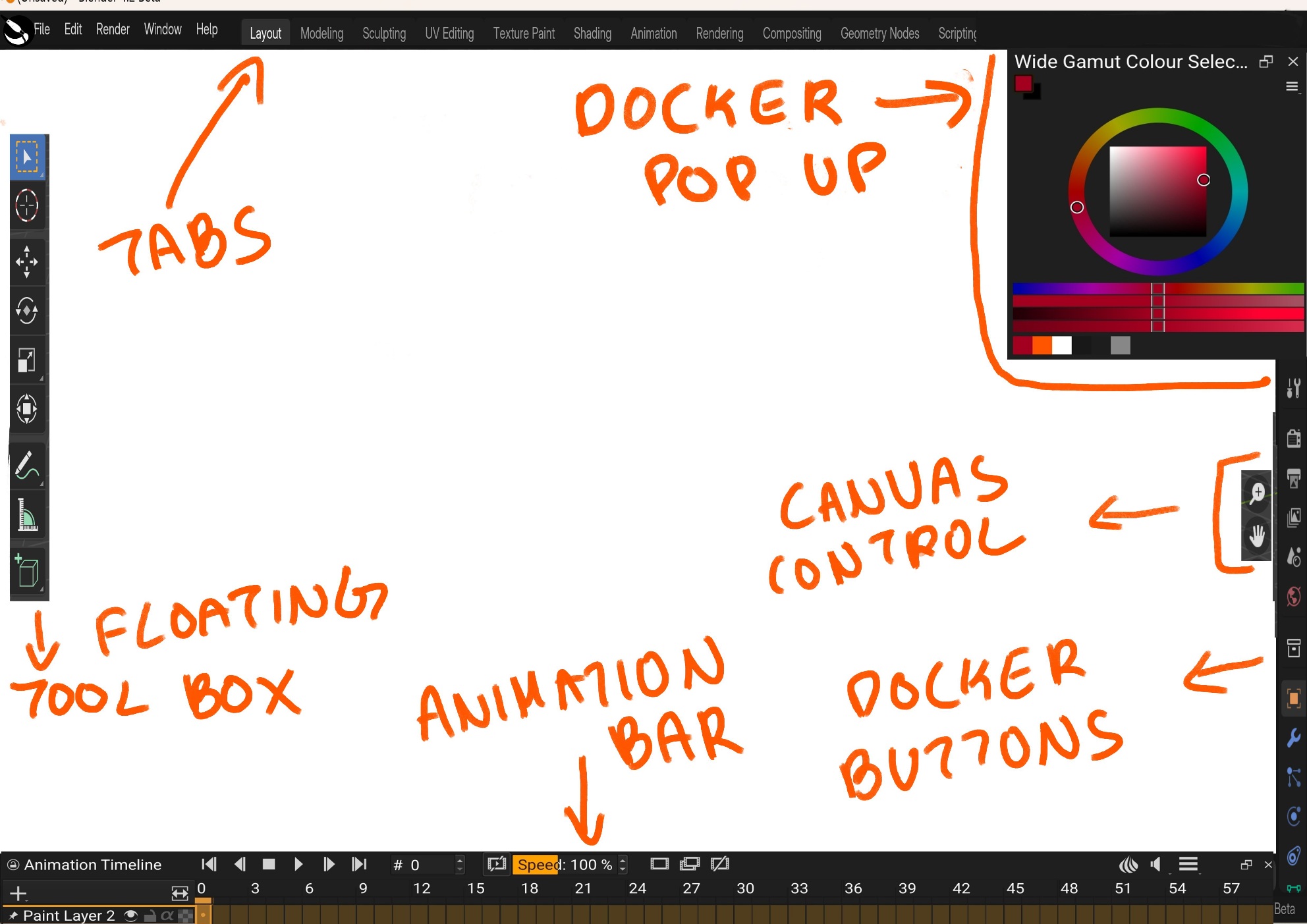
For this new one, i have picked up elements from blender i.e. how the toolbar is essentially dynamic and floating, there is a camvas control on screen. The outliner is now a permanent pop up docker place.
The top bar is something i need to make it more inline as its ust blender tabs and menu lifted off.
Animation controls will be only visible when animation tab is clicked so i guess will have to create multiple mockup per tab. This dynamic interface is again lifted off blender idea
It is being polished up little by little.
So,I tried add to bit your mockup.
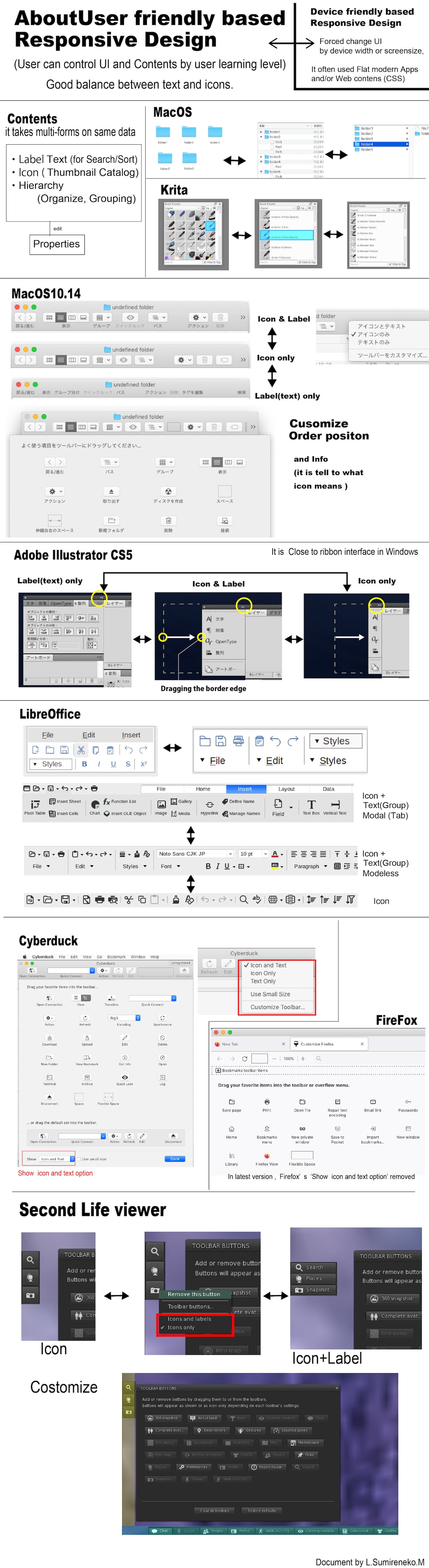
If layout icons around the screen,it hope that flexible positioning customize.
Here is an example of a customization screen that is common to a variety of software.
This also has the function of communicating what the icons mean.
This is looking fantastic. This is almost exactly how my mind thought it out.
You are the man! Thank you very much!
Yup this is adding upto to it.
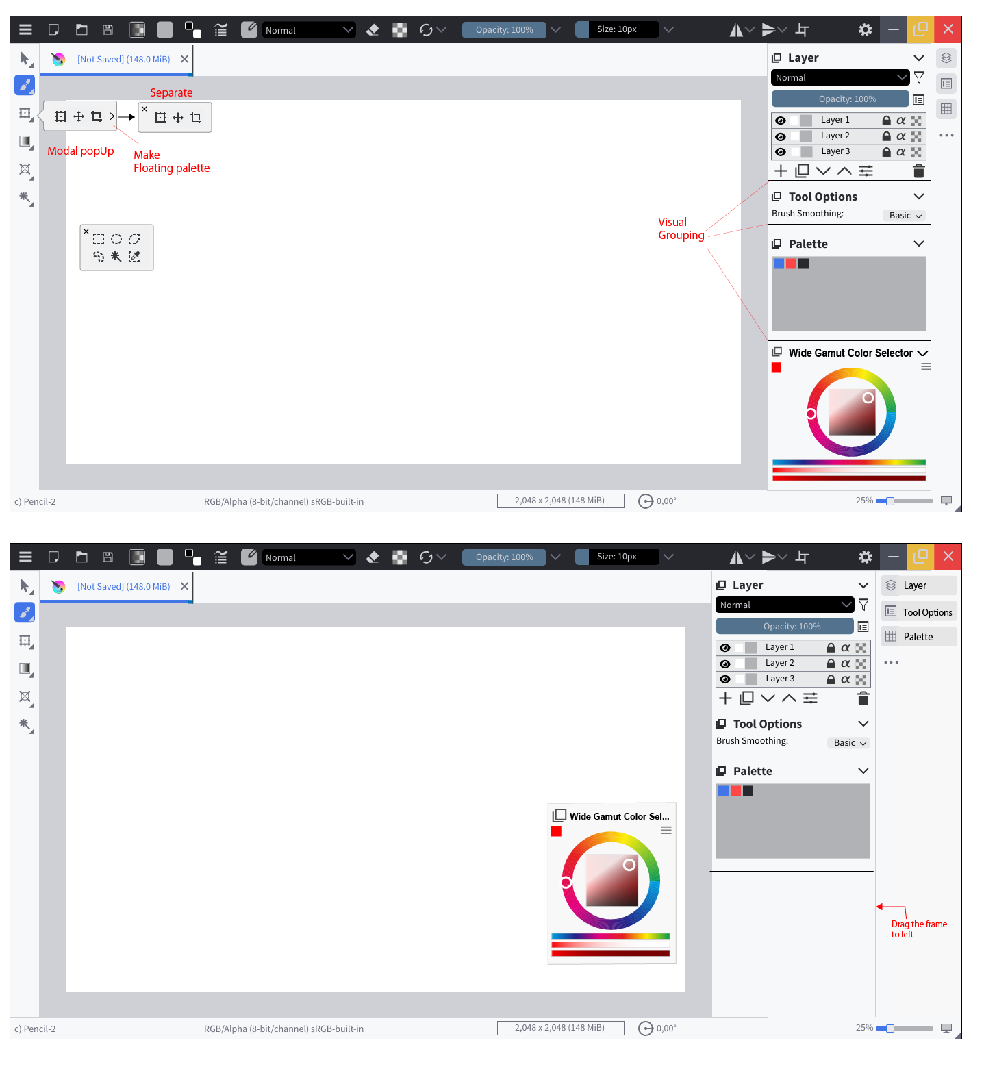
If i may add my two cents, in my mind it would be better if dragging would just reveal the whole docker panel instead of just extending the icon name.
So basically compressed panel will only show buttons and pressing them would pop up the said docker, dragging would reveal the name and docker as whole. How about that?
Ok now that i see it again, top bar has space so maybe we can move the tabs to top bar.
Oh I forget to reply on your questions, yes the tabs will be like custom workspace where animation will have krita animation docker at bottom and the editing will have node based post process system.
I took your feedback into consideration
You can also give me a pm so that I can invite you to penpot
Hidden Tools. You click on a tool and select it. Second click opens the tools selection.
Floating Tools. You can choose to always show all tools from one category.
Position is confirgurable, here I positioned it in the bottom-center of the canvas. Can be closed to be hidden again.
Please note, that the selection of tools, which are shown, is configurable. For Example could all drawing-tools be displayed. In that case no tools selection will be shown on double-click
Expanded Dockers.
Drag the Border to to expand or minimize. here I maximized it.
The idea with the tabs for workspaces reminds me a lot of the personas in Affinity software. I am not a huge fan of the idea for krita (I don’t always like it in Affinity tbh) but in Affinity these personas (which can be up to 5 in Photo) have icons, which saves a lot of space compared to the tabs. Otherwise a simple dropdown like the one currently used for workspaces would do and save space at the top.
I do like some of the ideas, but it is very hard to be cross platform between laptops, larger desktops, screen tablets and android and windows tablets with touch functions… You would probably need 3 dedicated workspaces for the various needs. CSP is the closest software in comparison, and used to port the interface over 1:1 on the various devices, which I appreciate in part because everything is where I know it. However, the controls and menus are very finicky and a simple thing like changing brush size is needlessly cumbersome. They tried to amend this with the new simple UI for tablets and phones, but to me this is far too much of a compromise, and a lot of functions are not even ported over, and not even all my custom brushes.
I hope this is not the direction Krita needs to move, at least not when it means sacrificing the good stuff, the customizability before all. I hate it when the interface design tries to limit reorganisation of tools and panels and forces me to work around it. Even if I agree that some of Kritas interfaces looks a bit dated and some parts are overly complex, fundamentally it is a great piece of art software that can produce very streamlined, professional and efficient workflows. This in my opinion is more important than look and feel.
I am currently on a samsung galaxy s8 ultra ( Android ) And Krita did the same. they ported the UI from desktop to android. It is nice, that I can use Krita there. And I don’t have any issues using it in there, for my illustrations. So I suppose, with a new design they will do the same.
I am trying to make all I can configurable, and still minimizing all to the minimum, so that it could be used on android, without issues.
I do agree, that tabs for workspace-configuration is a funny idea, but I think if you have a software, which is as complex as blender needs something like this as you don’t know, which tools are needed, for what you are intending to do. And on one look at that. But I don’t know if krita needs that… maybe when generating a new document, you can choose between workspaces. that would also make krita more accessible.
Despite of that I will try to generate the mockup from mixing with Krita with Blender, so that we have more choices. It does not mean, that those will ever be implemented.
Wow, the results are just what I expected.
The close/ button is now larger, making it easier to use. ![]()
Thanks for updating the mockup.
Thank you for invite,It seems that Pendot useful.
However I’m going to be busy these next few weeks…
So I would send you a PM when I have free time.
Yes,I think your idea is better.
It seems more reasonable.
In my mockup drawing, the docker title information had been place two place when expand after.
The workspace i have in mind is more like default interface. Kind of like how you fireup default krita.
However, every workplace should be customisable as per users wish. So this should not be a problem.
The idea behind this is more feature discoverability. People will immediately be able to know that krita also supports animation. Krita (if in future) also supports composting. This composting is my brain child where non destructive post process effects can be added. I am not sure if devs are interested but this could potentially open up krita to new generation of people who add tons of filters and what not.
Lets be honest, i am just throwing ideas to see what sticks. Nowhere its necessary that these ideas will go to “krita next”
No problem, I can invite you any time.
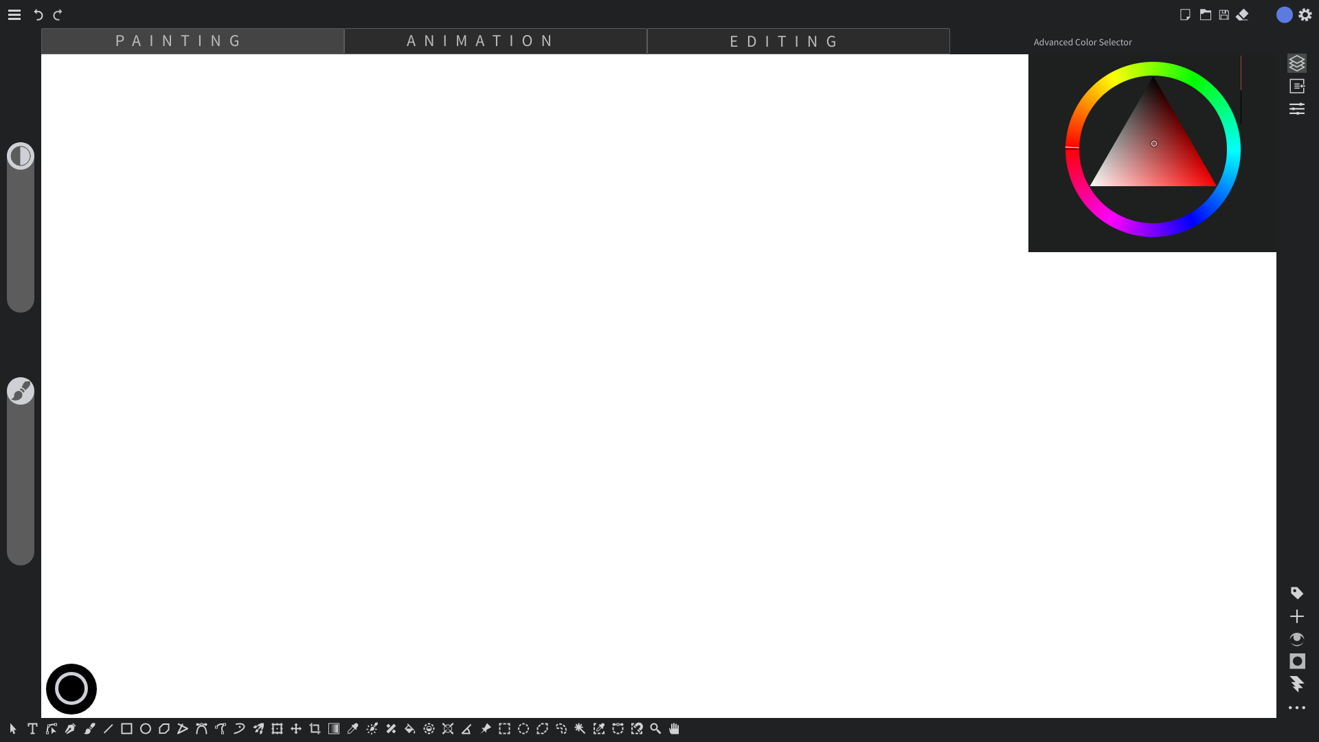
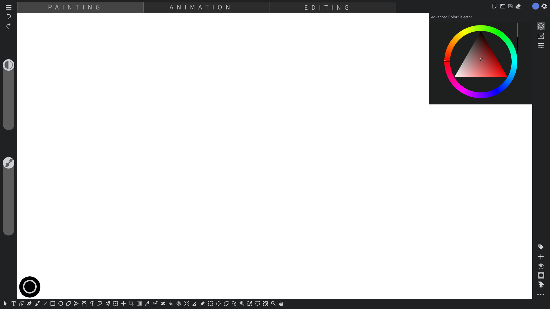
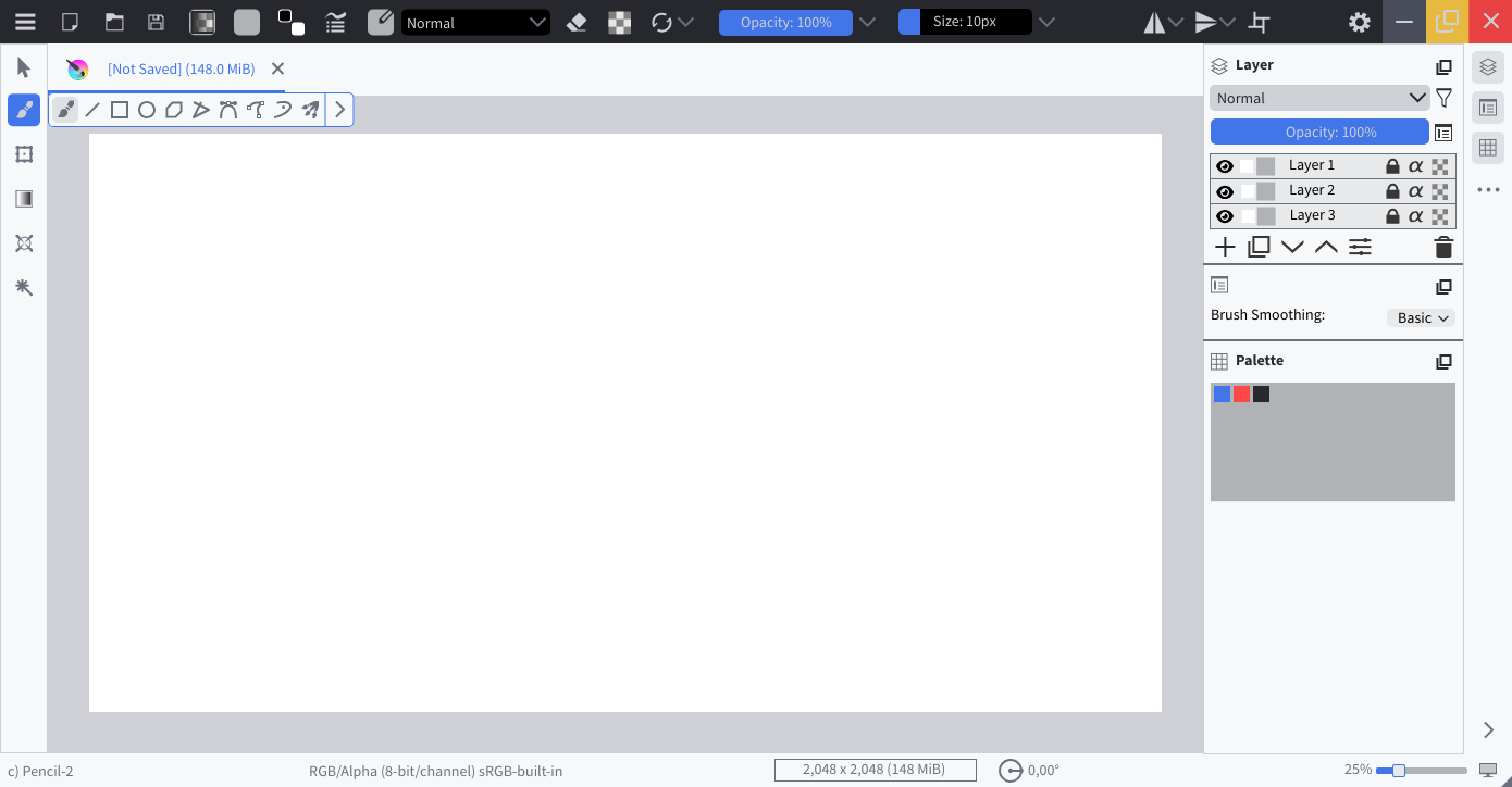
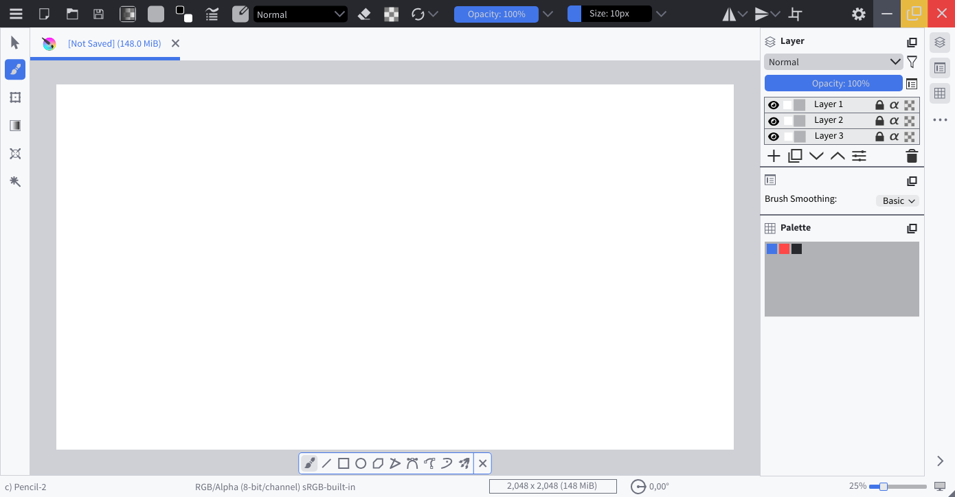
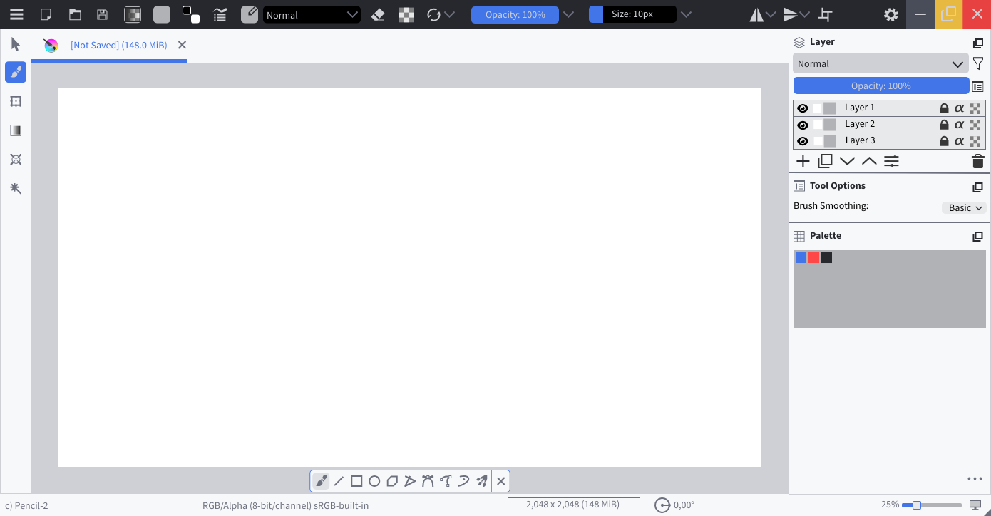
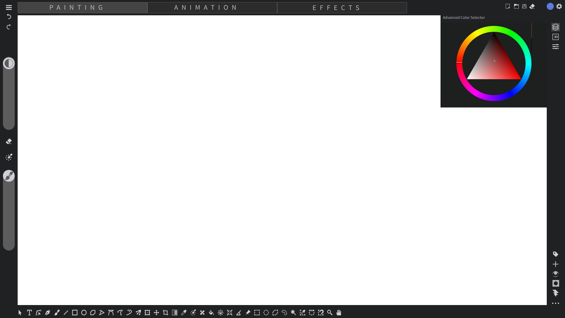
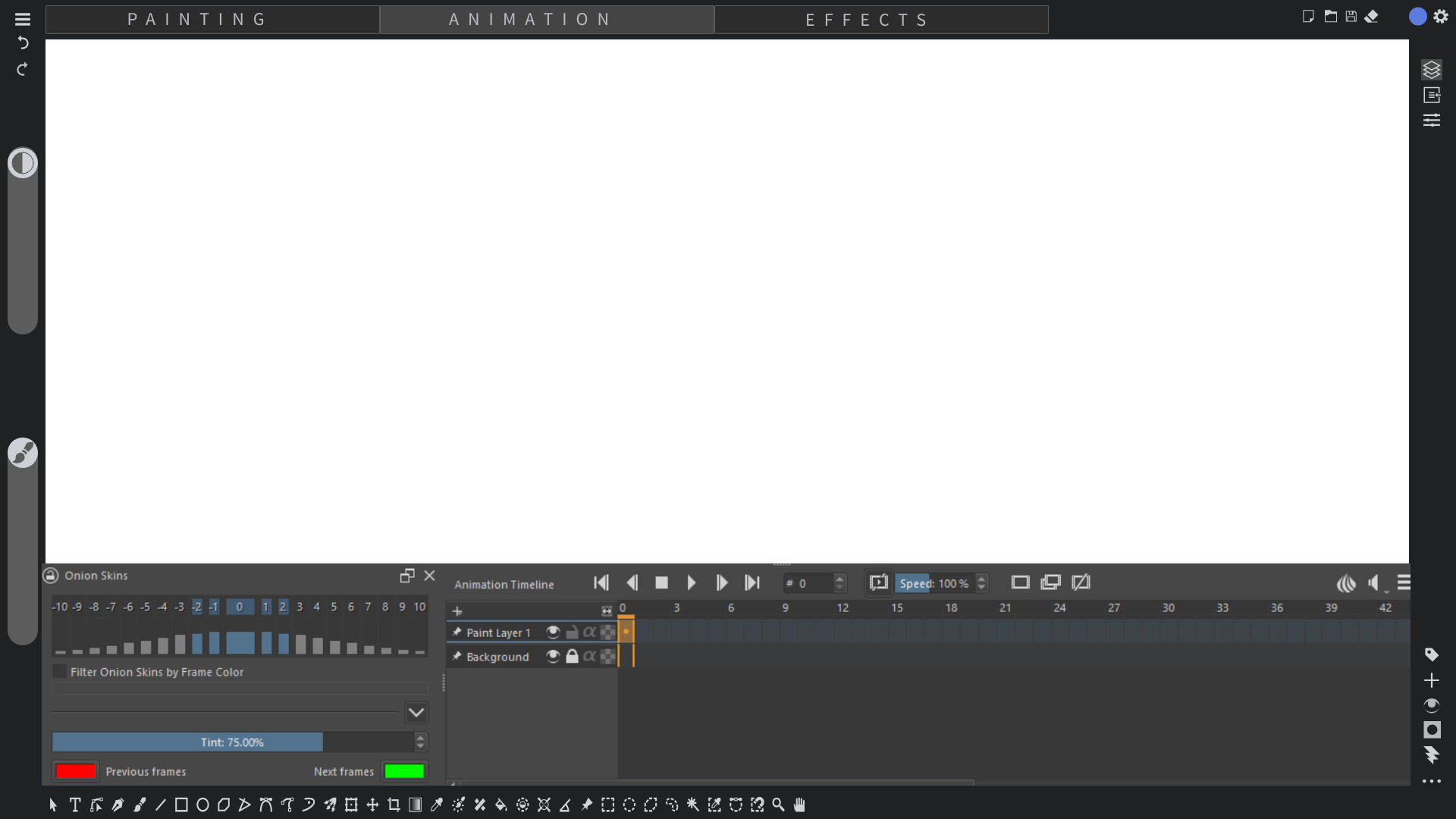
Thanks for @BeARToys invite. Here is somewhat the visual. The target keeps in moving but this is as of now how I feel krita can move forward.
The basic Painting workspace
The Animation Workspace
The Effects tabs (took directly from blender)
This alone makes it single handedly a modern design.
@Titan_Tech_games_mas , can you update the OP with latest mock up getting thrown here so that people don’t have to scroll the whole thread just to see them. Thanks!