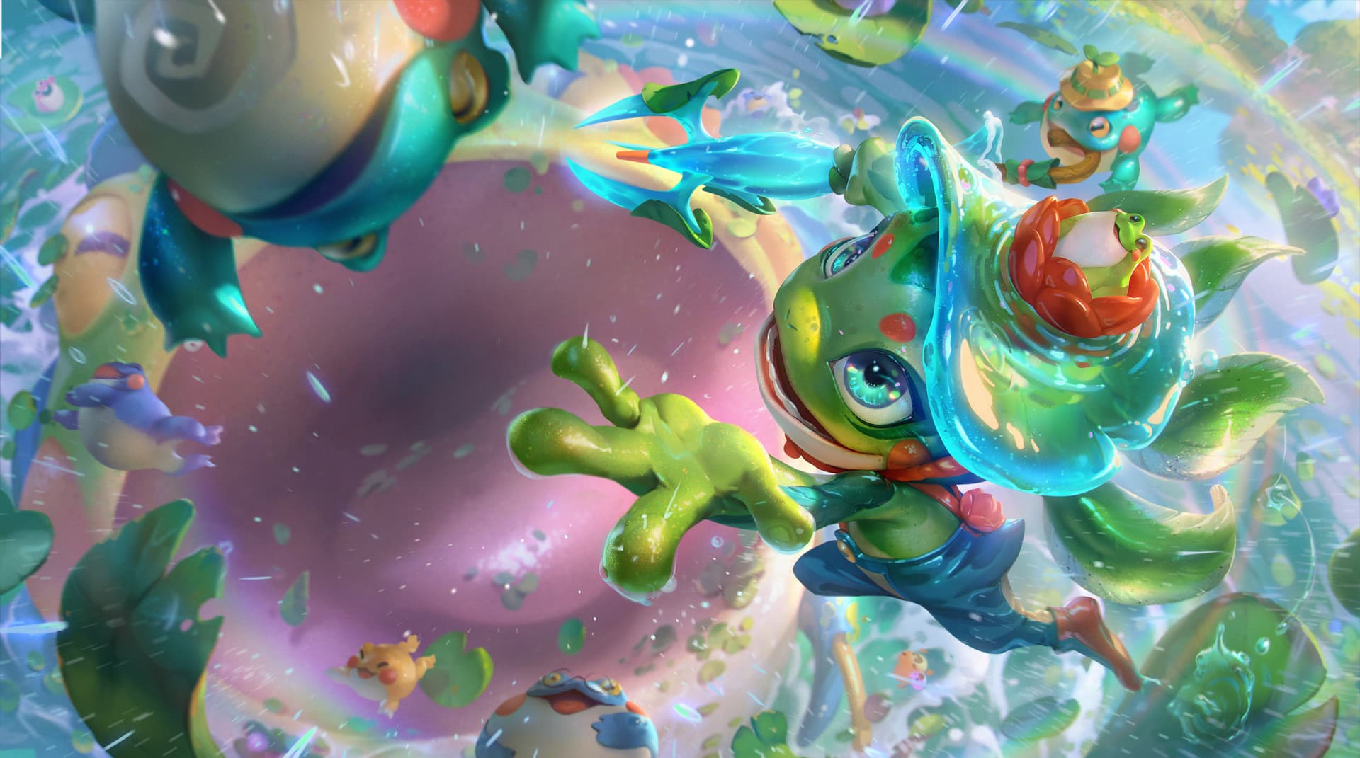
It all starts with the welcome splash art
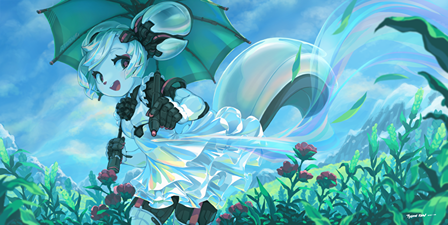
New modern UI is flat, simplified, sleek, with rounded corners (windows 11 look). As for the splash art, look at modern animation, it’s all colorful with clean vibrant colors.
I think something like this would fit well rather than monochromatic style.
Let’s take a look at Paint icons
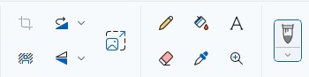
- They’re pastel colored
- They’re on a small side, giving neat feeling
- They have rounded selection boxes.
The closest to that is Affinity Photo UI, and I like it for that
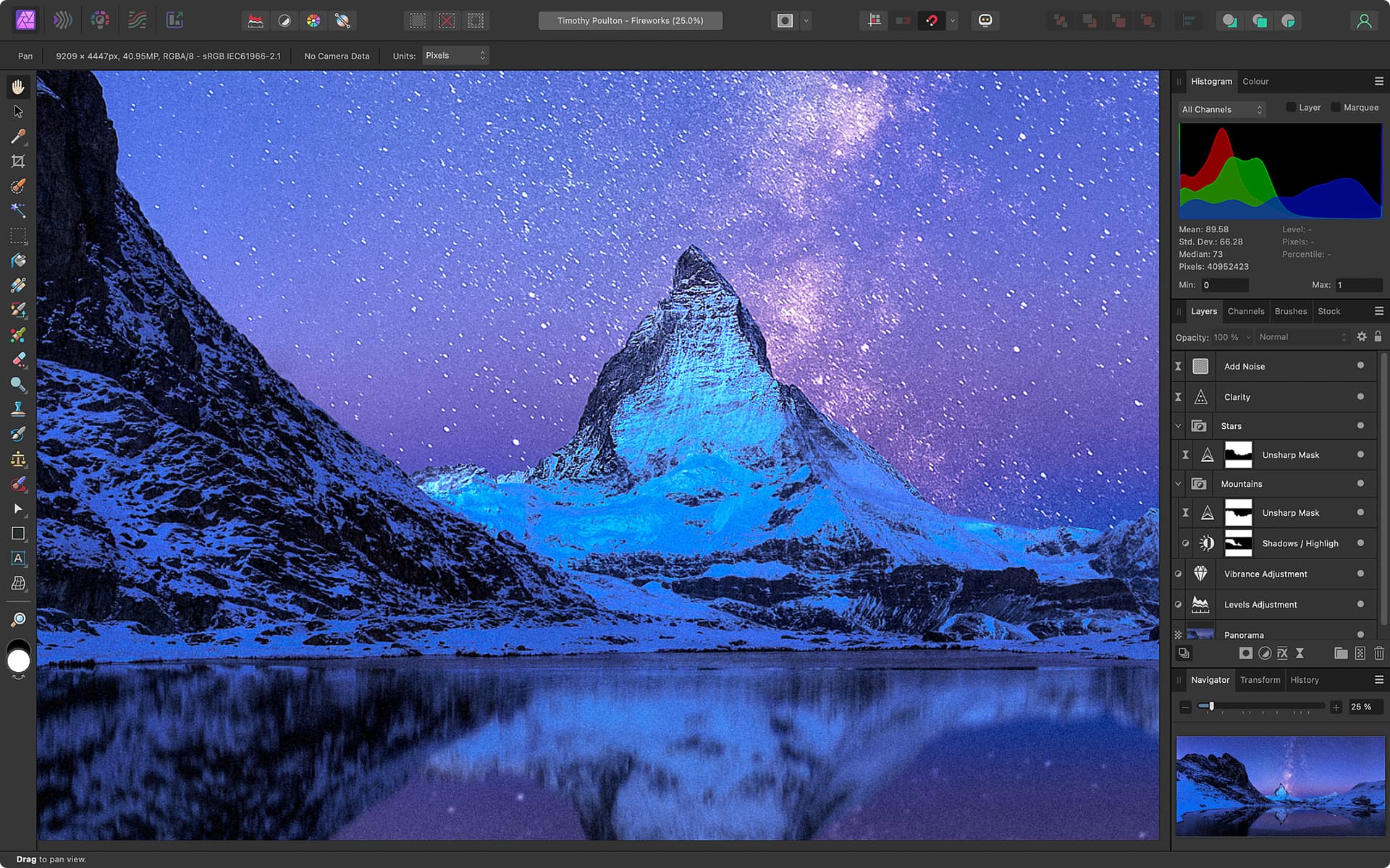
And now let’s take a look at pop-up panel of Krita
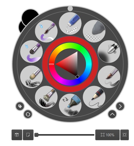
This kind of 3D icons was popular way back in time. It doesn’t fit modern design.
That’s how I define “outdated”.