I ended up posting in the thread as well, but I thought I’d bring the constructive discussion on what UI changes would even be desirable for reasons other than “it looks like it was made 10 years ago [which is inherently bad for some reason]”.
From my reddit comment:
I really don’t like “tablet UI” minimalist design look, but I have to say, if I had a screen tablet still, the ability to put faux physical buttons on the side of the screen like that would greatly improve my experience!
I specifically have always purchased tablets with programmable physical buttons running along the side and that is the element I have missed most in eras where I used a display tablet without them. This UI element might singlehandedly make display tablets without buttons a usable portable option for me.
The culture is linked to design. Clicky tech things were a part of 90s-00s, then touch display won the market and clicky things disappeared. For youngsters this is history, for adults it’s nostalgia. Design is just a part of natural evolution.
I have seen the mockup, its a good start but the UI needs to scalable, for desktop users with more real estate should have more things on top.
However, I agree the Krita’s UI can be updated. we should not restrict ourselves that it Looks like PS so its fine. we can have modern and intuitive UI irrespective of industry.
The real question is, who is going to do the hands dirty.
The way the UI/UX design is done is a matter of defining what it needs to archieve for whom. Just having a UI that looks nice does not make it functional. People have said here that the CSP UI is bad or outdated, but this is judging the look. Although I certainly agree that some things could be done easier, overall the UI and especially the flexibility it provides is very good when creating actual work, and much better than Photoshop.
In my opinion the Krita interface works quite well in many ways: it is flexibile, most dockers are well organised and the sliders work as expected. What I do think, is that the way the panels dock to the interface can sometimes be annoying (when a panel snaps magnetically to the top or bottom and the panel gets very wide), but as a whole these things do work.
What could be done to improve, as others have touched upon, is to create a base layout that is more familiar to users coming from other software. Perhaps when setting up Krita for the first time, the user has the option to pick a preset (CSP, Krita, Photoshop…) which defines base UI and shortcut scheme?
A complete UI overhaul would be an enormous task, and perhaps this is not where Kritas dev resources should go to atm. I am no programmer, so please correct me if Qt does not allow this, but perhaps there could be an easier way for a user to change icons within the UI, and perhaps define some other UI variables like colors, font size? If this were possible, perhaps the user could also share these UI/icons presets with other users, make it exportable as a kind of workspace?
That doesn’t sound like a bad idea. It would make discovering the existing PS/CSP/SAI compatible shortcut/canvas input schemes (and the fact that those are two separate things) easier. And it was previously suggested to make new/additional default workspace(s) (UI layouts).
Other apps like Blender and Inkscape have setup dialogs similar to this, which also let you choose for instance the color theme.
Icons are a bit complicated, if I remember correctly, I’m not sure how possible it is to make them easy to change.
The UI colors are changeable by switching theme in Settings->Themes,
but there’s no UI to make your own theme. (There is a decent if imperfect plugin for that, though: Plugin: Theme Creator Extension )
Font and font size can be changed with Configure Krita->General->Window->Use custom interface font.
I feel like I might regret that, but… if it’s the “vibe” Krita gives that is wrong (“looks outdated”), let’s maybe pinpoint what makes Krita’s vibe outdated and what kind of vibe we want to have? And don’t just say things, post pictures (can be screenshots but mockups would be even better). Because I bet many people saying “Krita looks outdated, it should look more modern” actually mean different things. And pinpointing it will lead to better understanding how to actually achieve it in coding or making assets/icons.
(I mean some words can be fine if there is no way to show it on pictures, like “adaptive toolbar” etc.).
And please remember that tablet UI (small screen, no keyboard, no mouse) and PC UI (big screen, keyboard, even a mouse) can and probably should be different (we can of course have both available in both cases). On PC, having a completely minimalistic UI like Procreate has could actually be a huge downgrade. You gotta think of power users as well, not just newcommers. Of people who use it every day for multiple hours, doing very extensive work, for whom one more click is a big hindrance. Likewise, the readability of icons is more important than their modern look, even though the ideal state would be to have both.
I thought about it… you know last year jetbrains overhauled the ui for its ide… I would say, the old ui from jetbrains felt a lot like krita today. I will try to make a mockup from jetbrains new ui and merge it with kritas current functions. Maybe it is worth a shot. Who knows.
New modern UI is flat, simplified, sleek, with rounded corners (windows 11 look). As for the splash art, look at modern animation, it’s all colorful with clean vibrant colors.
I think something like this would fit well rather than monochromatic style.
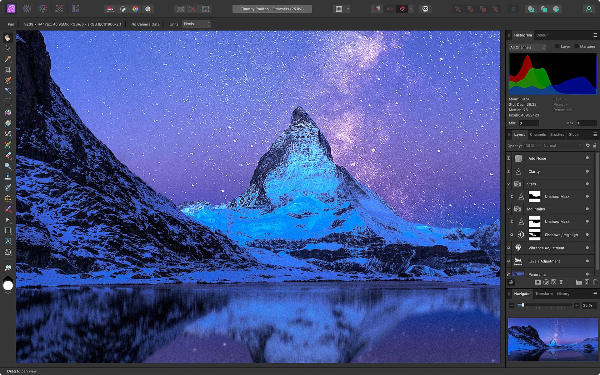
I see those are valid points, but I am still missing the mockup… like how would you suggest it should be looking in krita. Just posting an image from affinity does not count as mockup. That is just: look at this I find that nice. But it it does not help if you have to implement it.
Think about it that way: if a client tells you, he wants a cat to be drawn. And nothing more and the client sends you pictures of cats. Would you be able to draw the cat, the client wants? Most certainly not. You could try, but who knows how long it takes. However if the client can give a detailed description like: I want a black persian cat sitting at the window starring into the sun in the style of van gogh. That is another story.
For the programmers it is the same, they know how they can implement certain styles, but unless you give them exact information, how it should be, they are just guessing.
I Agree, No one is posting mock ups or inspiration. So will go first
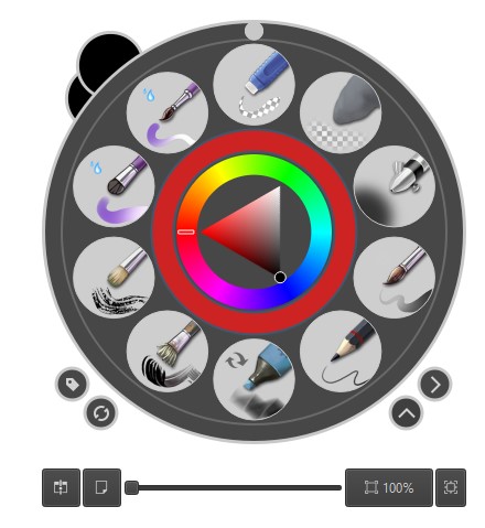
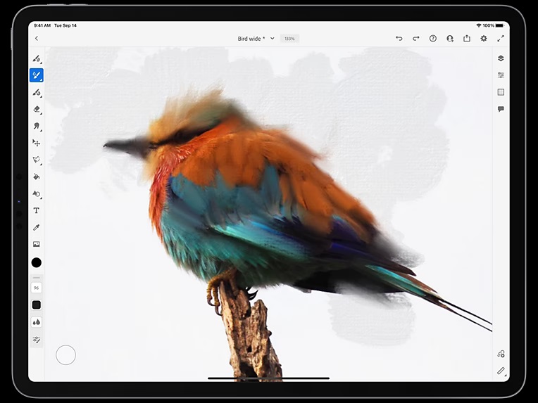
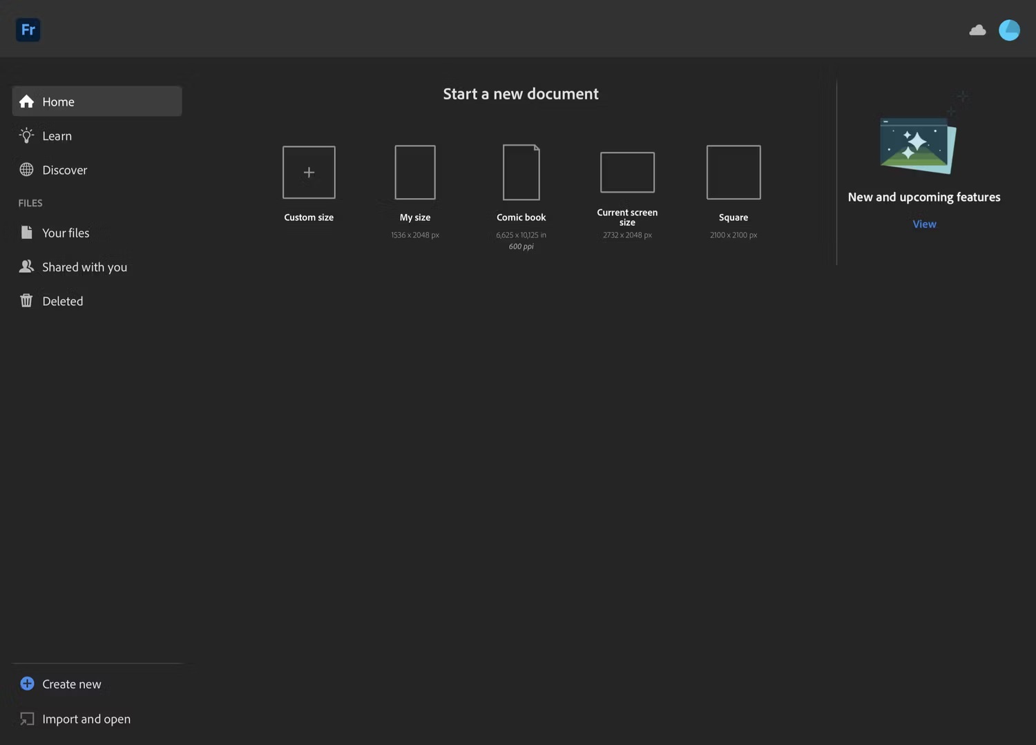
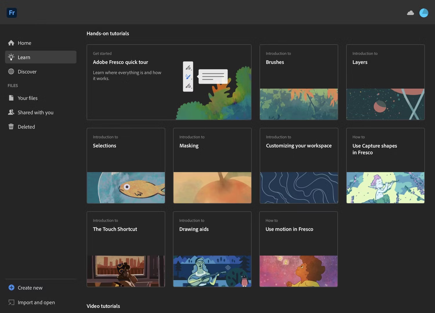
I like Fresco’s UI, seems very scalable, This can be made even more desktop friendly where all the krita’s menu can go on top, the dockers can be visible instead of just docks.
The welcome screen also looks much better. plus if we can add blurred transparency interface for floating dockers then it will follow the trend too
one of it is because its not flat or look flatter.
like those kind of buttons gradient are more old style.
newer are flatter with rounded corners and dare I say in my personal opinion too much padding
Yep. me to the client of my webapps.
One of my gripe of modern UI - is there is too much spacing with icons . some get relegated to the “more” section while i feel i can chuck them all in one space if i can reduce spacing.
Like till now I’m still raging on inkscape redesign - yeah it looks modern but damn my canvas space got reduce because the side panel got fatter because the UI spacing. The icons on the toolbar overflow.
If an option to “customize the spacing” is available I’m for the modern look. Just IMO some more modern UI design feels like there are too much white space.
I take some issue with the idea of the UI being outdated. Trends come and go, and they seem to be about the skin of things more than their actual functionality underneath. It is like the facelift cycle of modern cars, making changes for the sake of making changes without actual improvement.
Following design trends for the sake of being “up to date” makes little sense to me as Krita is not competing for market share with paid apps per se. As I said above, opening up the ability to develop skins for Krita (icons, colors etc) in a more accessible way makes more sense.
As for the comparison to Affinity: I have been a power user of Affinity apps for my design work for years, and even if I agree that the interface looks nicer, friendlier and more modern, the actual functioning of it is not much better and sometimes worse than Krita. The UI is much more restrictive in the placement of panels for instance. Adjusting the UI is also not as easy as it should be.
As a long term user of digital art programs, I tend to regard them as tool boxes that enable you to do your work. It should hold all the important tools in a logical way and not be too obtrusive to get in your way. How well the toolbox is organised and offers the ability to be customize to the needs of the individual user, the better it is. The way the toolbox looks is much less important. It is more challenging for a beginning user, but more productive once the user finds a workflow that fits.
Modern UI design like Affinity, Fresco and Procreate looks nice but forces a workflow on the user, with much less ability to make it fit its own needs. This might make sense on mobile devices with smaller screens, but I find it too limiting on desktop. And don’t even get me started on the new “simple” UI in Clip Studio Paint…
If the UI is scalable, then i don’t see a challenge, if it can scale to desktop with that kind of interface then power users are happy, if it scales to tablet with touch interface then tablet users are happy.
For me, 5.3 alpha has tremendously improved my workflow and I have kind of painted 20 things in a streak. That is the power of good interface. it made drawing fun for me.
the UI will come and go yes, But KDE itself boast as extremely customizable for every use case project, you can make it Windows like for that matter. why can’t krita be beautiful, adaptable and functional?
Although I understand Krita has limited resource and we might not get what we want but if there is a good vision then maybe one day slowly but steadily we can be there.
As of now I am happy how things are and will be glad to use the same UI in QT6 too but I am all in for more better UI
And yet you’re not allowed to have an independent eraser. So, nothing is perfect.
Is severely underestimated. I get it. You’re programmers thus you can work with any window that contains text. And you’re a power user that has been using Krita for many years. The UI is not important because you’re used to it and it works.
Oh, I remembered one more thing. When I was curious and googled Krita for creating an animation, people on reddit said Krita is only for the short animation, and doesn’t work for the long ones. And one person elaborated that Krita does pixel animation and it requires huge amount of PC resources. And that’s why animators use other programs to animate that use vectors instead because they’re much easier to calculate.
and yes krita is not yet for animation. the thing with open source is when someone kinda like something and they coded it and someone maintain it - it gets there . So that’s the animation feature. i think it works for storyboarding but like there is practically no resources put there save for 1 or 2 dev that maintain and optimize it. there are quite a number of feature in krita that get there because someone wanted and can code - or someone requested and a volunteer got interested and have some freetime so they added it.
Krita at its core is a digital painting program but obviously it has grown from that. So most feature is there. And the eraser will get here if someone get the time to do it.
I think sometimes there is a fundamental misunderstanding of how things like Krita and features get here.
OTH UI/UX rebuild takes tons - tons of resources fundamentally might require some feature freeze not to mention the team might need to wrestle some QT stuff for that.
To me there are more pressing issue atm. like you said the eraser feature, the docking system, the assistant feature, not to mention the much anticipated start of dev of comic features. Than just the UI [which is the look] , UX though can still be address .
fundamentally as it is open source, we have different idea of krita and of what we want krita to be. You want krita to look modern because for you it not looking modern is detrimental to its growth. For me I want krita to get some Digital illustrating feature [like comics paneling , improve assistant, better text] because i think there is a potential there. Some want krita to be the best digital painting app.
I think atm there is no resource yet to address some those. Sometimes what we think is simple is entangled deep in the code and hard to change (my experience though are from webapps so…)
This is feature request - doesnt mean it gonna be applied but it is also a good gouge of interest.
Like there are feature that took awhile to implement but once there is significant interest they get put into the consideration.
Personally, eraser tool is the only thing holding me from fully committing to it, the rest is secondary
Recently I’ve learned that Krita even has a measure tool. That’s cool as I was thinking to tackle a book in a near future that required an angle measurement. Alas, it says here it can’t measure any angle, so it’s kinda situational. But anyway, other programs don’t even have it.
But we diverted from the thread, so let’s end this here.
About the UI, one more story from me. I needed a font manager some time in a past, so I read many reviews of those. But they were bulky and old, so I thought no, this is too bad for me. But then a miracle happened. A brand new program was created. It basic functions were free, it was lightweight, it had a cool modern design, it wasn’t bloat. Well, I thought, that’s it, and just stick with it.