Update for Icon Library:
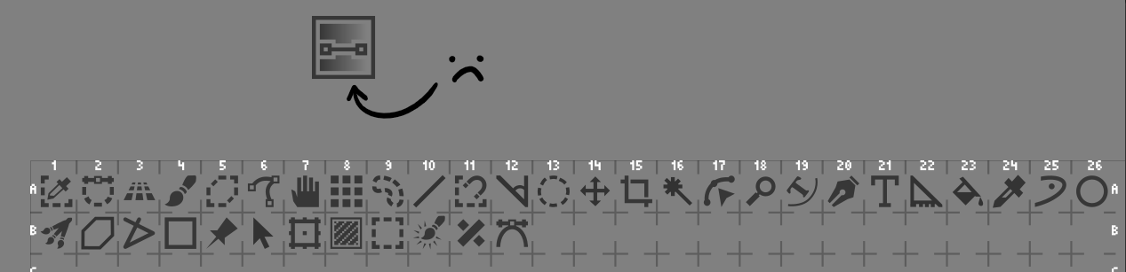
I’ve used the basic format of the Blender Icon table, and included the Toolbox Icons (arranged in Inkscape). Whether this becomes a separate Vector Library is up for debate.
Things I’ve noticed:
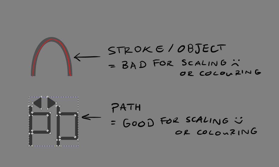
- Many of the icons are either stroke, fill or combinations of both. While this won’t really matter for Vector Library format, I think this poses a problem for scaling and colouring the icons outside of that format. In Blender’s case, they converted their icons into paths, which allows icons to be scaled and coloured in batches without varying stroke widths etc. For the example above, I converted all the icons into paths, so they could be scaled relatively.
A question for this topic: would we like these symbols to be converted into paths? On one hand, the symbols are harder to edit with stroke width etc. On the other, more variation is allowed, for colouring and scaling icons.
An example is shown below:
- Gradients in icons, like the first example, aren’t good for path objects. If the object is a path and has a gradient inside, then the whole object will be filled with the gradient. A workaround for this would be to have a blockier gradient, like how @EyeOdin suggested in Krita UI Icons - To be proposed - #15 by EyeOdin, shown below:
Aside from this, there would need to be categories made for which symbols go in which etc.
I’m happy to continue with the icon libraries for the time being, but these would also need categorisation.
Cheers