I like to craft some features, among them… speedlines. I made a lot of them in the past. However, I didn’t know if they were suitable for use in webcomics.
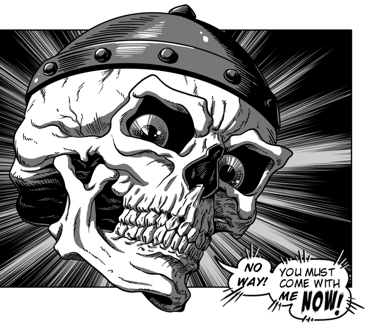
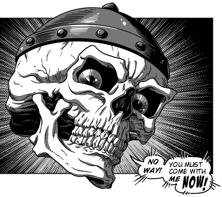
From what I’ve researched, half a page of a webcomic would measure 720 x 640 pixels: I created the page twice that size in Krita and made the art in black and grayscale. I didn’t apply screentones at the moment, what interested me most was having an art for tests
Most of the old speedlines failed the test… ![]() and I’m producing some new ones. At the same time, I’ve been testing different shapes and effects. These are two of my tests.
and I’m producing some new ones. At the same time, I’ve been testing different shapes and effects. These are two of my tests.
In this first one the speedline effect came out more like an explosion:
In the second, I took another speedline and applied a line filter to it:
So… what did you think?