I’m designing a cover for a picture book that will be displayed on Amazon in a small thumbnail size. They recommend using 2560 pixel length/height, which is what I’m doing.
I put a text box (vector layer) for the title and it seems fine on my screen when I’m working with it…but when I zoom out to roughly thumbnail size, it gets fuzzy.
It seems like other fonts are doing the same thing.
I haven’t transformed the text layer at all but it seems to be fuzzy when zoomed out.
Any suggestions of things I should try?
(or any additional info / clarifications that you would need to help? I’m very new to this! Sorry if I’ve left out obvious details)
Better ceate a separate version with the thumbnail size.
It’s only natural that you lose information by zooming out, you try to squish the same amount of pixels into less space on the display which has limited physical pixels at a fixed distance. The same will happen when you resize the image later.
Also in Kita all vector shapes are projected on a raster plane, so they still lose quality when downsized.
(also I’m aware that some of the images are also fuzzy when zoomed out…I’m guessing those need to be redrawn but I’m confused about the text being fuzzy. Trying to figure out the exact cause of the fuzziness before I get any work redone)
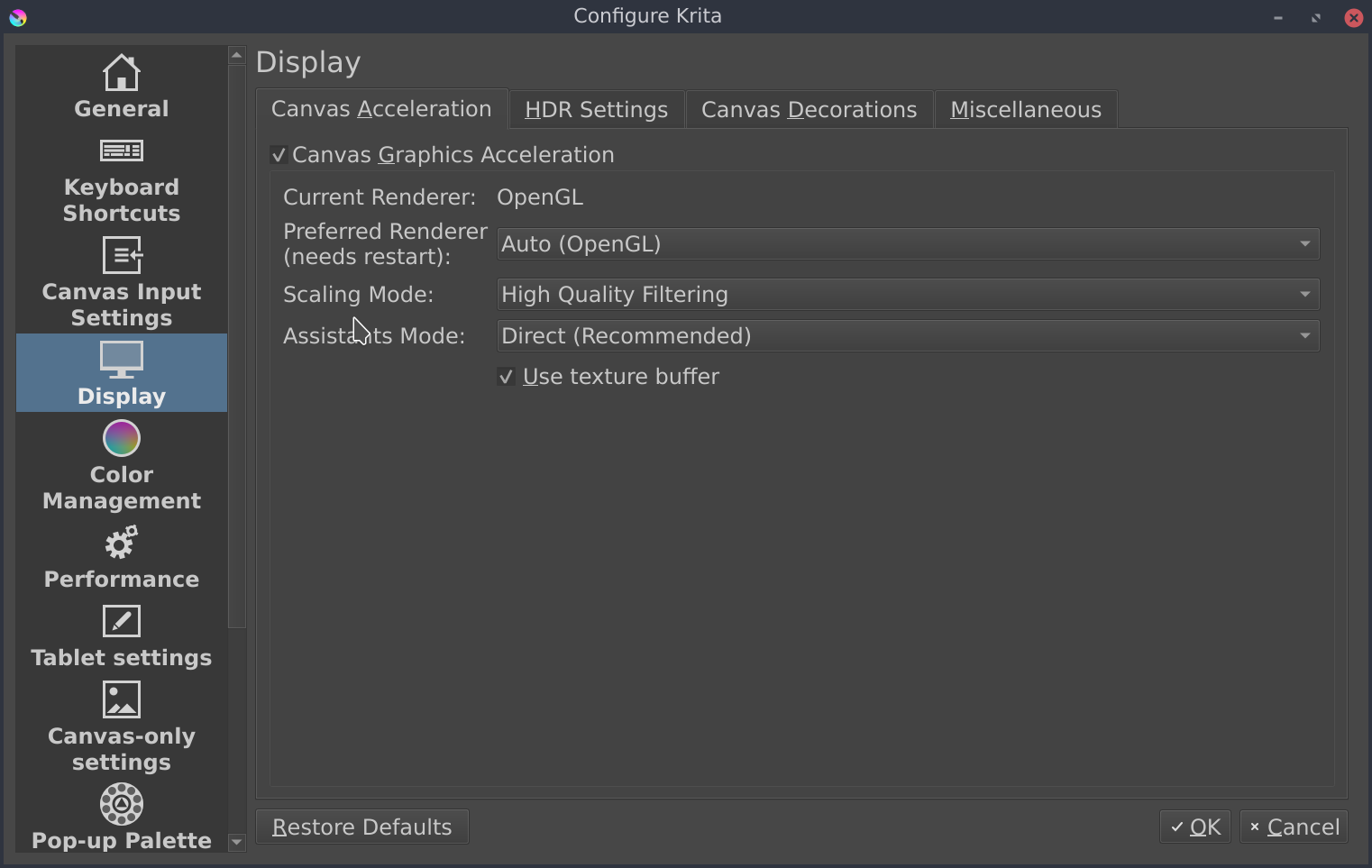
According to choice made here (rendered and scaling mode) the result can differ.
What are your current settings, what’s the result if you try different settings?
In all case, when you zoom out, you’ll lose details and get thing lightly “blurry” (especially visible on edges)
If you have 4x4 pixels document.
And zoom at 50%:
you’ll have to display 2x2 pixels
in a “simple algorithm”, each pixel here will be average color of for pixels
This is why you have the feeling of something “blurry”.
After there’s different scaling algorithm, that will improve how edges are rendered (to keep them “sharp”)
The bilinear algorithm is fast but probably the one that will “blur” edges the most
The high quality, I can’t tell you what’s behind (I don’t know if it’s an implementation of a specific algorithm or if it’s a Krita’s own made algorithm)
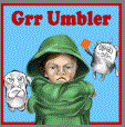
I’m not totally sure because you’ve provided screenshot as GIF file and I don’t know if dither is a consequence of gif file format used here, or if dither is from original artwork.
But if original artwork is a 2560x2560 dithered artwork, zoom out result can generate unexpected rendering
No
If it’s only a zoom problem then it’s not a big issue: there’s nothing lost from you original artwork.
If it was related to a resizing problem, there’s tip you can follow to improve resizing quality.
Also note: when you use the “print size” on a display, you monitor is maybe between 72 and 144ppi, whereas a printer usually will be between 300dpi and 2400dpi.
So the “print size” on a monitor doesn’t means a real print will be fuzzy (it will mostly depend of the printer used…)
I just fiddled with the all those settings (preferred renderer, scaling mode, assistants mode), toggled “canvas graphics acceleration” and “use texture buffer”…the only result that looked any different from the others was “bilinear filtering” and “nearest neighbor” (both of which were worse)
The dither is not visible on my krita file when I’m editing it, so I’m pretty sure that’s just from the GIF screenshot.
This file is intended for a digital thumbnail-sized display (though if people click on the book they will be led to another window where the same image is displayed larger…which is why I can’t really design this thumbnail on a super small canvas. It will be used both as thumbnail sized and smartphone screen-sized).
I have a separate version of the file that will be printed (and was designed at the right size for printing so I’m pretty confident that will turn out).
So where exactly does that leave this? Do you think that the fuzziness I’m seeing is only a Krita/display thing or is that actually what the image will look like when I upload it onto Amazon?
Ok yes, GIF is a weird destructive file format, PNG is better to share screenshots
I’m not surprised if they’re worst.
But I had to ask because if you were initially with bilinear it could be a reason why you get this fuzzy effect.
Here I can’t really help.
It’s too vague.
When you upload an image somewhere to get it being displayed on a browser or application, in most case:
image is recompressed, eventually resized
a thumbnail is produced automatically - about how the thumbnail is produced… which size, with algorithm, also which file format will have an impact about final thumbnail rendering
For me, if you have fuzzy effect while zooming out on Krita (and it’s easy to me to see it on dithered gif file as the gif file destroy a lot of information) it doesn’t mean you’ll have one on final thumbnail. But it doesn’t mean you won’t have one too
A zoom out is like a resizing, except that for performance stuff, this is a fast resizing.
So it could be a Krita/display thing.
But in all case, if your artwork is displayed as a thumbnail, you’ll get a more or less fuzzy effect: but resizing image to a smaller size, you loose some information and except if you use the an algorithm that is optimized to keep (or try to keep) sharp edge, you’ll always get something slightly fuzzy…
If you have to possibility to provides the reduced size version of your artwork, I recommend:
to flatten image before resizing
– when you have multiple layers, each layer is resized individually
– resizing a layer A with transparency and resizing layer B, then merging result, won’t generate the same result than merging layers + resizing
in your case if you wan’t to keep sharp edges for text, probably use of Lanscoz3 is a good choice; but you need to test each algorithm and choose the more appropriate for your case