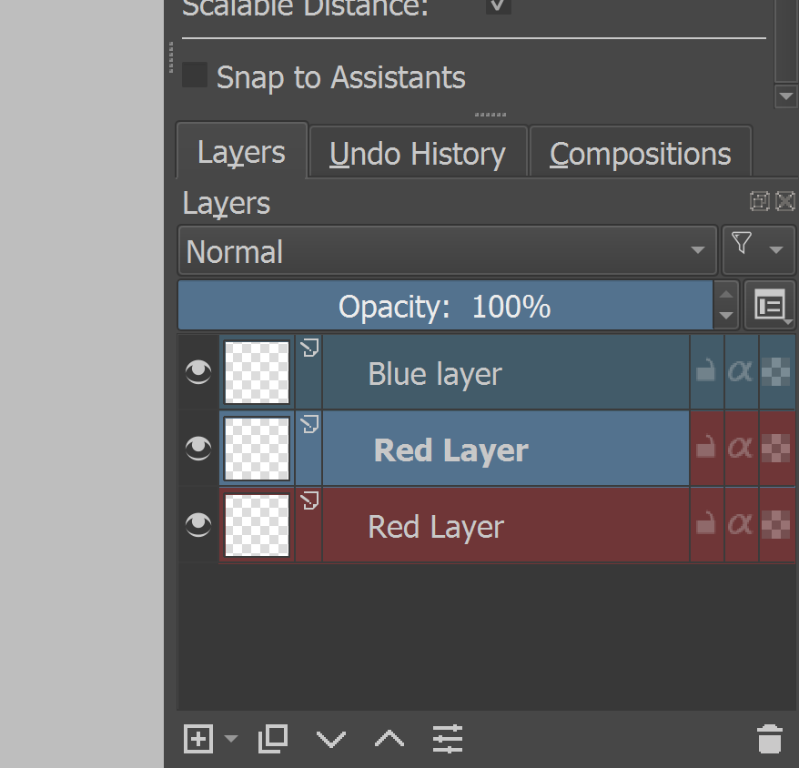
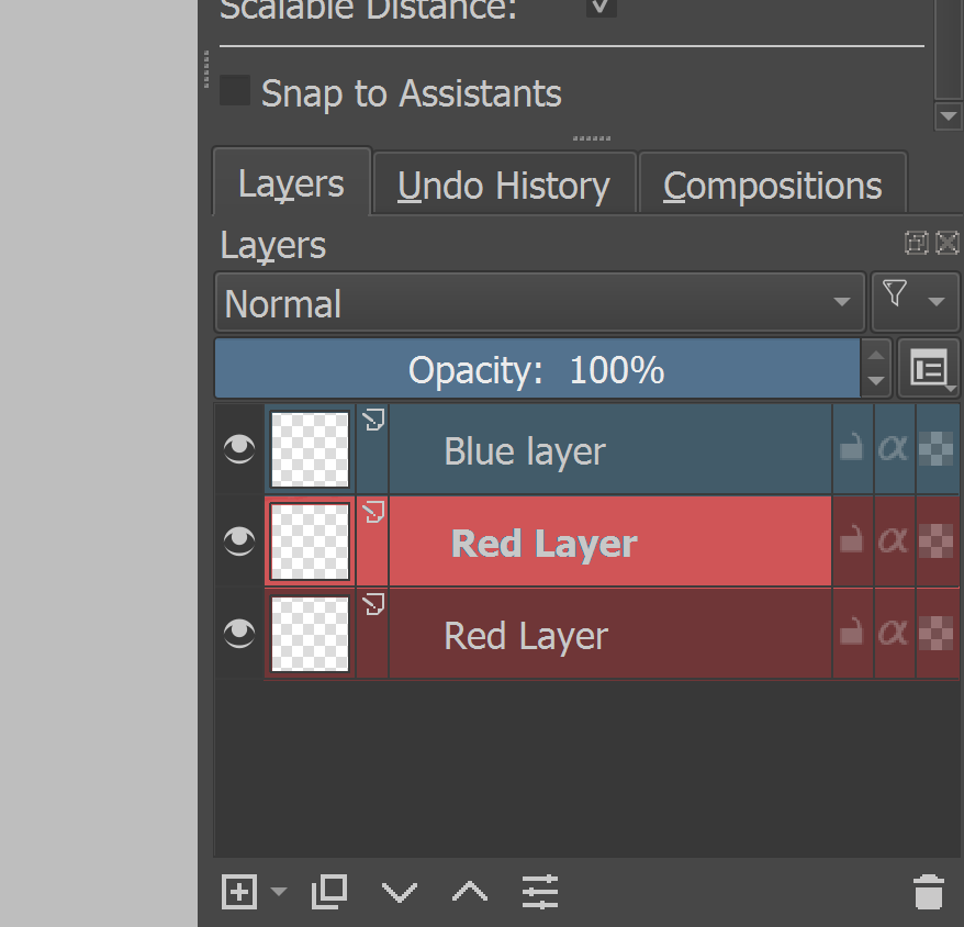
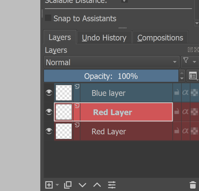
Right now the selected layer always looks more blue, than the color the layer actually is. Which makes it harder to read at a glance what you have selected.
Right now, the code just blends the color of the label with the “selection color” defined by the current color theme of your OS. Looking into your screenshot, I’m not sure everybody will agree that just making the selected layer color more vivid is enough to be easily recognizable.
You should also think about the case when multiple layers are selected. Imagine that these layers have different color label. How should we render them in this case?
In general, I’d like to know @Deevad’s and @scottyp’s opinion on this topic before we create a wishbug.
Thank you for the response. That is a good question, definitively something to be considered.
Maybe something like a selection border, when your selection is a coloured layer? Though, maybe that might be “too much”?
Maybe make it darker with the bright themes. It’s the contrast/difference between a selected layer and a not selected layer that’s the important thing, while maintaining the colour labelling.