Hello everyone.
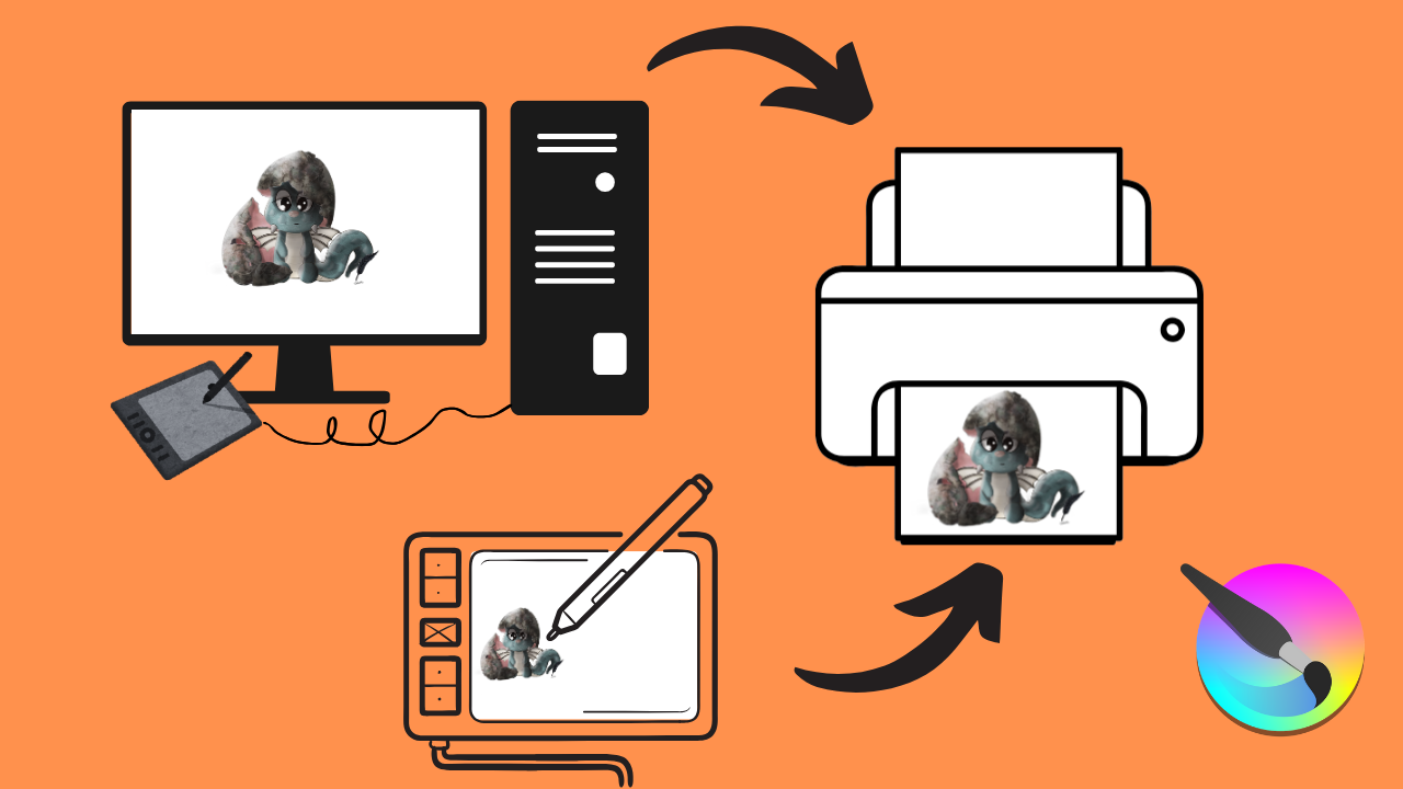
Are you tired of seeing your digital art look different in print? This tutorial is your guide to achieving flawless, color-accurate prints every time. I’ll show you how to calibrate your entire digital workflow, from your painting tablet and/or monitor to your printer. I’ll even show you how to set up Krita. By ensuring all your devices and painting software speak the same “color language,” you’ll be printing your artwork exactly as it appears on your screen, with no more unexpected color variations.
Chapters:
00:00 Intro.
00:15 Quick note.
00:27 FIRST… We must first understand why colors vary across different devices!
01:21 pause the video to read RGB vs CMYK.
03:14 How to find the color profiles that already exist on your computer.
04:13 How to find and download an ICC profile online + How to upload it on your computer.
04:36 Adobe RGB 1998 ICC profile.
07:00 How to set up your monitor, your tablet, and your printer to use the same ICC profile.
10:12 How to set up KRITA to use your ICC profile.
12:10 One last IMPORTANT thing to keep in mind.
13:16 Conclusion