Hello, I saw this disquisition and wanted to add my viewpoint on UI design and what I enjoy to use the most.
Its custom menus that pop up under the mouse cursor that are called using a keyboard shortcut.
Well, if it’s me, I don’t feel confused at all. @Dmitry did a great job doing this concept. I like how things were thought, and it’s not
counter productive at all. If it was implemented, it won’t stop Krita from being Krita, because
very first, the tools that were available would still be there and would work in the same way.
The UI changes a lot in terms of style and aesthetics, sure, but it’s optimized for productivity and follows good UI/UX standards. What do you need more ?
Access to menus and buttons is fast. And if all buttons can’t be seen immediately, it’s fine, because your screen does not have infinite length. Which is why grouping them is a good solution. If you want tool buttons to be always visible, a setting in Krita’s preferences may help for that; you could for instance enter a particular UI customization mode which allow to move a given button to a given place on the toolbar.
All in all, things can’t be perfect. Enjoy the work he and @Alexey did and congratulate them!
Come on! Come on!
Then we need plugins that can entirely change the way the UI looks and works, kinda like MODS for video games, or distributions of Linux. So be it. There’s no better solution if satisfying all users should be taken into account.
Thanks for the praise. In fact, I’m ready to completely redesign the krita interface. All settings of the tool will be transferred to a horizontal toolbox. The main focus will be on a more user-friendly interface. But as far as I understand now, the developers are not ready to make such a radical change in the interface. But if there are people ready to make a custom version of krita and they are ready to implement all this, then unsubscribe. I will be a designer. Concepts and their description, icons, I can take it upon myself. In addition, I will be at least not alone, my friend will also willingly participate in the work. Seriously, if there are interested persons, please respond!
We never said that a change to the tool option widgets cannot be discussed; only that it needs really careful consideration of the possible problems, and a good grasp of why things are as they are now. With a good design this could be considered, pending a good implementation. And you will need to be able to work together with us, using the normal development channels: phabricator, invent.kde.org, irc.
Note that we’re now working towards Krita 5, which gives room for bigger changes.
On the other hand, a toolbox with fold-out icons, that’s something I really don’t want. Sorrry, but I’ve hated that since I first encountered Photoshop 7.
Look at the telegram channel with our developments (https://t.me/krita_from_future). If you are interested and you want to work out the concept, then you can do a deep study and implementation. Now krita is released on android, laptops and transformers with a screen of 12-14 inches are also very popular now, and there it is no longer as convenient to use krita as it could be.
Maybe I started wrong. I will try to explain what I want to convey. I’m here because I really like Krita. But its current development for me is a road to nowhere. The development is completely chaotic, and many solutions, although successful, are not coordinated in any way due to the chaotic development, which makes the program fragmented and incomplete.
I suggest that you take a strong-willed act. Completely overhaul the Krita interface.
And I propose to develop it from the general to the particular. To lay down the main features of the new design and then systematically work out the details based on the new concept. But you need to do this initially consistently. Otherwise, nothing will work.
But I can highlight theses what I want from krita:
A simpler and more logical interface.
Scalable interface based on DPI and monitor size
Make the most convenient interface for tablets and touch monitors without sacrificing use.
That being said, I want to keep the basic principles of using krita the same.
Therefore, during the initial study of the concept, we decided to simply transfer all the current settings of the tools to the horizontal toolbar.
Make the toolbar dynamic. It will only show the available tools for the selected layer.
Therefore, I repeat, if you want to remake krita and make it modern enough for the current reality for the user and you need a designer, I can help you.
Well, some people don’t hate that. Now both sides should be considered if possible, always.
I have a 1600x900 resolution screen on my laptop. This is what Krita looks like when its tool bar is displayed in one column.
When I select the lasso tool, the focus isn’t even visible.
The column stay there and doesn’t show the lasso tool is selected.
You have to navigate yourself on the tool bar to be sure of it.
You would ask me to put it to two columns there but what if I didn’t want to ?
Anyway.
If possible, sometimes, help us by developing yourselves plugins for such things. I’m saying this because you know better than anyone how Krita works and the technology behind its source code.
So on one side, non fold buttons, in other words, buttons that don’t change.
On the other, folds buttons.
Plus let’s not forget that we’re humans @halla.
We adapt. If the interface changes, the tools are still there and would still remain accessible in a very similar way if not better.
Worst case scenario, let’s just have a customized Krita just like it was the case for Blender with the app “BForArtists”, a customized blender app coming with a new and better interface according to users, even though things in it change drastically ?
Yes and that needs developer time. The developers didn’t say that they are not open to contributions, they can’t dedicate their time right now as they themselves have other priorities in the project. So if you feel like you can take up the task. Then you can create the Merge request on invent.kde.org. You can build Krita with new interface and then try to add it to the default Krita. The development process is simple.
Right now your mocks looks good, but will it be possible to convert this mock into reality?
Again This topic is going off-topic. @novames00 please make new topic for the discussions
That’s the thing. Everybody wants a new, pretty, more usable interface (sometimes it seems for what you’re saying that that’s not the case for the developers).
But I’m an artist and also make some contributions to the code, and I can tell that the screenshot concept can be made in one day, while implementing it can take years unless you put all resources on it.
I came here searching for how to rearrange icons in the toolbox.
I like to have brush, dynamic brush tool, multi brush tool, and other coloring options like colorize mask enclose and fill tool, fill tool etc. much closer.
Also group the shape based selection tools under a single item or move it to top panel as sub menu icons under a single selection icon.
I can share some of my views if its of any use.
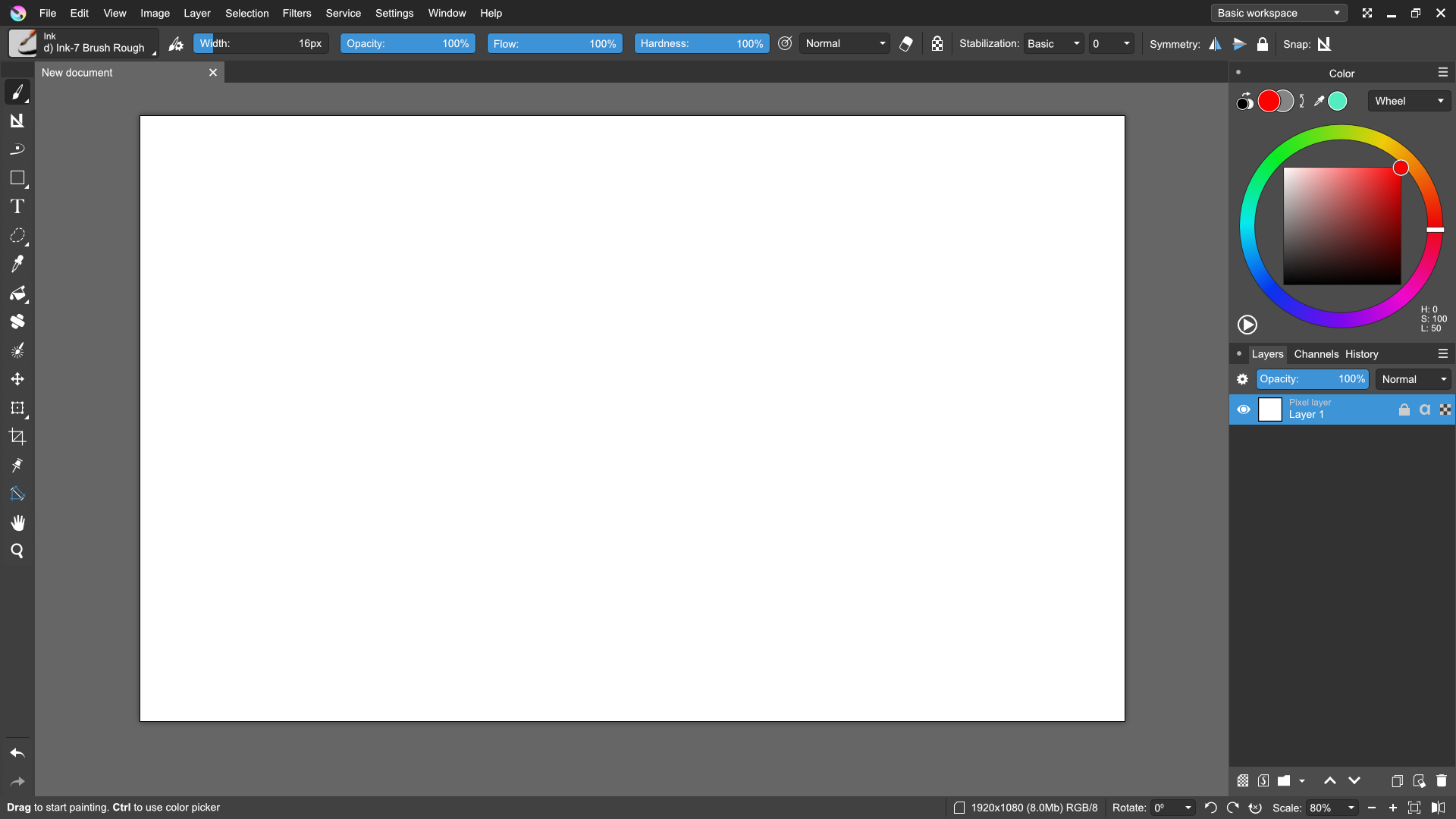
Blender’s UI and transparent panels are good. I personally prefer not to put tools inside canvas area, but keep it aside and take minimal space in screen. Since most new users might not have a 4k monitor, please consider optimizing the real estate for canvas.
Apart from toolbox, I’d like Krita to have some additional UI improvement.
Blender has Ctrl/Shift to slow down(fine adjustments) and speed increments in sliders. It would be good to have it for brush size sliders(or for all sliders in general). Also blender shows context aware modifier keys in status bar to perform additional actions for active tool.
Another is to have the brush settings open in a popup panel instead of a window (similar to Tool Settings from top panel). I’d like to adjust pen pressure and tilt to affect size, rotation, etc. and having to deal with the popup window is not that nice experience. A pin option to keep the temporary popup not to close when needed would be nice.
‘Toggle zoom fit to page’ could use an icon so we can put in brushes and stuff toolbar along with Reset zoom.
The dropdown button in front of the brush option slides could be removed and add to right click menu, or move to after the slider with half the width.
It would be nice to have all Brush smoothing options grouped as a dropdown that can be added to toolbar instead of 4 different icons.
Adjustable snapping angle for discrete rotation of canvas.
I’m only starting with Krita, maybe some of the above options are already there and I could not find it.
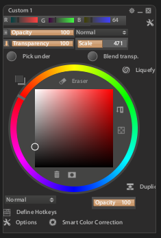
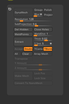
Z-brush’s UI is notoriously known for its non-user friendliness. Please don’t adapt much ideas from there. Popups of existing UI panels under mouse cursor is good.
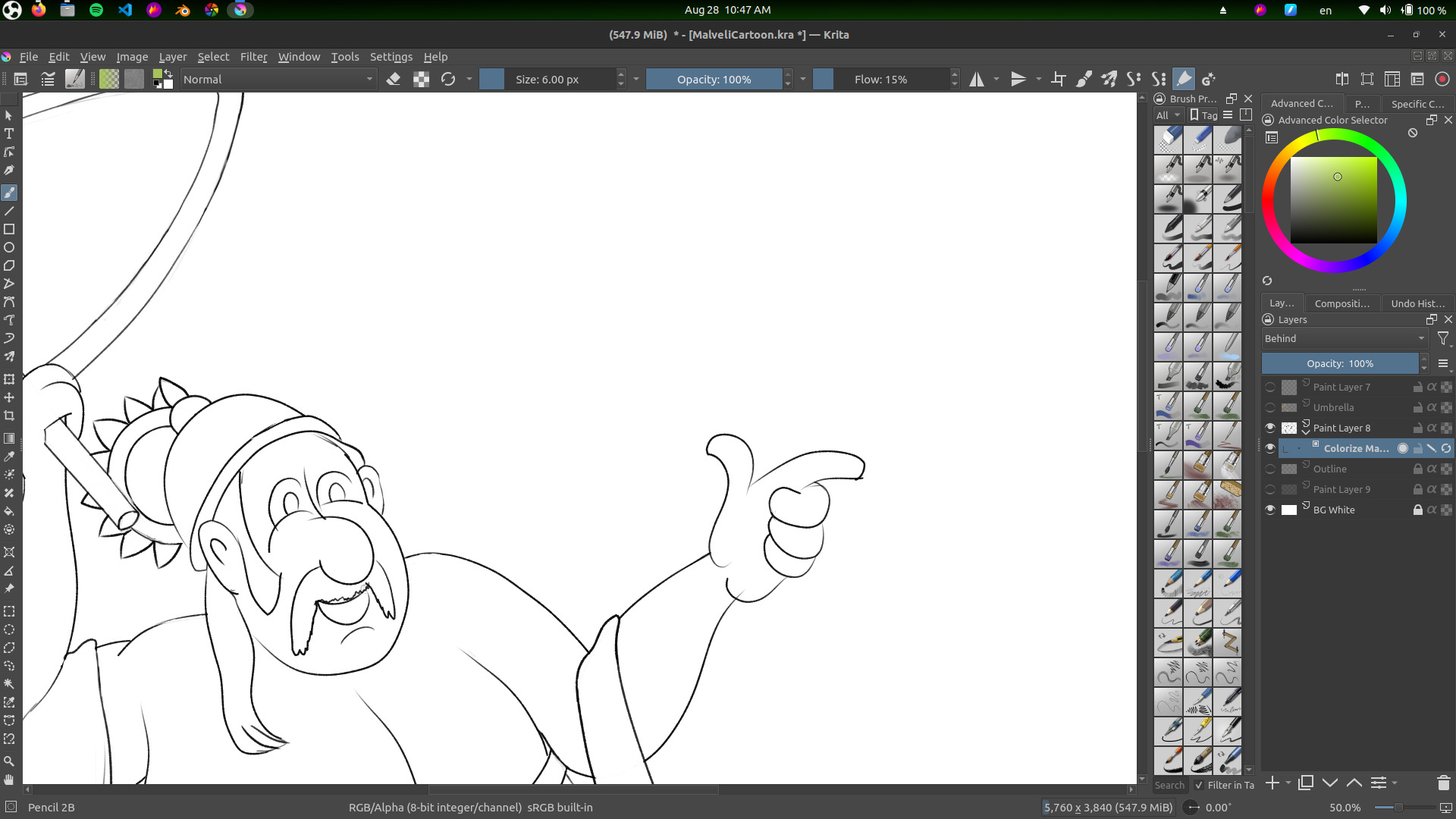
Glad to see some commentary and activity related to the toolbox icons. I’ve been wishing/thinking about this myself. Probably everything I was hoping for is already being considered but I thought I’d add my two cents. I uploaded a screenshot of the way I currently have the toolbox docked to the bottom of the screen. I like it there but a couple of programming tweaks would make it better.
How about the ability to center all the icons to the width of the screen (in my case a Huion 22" tablet)? That would bring everything directly under the drawing/work area. Even that would be a good first step.
Secondly, and I think this is being suggested and considered already, is the ability to group the icons according to purpose, how ever the user sees fit. One of the recording apps that I’ve used in the past (called Samplitude) provided the feature to do just that. Each individual tool icon can be hand-placed according to the user’s preference. They even had a small vertical line symbol ( | ) that could be hand-placed anywhere to create obvious grouping of icons. This is of course unnecessary in the default configuration, if docked to the sides of the screen. But if used along the top or bottom I think it would be useful. I know I can simply undock the toolbox and shape-shift it to float over the work area, but I don’t really like having any boxes floating over the work area. I find it distracting.
One other thing Samplitude does is allow you to add or remove tools depending on your needs. I probably only use about half of the tools (at the moment). The other half could be removed making it a lot easier to locate the specific tools I use on a daily basis. There’s like a “tool bank” window that contains all the icons. You open the tool bank and simply grab and place, or grab and remove. Just an idea.
Anyway thanks for letting me join in the conversation. And thanks as always to the wonderful programmers at Krita. This program rocks my world!