Hmm, have you got a reference picture? (I’ve never used ZBrush)
You guys are literal heroes.
I have been dreaming about changes in Krita’s UI. The current UI is nice of course, but there are so many things that could take it further. I am so grateful for all the amazing work you are doing to it. Much respect!
Take your time! The fact that you guys are doing this at all, in your free time, is absolutely amazing! 
Thank you!
Diagram of the Canvas
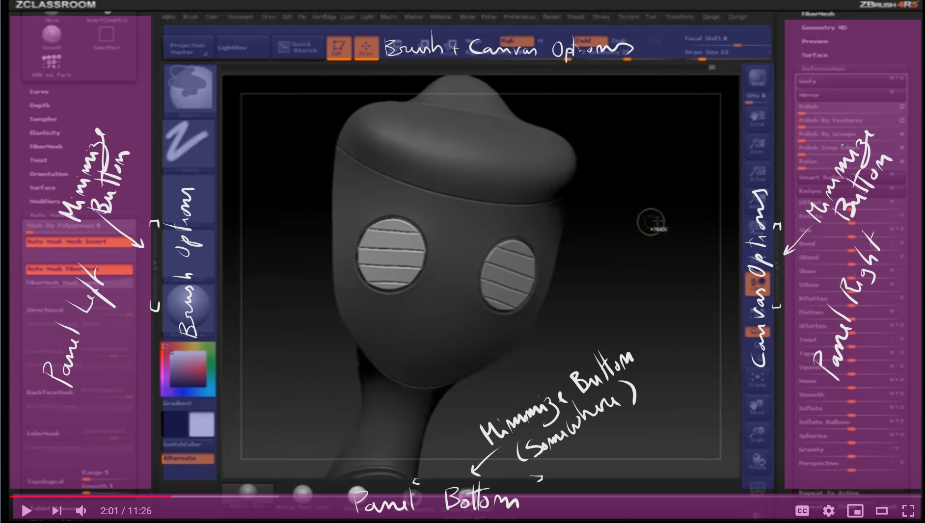
some tut:
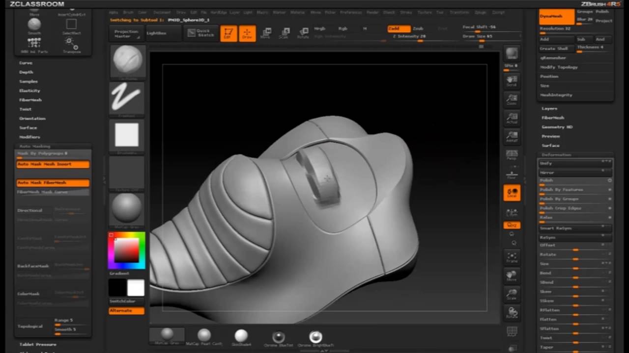
you have 3 key shortcuts to toggle on and off (if it was a radial shortcut it could be one):
- Panel Left
- Panel Right
- Panel Bottom (cropped out from image but it exists)
Everyone forgets that Zbrush is also a painting program and started as a 2.5D app. despite the painter mode being super sucky the panel organization is really ergonomic and really good for brush work, not to mention it does not favor left or right hand either. just like Krita, zbrush works with “selecting brushes” to do stuff.
If I made my mockup it would be based on this organization method.
@fullerhill_art We would love to have you on the team, I think three people is still pretty manageable 
@Rakurri You actually contributed quite a lot, both me and @Kapyia were using your mockups as a basis!
We plan to give this to the public in a few weeks, let you guys test it, use it in your daily work and give us feedback on how to improve it!
Oh, I’ve never really looked into Z-Brush’s UI  interesting!
I’ve always heard Z-Brush is a bit funky to navigate though. I can already say there’s a bit too much on the screen for my taste but I’m very biased. This is the UI I’ve created for myself (and the community) after all 

The scrolling panels in particular are a first time for me. It’s a cool alternative to tabbed dockers, but it doesn’t strike me as more friendly to use. But I’ll bide since I haven’t actually used them. I also think Z-Brush has a lot of dead space and weirdly sized UI elements though (buttons too large for their icons/text for example), so let’s not adapt that 
All in all I’m not entirely sure how much more can be done with Z-Brush’s UI system that can’t already be done with Krita’s dockers. Though we’d probably need a few new ones to match things more closely.
Thank you immensely guys, what you’ve been up to is looking great.
About ZBrush UI: I’m using ZBrush for a few years now, so I hope I can give a little experienced insight for those who haven’t.
I think when it comes down to “efficient” and “professional” UI/UX, having the most used tools always in the top bar is a choice many developers have taken over the years. It makes sense to me. Also, making it able to minimize/hide is also a great part of freedom.
Not sure about the sidebars of Zbrush, they are quite useful I must say but also a bit ZB-quirky, I haven’t seen that in any other software the way they have it. In there it makes sense because all the panels and options are modular and I can drag whatever I want to the sidebar. The sidebar is able to be toggled on and off all the time. Great.
@Kapyia Also, I really like your idea to have a toggle for the sidebars like in Blender. Since I’m using Blender there would be a consistency here between Blender and Krita. Your “full screen” design is nice and gets most stuff we don’t need out of the way.
And btw: the ZBrush spacebar / quick menu looks a bit like KanvasBuddy, just a lot more bloated.
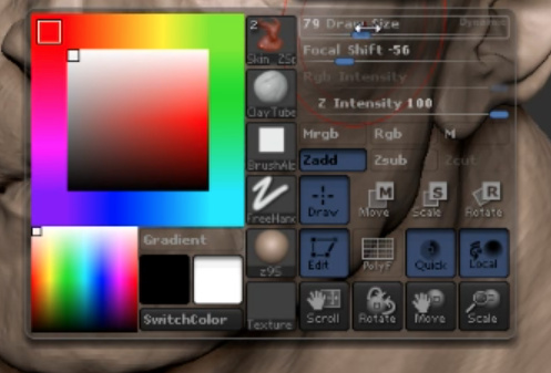
ARGHH! MY EYES!!! 
…can’t… un-see… 
This looks so good and clean. This setup would be wonderful for my small tablet screen. KnavasBuddy or something like it present natively in Krita would be wonderful for my workspace! As an artist with no knowledge of coding, I hope Krita UI is worked upon soon.
Sorry I’ve been a bit quiet on the feedback. To be honest - I’m finding a bit difficult to keep track of everything; There’s so many threads and different designs it’s a bit overwhelming. I see a lot of visually cool stuff going on, but I do have concerns - mainly around use of space and readability.
@Kapyia - I mostly like where your headed as you seem to favour de-cluttering the interface.
I can’t relate to others who like to pack options around a minuscule canvas window. I’m often surprised how other artists are choosing to work as I really value my canvas space!
I’ve said it before - but I consider vertical space very precious. Having said that - I don’t follow the opinion that horizontal space is in excess. For people working in landscape, particularly widescreen ratios, available width is also very important. That’s also the case when you’re zoomed in - so you can work over a larger area, and keep track of the surrounding context of the bit you’re working on.
One thing I’m not sure about is the way you’ve styled the toolbar - I think the opaque single vertical row I currently have is still the most elegant solution for me; though I would be interested in enhanced options and grouping. I don’t hate what you’ve done with it - it does look cool; it’s just I feel having that hovering over my canvas would add visual clutter while making the icons harder to see (depending on what’s behind it).
Anyway - keep up the awesome work everyone. I’m sure the end result will be worth it! 
well I was just speaking of the panels themselves. they act like Blenders N and T bars just are more stable of the sides and on the bottom. Krita kinda has it but they dont really work properly nor some shortcuts that should do it, Zbrush does that just far better to open up the canvas.
Not to mention the scroll down on the panel menu releases so much pressure on the menus and lets them be free. From my experience PyQt from Linux to Windows has scaling differences which makes it all very unreliable, not to mention some users have little monitors and other users have big monitors. any help you can get would be welcomed i am sure. if you want a clean minimalist look you will need to test it different OS to see if it holds up the framing, Krita is big because it works for every possible case.
for the amount of menus well if you use zbrush or any 3d you will get used to so many options most just hide it in categories, what you see there is the bare essencial you just might feel it is alot because you dont know what they do yet. regardless you can edit the zbrush interface just like in krita they just cant become float menus. It is a very respectable artist program, I would say top tier even. Not investigating one of the top artist programs seems folly to me. having only the Photoshop standard seems too few choices to invent upon to make it go further.
I feel like taking a look at Zbrushes UI features like:
- reinitialize zbrush, I think that would help Krita not having to reboot when installing a addon.
- making custom icons and moving them around.
- how to move the menu options from the file bar into the side panels and how they react
- open and close panels
Well I made my custom shortcut layout to try and combat the 2D clunkyness in Krita so I don’t acctually need to press buttons on the UI and suffer like I did in PS and Gimp.
that is why I am a believer of radial menus for keys and they:
- limited to 4 options or a max of 8 options.
- menus should be NOT be overloaded with options or sub options.
- if you cant use it with your eyes closed it is not a good radial menu the objective it to select even before the menu makes a draw render on the UI.
Zbrush space bar menu … yeah, you need to kill that, it is useless.
Ok, got some time to poke around python plugins in Krita, and tried to mimic one of the mockups here, initial results,
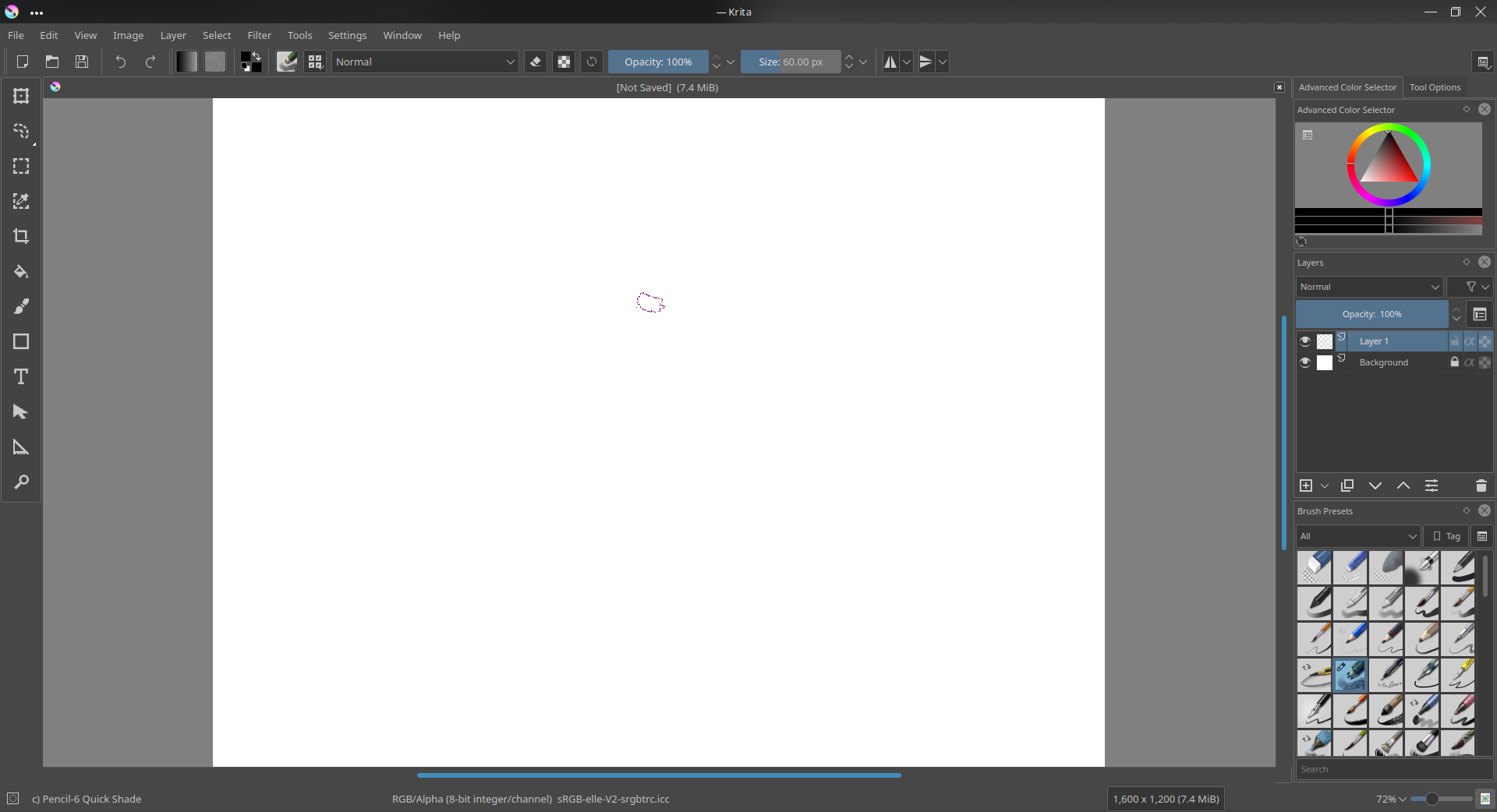
Not much of functionality cause, I am still trying to wrap my head around python, need some time to figure out how pyqt works. Here is the source code if you want to hack.
What doesn’t work:
- no popups
- doesn’t start with the correct tool
- tools don’t change in actual if canvas is not open but it shows they changed
This is fixed toolbox, it can’t be resize, can only be placed in the left side, disable the original toolbox if you are trying it. Also I didn’t push the desktop file to github, you can create one with this,
[Desktop Entry]
Type=Service
ServiceTypes=Krita/PythonPlugin
X-KDE-Library=CoolBox
X-Python-2-Compatible=false
X-Krita-Manual=manual.html
Name=CoolBox
Comment=A blender like tool box for krita
Btw, if you’re downloading the .zip file from Git, the folder will by default show as “CoolBox-master”.
Either you can change the folder name to “CoolBox”, or change the .desktop file’s “X-KDE-Library=” line, from “CoolBox” to “CoolBox-master”.
So this plugin is pretty usable now, though I would need some to iron out the minor glitches here and there before making the first release, 
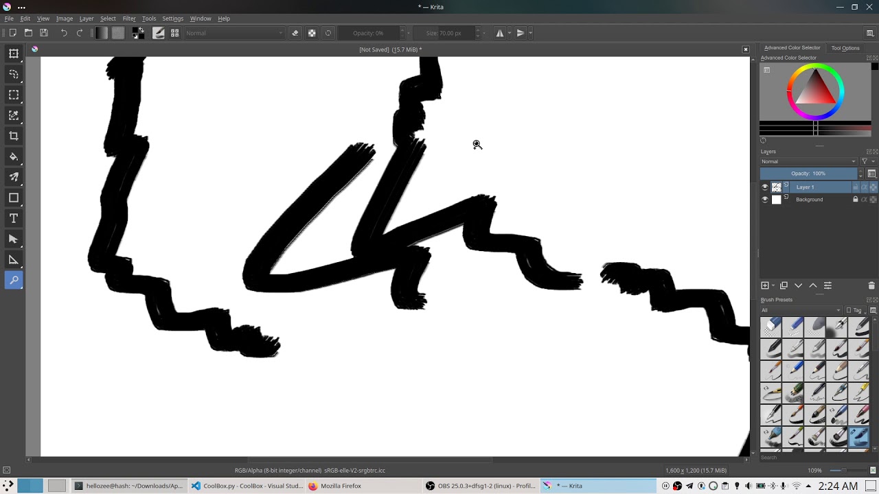
Looks great!
@hellozee - This is looking really good. Can’t wait to try it out once you get something shareable.
Here is the source code if you want to try, 
Hey all, v1.0 of my ToolKit/ redesigned Toolbox Docker is out! Feel free to have a look, and try .
Hi, all!
I have looked through all your comments and tried to formalize all the suggestions in some manageable form. I have split the discussion into 10 separate “problems”. Each of them can be implemented independently. Please check and tell if I forgot something.
Problem 1: Toolbox Grouping
Toolbox has 35 buttons. Some buttons are rarely used.
Proposed solution:
- Group them on the basis of category (or usage frequency)
- Each group has its own shortcut
- Pressing the shortcut cycles through the tools of the group
- The tool icon should have a tooltip with the shortcut suggestion (already implemented).
- If the shortcut is changed in the settings dialog, then the tooltip should change as well (already implemented).
Discussion:
- [+] occupies less space
- [-] the user must do multiple clicks to access the tool
- [-] some tools might become non-discoverable to the newcomers
- [-] @halla and @dkazakov don’t like the idea of tool grouping in general
Problem 2: Layertype-specific tools
Some tools are not applicable to specific layer types
Proposed solutions:
- (either) hide these tools (makes them undiscoverable at all)
- (or) disable these tools
Problem 3: Empty space at the bottom of the toolbox
Toolbox occupies the whole height of the lefthand side of the screen, wasting a lot of space at the bottom
Proposed solution:
- Make the toolbox floating and not occupy the whole height
- When floating, the toolbox should be places relative to Krita’s main window. Right now, moving Krita’s window will keep the floating dockers in their old positions.
Duscussion:
- [-] @deevad doesn’t like to see the canvas through the tools docker
- [-] it needs hacking Qt to move the toolbox with the main window
- [-] floating toolbox cannot have horizontal layout (without extra hacking in Qt)
- [-] it will conflict with “Infinite Canvas” feature (side buttons when scrolling the canvas too much)
Problem 4: Tool Options variable height
Tool Options docker has variable height. It means that the user must reserve maximum height for it, keeping the space wasted for most of the tools.
Problem 5: Unused controls in the toolbar
Controls in the toolbar (like brush editor, brush opacity and size) are useful only for the brush tool. For other tools, like Transform Tool, they just waste screen space. Ideally, the toolbar should be context-aware.
Solution for Problems 4 and 5: Context-aware tool-options in the toolbar
- Each tool has its own set of options, which are placed in the toolbar
- Toolbar will hide options that do not fit the width of the window
- The user can access these extra options in the dropdown button
- [optional] Some options may be automatically grouped into a single dropdown widget. E.g., if there is not enough space, Mirror Horizontally and Mirror Vertically buttons should group into a button with a drop-down menu (or into a grouping button that was proposed for the toolbox).
- Each tool defines context aware shortcuts. That is, they are available only when the tool is active.
- Shortcuts Editor should show their context
- Shortcuts Editor should not report a conflict when two actions have the same shortcut in different contexts.
- The most used buttons (e.g. brush editor and opacity slider) should be placed at the same absolute positions in all context-aware toolbars. It is needed for not breaking painter’s muscle memory.
Problem 6: Context-aware help strings
A lot of Krita features and shortcuts are not easily discoverable by newcomers
Proposed solution:
- Add a context-aware help strings to all the tools, tool modes and tool option’s controls
- This string can be rendered either in the status bar or at the right to the menu bar
- The string is shown when the user hovers the GUI control or presses some shortcut
Problem 7: Titlebar space is wasted
Main window titlebar occupies precious space. It would be nice to merge menu bar into it.
Discussion:
It is not possible to do that with Qt in a cross-platform way. We would have to implement it natively for every platform. Though Firefox and Chromium implement that, so it is possible.
Problem 8: Menubar wastes space
Menu bar has a lot of empty space at the right side.
Solution:
This space may be used either for context-aware help strings or for debugging information
Problem 9: Statusbar wastes space
Status bar’s info is not very useful for the user
Solution:
- It needs a bit of love. The proposed mockup solves the issue partially.
- The debugging/support information should still be placed somewhere:
- image size in pixels
- image size in megabytes
- image color space, color profile and bit depth (at least in abbreviated mode)
- red slider for memory usage percentage
- Ideally, debugging information should also include:
- what renderer is used: QPainter, openGL or ANGLE
- is stabilizer activated?
- is HDR mode enabled?
Problem 10: Single-document tabbar wastes space
Tab bar occupies space even when there is only one document is open
Solution:
- It should just be fixed. Either in Krita or Qt.
Thanks for distilling this discussion! I’ve been watching it a bit, but not sure how to respond or what to add. I’ll give my preferences for each problem:
Problem 1: Personally, I prefer the way it is (not grouped) but I can understand the desire to use less screen space (especially as we are targeting Android now, and some 2-1 Windows tablets benefit too). I think the default should stay as is, but there be an option or a button that switches formats. Maybe consider doing a check for screen size and default to the grouped version for small screens.
Problem 2: I prefer disabling tools but leaving them visible. Maybe add a tooltip for disabled tools explaining why they’re disabled. If they just disappear, it could lead to a lot of confusion when people can’t find their tools and don’t realize it’s because of the layer they have selected.
Problem 3: Floating toolbox seems more like a solution for tablet PC/Android again. For my use, on a multi-monitor system, I prefer how it currently works, where the floating toolbox is a separate window that I can put on a different monitor if I need more real estate for drawing. Like with problem 1, I like options, so if this problem is solved, I would still have it just be an option, not necessarily the default behavior, and definitely don’t make the new way the only way.
Problems 4 - 6: Proposed solutions sound good to me.
Problems 7 - 10: I guess I never saw these as a problem… if I need more screen space I just use Full Screen and/or Canvas only modes. Again, this seems to be mainly a tablet PC/Android issue to me. Maybe change the defaults for small screens? Anyway, I’m open to the proposed solutions, but for me, these issues just never bothered me in the first place.
Thank @dkazakov , for distilling the discussion so that everyone can understand it. It is a great summary of problem and requirements. I would encourage others to follow this format.