I believe that you should not look at who is inspired by what, but look at what is more convenient and productive to work with, which is easier for the eye and increases the speed of interaction. If it is, it doesn’t matter what it resembles. And to cover up the inconvenience ‘it’s own way’, in my opinion, is the wrong way.
What Dmitry and I and others are suggesting is intended to improve, not to invent ‘own path’ for ‘own path’ and being different from others. And we are absolutely convinced that this design can do this, because it optimizes the space and sets a greater integrity. Moreover, this concept was described even before Affinity was presented (where It isn’t, by the way), and when Blender hasn’t implemented it yet. And it is the implementation of this into the Blender that has shown that it really works. That’s why I called Dmitry to start working on this design based on old ideas.
Over the years of developing new features in Krita, there has been a lot of fragmentation and it has long been necessary to combine them into a single concept.
And… how does all of that justify things like removing the memory-usage visualization bar, the layer filter and adding weird things like a ‘empty layer’ button? Like, I want to believe you, but I am honestly wondering whether or not you have actually thought about why the current design is the way it is.
Making people more productive is important. But we need to be careful and not lose things that actually are important affordances for our users now. I’m a bit torn on how we can proceed here.
A couple more notes from your appreciative project leader/maintainer:
Some people are working on plugins, and that is pretty cool, and can be helped to validate all kinds of ideas. Keep going!
Other things are much harder to implement: implementing a new tool option toolbar instead of tool option widgets is rather a big project and needs to be done in Krita’s core. I really like your proposal as an initial draft – because we need to validate that we’re not losing functionality.
I’m not really into crowded client-side titlebars, and like I said before, I don’t want a dynamic toolbox (but that can be implemented as a separate plugin, so no big problems there). But, well, we can have discussions about that.
The problem with showing more contextual information in the statusbar is that someone will have to write that information; all the frameworks for showing that is ready, but we’re missing parts of the content. But that would be a good thing for someone to work on.
But in the end, a visual mock-up isn’t an implementation, and while I do agree it’s time for a refresh, coincidental with the Krita 5.0 release we’re planning for the end of this year, I am not sure who is going to do the work…
And not just coding–wise – though we’re also rewriting the resource management system – but before we can start implementing anything we need a throrough UX design, not a set of visuals, then we need to figure out what is possible within Qt, and only then we can start actually implementing things.
So we need proposals that go beyond visual mockups, in the form of phabricator tasks or, maybe gitlab issues (depending on where KDE is going.) Those need lots of discussions and iterations before we know what is desirable, feasible and doable.
This is going to be a lot of work for everyone involved!
Just to get an idea, this is the previous layer docker main task and the mockup thread. In particular what is missing from this thread is that there’s no requirements list being made of all the features that need to be in there (first link) before the mockups commence (second link). Because it’s otherwise a really good recipe to just basically lose features in UX design…
I agree with both of these strongly. However I’m of the view that the lesser of 2 evils is to have Tool Options in the Toolbar, instead of in the Docker. I don’t have any solid, decisive reasoning, but I just feel like the Toolbar is a less problematic form-factor for the function that Tool Options serve.
I suppose my main gripe with the Tool Options Docker is that it’s a pretty open-ended piece of screen real-estate: it can be any sized rectangle, of any proportion, and the widgets it contains can be arranged in any way. This flexibility I feel works against the user’s productivity because it means the Docker doesn’t have just one optimal size, proportion, and layout. Instead it has many, and the specific combination depends on the specific Tool Options UI being displayed.
Not to mention that each Tool Options UI seems to have its own rhyme and reason for how to display their knobs. The Assistant Tool and the Selection Tools draw horizontal breaks differently, and the anchoring/gravity direction buttons of the Select Shape Tool and the Transform Tool have very different footprints on the user’s screen.
The effect that this level of variety has on the user’s productivity has to be non-zero. Personally, I feel it is negative, but I’m willing to be convinced otherwise.
So in search of an upgrade, I explored the possibility of the Toolbar form-factor for the Tool Options: it’s a stricter and more easily predictable chunk of screen real-estate, since it is just a line of widgets with uniform height.
Of course I quickly ran into problems because it’s pretty clear that some Tool Options UIs can’t fit on a Toolbar without suffering major UI/UX penalties. Some Tool Options have widgets that are simply way too tall, and have to be relegated to a drop down menu.
–
TL;DR I suppose the most likely path forward for Krita’s evolution is to improve the state of the Tool Options Docker: to unify it and make the UI/UX of the various Tool Options UIs more consistent with each other. I, like boud, rather really don’t like buttons that change.
or even this: https://preview.redd.it/tvxd0gs58no31.png?width=2560&format=png&auto=webp&s=064cf10e3238cc923eb035619c85ad8bc402eca5
(source: Reddit - Dive into anything , apparently the display was ~4k… ok, this screenshot is as a joke, since every reasonable person will change the UI scaling to something more sane, but the previous one is more like a lot of users do use Krita with).
A lot of standard laptops right now are shipped with fullHD, and for some reason Windows uses 150% scaling by default, so Krita has ~700 pixels vertically. Believe me or not, one of the biggest problem I had in last year was how to tell people to go to Configure Krita → General → Windows, disable HighDPI and press alt+O, because they couldn’t reach OK button (it is outside of the screen because the configuration dialog is simply too big now). Later @halla decided to just always apply settings unless the user press Cancel, so at least the second part wasn’t that difficult anymore
(I do user support, btw.)
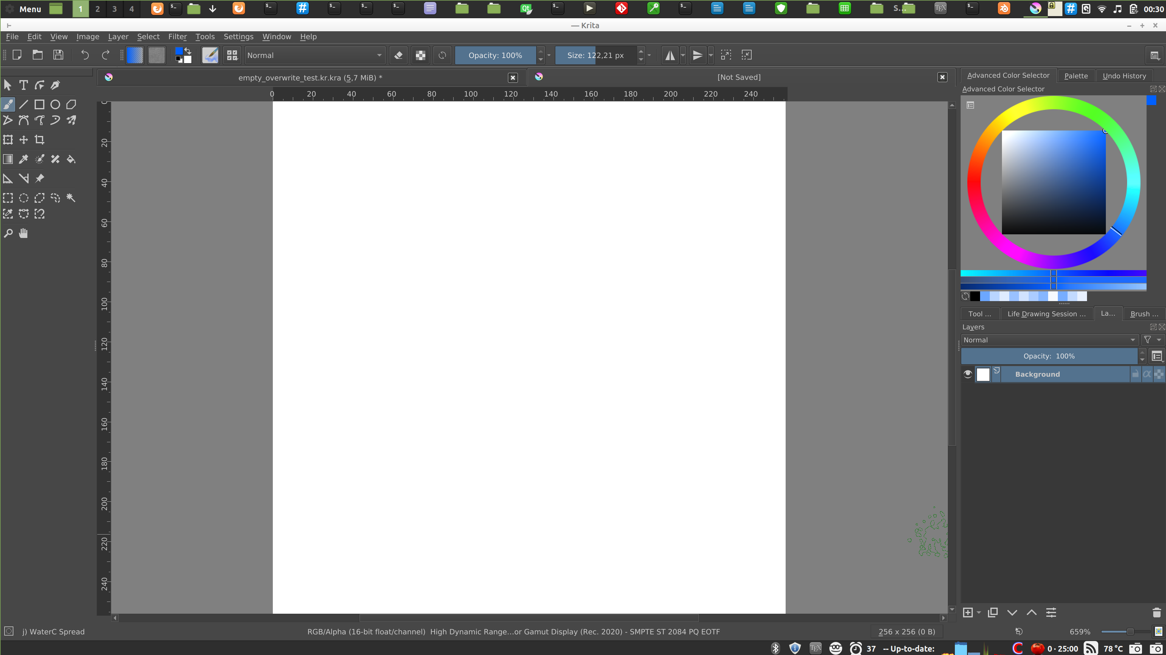
This is a screenshot of my display with latest Krita on Linux, display is 4K but it’s only 14", so I use around 2x scaling, I think. It is around the same size as fullHD without scaling would be.
we cannot add anything to the titlebar, we can only hide it, which will be the same as going with Krita into full screen mode.
you painted with red the whole status bar even though it has the color space, bit depth and color profile written there. It’s kind of very important for user support in cases of color management issues, so I wouldn’t want to get rid of it or replace with something else.
one tab in a tabbed mode - yes, but I’m not sure what could we add there. Or you suggest hiding it? I wonder if that would be possible, also how to close the image without closing whole Krita? For multiple tabs there must be a name of the image there, otherwise how users would identify which tab contain which image.
the bar with File etc. menu entries - I’m not sure what can be done about it. But note that you can have Canvas-only mode with all dockers etc. just without the menu bar, if you choose so in Configure Krita → Canvas-only settings. That doesn’t solve everything… but I’m not sure if we can do much there. (Someone did suggest we could have workspaces there like Blender do, though).
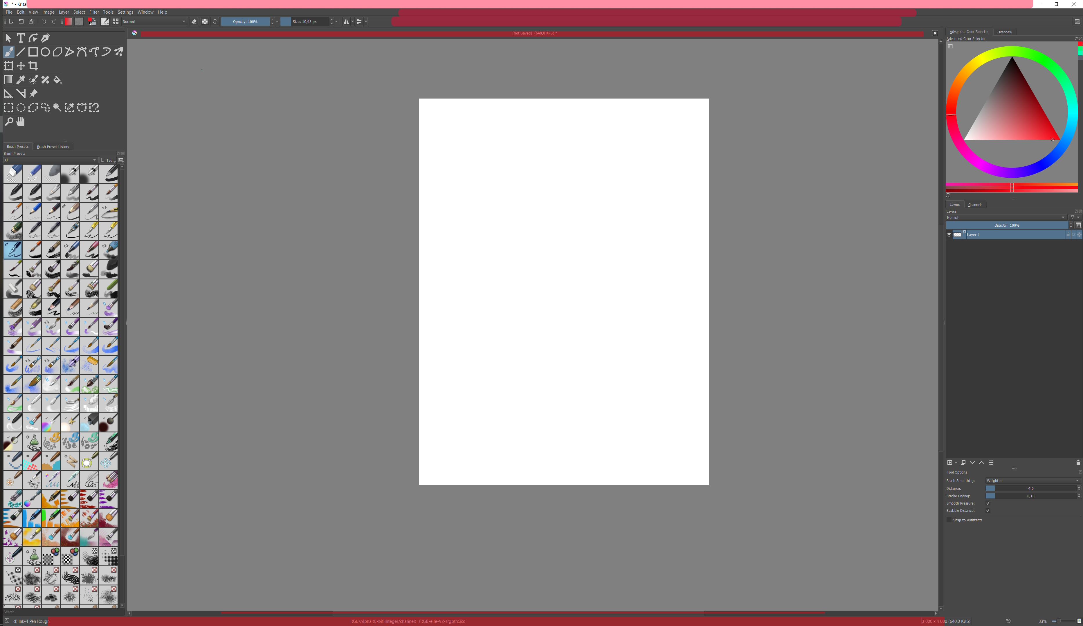
the toolbar with Size and Opacity - yes. This is something I would like to have some care given. Note that you can configure what appears on the toolbar if you go to Settings → Configure Toolbars. However a lot of actions don’t have nice images, and for example the Color Picker and Freehand Brush Tool, even though they do have icons in the toolbox, look like this:
(I tried to make myself a nice tablet-friendly UI). It would be good if someone just added icons for at least all the actions that do have icons somewhere.
And overall concept is still in the works, how you see. And yes, main design of the layers docker in Krita is fairly good! We show the progress on redesigning the toolbar and tool options docker, because this is a very big drawback right now.
About ‘clear the layer’-button. And at the same time about choosing the type of layer.
I have been answering questions from newcomers to the Russian community of Krita for several years, and it is a very common problem that people do not understand how to clear the layer, and don’t even know about the different types of layers. :: )
So we added a couple of basic buttons. But this is not the subject of discussion in this topic… :; )
We try our humble best!
P.S. I think that if a user sees a notification that ‘you are use something at the wrong place’, then we have already made a mistake somewhere in UX.
It’s true. Therefore, we try to minimize the number of basic buttons that need to be targeted with the cursor. And we collect everything in a system of simple unified keyboard shortcuts. Hence the idea to assemble such tools into a single tool with switchable modes. As a result, we have 15 shortcuts for 15 tools and several double-shortcuts for managing their options, this is the left side of the keyboard. Hotkeys are really working with muscle memory. The cursor is not very good at this…
First of all, apologies for not having too much of an input this past week on this topic, or KA in general. I’ve been trying to replicate the Toolbox as a workable Python docker, and given I haven’t worked in Python (or even Qt) before 2 weeks ago, it’s been a difficult process .
I’ve neglected to show screenshots or working models of this Toolbox because, they simply don’t exist at the moment. The Krita developers have been extremely helpful on IRC explaining things to me, so I’d like to thank them for that.
Looking at this topic; I would justify the metamorphosis of discussion from Toolbox-based to more Tool Options-and-Toolbox, because there isn’t much point moving these threads to a new topic atm, and the salient points of conversation also apply to the Toolbox Docker individually.
I would agree with the new Toolbox existing as a plugin; there isn’t much value added to this plugin that would equal the effort of recoding Krita’s existing Toolbox.
The Tool Options Docker is a different beast to tackle. I personally wouldn’t be able to work on that until this Python plugin is finished, and it would require more knowledge of Krita than I currently have. I understand it as an important part of Krita that merits a rework, and would encourage any willing coder reading this to give it some consideration.
I can’t remember any more points I wanted to say, this separate discussion about UI scaling might be better suited to the Krita UI Redesign Topic, but that’s locked atm . Even the Overall Docker Redesign Topic might be a better place, however I appreciate that conversations started in one topic might include other topics in them.
Going forward, I’ll keep working on this Toolbox plugin, currently there isn’t much to show, but I’ll be sure to update here if something works (fingers crossed).
@slightlyangrydodo I have been working on modifying the toolbox via Python, but have currently ran into a strange issue with signals and slots when you connect them before the main window has finished loading. Or at least so it seems. Might have to turn in a bug report on this one.
With a community full of artists - whom all have a keen eye for visuals - I think we could have a UI design idea for every user on here but with a lot of ideas up in the air it’s very difficult to decide on a single one. Every design has its pros and cons but is rarely compatible with each other. So which one do you choose? Do you choose the simplest looking one? The most conventional looking? The most flexible/customizable? The prettiest looking (according to whom)?
User-experience design is a much deeper rabbit hole than it might seem at first. Some prefer less, some prefer more. If you ask me, I think the more UI design threads we have and the longer they grow with more ideas and arguments for/against each design, the less likely we’ll see any of them implemented.
I think it might just be the best for now I can respect the developers not wanting to spend time and effort on fixing what isn’t broken.
So I’ve got something reminiscent of Blender’s toolbox and “properties” going
I’ve also implemented shortkeys to quickly be able to hide/show them (in my case T and N just like Blender). The toolbox works great, but the tool options are a bit shakier. It works fine on my end, but the tool options are bound to break on other people’s machine because of how ugly I’ve had to make the code underneath. Partially because I’m not that great a coder, and partially because the widget’s flexibility makes it a bit unruly.
This is crazy good. Even @halla talked about how the tool options isn’t what it could be, since it is really useful, but is available only in a docker. Having that extra click and less screen space in the dockers area is a bit of problem, but this is beautiful, excellent idea!
Little bit of both! Qt has a built in way of getting the “recommended size” of UI elements which is pretty easy to make use of. When it came down to resizing the container holding the options and the hide/show button, moving it to the correct position, and making it shrink it to respect the boundaries of the canvas, things got a bit more complicated
Here’s a snippet of my work in progress Toolbox plugin in action: https://www.youtube.com/watch?v=3FlHJRO-lG0
I’ve already heard about the alignment of the popup menu, which I’ll change to fit the toolbutton soon.
I also need to implement a ‘horizontal mode’ and resizing/layout of the buttons, and swapping with active etc.
Out of curiosity, are you planning to make it customizable at one point? It would be fantastic to be able to decide what you want to group and not. I would love to have something I could tweak exactly how I want it! I would for instance like to have a lot of them ungrouped, but some that I use less frequently (like the shape tools, vector tools and the the shape selections) I would absolutely love to group!
Regarding the plugin, so far we’re implementing things with modularity in mind. It’s a design challenge, but we want to have the majority of the options exposed to the user, so it’s still gonna take a few more weeks until we have things ready for testing.


 .
. . Even the
  Also, I haven’t been very active due to work lately, sorry gang!