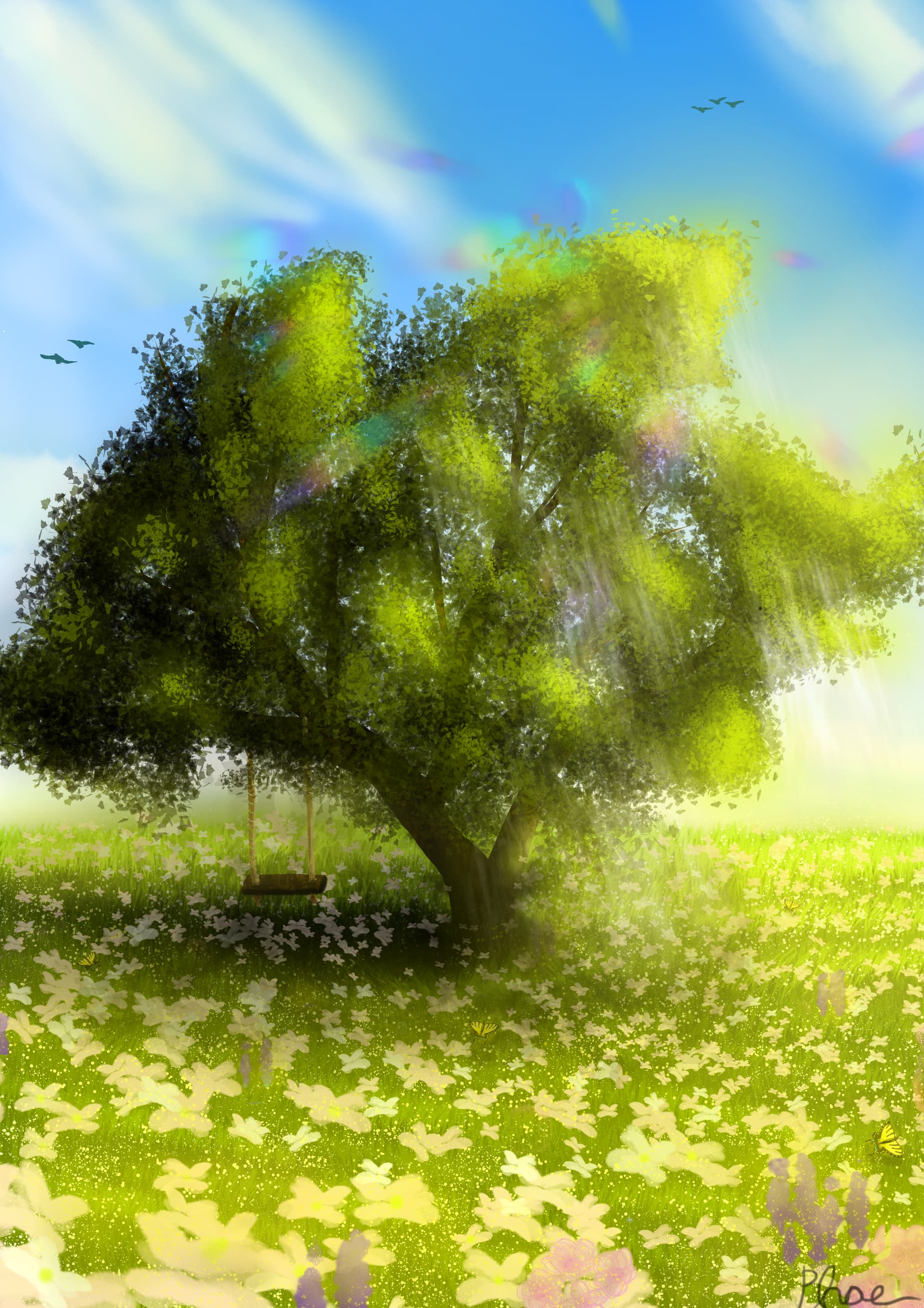
Thanks to all the tips! This is the latest version above. You can see my previous versions below.

I really like this one it definitely my best yet.
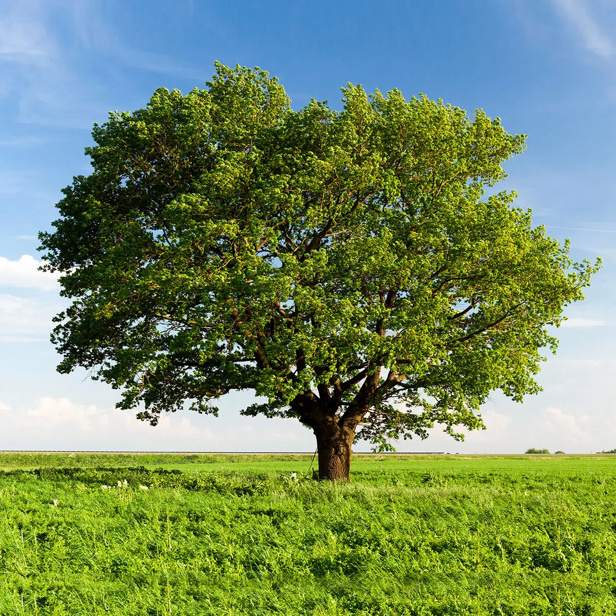
Below is the reference image I used so you can see how i built of of that.
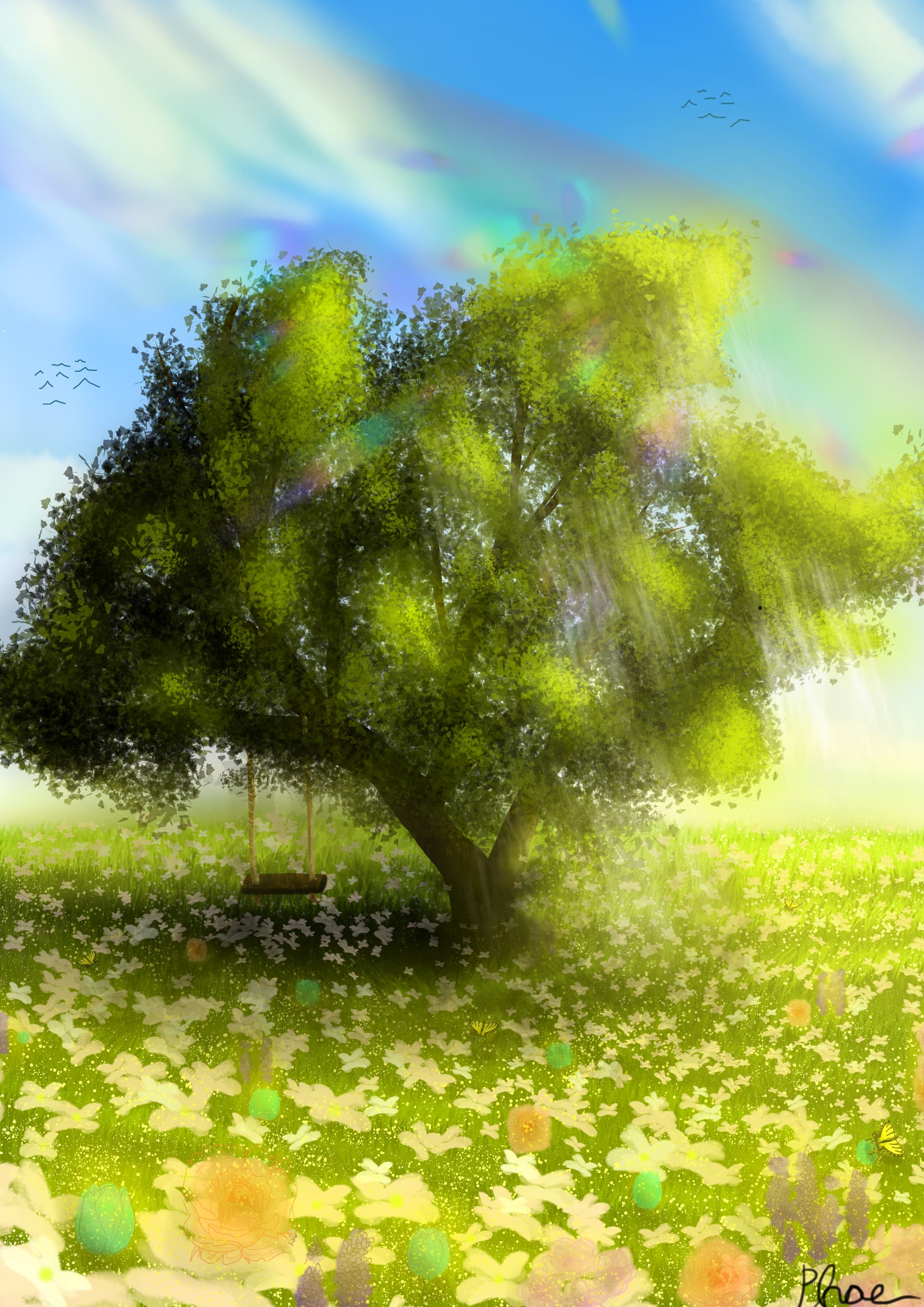
oh and here the first draft i did last night before doing the final one this morning
13 Likes
Hi Phae,
I like this a lot  , and I’m sure it was a lot of work going into this painting.
Both the tree and the flower meadow look great, the shadow is fitting, and you did much more than copy the reference.
Since you asked for critique though, here a few minor suggestions from my side:
The rainbow and the colourful “lens flare” together may be a bit overkill. In this case I would probably keep the lens flare, and get rid of the rainbow. Because the clouds and sky rather look like a sunny day without rain. With rain, there may be bright sky in between, but the clouds and/or sky often look different. More round shapes, darker grey etc.
As for the flowers, I can get why you wanted to include the beautiful orange rose shape with lineart. But both the lineart and the perspective (the flower should be seen more from the side, at least the ones in the back) do not quite fit the rest of the picture. Also roses do grow more on bushes than on their own inside a meadow.
Same goes for the green tulips. While the perspective is okay there, green is an unusual colour for flower petals, so it looks a bit off.
But this is just smaller details. Overall I think this is one of your best paintings here! 
Edit: Oh, and I see the “birds” are kind of “lazy style” and upside down. My art teacher would have rolled his eyes if he saw those. 
1 Like
Thank you so much for your comment! Those tips are really helpful
Below if what the piece look like last night and i came back in the morning to touch up a few things, so i felt it was to lifeless and empty and hence why i added the flowers however as you pointed out i really couldn’t get them to fit in properly and just added different flowers randomly like the tulips are actually blue but i put a yellow over them for lighting and it cased them to have that green color so i will probably make them a darker blue or something and ill erase the roses, now that you pointed that out i cant stop seeing that they really don’t fit lol 
oh and i’ll work on those birds 
again thank you so much for the your critique, its really helpful to have another pair eyes look at it
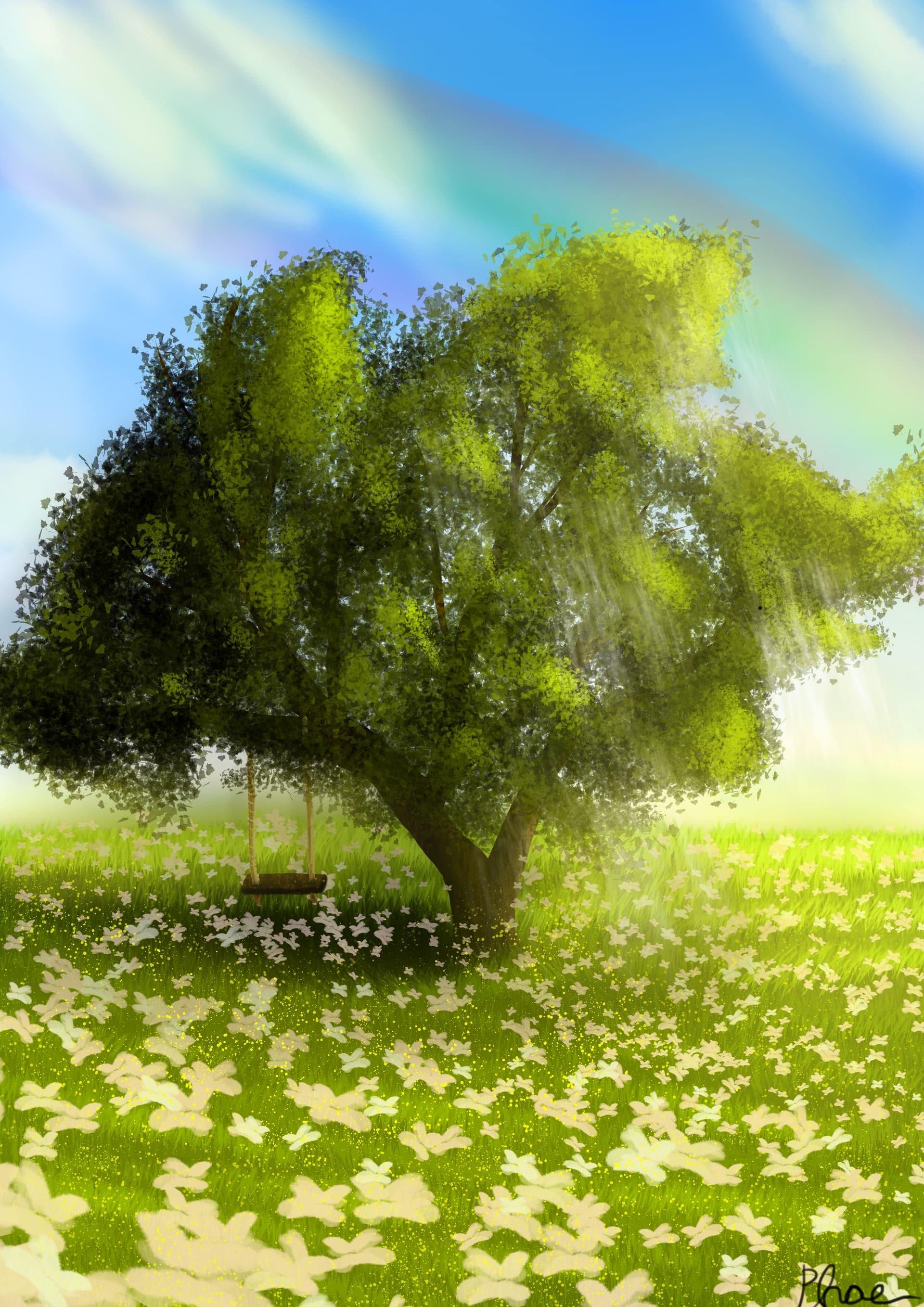
You have a good eye. This older version indeed has good (colour) harmony, but without different flowers the meadow maybe looks a bit boring.
So I like the idea of adding some different coloured flowers still. (The only painting I have here actually has a meadow of crazy coloured flowers too, lol.) Just try not to make them green, and try to make them fit the hand-painted style your other flowers have.
Now for the problem of blue flower mixing with yellow light to then turn green: the solution could be to actually only let the light hit the top/right side of the flowers (this is where the light source seems to be in your work). The part not directly hit by the light would still be blue then. Of course, this is more work. But you can probably get away by only doing this for (all) flowers in the foreground. 
Oh and also, the “green” flowers were too transparent I think. Green grass shining through. If you use a pressure-sensitive brush and do not press super hard, this can happen. Depends on the brush settings.
1 Like
Thank you! I try those tips out!