Probably made (almost) all the rookie mistakes of a non-pro. ![]()
Still experimenting with different brushes to obtain the effects I am looking for.
Any advice on how I could improve this?
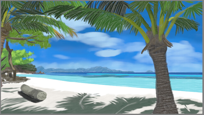
For reference, I was looking for a ‘loose’ painting effect, like the one this guy describes in his tutorials, but ended up getting impatient with the palm trees and going for a more ‘detailed’ look for them.
I was also aiming for the ‘atmospheric perspective’ effect by shifting colours toward blue as objects were farther away, but the colour picker disagreed ![]()
Maybe the fact that I had a very bright, colourful photo as reference did not help me tone it down. But I can probably learn…
Any suggestions are welcome!