Thanks. So, just keep doing what I am doing? Despite it not being similar to the same technique?
Maybe try this brush-set, it is for such kind of art.
DEK (Devin Elle Kurtz) - Foliage & Grass Brushset for Krita by lobabrancrats
Michelist
2 Likes
I’ll give it a whirl. Thanks.
Still trying to get the sun rays done right. I still am having trouble getting it to look like Julier’s example. And yes, I tried addition and even dodge. But I don’t know how to get that ‘glow’ effect where it actually looks like realistic sun rays. Here’s what I’ve gotten so far (after redoing the foliage part with one of those grass brushes):
I’m at a loss on how to bring out the detail with the sun rays like he does without making them look like mere lines on the image. But I find blurring them also destroys detail in return.
2 Likes
I’m too lazy to watch the tutorial but I might know a thing or two about light.
-
The best light is the one that subtly shifts hue and value. For color dodge he’s got a strong red hue on the edges, using more white/gray in the core of the rays. You could perhaps even walk a bit towards blue in the red for the very ends of the rays.
-
He’s got two kinds of light effects there, the god rays radiating from the sun and a halo. That halo, reddish on the edge and more yellow or white in the center, is important to soften the transition of the rays to the rest of the image.
-
Lighting works better when you work on the atmosphere of the whole piece. It’ll tie the light together, otherwise the isolated light effect will stand out. So maybe a lighten layer for the atmospheric fog far in the back, a color dodge or overlay or even divide (you can mix and match) for the general light in the air, multiply in the foreground and edges of artwork for a shadow version of bloom, all used with very soft airbrushing or round gradients hardly over 5% in opacity.
2 Likes
Hi! Yes, I think you just need to patiently build up the effects with small increments. And introduce variation in the color.
On my monitor at least ![]() image from the tutorial is much more purple and red. I challenged myself and added some red strokes onto your previous image. The two first layers are the rays, the third layer is just the flare over the sun. It requires very light opacity and gradual buildup.
image from the tutorial is much more purple and red. I challenged myself and added some red strokes onto your previous image. The two first layers are the rays, the third layer is just the flare over the sun. It requires very light opacity and gradual buildup.
I think procreate brush works a bit different than the default Krita airbrush. You could try adding pressure-controlled size, and experiment with brush size. Opacity around 10% should be about right.
(a slight retouch of your image!)

I also did a quick hue and levels adjustment - moved it a smidge towards purple, and compressed low levels to make the image appear darker (removed the flat part on the left side). You have to be careful though not to cut too much!

I hope it helps, and please let me know if you’d rather I didn’t touch your image – I will remove it then ![]()
2 Likes
No. I am fine with you retouching my image; this is just me practicing. So, your retouch gives me ideas on how to get that red color effect with that hue adjustment.
Now, if only I could get my sun rays to look like they haven’t been blurred to Hell, then that would be great. It seems like his sun rays have a sharpness to them despite he blurs them.
1 Like
Really, I am just experimenting; as I am wanting to get better at making scenery backgrounds. How to do proper lighting and melding it together is what I struggle with it seems. But you brought up some useful tips when it comes to lighting techniques. I’ll try using your suggestions. Thanks.
No need to explain yourself. How else are you to learn if not trying challenging things and struggling a bit? Experimenting is great, sometimes people just try to stick to recipes without trying to find what works for them. You’re doing the opposite, giving yourself room to try things, and that pays off.
I went straight to the point in the previous post and forgot to say you’re doing fine btw. The clumps of flowers in special came together nicely. Imho the rays are the hardest part of that image. ![]()
Thanks for the compliment. And yeah, I am discovering that the rays is what’s hardest in this piece. Gonna have to play around with it.
For the foliage, I just used a plant brush and then used the smudge tool with an upward brushing motion. Because, well, I’m not a Procreate user; where it seems to be easy for the guy making his example piece. Like someone else said, I think there is some kind of cheating in Procreate. ![]()
1 Like
Yep, it’s looking closer and closer to the reference!
For the rays, I think the main thing is that they need to be narrower. You would need to paint them the second time and make them more focused.
What I had difficulty with is that in Procreate that brush seems both small and with a soft edge. Whereas in Krita, if you shrink the airbrush, then it’s edge becomes harder and harder. Maybe the tip needs to be adjusted, or maybe it’s just the matter of doing more passed to build up the shape. But it looked easier to do in the tutorial.
Yeah. Because people who use Procreate are cheaters it seems. ![]()
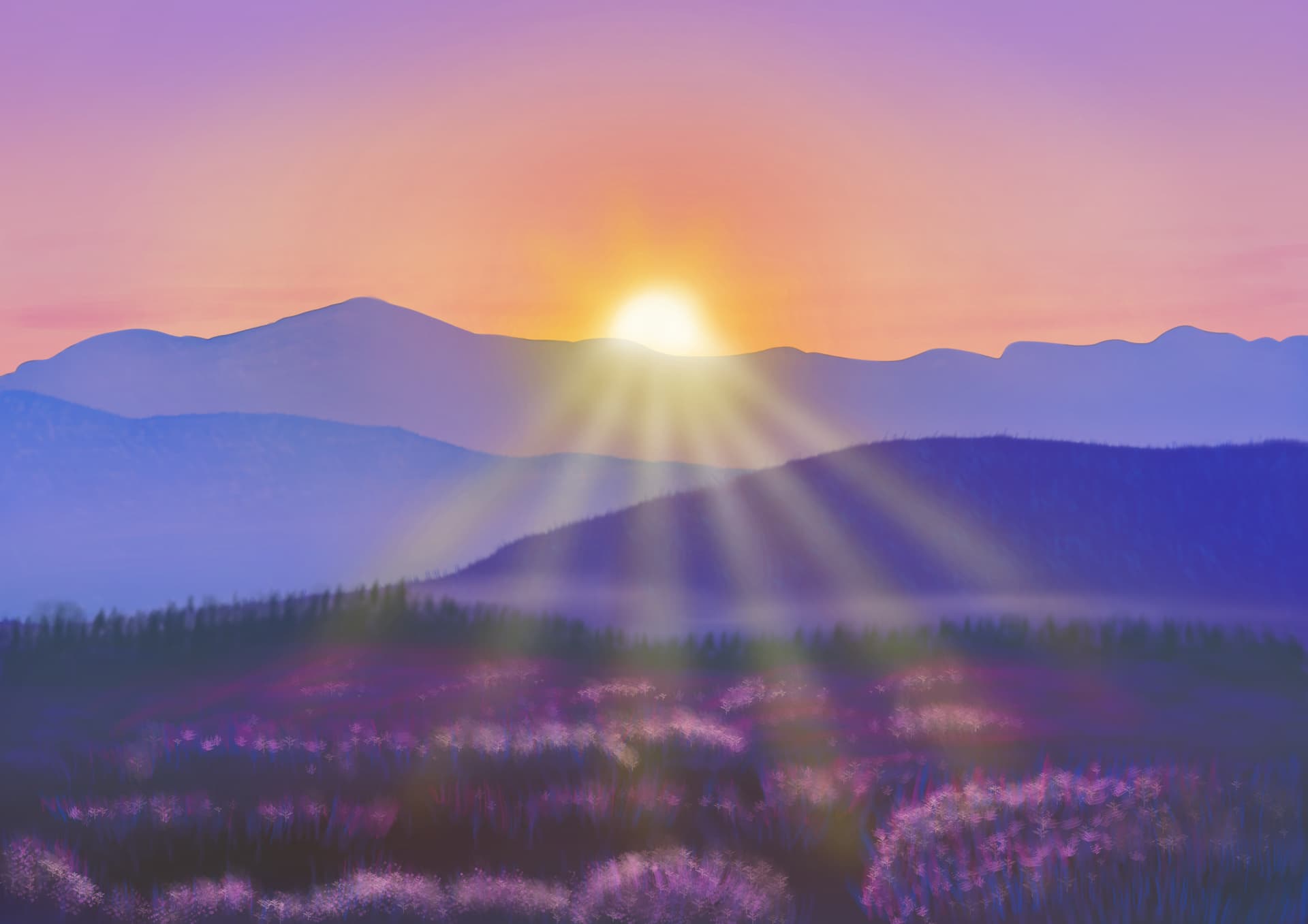
Well, I gave it a more red look and brightened things up a bit. When I work on this more, I’ll try adjusting the hue. I’m done for tonight.
Alright. I think I am done with this (for now). If I keep on going with the same piece, I am going to go insane. This is my final product:

I think I’ll try doing another example piece of his. Maybe that woodland stream example he just came out with a few days ago.
6 Likes
Really love this!
Thank you!
1 Like
Welcome!