I’ve been wanting to experiment with comics, does anyone know the best document size to use to downsize and for printability (I would want to make my life easier if that happens in the future)?
I would want the proportions to be the same as 800x1280, but larger. should I double it in size, or more?
I also use 800 resolution, should I go higher? Is that overkill?
Do you want to make traditional comics (i.e. for print) or webcomics? These are different things: if your goal is to make comics for printing, the ideal is to measure the format you want for your magazine. For example, there is the american format and the manga format.
In this case, it is advisable to create your drawings at double the final size and with at least 300 dpi resolution.
If your goal is to make webcomics, your magazine will be viewed on screens, not in print. This is because the ideal formats for the internet are small and with lighter resolution.
There are those who use the size of 800 x 1280 pixels for a webcomic page. Here also you can make your art in double the size (i.e. 1600 x 2480). If you want, use 300 dpi resolution… because, in any case, when you export your art, you must do it in png format and reducing the art by 50%. It will have lower resolution, but with a greater chance of output with quality…
Thank you!
I was thinking of doing webcomics, but progressing to books if the comic was successful enough. I am new to digital art (having predominantly used traditional mediums until recently) and was worried that shrinking down a big document would hurt the quality too much, but I’m glad to know that it should be ok!
can be compressed lossless, e.g. without quality loss through compression
can have transparency, the so-called “Alpha” or “α”, the latter symbol is found at the end of every layer in the layer-stack of Krita for instance
As long as your work isn’t ready, your picture isn’t finished, stay in Krita’s own format’s “KRA” or (if you want to save space and don’t need the preview picture a KRA-File holds) “KRZ” (Z for ZIPPED)!
Don’t save the files you are working on as PNG or even (the evil) JPG as long as they are not ready (JPG is okay for saving works to be published online (and even when I consider a picture ready, I won’t purge my KRA-Files, you never know if you will need them anymore)).
If you would save in PNG or JPG then YOU WILL LOSE PICTURE-INFORMATION in form of all the layers used and all the applied effects (layer-styles, masks, filters, …) are gone, and with them, you may lose tons of work!
You should always only EXPORT your pictures, instead of using “Save (CTRL+S)” or “Save as (CTRL+Shift+S)” to save it in a different format than Krita’s native formats “KRA” and “KRZ”. The “Export”-Command is found a little below “Save” and “Save as”.
This way you preserve the very important layer-structure of your works, you also preserve the original name of the document you are working with.
Maybe you make a small test canvas, add two or three layers, scribble one or two strokes on any layer, and save this document via the different options to disk. But at first do one save of it as “scribble-layer-save-and-export-test.KRA” (or whatever name you prefer) to create an original to that you can fall back!
Begin with the “Export”-Options before turning to “Save as” and “Save”, and save it as KRA before saving it as PNG or even JPG.
Always watch what happens (or not) to the document’s name in Krita, and what happened to your picture’s layer-structure after you open the just saved test picture. I hope you get a feeling what you do to your pictures in the future, if you’re testing the behavior of these options now.
If you want to notify someone that you are ‘saying’ something to them, you get their attention by putting an ‘@’ in front of their username, as I’ve just done with you in this reply. This is called ‘pinging’ someone and they will get a notification that this has been done.
Thank you so much! I was wondering what the difference was since they seemed like the same thing lol, thanks for clearing that up!
Also, I usually save my art as a Krita file, then make a second one that I turned into a Jpg if I so chose, but I did notice a dip in quality when posting on a writer’s forum I’m on. Does that also work?
@Michelist@Guerreiro64
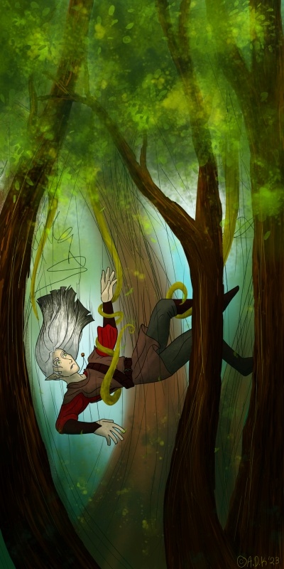
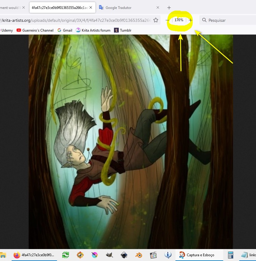
Here’s an example of what happened from a recent painting (I have several copies as well as the original Krita file!). It was originally much clearer, being 2000x4000, but it turned grainy when I reduced it to post (especialy if you zoom in on the elf’s (Grey’s) face) (it’s now 400x800), but when I tried as a PNG previously, it was too much information for the site to handle. Is there a way to make a PNG that looks like a photo that can be cropped? what’s the size limit for posting photos/art on here? How far can a rasterized image be compressed and/or enlarged?
This belongs to one of the most misinterpreted / misunderstood topics discussed, at least felt, a thousand times a year, here in our forum. And I believe similar discussions can be found for other programs too, may it be Paint.NET or Photoshop, doesn’t matter. It has to do with color management and calibrated displays, if you want to read more about that topic, then feel free to use our forum search to find topics about “dull color after posting my picture to platform XYZ” and anything color and publishing related. If you want I can search such for you, but probably not before tomorrow, it is 1 AM where I’m living, and I have to sleep a little bit.
Ha ha, edit before posting:
You were quicker with your additional question, then me trying to answer it not, with my answer to it beforehand.
From 2k by 4k down to 400 by 800 pixel, so 5 times smaller, is a quite big step, 1.688 by 3k would have been okay for the forum, I guess, maybe even 2k by 4k would have been accepted, the size-limit here is around 12 MegaPixel if I remember that right and if an uploaded picture is to big the forum states that in the error-description, so you can adjust it.
For those compression-artifacts you see, can you tell us which filter you used to reduce the size? My preferred filter is Lnczos3, if that result is not satisfying I begin to try the other filters.
And did you use ‘‘Image’’ >> ‘‘Scale Image To New Size’’, or via which way did you reduce the size of your picture?
I’ve posted my full size screenshots (1280 x 1024) as .png files here and they show as smaller thumbnails that can be clicked to expand out (not to full size) and they can be downloaded as .png image files.
There is a limit for uploaded files of 3 MB file size and there is also a pixel size limite that I’ve forgot the size of. You’ll get an error message if you try to go over the limit.
Whatever the limit is, it’s large compared to the average screen size.
If you do upload a .png file above a certain size, it will be converted to .jpg to reduce storage requirements. This is not a problem for ‘painted artwork’ but can be a problem for ‘technical artwork’ if details are important.
As far as you like but quality will be affected.
You can send a message to yourself and post images in it, then read it to see how they will look when presented.
It also kinda depends on the style of drawing. Some are more prone to visible quality los than others. When sizing down some pixel information have to be thrown away and are lost forever and when sizing up they have to be pulled out of thin air (which has it’s own problems). My rule of thumb is to halve as long as I don’t go under a certain threshold and I try to never reduce the size by more than 50% in total, but it’s more a matter of experience than a hard rule.
Normally I already think beforehand of the minimum size that the final output medium has (like 500x500px for a user icon) than I double it and when it’s still too small I double it again to have more wiggle room for smudge brushes, wich I mostly use, to work their magic. So I know I can resize it back to 500 later without having to lose too much quality.
And even when a website allows you to upload artworks in ultra HD losles quality, if it only shows on a tiny 1080p screen, there’s nothing you can do about it (the technical limitiations of the device or the website, I mean).
Although I prefer PNG I sometimes see no other solution than using JPG as the export format because the loss in quality due to compression is neglectable compared to the loss of information due to resizing. Sometimes there are just no easy solutions.
One of these days I’m going to create a topic about it (if they don’t create one before!). Due to lack of time, I will say the essentials:
Establish how, where, and at what size you want your readers to see your art. Without knowing this, nothing is done. Do you want them to see it in a print magazine? So follow what I said before. Want them to see it on a smartphone? So use a different size.
The problem is that many users create a page the size of a printed newspaper…. to post on the internet, and many people use a smartphone to browse. Obviously it will be difficult to view the art in these conditions.
Once the size is established, worry about your art. I’m not talking about style, talent, or drawing quality, but rather the message of your art: what do you intend to communicate to the reader?
In this art I am seeing an elf being captured by the branches of a tree, a tree that is not like the others. That’s what I’m interpreting, when I see your art. Is this the message you wanted to convey to the reader? Or did you want to communicate something else?
I say this because your painting seems to have a lot of wasted space. Below the elf there is nothing but logs and vegetation and above him, only leaves. Your board would work better if you cut out some non-essential parts. Just to get a better idea of what I’m saying, I zoomed in to 170% and took a screenshot:
I’ve been thinking of sizing it so it will be readable online, but easily printed onto comics of about the average book size if I felt inclined to print (about 10" by 6" or so, I don’t know the average size for graphic novels beyond how small Manga books seem to be) (I am mostly stuck with being fed comics by pipette on webtoon or fed by droplets from the ceiling on Tapas). What would your recommendations be?
My main goal with this art piece was to illustrate how part of the magic system in my current work in progress might look (basically elves can control plants, and humans can control animals, both powered by magic that exists in their world’s water). So, sort of an illustration for myself that got out of hand with the detail lol. I haven’t drawn the magic system beyond a few sketches, but I’ve been wondering how to portray the magic in a way that’s legible without ripping off Avatar: the Last Airbender Maybe I should make it so the plants and the elf controlling them glow in some way?
I was trying to convey that the elf (an OC from this world named Grey at the moment) is using the vines to catch himself as he falls. Any ideas on how I could communicate that clearer? I appreciate your advice about messaging and giving me your opinion!
I’ve been thinking of sizing it so it will be readable online, but easily printed onto comics of about the average book size if I felt inclined to print (about 10" by 6" or so, I don’t know the average size for graphic novels beyond how small Manga books seem to be) (I am mostly stuck with being fed comics by pipette on webtoon or fed by droplets from the ceiling on Tapas). What would your recommendations be?<
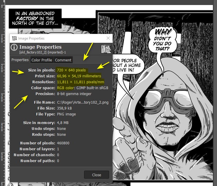
See the following: size, resolution, weight and color system of internet files are very different from print files. Here is an example of my illustration for a webcomic. It has a size of 720 x 640 pixels, acceptable for the internet. I opened it in Gimp and see what its size is, true, in millimeters:
This would make a tiny comic (6 x 5.5 centimeters).… and if you increase the page size, you’ll start to have screen viewing problems.
My main goal with this art piece was to illustrate how part of the magic system in my current work in progress might look (basically elves can control plants, and humans can control animals, both powered by magic that exists in their world’s water). So, sort of an illustration for myself that got out of hand with the detail lol. I haven’t drawn the magic system beyond a few sketches, but I’ve been wondering how to portray the magic in a way that’s legible without ripping off Avatar: the Last Airbender Maybe I should make it so the plants and the elf controlling them glow in some way?<
Hmmm… I couldn’t help much here. But a positive point is that you are worrying about creating something new.
I was trying to convey that the elf (an OC from this world named Grey at the moment) is using the vines to catch himself as he falls. Any ideas on how I could communicate that clearer? I appreciate your advice about messaging and giving me your opinion!<
Try to imagine how a person in a command position acts. Her position and attitude is different, in the example of your illustration you send the message that the vines are dominating the elf and not the other way around.
A starting point might be to watch animal training videos. It occurred to me that perhaps an old circus video, where there are elephants, is the closest thing to this case. There was a number where a person was lifted by an elephant’s trunk.