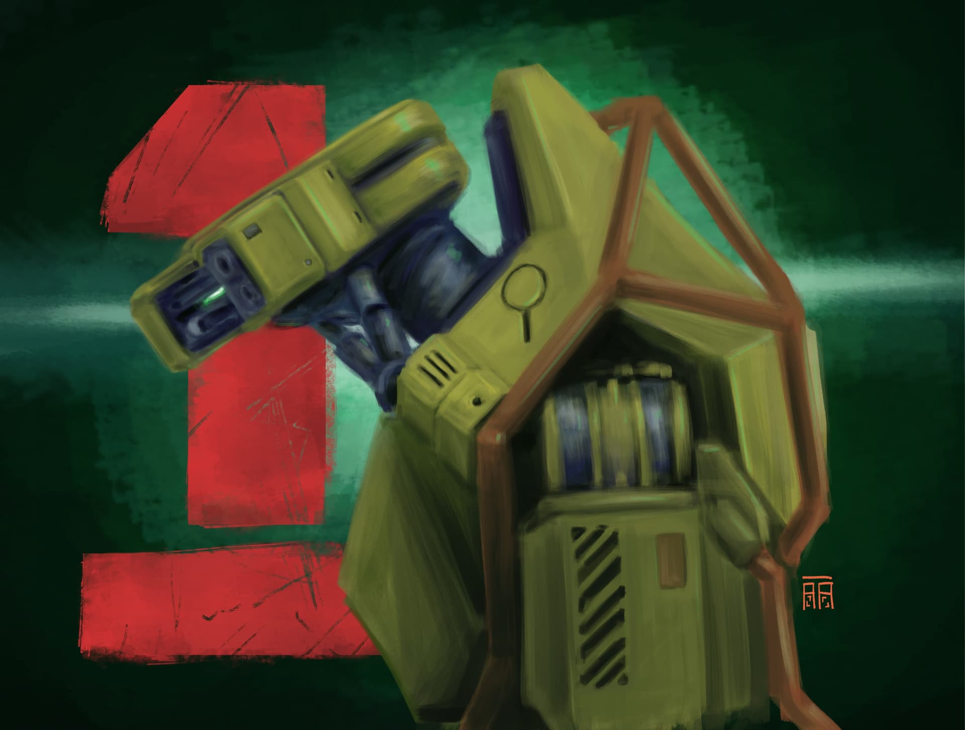
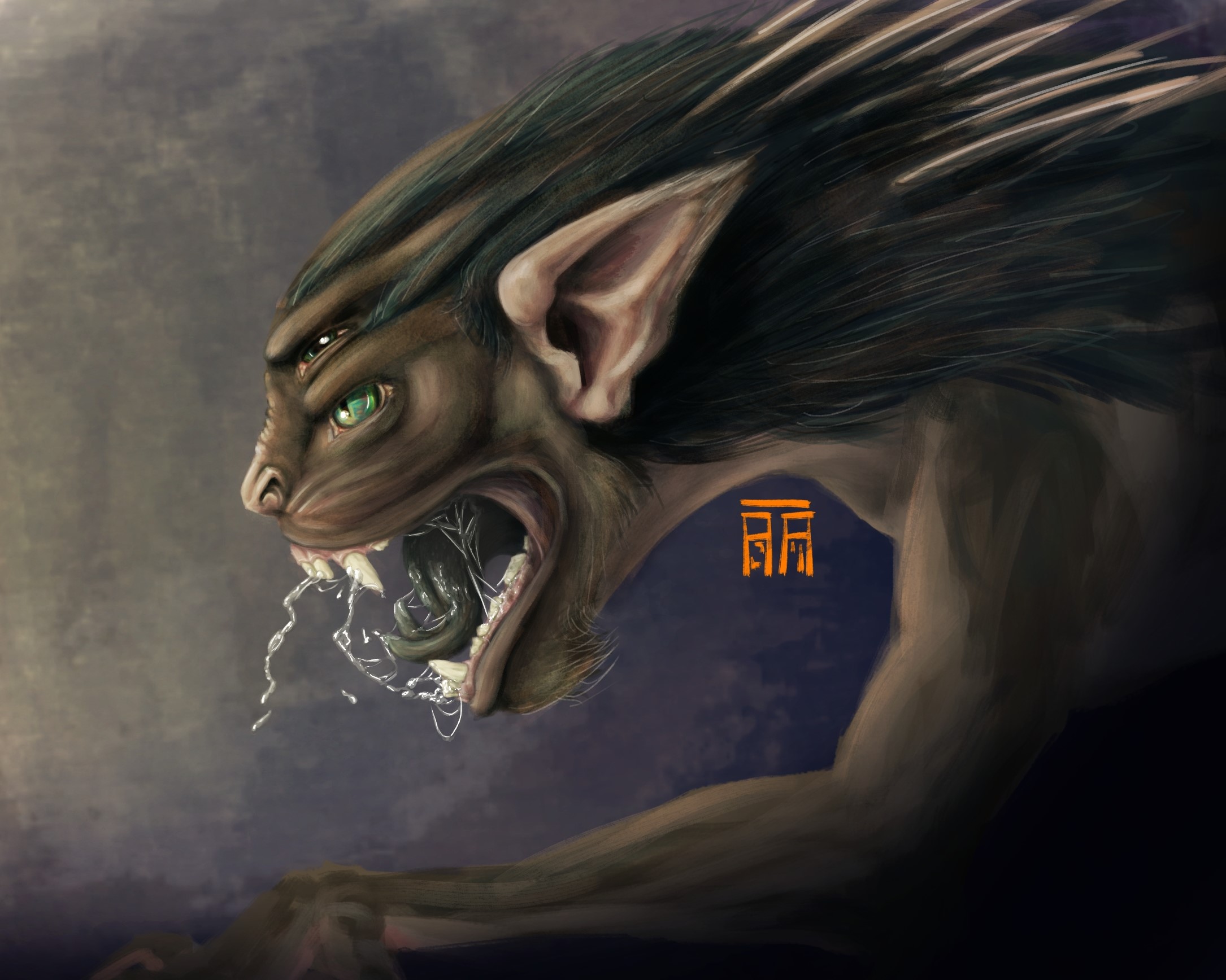
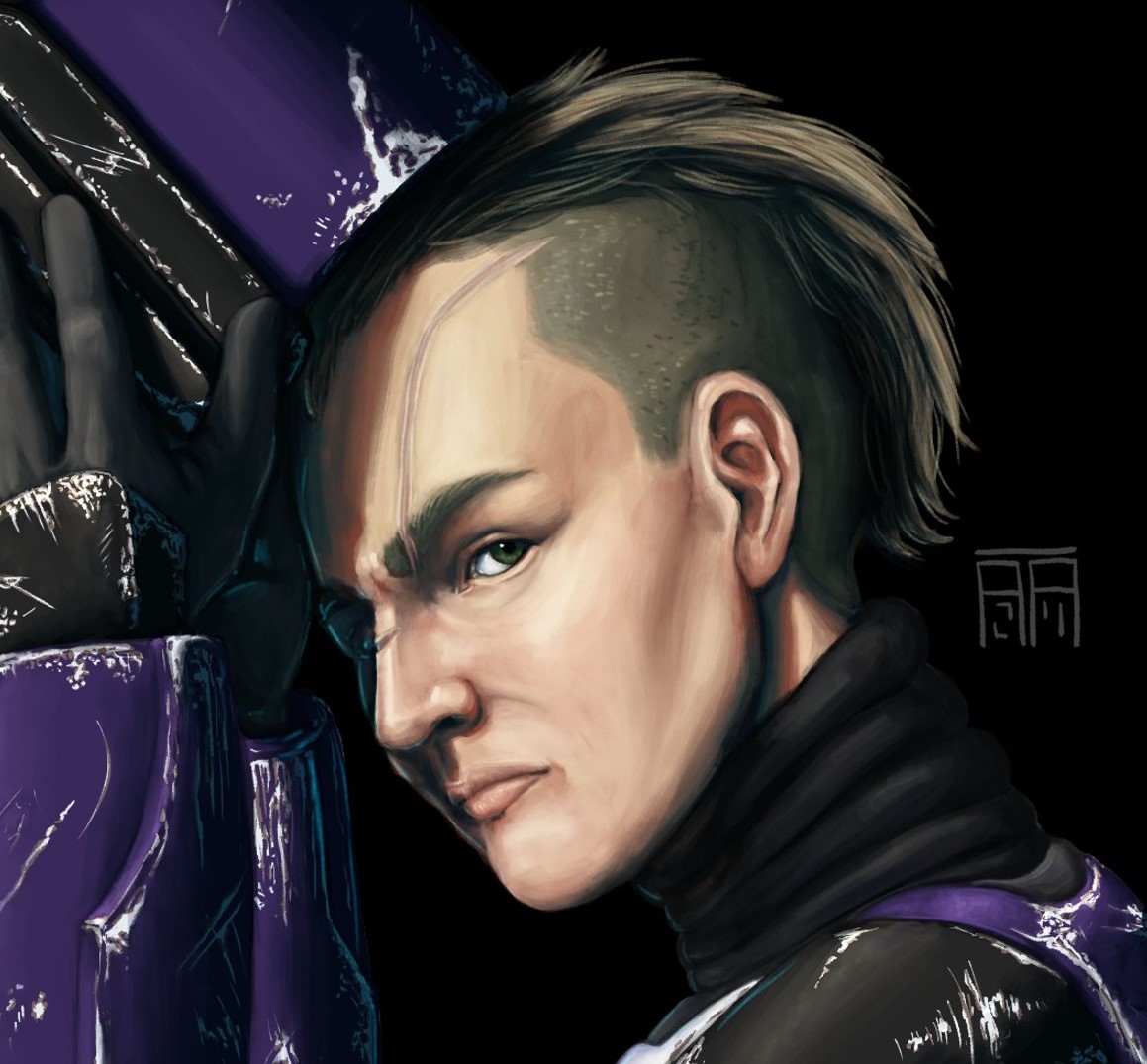
I’ve been working on using color shifting to get to darker and lighter colors in my paintings (as opposed to blending modes or adjustment layers + masks), and what I end up with always feels very muddy and gross. I didn’t include a human example, but I struggle with human skin looking nasty, too.
I did study art in school (studio art minor), and I think my understanding of color theory (or lack thereof) may be a strong contributing factor. I’ve also been wondering if my color range(s) for my paintings are too wide and maybe I should narrow them down? Half the battle is identifying what I don’t know that I don’t know, right?
I would LOVE some feedback on this from anyone willing to share insights/critique.
Muddy colors tend to be mainly due value issues. Set your default soft proofing to grayscale at settings so you can easily check them. Value issues can be due form and light problems, as in you’re unsure of how the light and shadows are supposed to look on a given surface and curvature.
Another possible cause is saturation, either excessive or not enough variation. Skin, for example, tends to have a band of slightly more saturated color in the transition areas going from lit to shadowed due subsurface scattering: The light enters the skin, bounces a bit and leaves at shadowed areas. It’s more saturated due the flesh and blood colors. Without it lighter skin tones will look too opaque and clay-like. Darker skin tones on the other hand need nice reflections and base color transitions (color variation of the surface itself, not just due light entering) to look more lively.
My advice is do color studies, and among them pick some subjects with crisp lit areas and shadows to practice casting them too. Don’t sweat over details, keep it simple, make them tiny if you need, but ask yourself questions. Ask why these lit areas look cooler than shadows, or why a specular highlight has different colors and things like this. Actively asking questions and looking for answers is the key, not mindlessly copying. You can even study by only looking at something if you keep thinking about what you’re seeing.
First thing I see is that you shade with black and white mostly. And when you learn realistic painting you of course do this a lot. But this also can make artworks look dull.
You could try introducing colored light sources, this will lessen the blacks and grays and makes things look more vivid.
As a fellow learning artist, perhaps you should work/focus on your values (light/shadow) and the transition of the planes (front,side,back etc…), how the material you’re trying to paint interact with light (highlights) and creating contrast between the colors of light and shadow (what i mean by that is ex: warm light with cool shadow tones or the reverse).As a example here is my art before and after doing what i as trying to explain:
Do you use the colour sampler a lot? I do and I find my colours can get a little “off” from doing that. I keep the palette docker open right next to my canvas to remind me to use a clear colour from the palette once in a while.
I actually don’t shade with black and white in either of these paintings (except for eye highlights and pupils). The robot painting doesn’t have any black at all, and the only white I used was in the very center of the eye. The “blacks” are very, very dark and saturated blues or greens. Even when mixing paints in real life, I don’t use black and white unless absolutely necessary.
However, the color relationships are definitely making it appear as though I am using black and white, hence the muddiness. I lower or raise saturation and value with cool and warm color shifts, but I think my jumps are too big, especially given the insightful value comments by other posters.
I love the idea of using colored light sources! I’ll definitely try that, thank you.
—I try to use the color picker as little as possible. I usually use it to find a light, mid, and dark value of a tone and go from there. Or at least a mid and then try finding lighter or darker values from there.
I always have the color docker open next to my canvas, and I think that’s a great reminder you said about grabbing a “clear color,” which I definitely neglect. Thank you!
Sorry for replying a thousand times—I’m obviously new to the site. Thank you so, so much for all the feedback!
@Carrion Thank you so much for that before and after! That makes a huge difference. I often pair that warm/cool technique with blending modes, like multiply, screen, and overlay. Works amazing comic my style, and it looks awesome in yours.
@Celes Thank you for the advice, especially about the soft proofing. That will be so much faster than turning a desaturation filter layer on and off! I didn’t really know what that feature did exactly, and I’m so glad you mentioned it because it will be invaluable (pun intended).
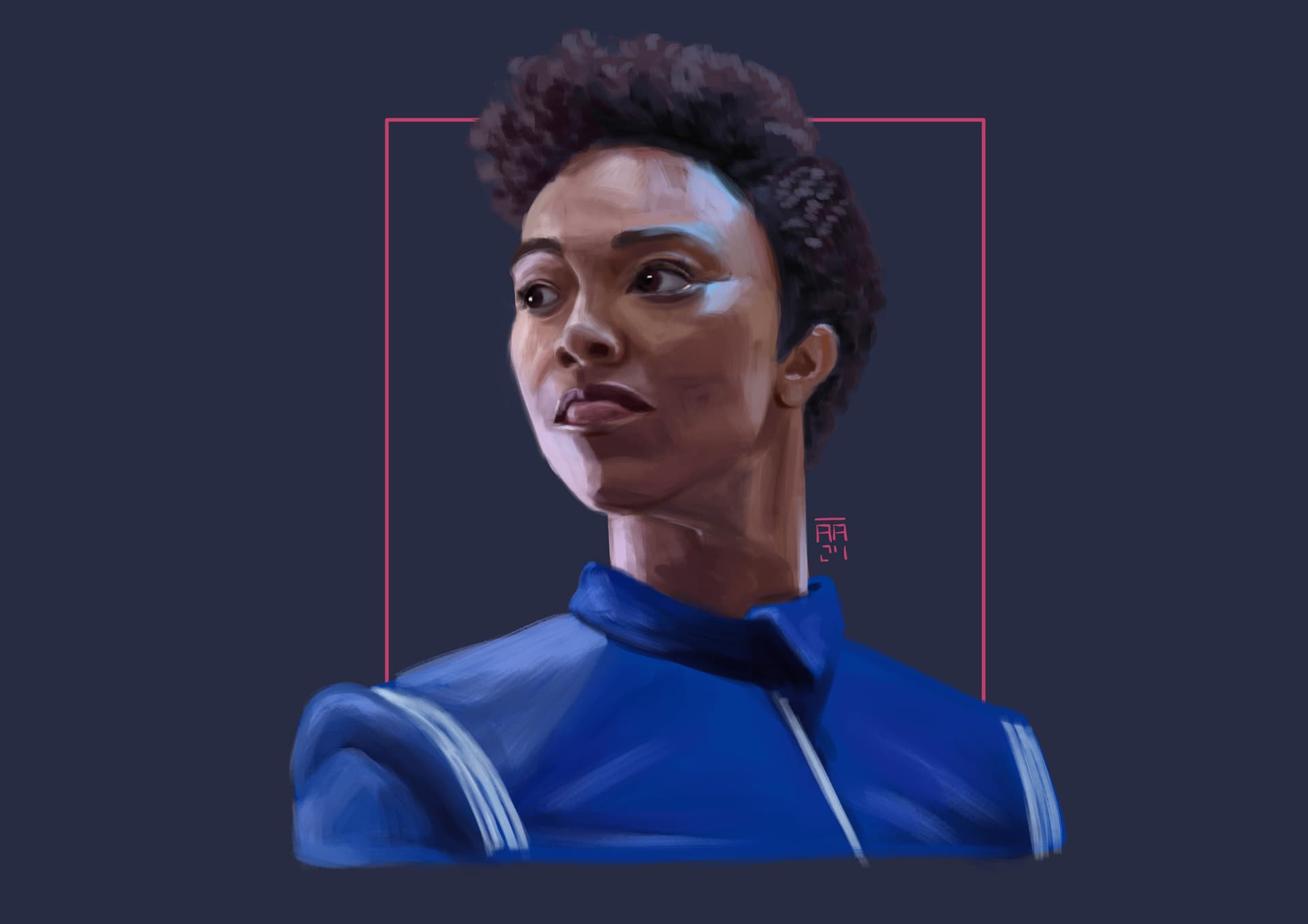
On the human skin (for lighter skin tones at least), the first time I really noticed that saturated band was late last year during this painting (cropped):
To be honest, you seem to be on the right path. It’s only a matter of watching out the values and keep practicing.
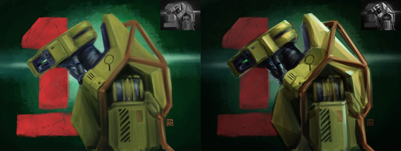
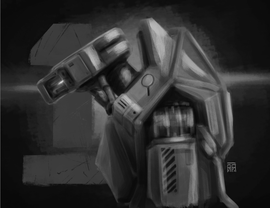
Just to show what I’m talking about with the values, I did a quick paintover on the robot. I hope you don’t mind. I didn’t alter the colors that much and can share the kra if you’re curious, I just walked towards slightly cooler and warmer hues at some points, but the key to readability and depth are the values.
One trend I’m noticing is that sometimes you outline smaller individual elements (eg lips) but don’t give the same consideration to the depth of the entire figure, how it acts as a single blocky form with volume. Start bigger, consider the shape and depth of the larger elements, then go smaller.
@Celes I don’t mind the paint-over at all! (The robot isn’t mine; its from a Secret Level short.) That’s insanely helpful. Starting big and moving to smaller elements has been a huge challenge for me the last few years.
I would love to look at the .kra file to study.
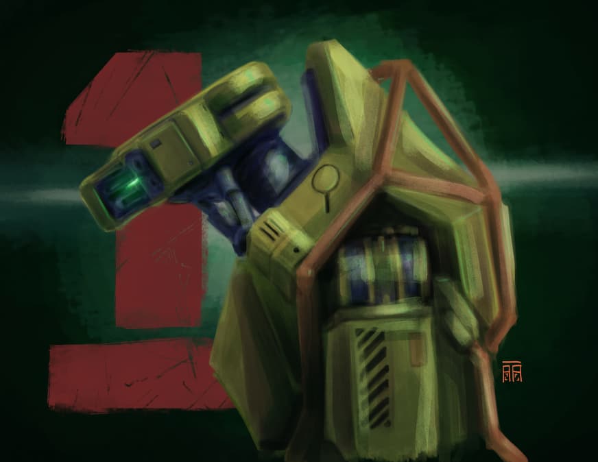
EDIT: I tried a quick paint over myself just to play based on your example. Instantly more interesting. I can definitely push it more, though.