I’m very new to understanding the whole RGB color info, so here is a bit of a technical query … I have currently a very average 4K monitor with 97% sRGB (71% Adobe RGB) and soon to get a second monitor with 98% DCI-P3 (131.3% sRGB) …
So wondering how to setup the best color settings to take advantage of the better color accurate monitor, and wondering how it would effect a the lessor monitor if colors overall set to wide gamut?
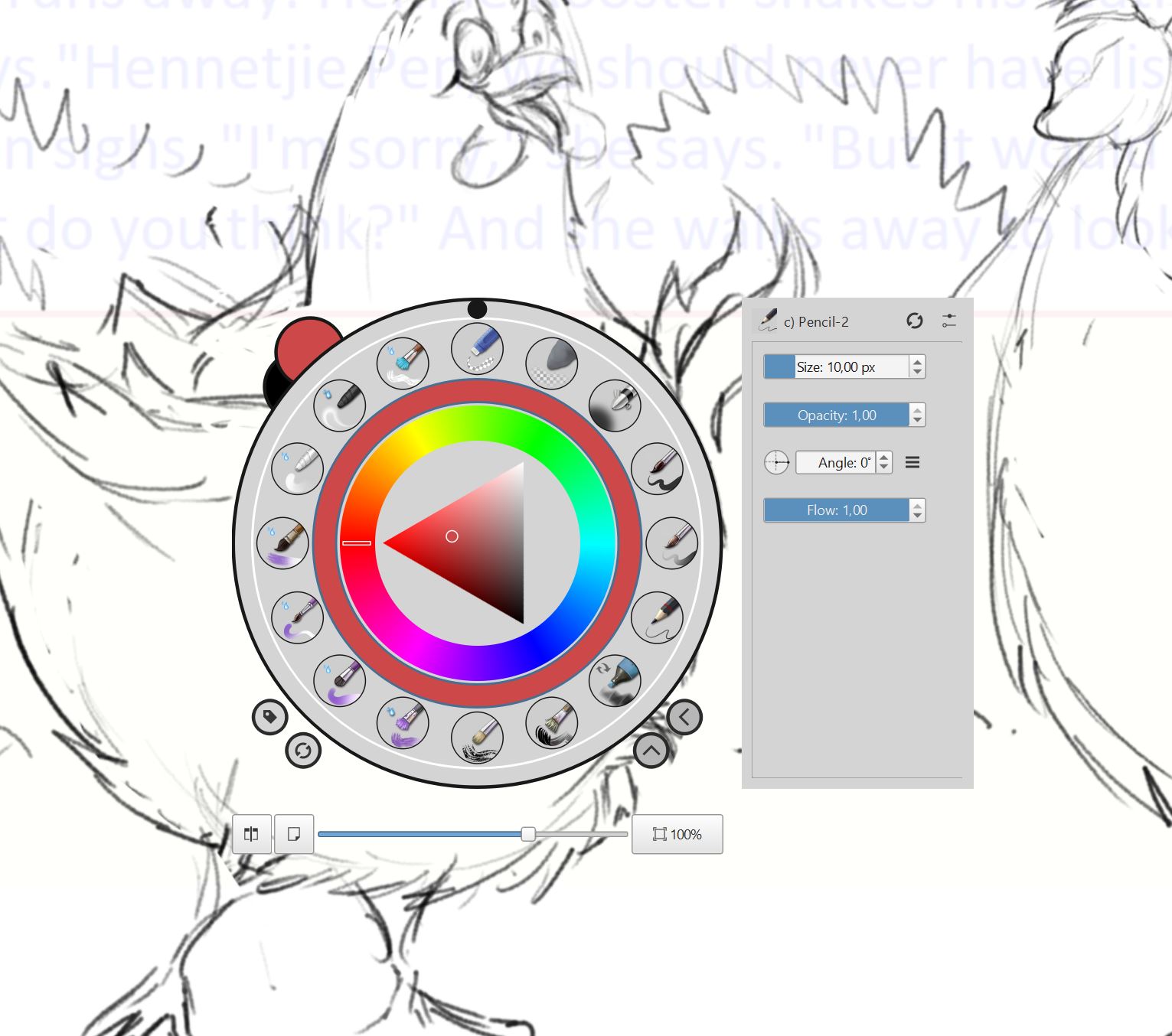
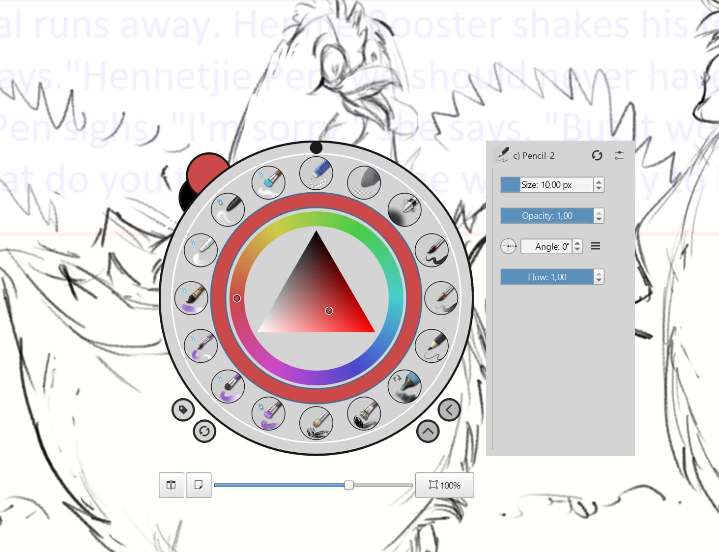
One thing I did notice that was interesting, is that when I set the popup color wheel to wide color gamut, the colors were much duller than when using the sRGB … I understand SRGB is more common to web and mobile devices … but thought a wide color gamut would just give a wider range of colors, not dull the colors … how am I misunderstanding this?
I’m also aware that CMYK is understandably duller, as that obviously has a much smaller color range which is limited to printing.
Again, I know this is a bit of a technical query …
Are you sure that you had exactly the same colour, especially the S,V values in the triangle, when you compared them?
I don’t know much about this area but if your monitor has a capability limit of showing 97% of the sRGB range then you can’t expect it to show a wider range of colours when using an application that works with a wider gamut.
Yes I didn’t change anything but the gamut selection in Krita popup settings … then Wide gamut went dull. Not sure if it’s because of the lower gamut monitor or something else.
And yes, obviously I don’t expect my 97% sRGB monitor to show the wider range of gamut.
I’m posting this thread to try learn more about it … why it goes duller and how it would effect using a dual monitor with different gamut levels … what the best color settings overall should be for best results … etc
Aha! I had a very saturated colour chosen when I tried that before.
I also see the ‘dulling’ of the Hue wheel colours when switching to wide gamut if the colour is in the middle of the S,V triangle.
I’ve no idea why that happens so we can both wait for an explanation.
I think I remember what’s happening now.
That ‘wide gamut’ selector used to be the standard/default selector on the popup palette. It’s characteristic is that the Hue wheel shows colours at the S,V levels set in the triangle. That was/is unusual compared to other types of colour selector so people asked for it to be changed.
An option was added to give a choice of two different types of selector.
No the Wide Gamut selector used to be only available by editing kritarc manually, the sRGB one was the default. I don’t really have a clue why it would look less saturated, I can’t really think of a scenario where it could (unless you forged some ICC profile with tiny gamut).
But it’s pretty unclear what we’re really talking about here.
If I understand correctly, Redrobin does not actually have a wide gamut monitor yet?
If you set it up correctly, the wide gamut selector will indeed show a larger color range than the sRGB selectors, that means the latter will look less saturated and not cover the whole area of the wide gamut selector.
But the crucial points are:
What display profile did you set for you monitor in Krita?
With the default sRGB setting, the wide gamut selector will never look more saturated, because you told Krita your monitor can’t display that.
What color space did you choose for your document? The wide gamut selector will offer the gamut of the document, and convert that to your display profile. So again, for a default sRGB document, it will never offer more colors than the sRGB selector.
Note that for CMYK, it currently falls back to sRGB in the popup palette, since it can’t fit a 4-channel selector in the circular area. Maybe Adobe ClayRGB would be the better choice…
But it’s usually recommended to work in RGB and use soft proofing to get a preview of the CMYK equivalent, since you greatly reduce available blending modes when working in CMYK, many filters will go through RGB anyway etc.
But of course all of this will look pale if you just told Krita you have a wide gamut monitor, but your monitor can’t actually display that.
The sRGB selector has a triangle that rotates around the Hue wheel and some people were not happy with that.
The wide gamut one was made available via Settings and its triangle does not rotate.
The wide gamut Hue ring changes its S,V values in accordance with the S,V selection in the triangle.
That is the same behaviour as the ‘Select a Colour’ selector that you get when you click a FG/BG colour on the Toolbar. I thought that was a UI design thing to show what actual colours were then available around the Hue wheel for a particular S,V setting.
Firstly, yes currently I only have a basic monitor, getting wide gamut monitor next week, and plan to use it in dual display … so besides just learning generally about color space etc, also trying to find out how it will effect me using a wide color gamut across 2 screens, where one is average monitor and other is high gamut monitors.
Obviously I plan to do the main artwork on the high gamut monitor where color accuracy is important and will use the average gamut monitor for other windows, panels, etc where color accuracy isn’t important.
So regarding presently I’m doing these tests just on the standard monitor … I have Not changed any Krita color profiles (default) as same with system profile (default) … all I did was change the color profile in the Krita settings for the popup.
I was surprized to see it go dull … as I understand definitely the standard profile cannot display all the colors … but didn’t expect it to go dull, in fact I expected it to either remain the same (as it couldn’t display any more than what the sRGB original had, or maybe go brighter but probably not accurate … just never thought it would go dull.
I’m also concerned, if my one monitor can only display a wide color profile and the other just an average sRGB … how is it going to effect the overall system if I’m either going to have to choose Wide gamut or sRGB … can’t run both at the same time for each monitor on a dual display.
Below are screenshot showing Krita color settings, then one popup with sRGB (bright) and other with Wide gamut (dull).
Oh now I get it, you’re confused about the hue ring rendering differently with the wide gamut selector…it just reacts to the hue/saturation you currently picked and shows the colors you’re actually going to pick, rather than a static “rainbow”. That has nothing to do with different gamut.
I keep forgetting that you can’t change that behavior in upstream Krita yet…
Aha I totally see it and get it now … sorry still new to Krita, trying to understand how it and digital art in general works … know the basics, but lot to learn still. Thanks again
So a big interest to me would be, I know it will differ among digital artists … but what do most serious digital artist work on … Wide Gamut vs sRGB? Is it only dependent on whether one has a wide gamut monitor and also is there any benefits in working in creating wide gamut artworks compared to sRGB?
I know with photographers specifically it is important, cause they’re trying to replicate an image they have already taken in raw to get the closest possible color.
But how does it help digital artists … are there any benefits, can one see more color space/range if one has a wide gamut monitor?
And I’m assuming it would only count if one plans to print it, as most viewers across the web have standard non-wide gamut monitors … or am I wrong and there is an advantage to creating wide gamut digital art, in that it does in some way produce better color than if created in sRGB, even when viewed on average user monitors?
What happens to is when I shade on my Cintiq (Adobe RGB I think) I make very nice degrade and all that the information is there, but when I see it on a sRGB monitor the shading will become a block of one colour. It sucks the pretty out of it. I think that is why jpg compression works so well monitors, are bad in general.
But with a good monitor and a normal one side by side having the same output you can see the difference in quality.
I hear you … but if most of the world has a “normal” monitor and not a “good” monitor, that means most the world only see the “dregraded” version … thus wondering, does working in Adobe RGB (wide gamut) maybe give any advantage in the actual creation process and final output, as compared to doing the exact same job/work/project in sRGB … wonder do wider color selection translate into better and wider creative options and end results … or is everything lost in the end and there is no difference.
For photographers, it makes a huge difference shooting in RAW and editing in Adobe RGB (wide gamut) as the wider color selection definitely shows in the end results, compared to shooting and editing in sRGB, even when viewed on screen on a “normal” monitor … so again I wonder if it might be similar way of thinking and advantage to digital artists who’s creative process starts on the monitor … or not.
I don’t have enough experience to answer that with certainty.
But it is true everyone is on really bad monitors so your work will be essentially never properly displayed. I have been feeling need to proof test my work on my laptop because when I launch I can’t ever tell which sections of the images really are gonna be destroyed.
I’m wondering if it might be best to work in wide gamut even although the majority won’t be able to view it currently in it’s best wide gamut range … not only might it allow an artist to have the best possible version even for achieving, or print if one decides to … but maybe in near future with technology, maybe the majority monitors in future would have wide gamut as its standard … same as 1080 became standard for resolution, now 4K, etc