So, they’re is called Calx (/'kɑɫks/ , for IPA enthusiasts), a fantasy wingless dragon that’s able to fly thanks to magic. A very serious, but sometimes light-hearted, leader of Arkhos Kingdom Knights, from my own world: Lithos.
As for the background, i think it’s missing something. can’t figure out what tho… any tips?
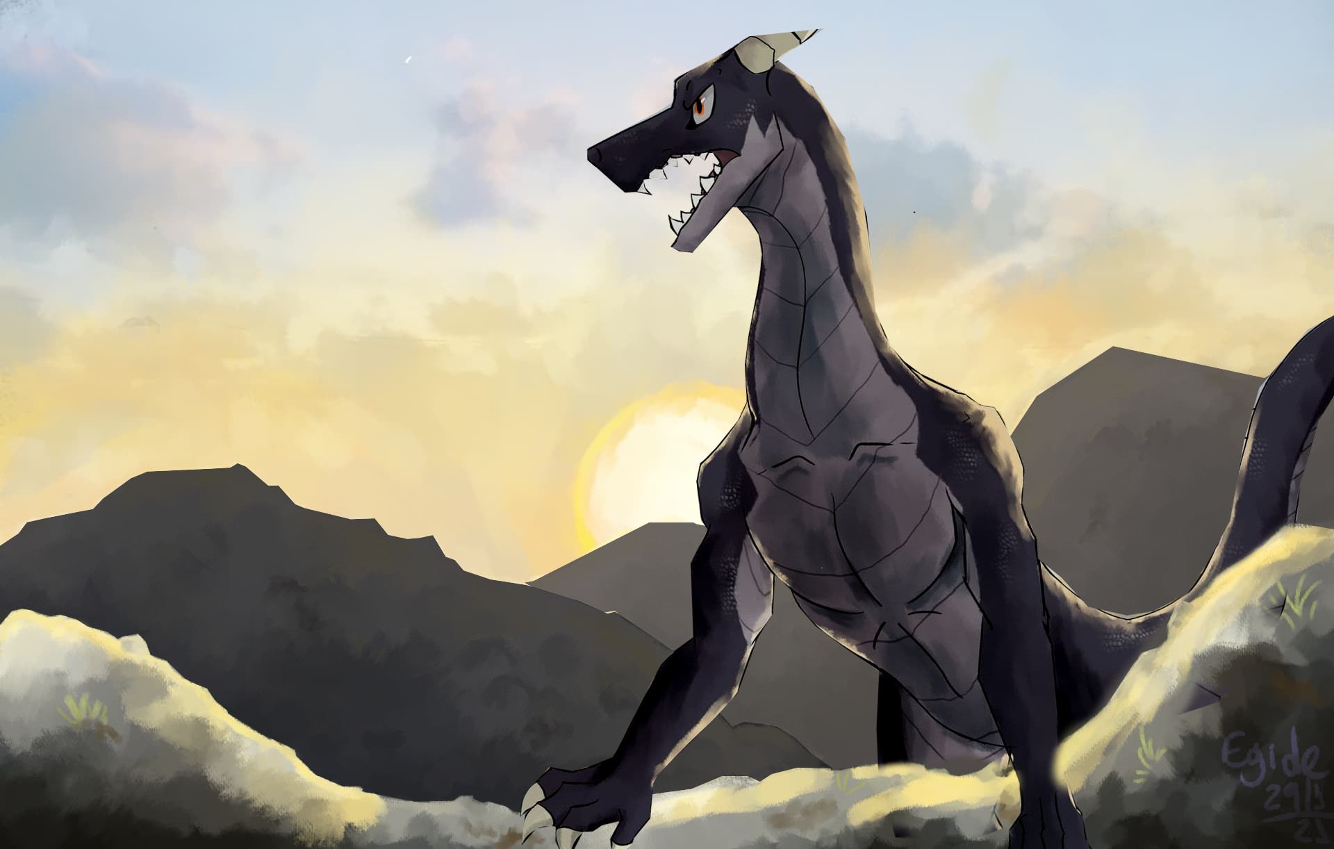
Ok, now it’s more clear that there are two mountain ridges behind him.
This is something that should be planned for during sketching, so the character can be in its rightful place in the image and background stuff adjusted accordingly.
kidding… i think i understand. For some reason i locked on the idea of the character being centred on the piece and didnt think about the overall effect.
also, the contrast change you mentioned really worked!
Tysm!
It took me a bit to notice that the magic wings are connected to the dragon. I believe they should have the same contrast and similar detail as the dragon because they look too far away. The dragon doesn’t have to be so dark, as someone suggested. It works, but it covers the detail you put in it. I think that the mountains farther away should be lighter. In real life, they may seem darker than the ground we stand on, but it still reduces depth in drawings. Lastly, you could add more light areas on the dragon so they align with the wing’s shadows, if there are any. The right side of the horn, jaw-line and collar bone are potential areas. Still, this light comes from the back. It’s up to you.
yeah, that is probably because one of the wings ended up behind the tail when it shouldn’t. i had a lot of layers in this piece and thats not smth i’d do again.
now that i about this, i may have missed the big picture. the dragon is almost flat colored and has lineart but the bg is very painterly and draws too much attention IMO
I shouldve focused more in Calx rather than the background.
theyre more like glass. i always have a hard time with materials like that.
i really like this suggestion! always good to make shapes clear with some hard light/shadows
actually, i really appreciate all your feedback in general. thanks a lot!


 The symbolic, magic wings are an interesting touch!