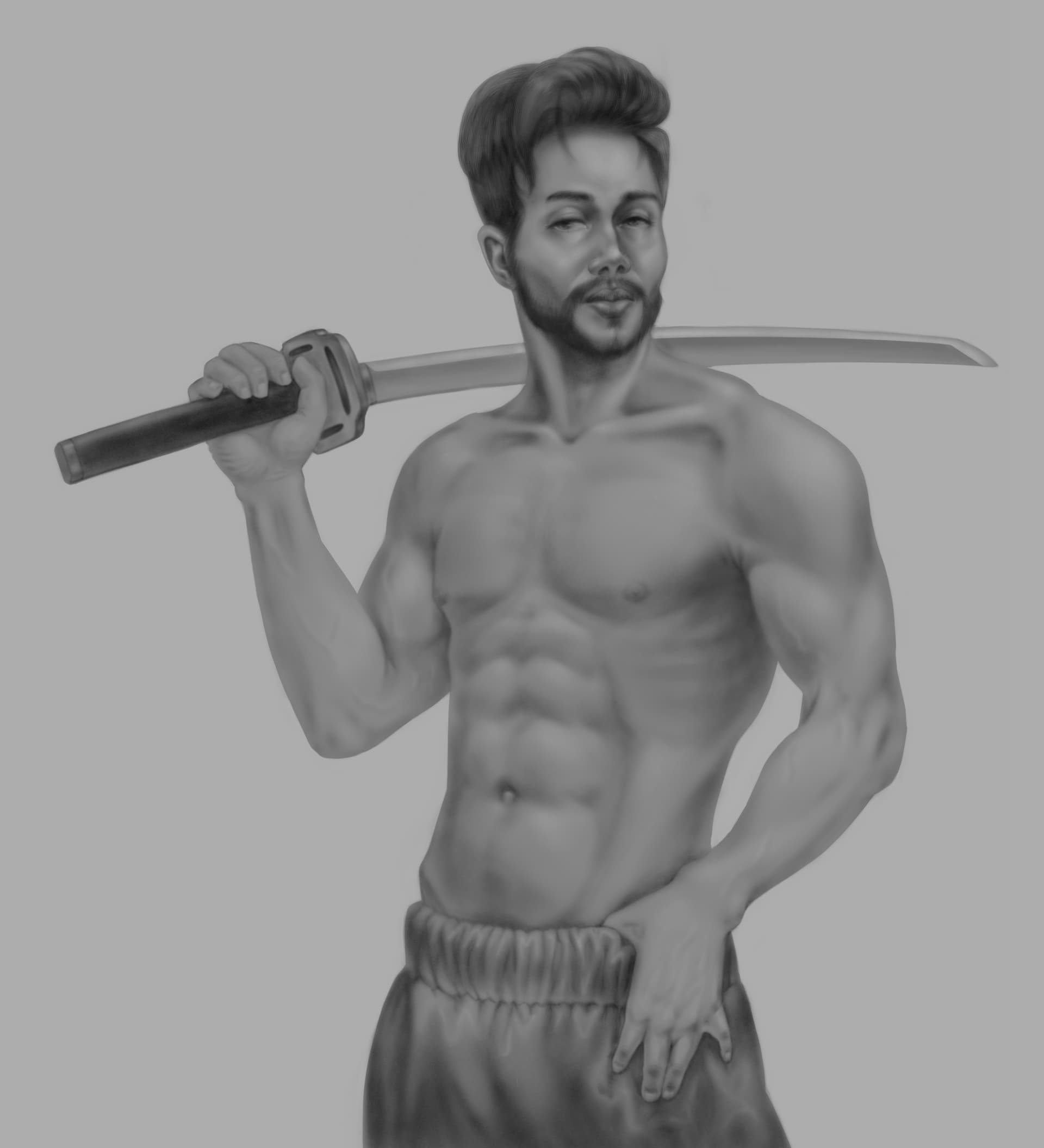
I think I finished rethinking this art. After all, this is just a drawing, it may not be perfect. I think it is complete enough to put it in this section.
It looks really good! The first one is my favorite, definitely. The face fits better. However, the third one has very nicely defined muscles, which are a bit too obscured in the first one.
Thank you) In the first one, it was possible to emphasize the muscles, but I already wanted a more natural figure. Also, I wanted the tattoos to have such a bluish tint. When I checked the references, I found that tattoos mask the skin quite strongly, which in some cases even masks the terrain (for example, veins) and that’s why I left it as it is))
the improvement is crazy!! the first one is definitely my favourite! was there a time gap between the first drawing and the second? because wow! the difference is huge!