Hi
Following discussion, here’s a poll to determinate which label/icon is better to be used in the UI
| UI | Description |
|---|---|
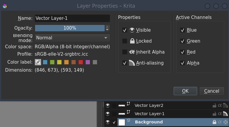
| Anti-aliasing | Label “Anti-aliasing” The icon “shape” is active (bright) to indicate the active anti-aliasing status |
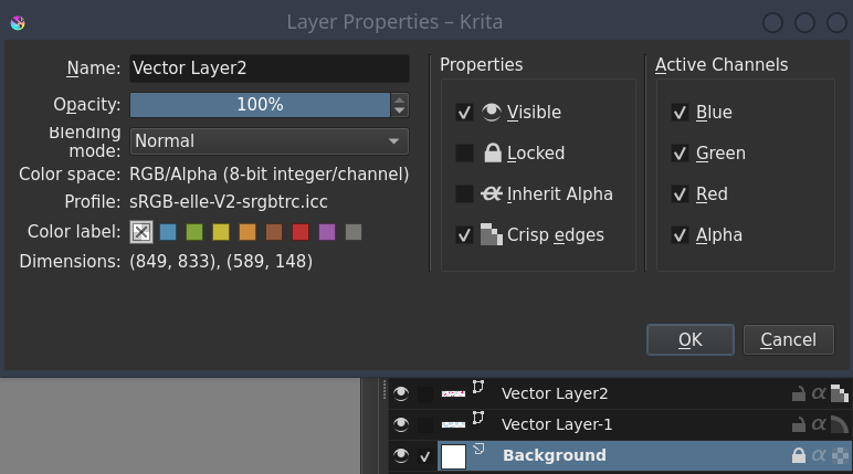
| Crisp edges | Label “Crisp edges” The icon “pixel” is active (bright) to indicate the inactive anti-aliasing status |
Make your vote!
- Use the Anti-aliasing UI
- Use the Crisp edges UI
0
voters
Grum999