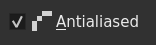
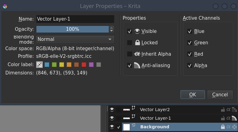
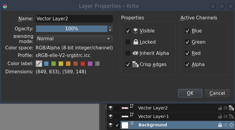
I think that is ok: off=no-aa, on=aa, with the 2 icons. Simple and everyone should know what it means.
For the icon on the properties dialog nothing prevents you from using other icon which resembles the other 2. For example a mixture of the 2. Or maybe just use the aliased one even when the text is “anti-alias” since it represents better kind of what it is about, not sure. The same happens with the other icons: the eye is always opened; the lock is always locked; the alpha is always strike-through.
Other thing is the text. I think it is almost always used “anti-alias[ed/ing]” in the ui text, with the hyphen.
I think I like Option A, with the brightened anti-aliased icon next to checkbox with the label anti-aliasing on Layer Property.
But, Pixelated with crisp icon option on Layer Property is understandable. Arguably even more so than anti-aliasing. In the Krita discord, some one didn’t get what anti-aliasing mean. And anti-aliasing seems like a very technical word where Pixelated is more understandable. Plus, people here understand what Pixel Art is, so by extension would understand Pixelated.
I think there should be a voting thread for this. Maybe 2. To let the community decide. I’m leaning on Pixelated with bright crisp icon within Layer Property because the terminology “Pixelated” is more understandable than “Anti-Aliasing”.
I didn’t though the most complex part to implement this was about terminology or the icon
So to be simple, I don’t have the choice, the “bright” icon in dialog box must match the “bright” icon in layer docker, it’s not possible to have something else
there’s no specific code dedicated for dialog box and no specific code dedicated for layer docker, these part are managed dynamically by Krita, using one icons settings defined for layer type in one place (and that’s pretty interesting for me, in term of for that it’s mostly a couple of lines of code and I don’t have to manage anything about UI, display, events, …)
to have different icons from dialog box and docker layer, it means to review the Krita’s internal system that manage it and I really don’t want to touch this part
So if I have “pixel” icon as active (bright) icon in layer docker, it will be this icon in the layer properties.
That’s why for me this is a nonsense:
We can’t have “antialiased” term with pixel icon to activate the “pixelated” mode.
It was what I’ve implemented first (with a not so nice icon), but looks like not satisfying
Yes, it’s “anti-alias[ed/ing]” or “anti alias[ed/ing]”, the spell checker don’t stop to highlight the term “antialiasing”
For the poll why not, but before we need to have something stable to vote for because I’m now lost with all feedbacks
2 polls?
[Off topic]
Concerning Discord users that don’t know the term anti aliasing, I don’t know.
It’s the appropriate term, may be they can read documentation or take time to dig a little bit what digital painting is and the vocabulary related to digital graphics stuff
If tomorrow you have a user that don’t know what “Alpha channel” means, you won’t rename it as “Transparency information”
Come on, you are a veteran here. You perfectly know that this thread can easily reach 100 answers just debating these things
The main problem with the first icon is that it is hard to know what it does just by looking at it. I think the new ones are better, since they clearly show how the option affects the layer, and they are more consistent since they resemble the selection icons (although I still prefer the ones used in the selection tools, but the new ones as well). This last thing is important ux wise in my opinion since users don’t have to “learn” different iconography for basicaly the same thing. If they have used one thing with those icons, automaticaly will kind of know what the other thing does.
I’m ok with “off=no-aa” and “on=aa” and “anti-aliased” text + anti-aliased icon in the dialog and also I’m totally ok with the “off=smooth edges” and “on=crisp edges” and in the dialog the aliased icon with “crisp edges” text. I don’t like the “pixelated” text because that usually means that the whole thing is pixelated, not only the edges.
In the end I think the majority of users that open that dialog should already know what the icon means since they would have interacted mostly with the button in the layer stack.
I think that those 2 options are the ones that should go in the poll? But I also think that if nobody else answered here says something about it.
Just wanted to say that Krita already has icons for Anti-Aliasing and suggest using the same for consistency.
This is how it looks for the selection tools, for example.
I don’t know what gradients have to do with this, do you mean that the shape edge is anti-aliased but the fill gradient isn’t?
Anti-alias comes from reducing the staircase edges (aliasing artifact) when rasterizing a vector shape by making some edge pixels semi-transparent. What is put inside of the shape is arbitrary, the rasterized shape acts as a mask for that “fill image/gradient/color”. Nowadays there are post-processing effects like fxaa that try to reduce the aliasing effects by smoothing the edges of an image (i mean edges inside the image that divide different regions of different color, value, etc.) . That is used to emulate anti-aliased edges in the fill tool for example, but it is not true anti-aliasing, it is a smoothing operation, like blur, since it is applied to a bitmap.
This new option controls if the vector shapes are rasterized using anti-aliar or not.
When I read “pixelate” I imagine the effect of some filter that makes a whole image appear blocky, as if it had lower resolution and was zoomed in.
Yes, that’s how I interpreted your statement of the whole thing is pixelated, but not only the edge. At least in this context. And so, I went to test that if it just beyond edges of vector shapes and stroke. However, this is out of scope even though it’s related.
Yeah, it’s not without problem. “Crisp Edge” seems to be swaying away from the convention of one-word to describe the state of rendering of vector.
“crisp edges” comes from how it is called in the svg specification. I imagine that they chose that because they thought anti-alias would sound too technical. I’m ok with anti-alias since it is already used in different places in the ui.
Yes exactly, this is why I used it in my proposal.
Here is the official SVG specification:
crispEdges
Indicates that the user agent shall attempt to emphasize the contrast between clean edges of artwork over rendering speed and geometric precision. To achieve crisp edges, the user agent might turn off anti-aliasing for all lines and curves or possibly just for straight lines which are close to vertical or horizontal. Also, the user agent might adjust line positions and line widths to align edges with device pixels.
Deactivation of anti-aliasing is to change the way the shapes are rendered, the “pixelize” or “pixelate” term let me think that a post-process remove the anti-aliasing
@Deif_Lou@dkazakov it seems my MR has been merged in master… but of course it doesn’t take in account last change related to icon+label
I wasn’t expecting it could be merged without a “need changes”
So, once a MR is created, what’s the best method to put it it in stand-by, waiting for a feedback from KA for example?
Taking in account I can’t put labels on MR
So now what was merged is Ok (except the label/icon that will be reviewed) and I’ll have to do a second MR once the poll will be finished and the right label/icon implementation done
It’s not a problem?