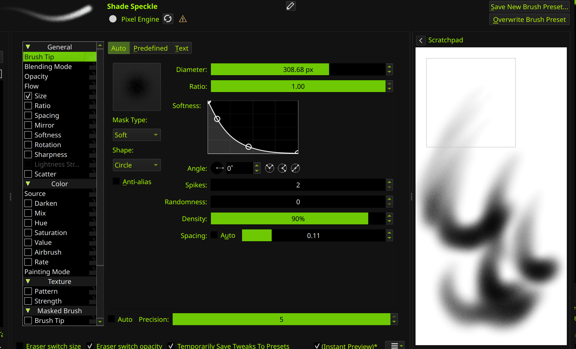
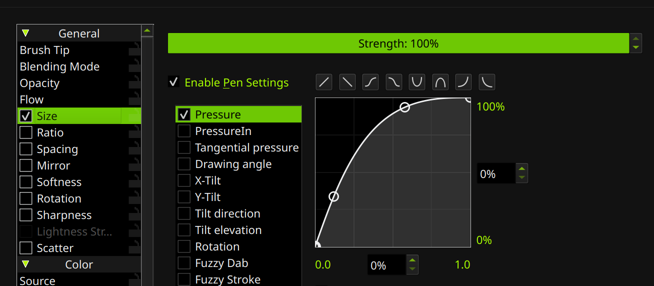
I encounter the same problems when working with soft airbrushes:
The inability to make really smooth and soft transitions to get the “airbrushed look” because those artefacts and rims showing up that the user talked about in the linked thread.
When working in a 16 bit color space, these problems don’t seem to exist, but after converting the picture into 8 bit color space, the rims and artefacts show up in an ugly way.
Reducing brush density to 85% eliminates the problem when working in 8 bit color space, but if you work with large brush diameters or if you don’t overwork areas several times with different colors in a glazing way, you inevitably get that “grainy look”.
Overworking every area with Blender Blur is not really a solution, because you lose a lot of details when overworking areas with lots of details in that way. It also increases the time necessary to paint an image to a large degree.
In the thead linked to above, @raghukamath mentioned that Krita would need “better dithering” / “dithering enabled everywhere in Krita” (I don’t know, possibly pointing to the brush engine or brush settings?) to solve this problem. Therefore, I would like to ask if there are actual plans to increase dithering in Krita (concerning the soft brushes and how they work) in the future.
P.S.: Sorry, I have no idea of programming and don’t know in which area of Krita “better dithering” could be implemented to solve that problem, so I am not sure if I chose the right tags for this thead.
I see that you had to reduce the density of the brush to 90%, which will lead to a grainy look to a certain degree as seen on the scratchpad test.
I work with an airbrush with the density set to 85% at the moment to avoid rim-like transitions and artefacts when working in 8 bit color space, but therefore I get a grainy look. The main problem with the grainy look created that way is that the grains increase with the brush diameter, which makes the grains of the areas painted with large brush diameters stick out against those painted with small brush diameters.
Yeeeah it’s just a workaround to get around the lack of dithering on the smooth brushes. I don’t mind the added static but I definitely agree the ‘soft’ mode brushes should have some sort of inbuilt dithering like the radial gradients. I doubt any artist likes the color banded look.
I also work in 16 bit depth because of my aversion to color banding
I’m not noticing what the original thread is talking about, I only notice the usual color banding that even CSP has. Maybe your ‘spacing’ is too high? Either way it does need better dithering in some areas.
No, the spacing is not the problem. The problem is there with 10% or 15% spacing.
Neither is opacity the problem as it is 100% and not linked to pen pressure.
Anti-alias is enabled.
I don’t think that the problem can be solved through just finding the right brush settings.
You cant fix this issue with brush settings. You can only tweak brushes(randomness and density (it doesnt work for any custom brush tips)) to minimalize visibility of this issue (basically what you been doing already).
Devs added Dithering to gradient tool back then but not brushes.
They are aware of this issue for years but it seem to be pretty low on their priority list.
@Zer0Frost I really love Krita, the entire Krita community and the Devs of Krita.
But to say my honest opinion, if adding Dithering like Blue Noise or so to the brushes in Krita is a low priority, then this will possibly not lead anytime soon to many more professional Manga and Fantasy artists using Krita for their work, because for their work it is very important to easily make soft transitions and smooth surfaces without color banding while working in 8 bit color space…
The color banding issue is worst in the following situation:
Working in 8-bit color space.
Working only with glazing / low opacity brush strokes to slowly build up and model a surface.
Working with skin colors (beige, brown, greyish pink and orange).
Absolutely terrible: Trying to render an area with the two colors of bright yellow-beige & dark red-brown.
So, exactly the regular situation in almost every motif when a Fantasy artist paints a Sword & Sorcery image and tries to render the most important parts of the image, which are the skin surfaces of half-nude barbarian warriors, fairies and similar protagonists…!