Bundle Creator: Improving the UI/UX design

No worries, the reason for underlining the tags is so you know which tag is applied to which brush (resource). Consider the case where someone has the tags Brush and Bristle, you cannot use “B” as indication of either, so you would have to use “B” for brush and “R” for bristle (the next available character is the R after all). By underlining the character that is displayed, you can now see that the tag Brush is applied to resources with a B, whereas the tag Bristle is shown with the R.

This is useful for cases where you are applying tags for a subset of brushes (e.g. only the Erasers from the bundle, but not the Pencils). Thing is, the selected brushes only show the tags that are applied to the selection, if you select brushes with multiple tags, there’s no way to otherwise indicate which tags are applied to which brush.

As an example, go to the Resource Manager and select brushes within the default Krita bundle and you’ll see this same behaviour. And this makes it difficult to identify witch certainty which tag is applied to a brush WITHOUT selecting the brush first. Notice that I select both brushes at the end.
TAgs

1 Like

Aha, okay, so basically you’re only concerned with being able to distinguish and recognize during tag assignment which brush has already been tagged and with which tag(s), if I understood correctly?

Michelist

1 Like

Yes, exactly.

1 Like

Okay, now I get it. Thanks! :smiley:

2 Likes

Based on the improvements/suggestions since my last mock, I made a new mock trying to put together everything. Please ignore the spacing and alignments since I didn’t spend too much time trying to align things perfectly - though let me know about any obvious changes regarding this.

The new Bundle Creator would have two windows which can be navigated using the Next and Back buttons. The first window Add Bundle Details and Choose Resources would allow users to enter the metadata for the new bundle and choose what resources to add. On clicking Next, the users will be directed to a new window called Add Tags to Selected Resources that would allow users to add/modify tags for the selected resources.

Window 1 - Add Bundle Details and Choose Resources

Window 2 - Add Tags to Selected Resources

Main changes that have been introduced:

  • No Embed Tags button. Instead, a separate window for managing tags.
  • The initial letters of a tag displayed in the top right of the brush thumbnail for both the gridview and the listview.
  • Underlining the tags in the Tag Selector Window (see right section of Window 2).

Let me know in case I missed out something or any further improvements that should be included! Also, please suggest changes regarding the window names/headings since I came up with those on my own without putting much thought to it.

4 Likes

Hi, i know people is interested in this so this are my 2 cents. done in inkscape as my others mockups time ago for brush editor.
Any questions are welcome

I am not sure if to add a second window because until now i spend just a couple of seconds in that window. I select the tag my brushes have and is available and done, i have done all the job previously when saving my brushes.
About where to place it. I would use Settings/Bundle Creator

Also i was thinking in something like this to make faster selection.


(sorry, i create this really fast)
Brushtips, Brush Presets, Gradients, Gamut Masks, SeExpr Scripts, Patterns, Palettes, Workspaces . I don’t know if more wold be added in future.
We could create an icon for each category and that way is faster because is not a click and lokk for a text reading but more visual guide. The name on the side is auto selected by Krita as an auxiliar guide

Thanks for all the work involved. I don’t know the deathline here, but I am sure this would be a +1 in Krita’s development road.

PD: This is how i use paper to design my bundles as i quote in the image text about Counter.
And in this case is a medium size bundle but Charcoal KA or Digital Atelier were bigger.

5 Likes

I kind of really like how you decided to merge the Bundle Name and Save to part, and the default icon being set to something related to Krita. Opening the tags from the tag button is also okay, as long as it looks similar to my mock because I kind of think that this way of adding tags is more convenient than the current one (personal opinion). Also moving Save and Cancel to the top, giving a warning yellow border for removing resources and the counter - these are pretty cool ideas.

I also feel selection should be made clearer because currently it’s a bit hard to notice immediately.

As for the separate resource type drop-downs with icons, I personally feel that would be a bit too clumsy. Instead we can have only one with icons as in my previous mock. Though I think I need more up-votes if I change the drop down part to icons because I feel this is something people should be aware of before it’s being changed.

As for the tags, I know adding too many tags to a resource can make the thumbnail a bit too cluttered, but practically do resources have too many tags? This is something I feel you can answer better because I am not aware of the practical use-cases. Like if most of the time, a resource happens to have 3-4 tags, I think I can add the letter indication as requested by others.

Thanks for sharing the detailed thoughts!

2 Likes

Thanks for your kind comment. Take whatever you need and left what is not useful for the user. You need to give your personal view. And thanks for your work. Add tags is better as I see now.
My bundles normally have one general tag, but maybe other users find more useful to add more tags. The reason maybe is that I have normally my brush preset docker in all tag and the pop up wheel with specific tag.
Also I would put like a background square to be sure the letters are readable in all types of icons. What do you think about it?

Also I was thinking about to add a mini drawing of Kiki in the overwrite window to make less warning :warning:. Who knows pets are always welcome

1 Like

Yep, I feel adding a background colour is important else sometimes it becomes unreadable sort of.

What do you mean by the overwrite window?

Since I am doing this work as a part of Google Summer of Code this year, I would need to get a list of confirmed ideas that I can put up on my proposal. So, I am creating a poll where you can select multiple options whichever you feel is relevant for you, and I’ll start noting down the options with the max number of votes in my proposal. The ones with fewer votes need to be re-discussed in case someone has issues with that. It’s kind of hard to include every detail in a poll in a multiple option format, but I tried my best.

  • Bundle Name and Save to clubbed together (Refer to Ramon’s diagram)
  • Saving previous bundle information
  • Having separate gridview/listview for Search and Selected columns
  • Save and Cancel buttons to the top
  • Warning yellow border on button for deleting selected resources (Refer to Ramon’s diagram)
  • Tag Selector for Selected Resources with UI similar to Resource Manager
  • Letter indicators on upper right corner of thumbnails for tags
  • A more prominent border/mark for indicating selected resources (Refer to Ramon’s diagram)
  • Change Resource Type drop-down to icon selector (as suggested by Ramon)

0 voters

Note: Refer to Ramon’s mock or my last mock for reference.
Feel free to mention anything that you feel I have left out. Also, I will keep adding newer ideas/suggestions but the most voted ones with be given priority.

I really feel that we do not need to over complicate this. It will be too cluttered and the user will be overwhelmed with all the options and information. Regarding the mockups and ideas presented until now I have feedback on two points.

  • Indicating the first letter of tags on the thumbnail - It is not at all legible and more so it assumes that the thumbnail is clean, I have seen many thumbnails which are just scribbles or messy sketches what if I have more than 6 or 10 tags to a brush? won’t the initials cover the thumbnail? I don’t know how adding tag initials on the brush helps in the sea of information, more often I do not even remember all the tags and initials that I have created, what if there are two or three tags with same initial? this doesn’t solve anything and It obscures the thumbnail.

  • Save and close on top - Do we have this paradigm anywhere in krita? Why to break the muscle memory of the user who is accustomed to click save in the bottom half of every dialog. Each dialog has action item at the bottom and not at the top. If the goal is to prevent the buttons from going out of view on small screen then the issue is that the dialog is big and so filled with information that makes it huge the problem to solve is to make it less bigger. Moving the buttons is a work around not a solution.

I would suggest that we break down the bundle creation process in two parts and split the dialog to reduce the information over load. @Srirupa_Datta you already have two window/ step process, I like that. I would move the details like description license etc to second part and keep the resources selection and showing which resource is selected in the first part.

  • The first part will be choosing the resources. I can see which resource is selected and tags associated with them here. We need to check what layout other software are using here and take some inspiration. In some software I have seen a tree like folder structure of resources shown to the left and user can drag and drop things on the right to add.
  • The second part is the meta data / information editing. Here the user will add details about the license, name of the bundle, tags associated with it bundles thumbnail etc etc. this dialog will have the save button which will open a folder like how kra files are saved. This will remove the need for the save to button.

I am sorry if this sounds radical and too much of a redesign. Take any feedback in this with your own interpretation and discretion. I will try to add some mock-ups to support my feedback.

3 Likes

I second what @raghukamath said. Also, a too wide dialog may not fit and appear cut on some screens, specially tablets. So I also think that the info and selection can be separated. Maybe having 2 tabs is enough instead of two dialogs. Or maybe an installation-like dialog with next and previous buttons to change page. The crucial part is to allow the user to go to any page at any point.

3 Likes

Based on what I summarised from the previous discussions, I think while creating a resource, it rarely happens that a resource has over 10 tags. Like that is what @Hologram said and based on that I felt maybe then it’s useful to have this feature since it would help artists to take a quick look at the thumbnail and understand which tags are included.

For this, this was the solution/workaround

I think the main purpose of this idea was to prevent Remove Selected Resources button and Save button being placed too close to each other. However this can be avoided by using the two window approach using Next button as then the Save or Cancel button, if they exist, would definitely be in the second window and adding resources to selected list would be in the first one.

I can shift the metadata and saving parts to the second window and the entire resource selection and tagging to the first part.

No, it’s just that I’m trying to put together ideas that everyone agrees with more or less. I will definitely not include any idea immediately that didn’t get too many up-votes since I understand it’s better not to add a feature that some users will have a problem with. Just that unless I get a few concrete ideas, it’s hard for me to look into the code and start thinking/discussing about the structure/function of the new classes etc.

I personally feel having an installation like dialog would be a better idea since it forces users to not miss a section. Adding tabs kind of makes it optional.

There are some “wizard-like” examples here, if you are interested and want to experiment: Dialog Examples | Qt Widgets 5.15.12 (and maybe others can see by the screenshots what I was referring to with “installation-like” or “wizard-like”).

1 Like

I think tabs make sense, because it is easy to go back. With separate dialogs you cannot easily go back if you changed your mind after confirming too quickly. The save button would be greyed out until you fill in the second tab (there would be a next instead). In the next window, you’d have a previous window.

It doesn’t have to be a tabs based thing, but a multi-step, next-previous and indication whether you are on the first or second window (whatever way this is done) would be neat.

As for the thumbnail letters, you could add a checkbox in the hamburger menu to show/ hide the letters. People who don’t need them can hide them, people who like them can show them (if only temporarily as a check).

Ngl I also think it’s overcomplicating stuff. The main thing I want is to be able to filter by tag when search brushes to bundle up.

That’s why I went on tangent earlier asking for ability to organize brushes in the docker. I think we could do more for Krita by tackling the more pressing drawbacks that the software from all the angles such that it becomes a well rounded software.

A bundle enhancement patch would be well complimented by the addition of features to the brush engine. Such that we will want to make new unique Bundles. Ideas like this one Curve inside a curve (fuzzy dab) - #6 by tachiko

Also please include this in the same patch: Tiny QOL edit icon next to brush icon in the preset editor - #2 by Deevad
That is pressing and is kind of part of the bundle creation process.

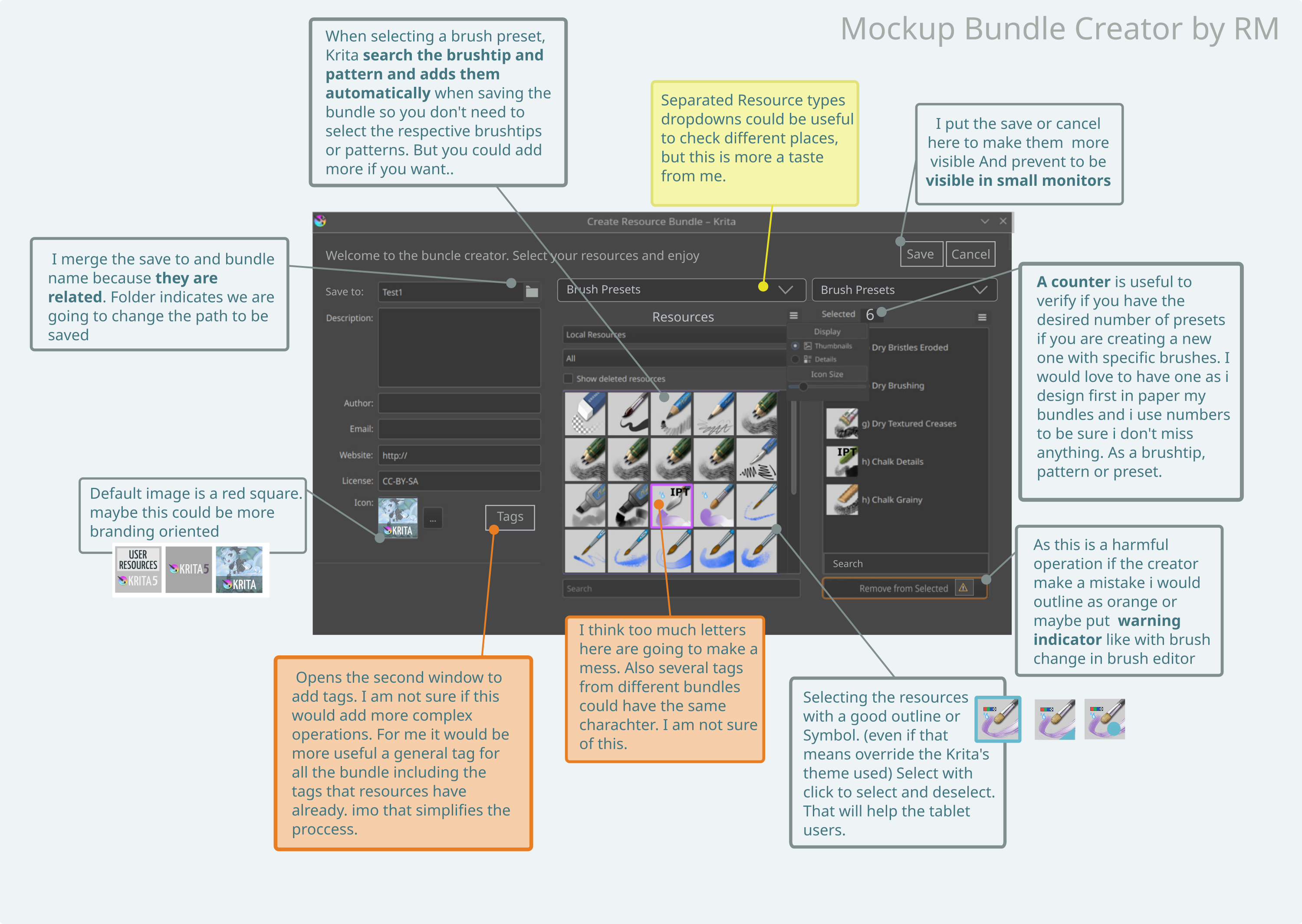
Whether the windows/dialogs are accessed via tabs or forward/back buttons is all the same to me, I am adaptable, but we will hardly get around two dialogs of any kind if we want to have all ideas available in the new editor.

@tachiko’s interjection is also worth considering/should be considered. On the one hand, if you want to add new tags to newly created brushes in the bundle, they should be addable in the bundle editor, hence the second dialog, on the other hand, already existing tags also help when composing bundles from existing resources. Only that we then have to have additionally the search for tags in resources integrated with and that has to be in the selection dialog.


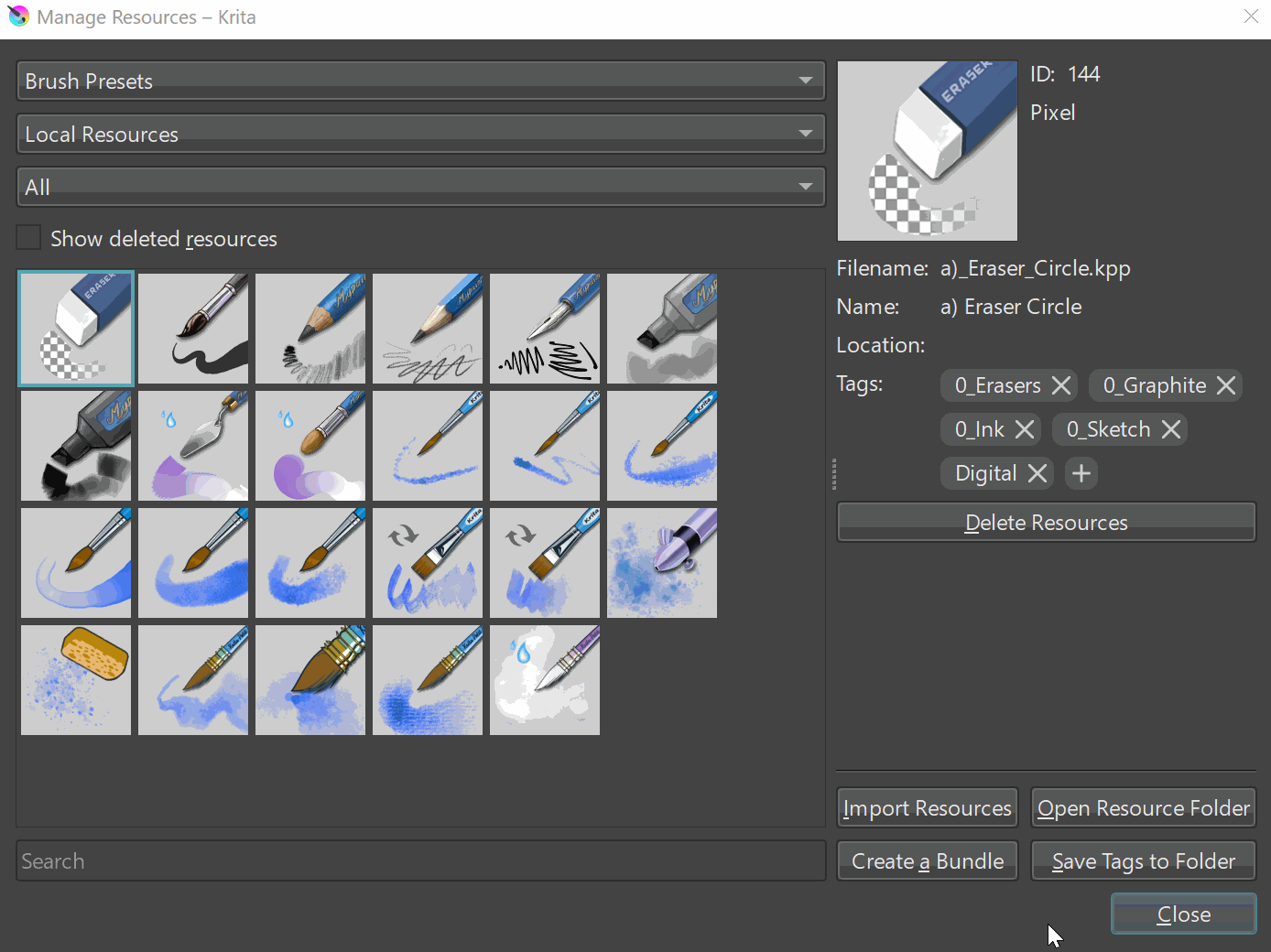
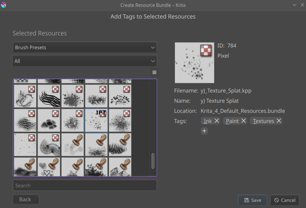
Something from Ramon’s mockup I wanted to address, he asks that adding presets should automatically add the brush tips and the patterns. This is already implemented, but unfortunately with a bug that I have not yet created a report for. The associated brush tips are already added automatically (and it results in a logical error message if you add them yourself as well), and now comes the bug, the patterns should actually be added as well, @tiar says she already implemented it that way, so it "only"™ needs to be fixed by tiar’s code to fully use the convenience of this feature. That means you wouldn’t have to reinvent the wheel, you "just"™ need to find this bug in tiar’s code and fix it.


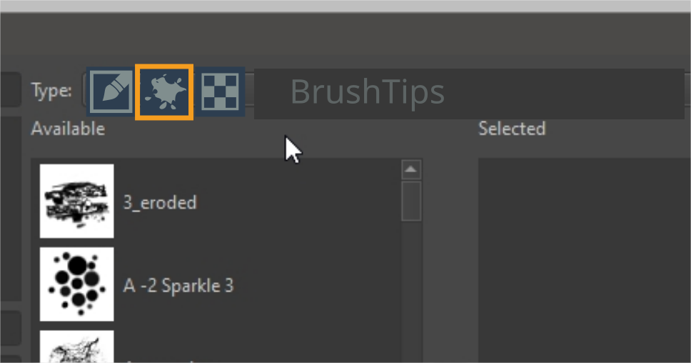
Ramon’s idea with the icons, instead of the drop-down menu, displeases me. Although I create bundles quite often, I do not do it every day, and therefore I would probably have to hover the icon each time to get the tooltip for icons I don’t understand or remember, because I’ve forgotten their meaning, at least I’m faster with the menu. Especially if more resource types should be added to the ones that can be bundled so far.


I would still be happy if in the future layer styles (including the Photoshop layer style libraries in ASL format), color-schemes, input profiles, predefined_image_sizes, preset_icons, symbols and templates could be bundled, and possibly even profiles and sessions. And quite far ahead tasksets, preparing for their possible future usability?

With the templates, it must be considered that to these also patterns can belong. Analogue to presets these should either be added automatically (presumably tiar’s code for adding brush tips and patterns to presets could be used for this, but you have to parse the KRA for the pattern(s)), or users should be told that they have to do this manually (and for the dumbest users to assume, add that the patterns for templates have to be in the “patterns” folder (so automatic would be highly preferred)). So this means, not only the folder structure belonging to the template must be considered, but also possible patterns in the “patterns” folder, referenced in the meta-data of the KRA-File, so templates probably represents the most elaborate resource type (and this is probably a reason why they aren’t a resource that can be bundled right now).

Michelist

Actually I meant something like the wizard like dialogs as pointed out by @Deif_Lou, with Next and Back.

Could you kind of elaborate on this? Like what exactly this idea is about and how is it related to the Bundle Creator? I checked out the link but I couldn’t understand kind of.

This is again something that @tiar can help me with. I am not quite sure why these cannot be bundled. Like if there’s any reason why these were not chosen for bundling.

Also what exactly do you mean by this?

1 Like

I just thought having new ways to customize brushes around the same time as bundle creator improvements get added would be nice. That thread was just showing one way I thought could help with creating interesting brushes.

Like I’d prefer having a mini update to bundle creator that solves the more glaring shortcommings. And then later a final update for the minor enhancements and Qol tweaks.
I’m sure a lot of things mentioned in this thread are nice but so are many feature requests.

The patterns, in case there were patterns used in a template, are referenced in the KRA-File from which the template is made.

Here you can find an example where patterns are referenced in a KRA-File:

It is the “Watercolor Page A5 300DPI” that I’ve fixed and improved, but it was initially made by @Pesi as an additional “goodie” to his superb Watercolor bundle.
In case one would like to make a template out of this paper/bundle-combination and then want’s to put this template into a bundle, you have to read out the referenced patterns and add them to the bundle. And you have to read out every template’s KRA-File, so that you don’t miss if it has patterns referenced.
The description how to install it can be found in the following post by me:

By the way, in the course of that topic, Pesi bemoaned that templates couldn’t be bundled currently. :wink:

In case of further questions, don’t hesitate to ask me, I’ll try to answer them as good as possible. I tend to miss (something) some things sometimes.

Michelist

And now it is time to sleep, it is 6am, ouch!

Add/Edit: Download link renewed