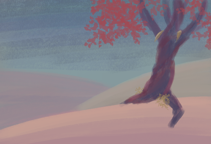
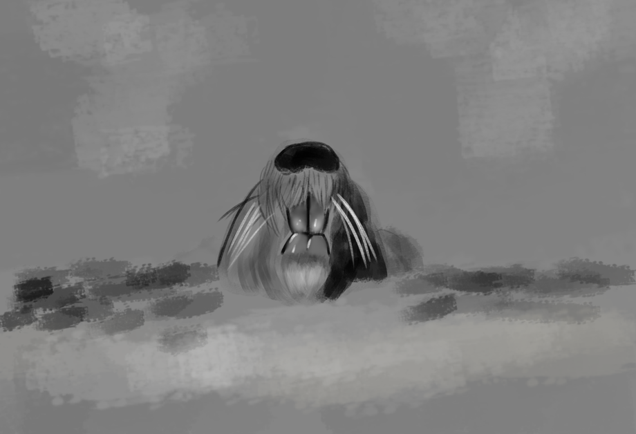
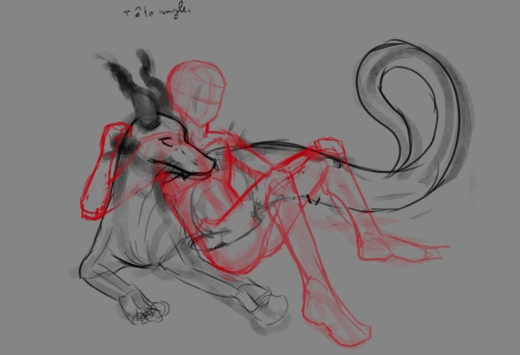
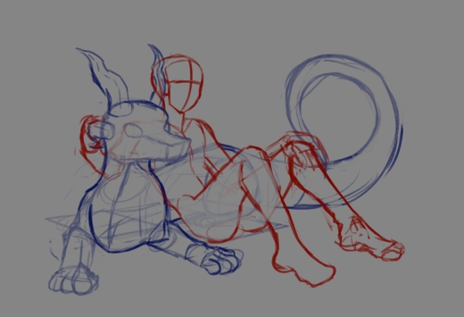
Looks like a great scene. Can’t wait to see it finished.
1 Like
Thanks ^^.
1 Like
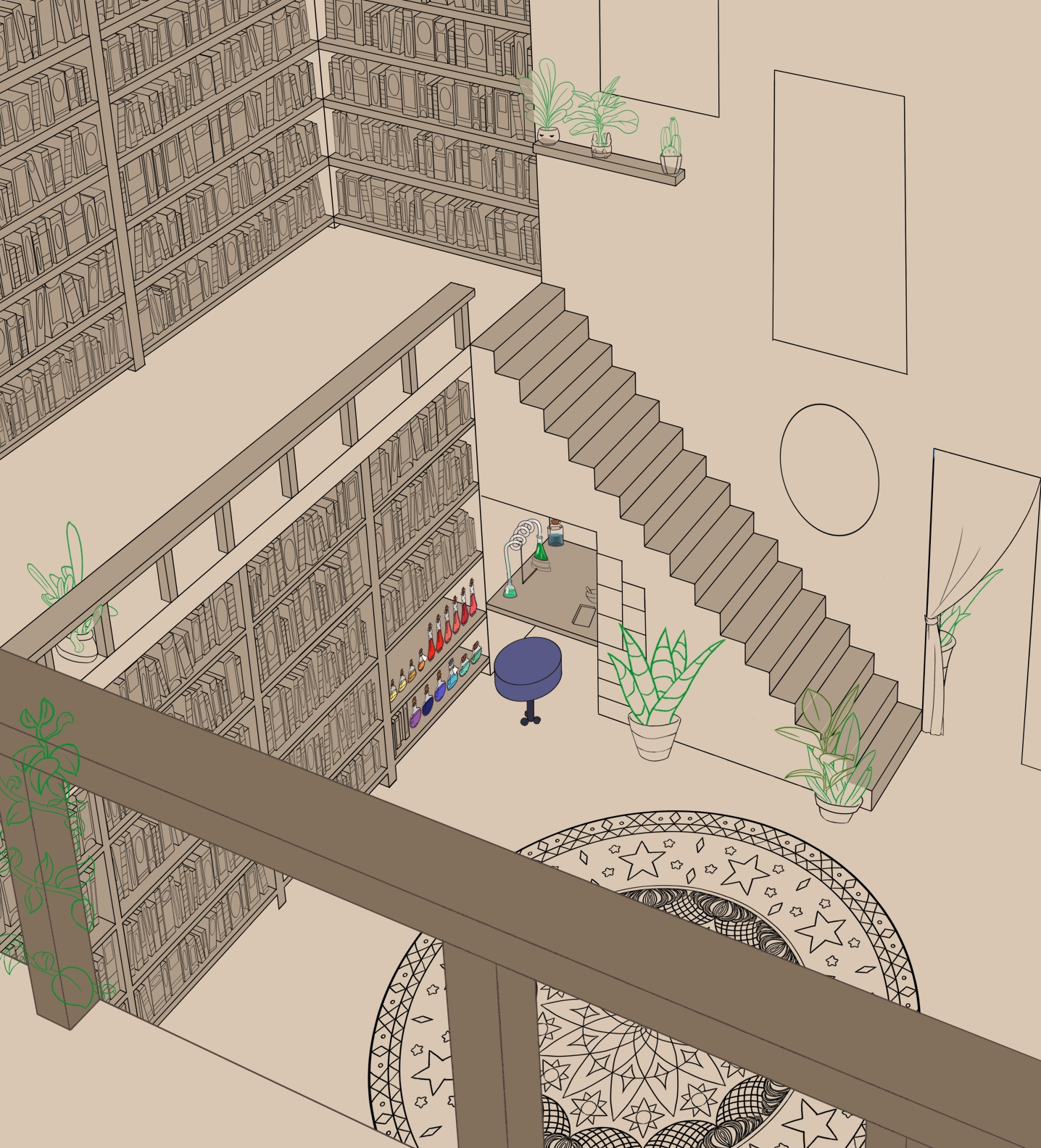
Wednesday was hard, waking up with my leg hurting but I was busy running all morning (didn’t have much of a choice, public transport are… nearly non-existent so we make do with what little we have) and making resume all afternon wasn’t that much relaxing. Well I did take a pause but of course it’s not enought by the end of the day I was feling pretty sick and the day after… walking hurted even more.
So I’m pretty much disliking the staircase for the time being, guess its carpet will wait until I feel better. The good point is this week-end shouldn’t be too hot.
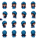
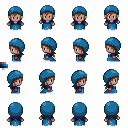
The comic bunddle helped me save time.
5 Likes
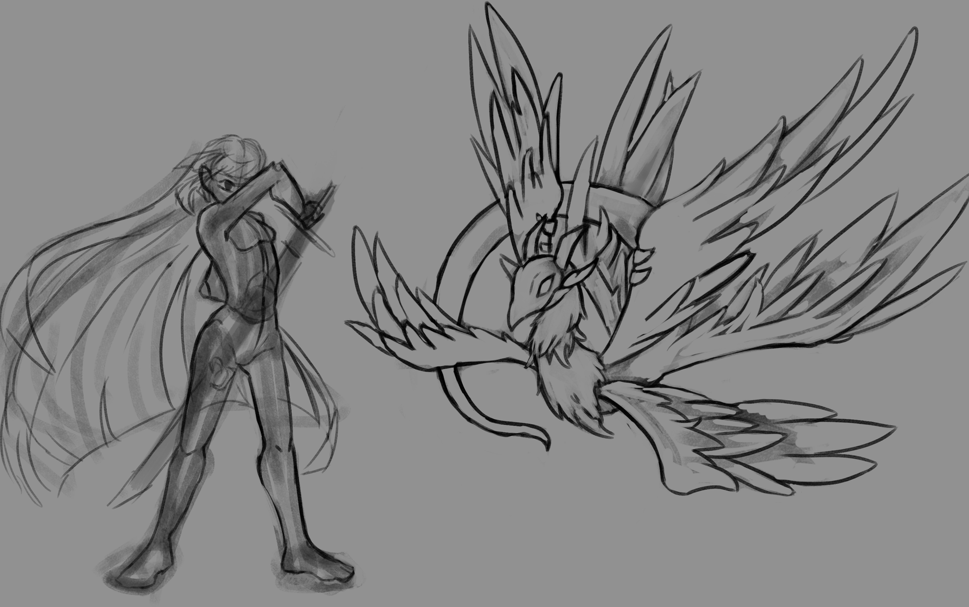
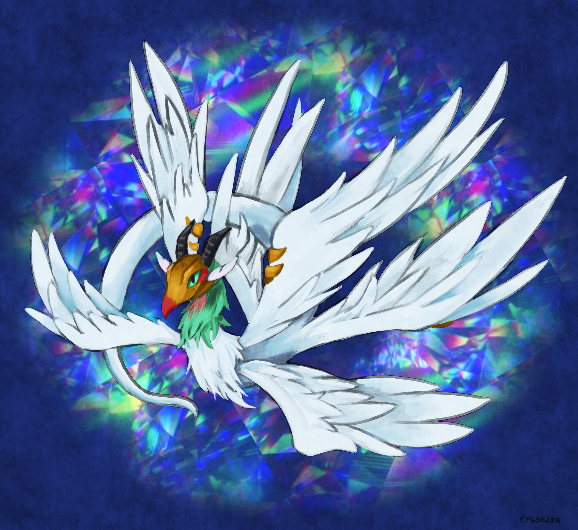
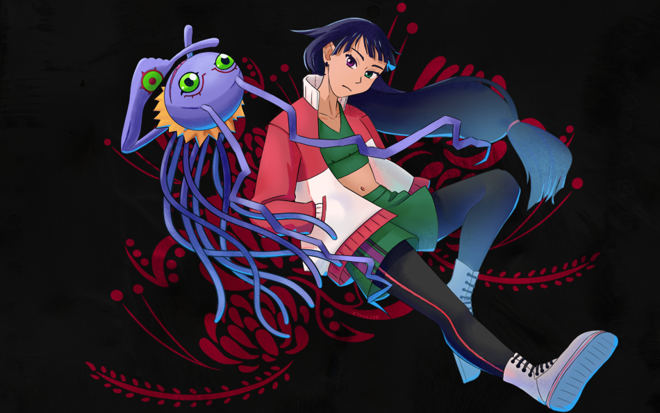
I did run away when doing the flat color, wich ended up with a sketch of one of my favorite digimon.
4 Likes
Great color choices, it really pops.
1 Like
So very pretty 
1 Like
Hey very nice drawings WIP, and I am sure you can find the solution for your drawing problems.
I also have hard times trying to figure out the right color for my own piece a bit similar situation to yours I think.
Not sure if this will give you some idea, but currently I am analyzing multiple artworks from several artists and only focus on their color choice, where they put those, and for what purpose. I know some color theory but I am still not in a place where I am confident with my choices for color. If you feel the same, maybe doing artist/master study can give you some idea how to approach about doing your drawings.
Also may I draw Bernard and his Bunny friend? If I post the result I’ll link it to you.
1 Like
Sorry for the late reply.
@dragonscales @AnotherArtist Thanks ^^.
@ynr_nohara Color theory is a bit of a strugle, sure I can recite some rules without problem but I felt that I don’t really understand them. Yeah confidence aren’t exactly here and at the same time I don’t really think about it (most of the time). That may be a good idea.
Yeah no problem, feel free ^^.
1 Like
Not sure this will help since people study differently, but the way I remember and know what color and light theory is for what occasion is remembering it like how it represented in Video game graphic setting. That way I can actually see when I turn it off and on in the game, the effect is obvious and visible in a more clear way.
For example:
- Base color == local color
- Shadow setting in game is type of shade in general (core shadow, form shadow, halftone, highlight,reflected light).
- Ambient Occlusion == occlusion shadows, “cramped place is darker” logic.
- SubSurface Scatter == called SSS too in visual art, happen when light half penetrate and object and bounce inside and make it glow, applying it is just putting lighter value gradation and higher saturation in affected area (subtle glow effect).
- Ray trace == is how reflected light’s hue is affected by environment, need to imagine the light bounce and the material where it bounce from
- Color grading == this is the artsy fartsy stuff (I always think of the yellow tint filter in Breaking Bad that happen in Mexico scene, or Orange tint filter in Fallout New Vegas). More about the “feel/vibes” not about how something suppose to actually look.
There are other things that affect how I choose color in a more creative way, but I think every artist has to have firm foundation on how he/she make decision. But I also think the most important thing to do is not trying to remember these things like grocery list, instead to practice of adding them one by one and over and over in various artwork you do until it’s natural to spot if you miss a variable.
I don’t have teacher nor I went to artschool, so I get confused a lot because I hear all the different opinion people have on internet. So I thought to myself what is the consistent thing I see about visual art… video game graphic settings. Will this work for everyone else when learning?? probably not, but having firm foundation where you based your decision making is important. Wether from artbooks, art teacher, art youtuber, those tutorial slides from pinterest, or trying to copy the style of your favorite artist, don’t matter, just need to be consistent in the way you make decision and in your practice.
Sorry for the long paragraphs, this is most likely for me too. I have no teacher, barely anyone to talk to (my own fault), so I have to keep reminding myself that there is a way.
1 Like
No worry it’s interesting to read and yeah sometime it help understand to make it in word (it sound a bit strange in english, hope the meaning come across well). Morevover I didn’t think about looking in the video-game direction, even if after you mention it look like a pretty obvious direction, I did think about films and illustration but not game.
Don’t the color material matter for for ambient occlusion ? With light absorbtion and all, that’s when I realize that I should be more serious about my physique lesson. If it’s white it don’t really get somber. It’s the kind of case where any exemple I think of are either pure realism based or color grading dominant (memory is a strange thing).
1 Like
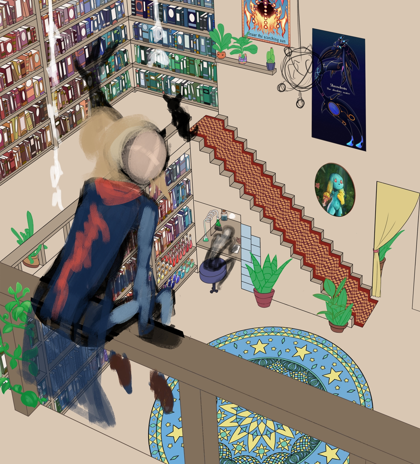
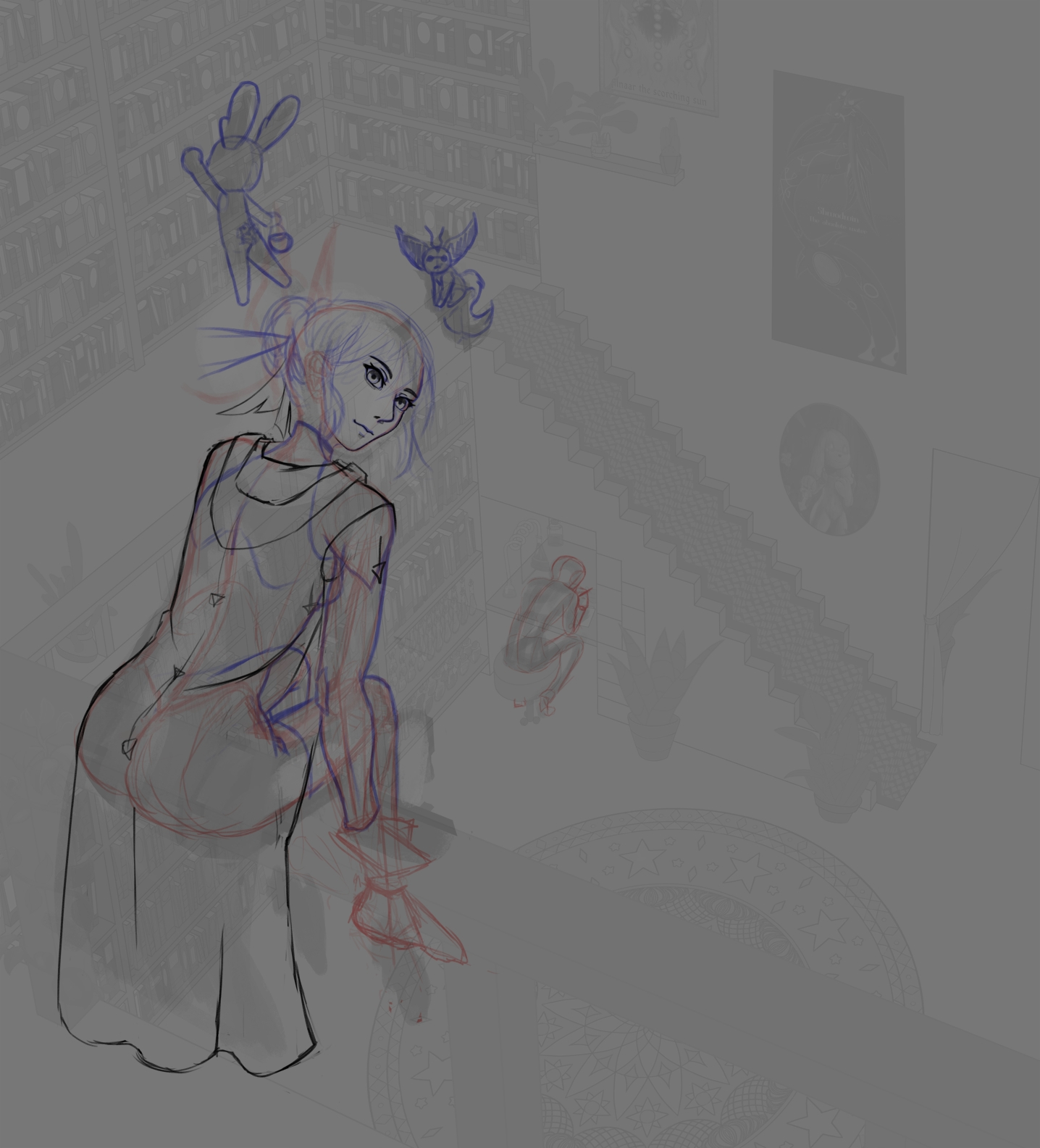
Finaly done with book color. I separed it in two krita file to keep the size not to heavy. I feel like it’s becomin more of a wipbook than a sketch book, oh fine.
3 Likes

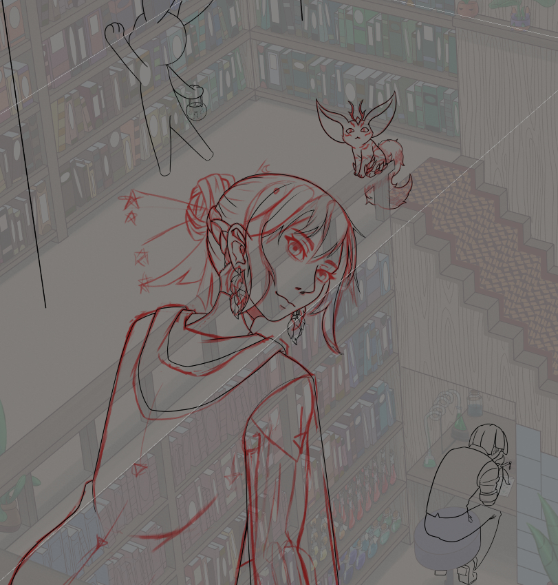
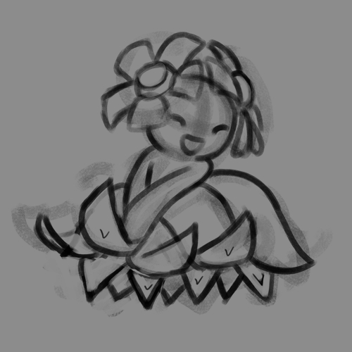
Line in progress, except the face need some correction. And I need to choose a flower for the tail… choosing flower is hard.
2 Likes
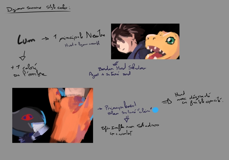
Study how digimon’s artwork color look, of course my notes are a mess XD. I ended up divising the thing in two part, but the way they make the first/neutral shadow light deserve it’s own analyse. For the second, well blue isn’t the only color used for accent, they use pink in Miu even if more discretly, but nore really the same way.
I wanted to test how their blue light in shadow but was to lazy to make something, so I just taken an old thing and aplied it fast.
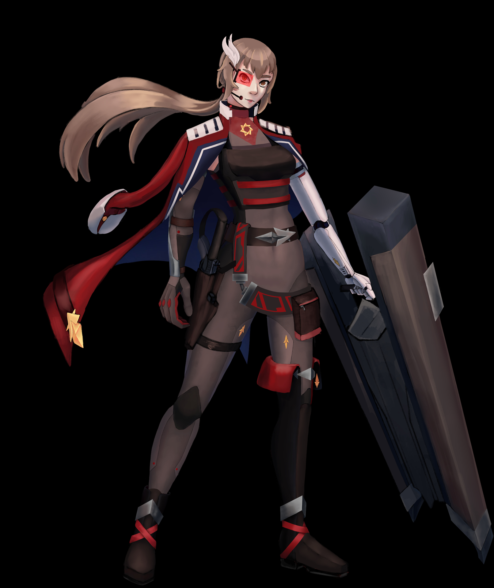
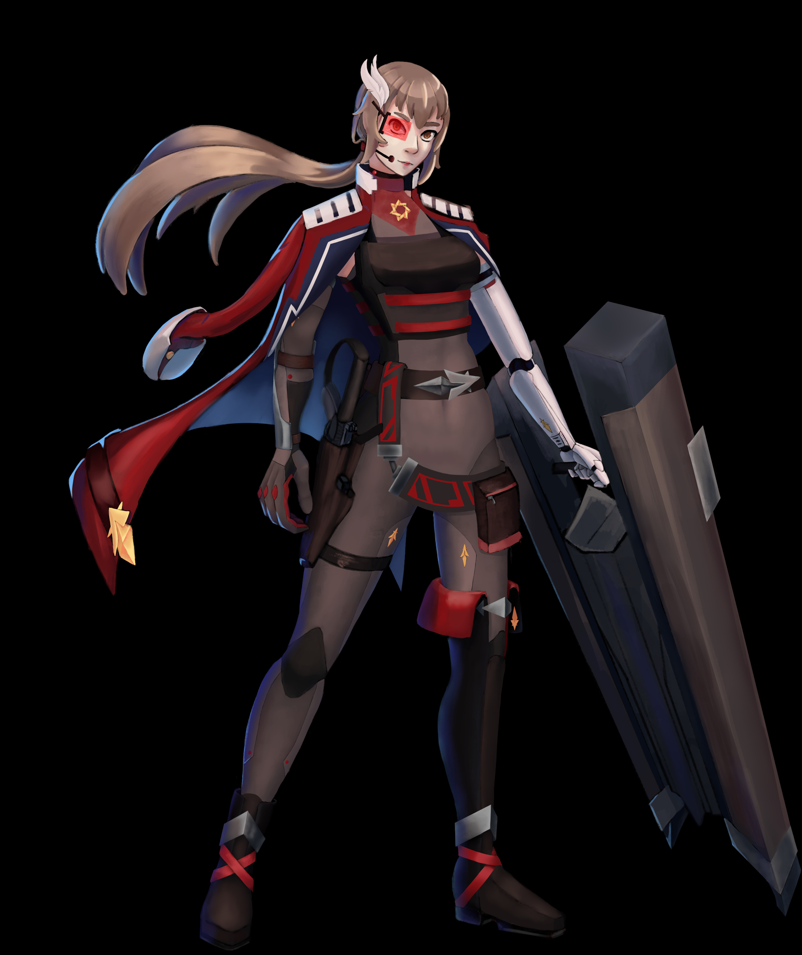
And yeah pretty good way to make thing pop more and make them easier to read. And blue work for anything.
5 Likes
Sorry I wrote a bunch of nonsense stuff again. What I am trying to say, maybe if you put a background color it will help in determining the shading for the other part of the object. Marco Bucci on youtube explain about light bounce, where the environment actually drag the local color of the object to other hue position. Both Guweiz and mr Gurney also explain the same stuff. I think the best example how it is done is samdoesart videos. I don’t remember the exact videos, but I remember it’s a drawing of a girl on a beach. In the video I think sam said the reason why he always draw the background first, because it helps determine that hue shift mr Bucci explained.
Even if the background is just flat color, it still affects how you perceive your shading. Like the current black one, make some lighter color pop more but killed the already dark color. Sorry if this doesn’t help much, having hard time writing this without making myself confused.
1 Like
Ha that, yeah I see. No need to excuse that’s can be quite hard to explain and you dit pretty well, making the background first (even just flat) for adjusting the color make sense. And givin the name for reference does help, not just me but if someone else read that’s giving another way to understand. So what I mean is thanks.
Not sure in wich year physics explain absorbtion, refraction and else, pretty easy to understand the theory but when it come to appply it… well that’s a bit of something else. I’m honnestly to lazy to search my old physic note and to calculate it, but when in a pinch going this “hard way” could help huh.
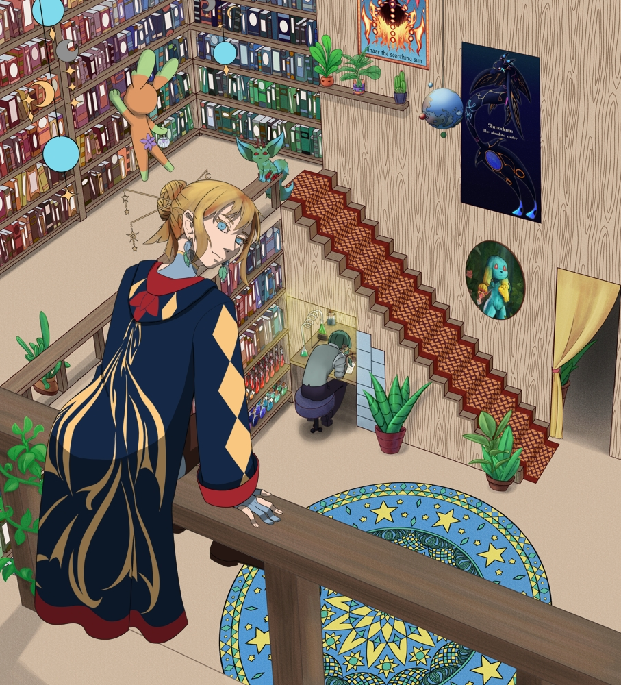
Base color done, time to try apply the whole shadow and ambiance light thing… not the easier but I need to finish this one. Really.
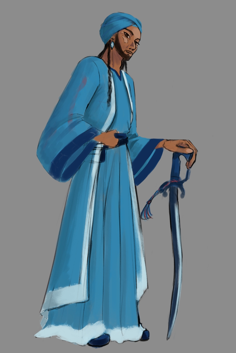
Plus one sketch.
5 Likes