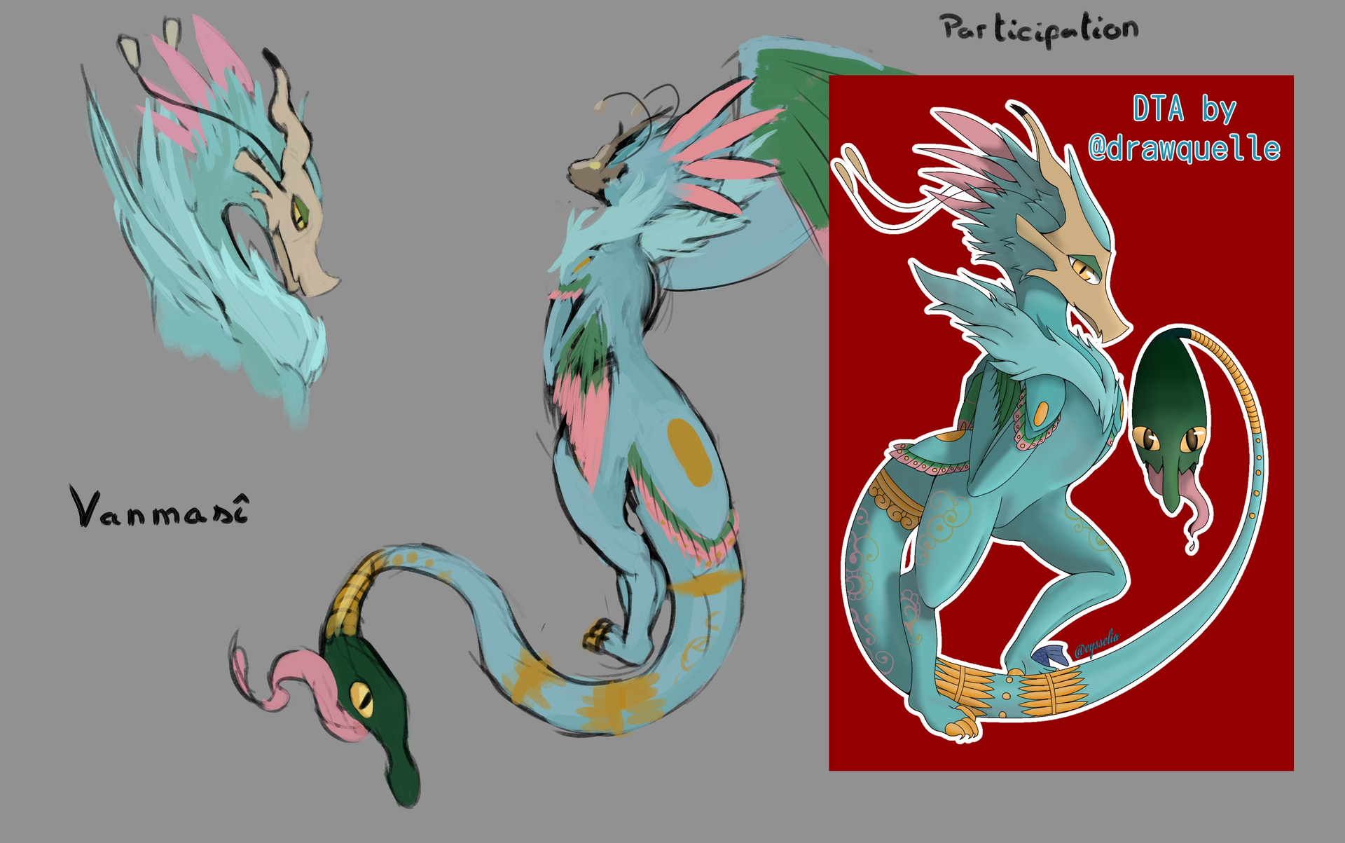
The images were AI generated, that’s why the user was removed, in case you were wondering why they’re gone. The user posted several images, on other peoples topics too, using AI to change the artist’s original works into slop.
@UrLocalCapybaraBean Thanks ^^.
@Takiro Thanks for the explanation and all work done for the forum ^^.
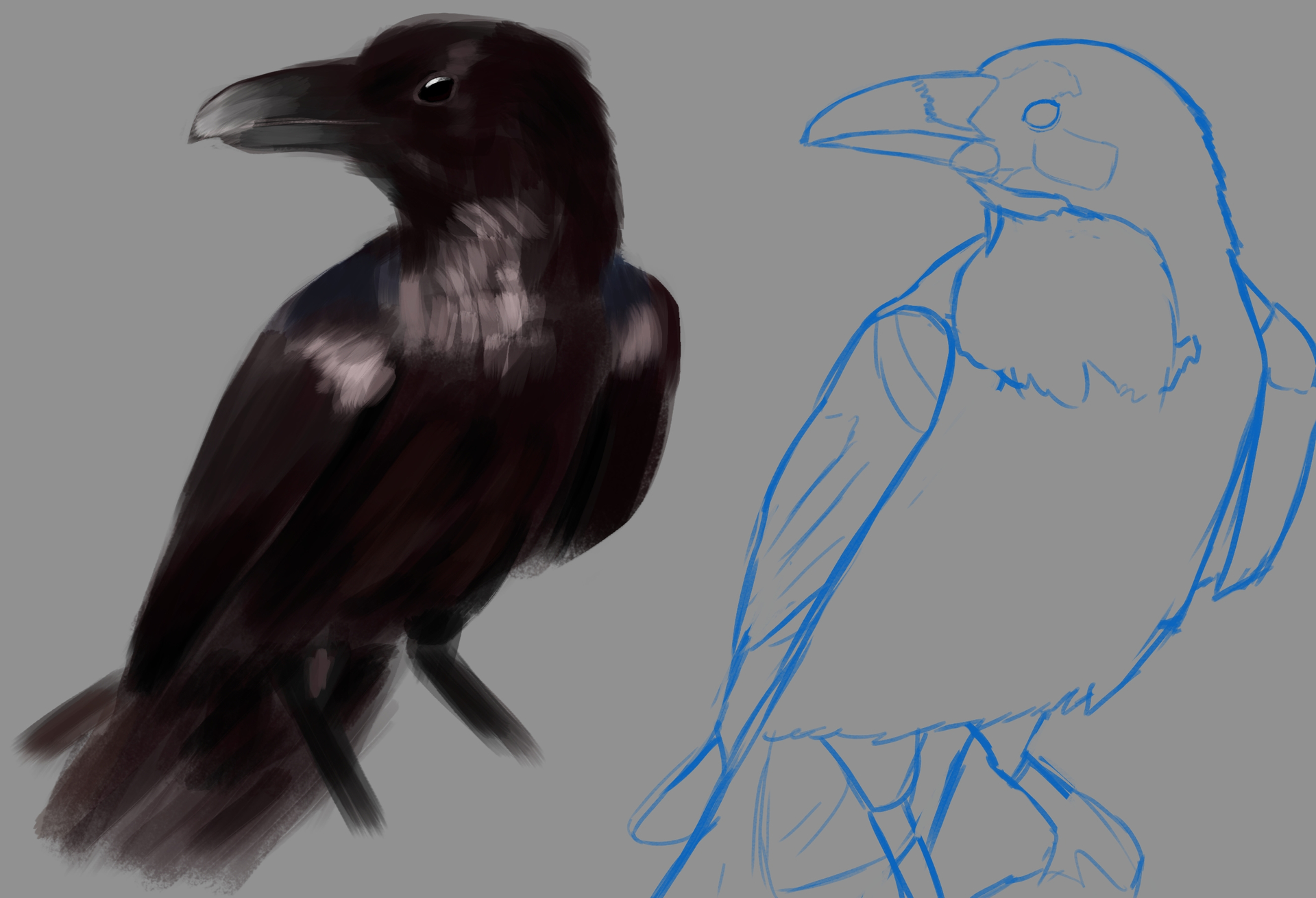
Checked the date and realized that I better study birds asap if I want to make it in time and with a proper painting. Birthday gift shouldn’t be late.
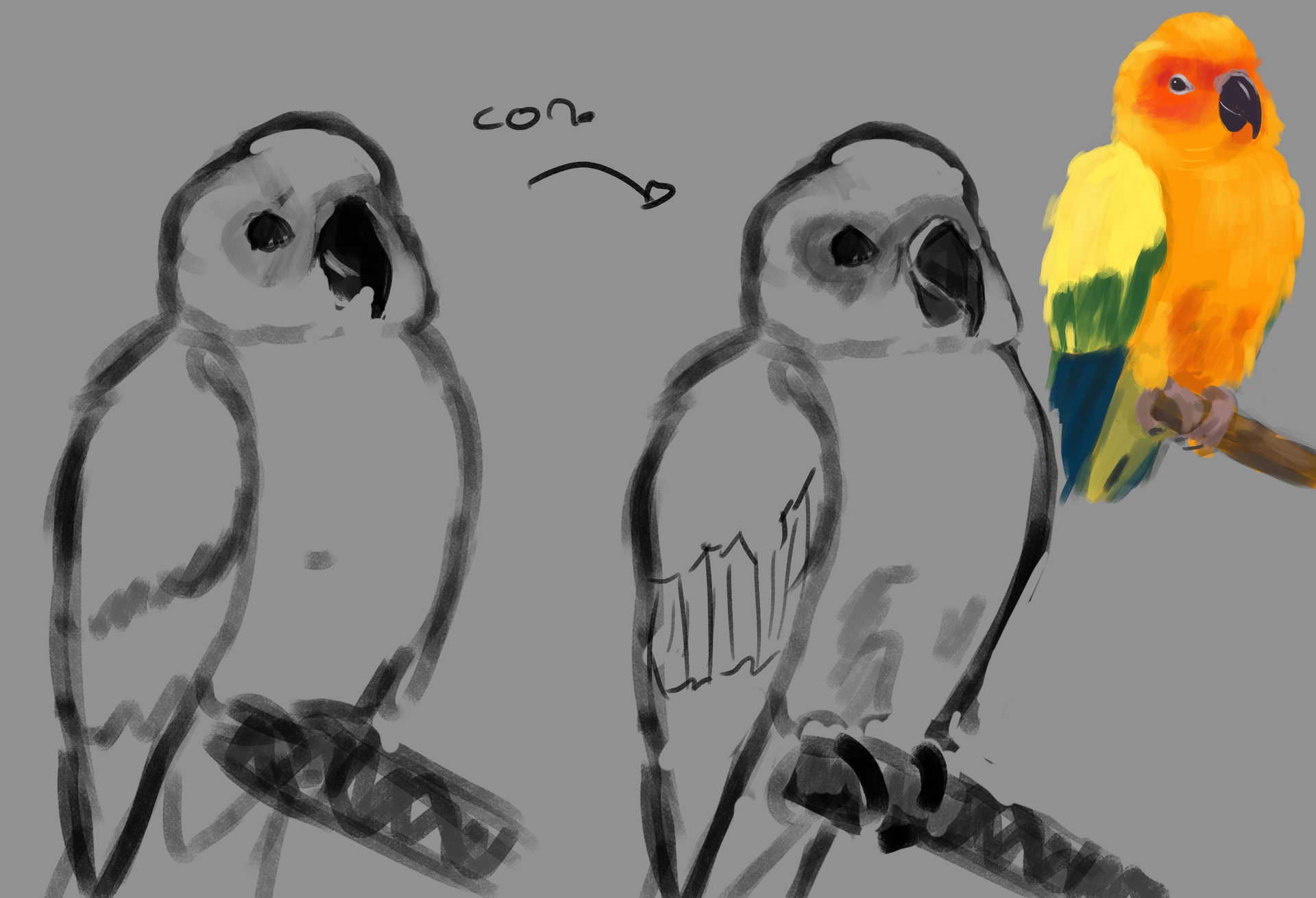
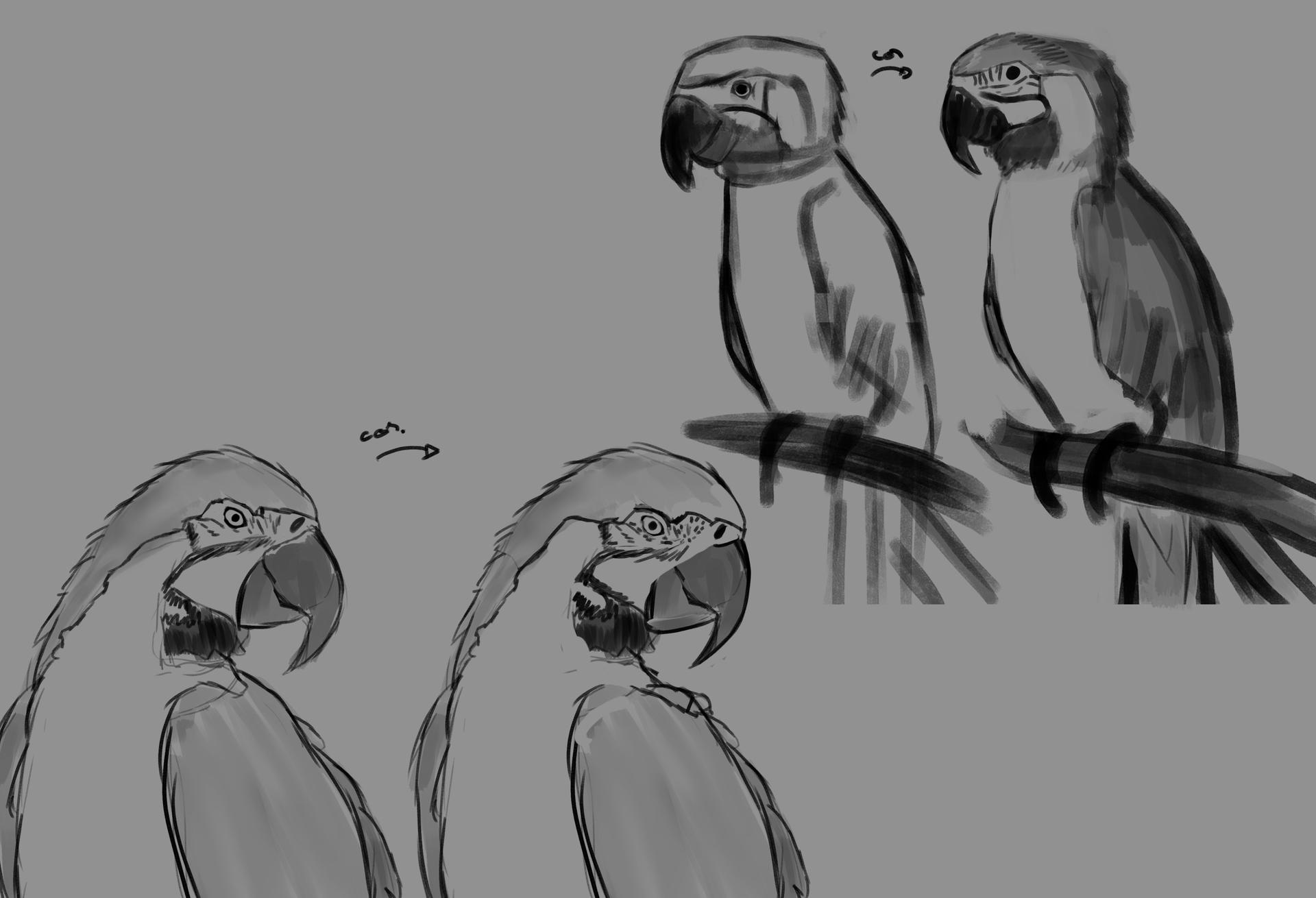
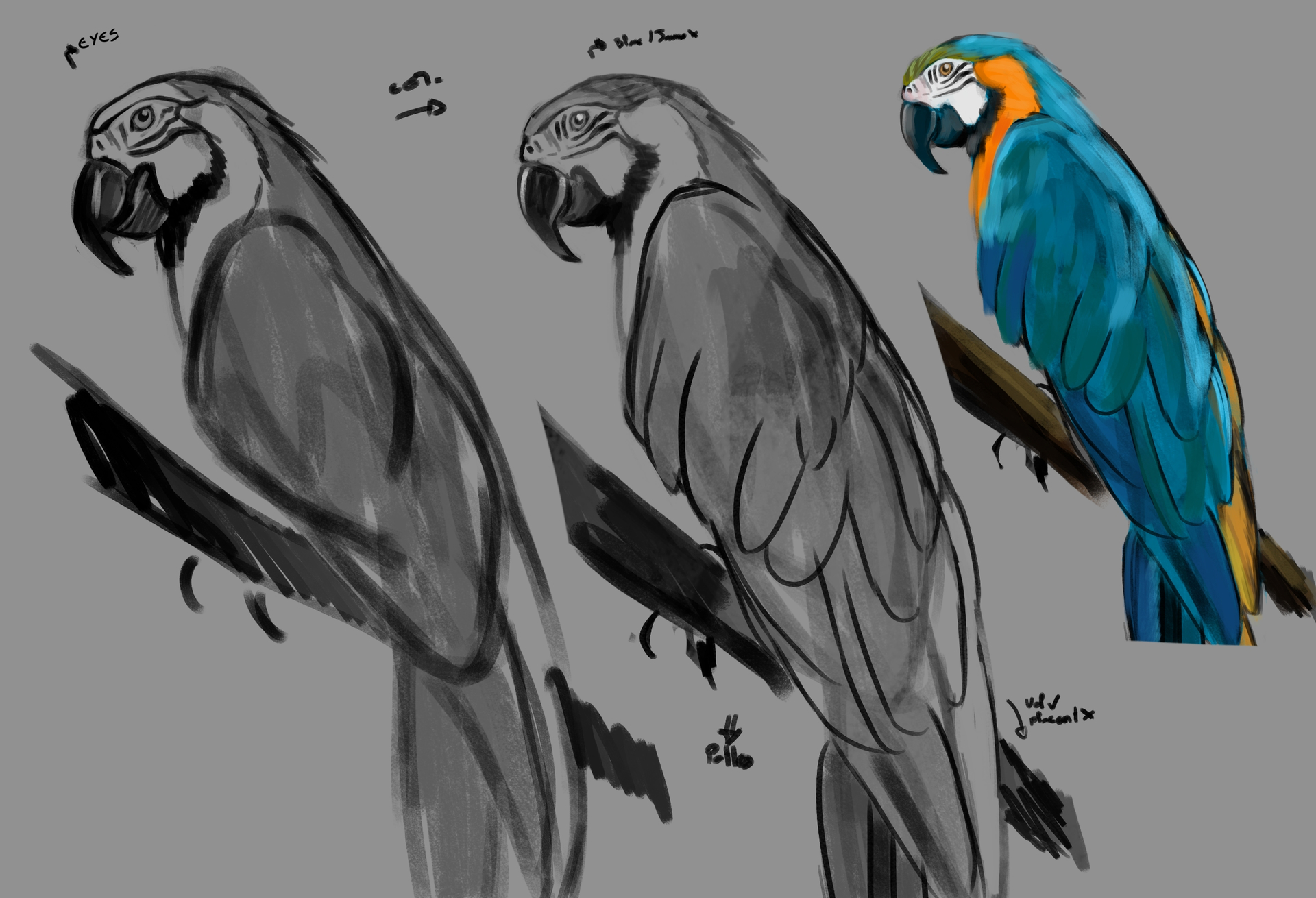
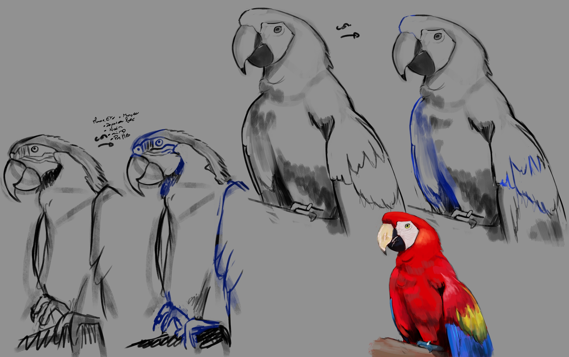
So first see the errors that tend to come back with a little exercice : sketch reproduction on the left, and the correction on the right (I find it easier to spot anatomy error with tracing than just with the reference).
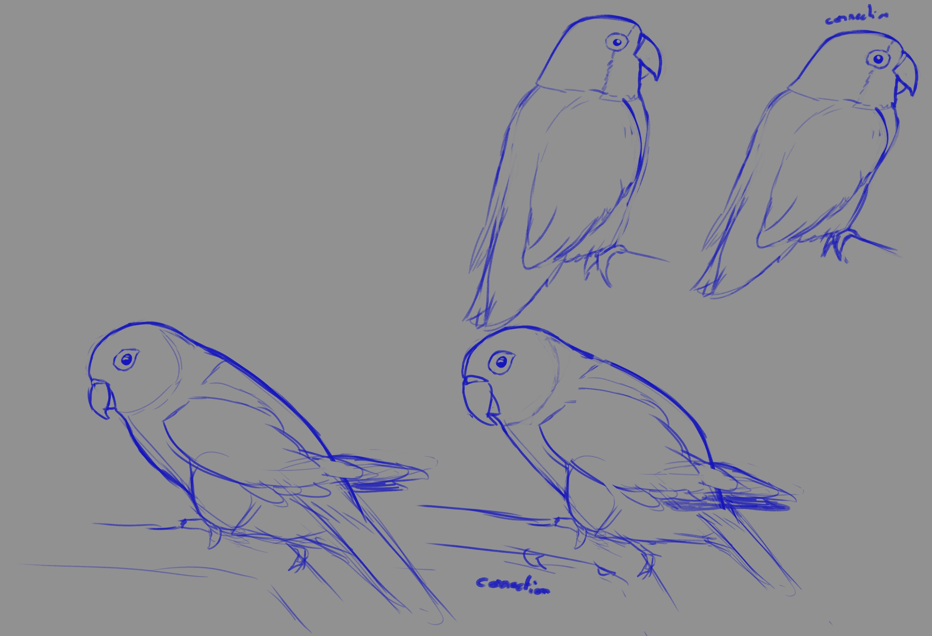
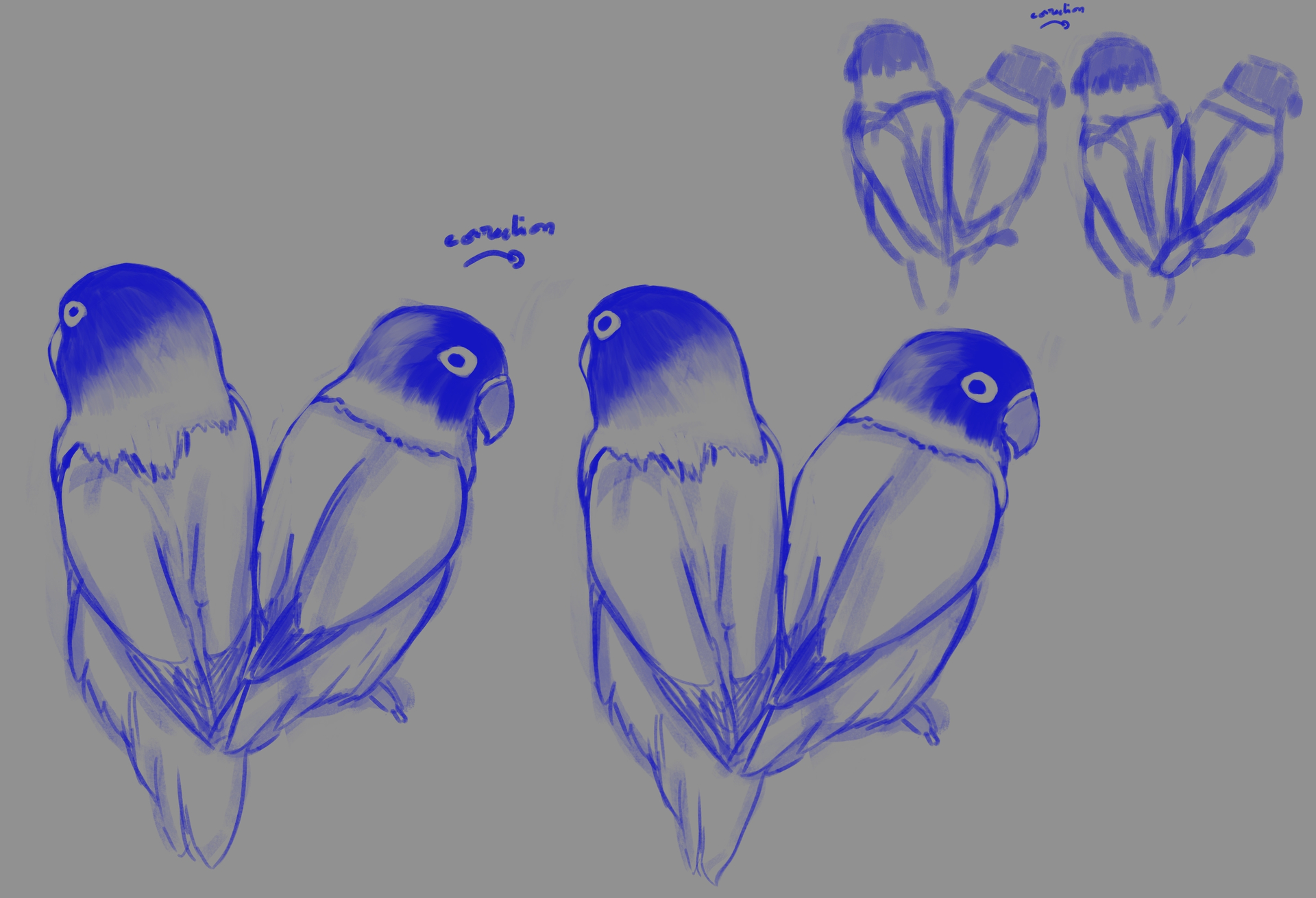
Conclusion : The eye placement is always off, they are often too slim and the beak’s parrot (well lovebird here) is off, too small or not round enought.
Now go to practice, at least I know what to be carefull.
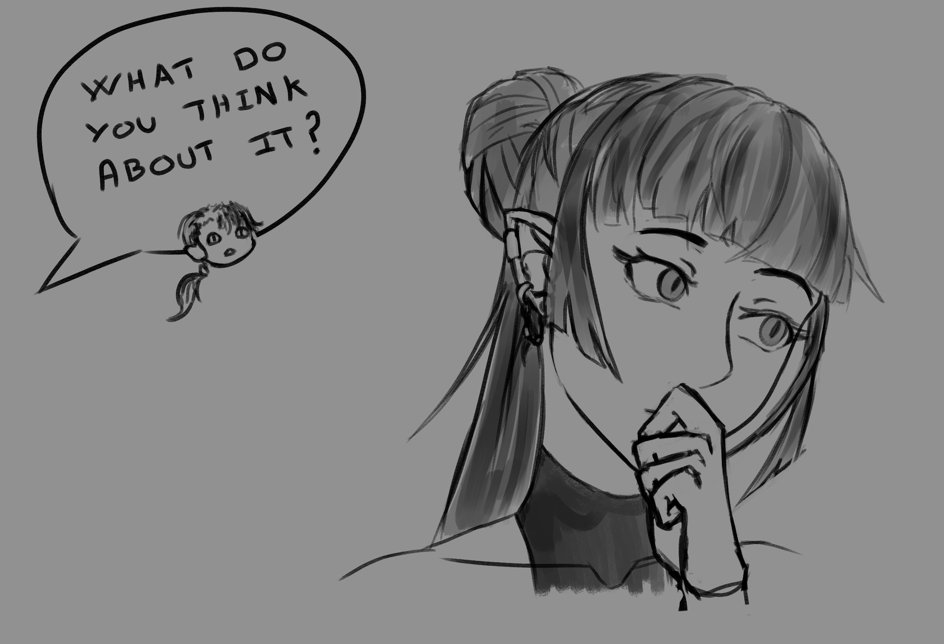
Even if bird will be the priority for a while I taken a bit of time to sketch one of the rejected idea I had for the krita challenge.
Beware of the bad idea.
6 Likes
7 Likes
Bird report advencement : Making detailled feather are hard, but it was more of a difficulty with traditional art since I have some bad habit with watercolor. Well that was a nice change and the final product did satisfy the person.
On another note I didn’t abandon krita totally :
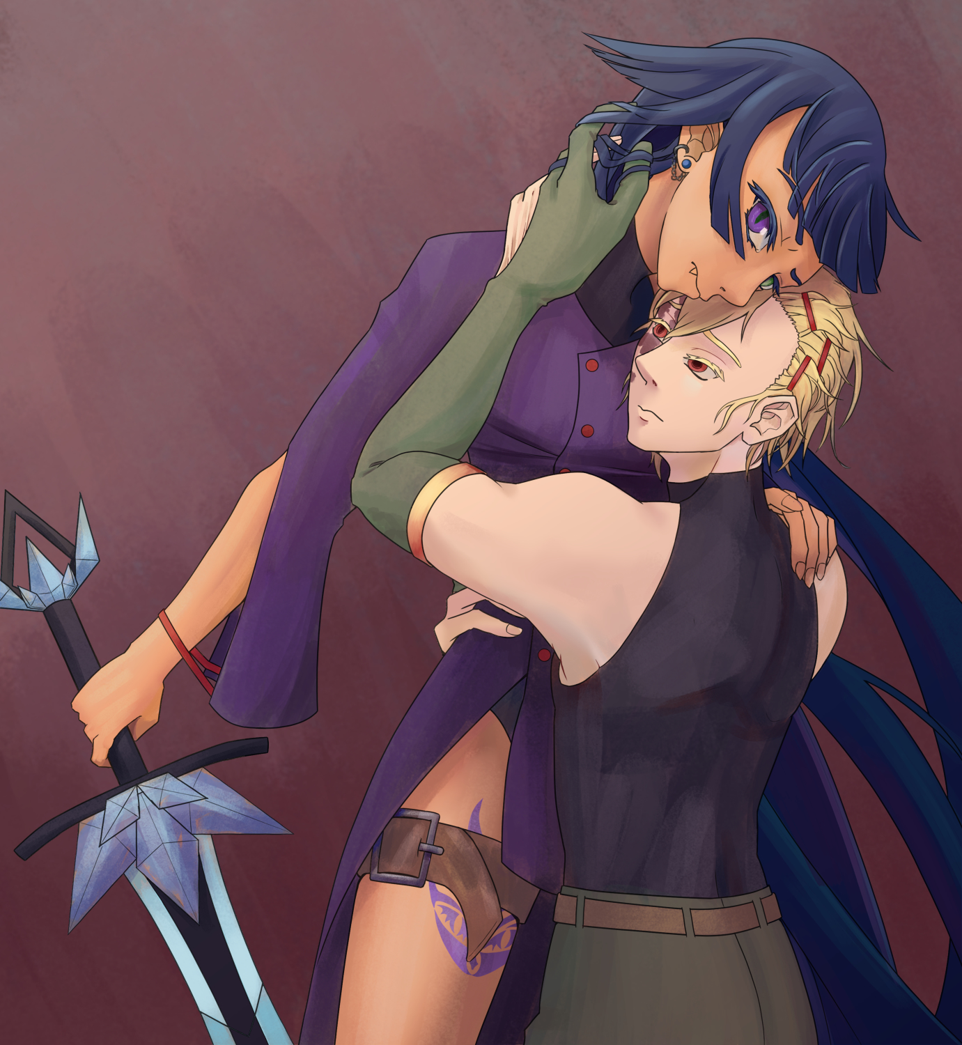
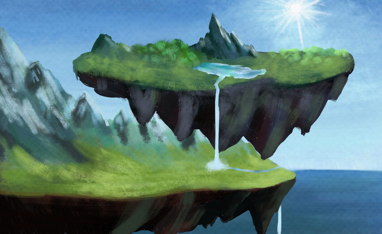
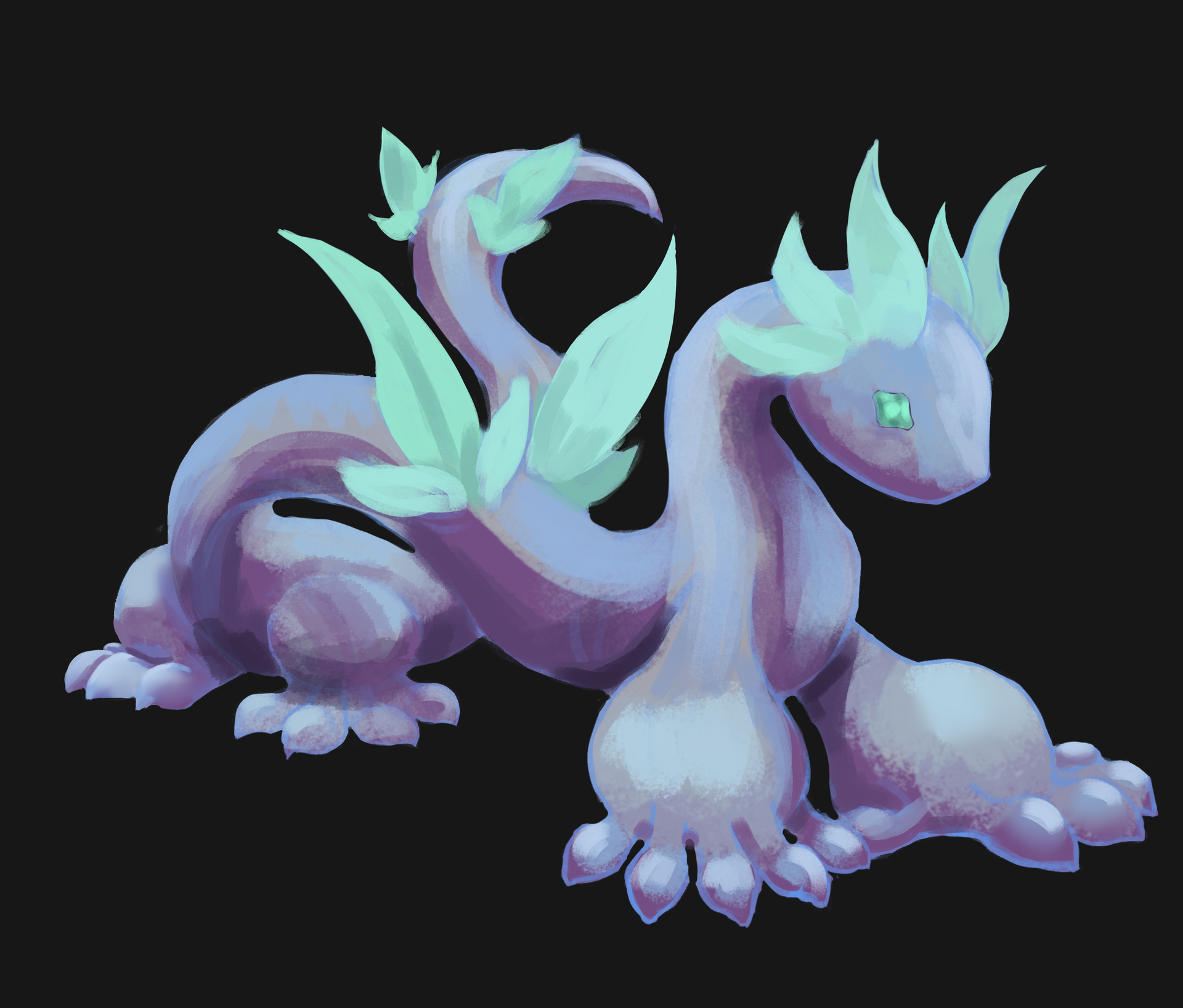
And now I will go make a propre illustration… or try if I can decid on the clothes.
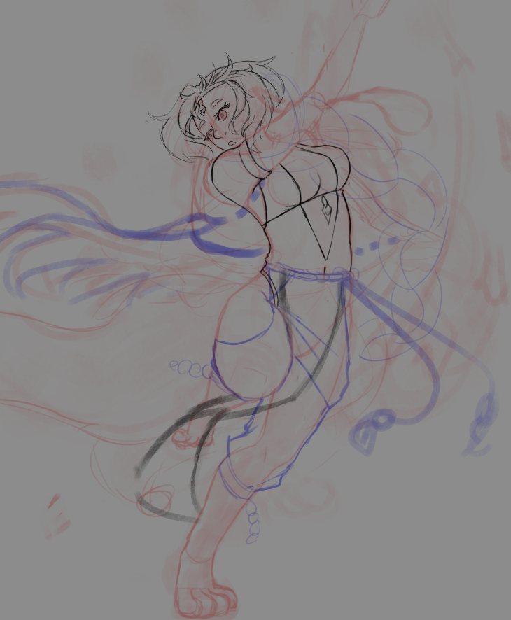
3 Likes
Reference unsplash : chuttersnap
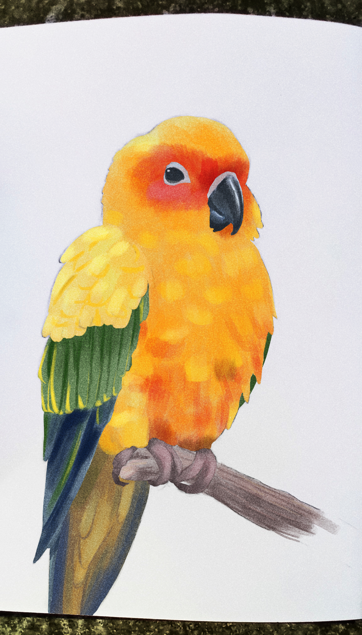
I did a clean draft on paper, the feather were alright, and added the color on krita. I’m pretty sure that’s not how you color a line made traditionnaly, but the result are fine.
7 Likes
She looks fluffy and content with her perch.
1 Like
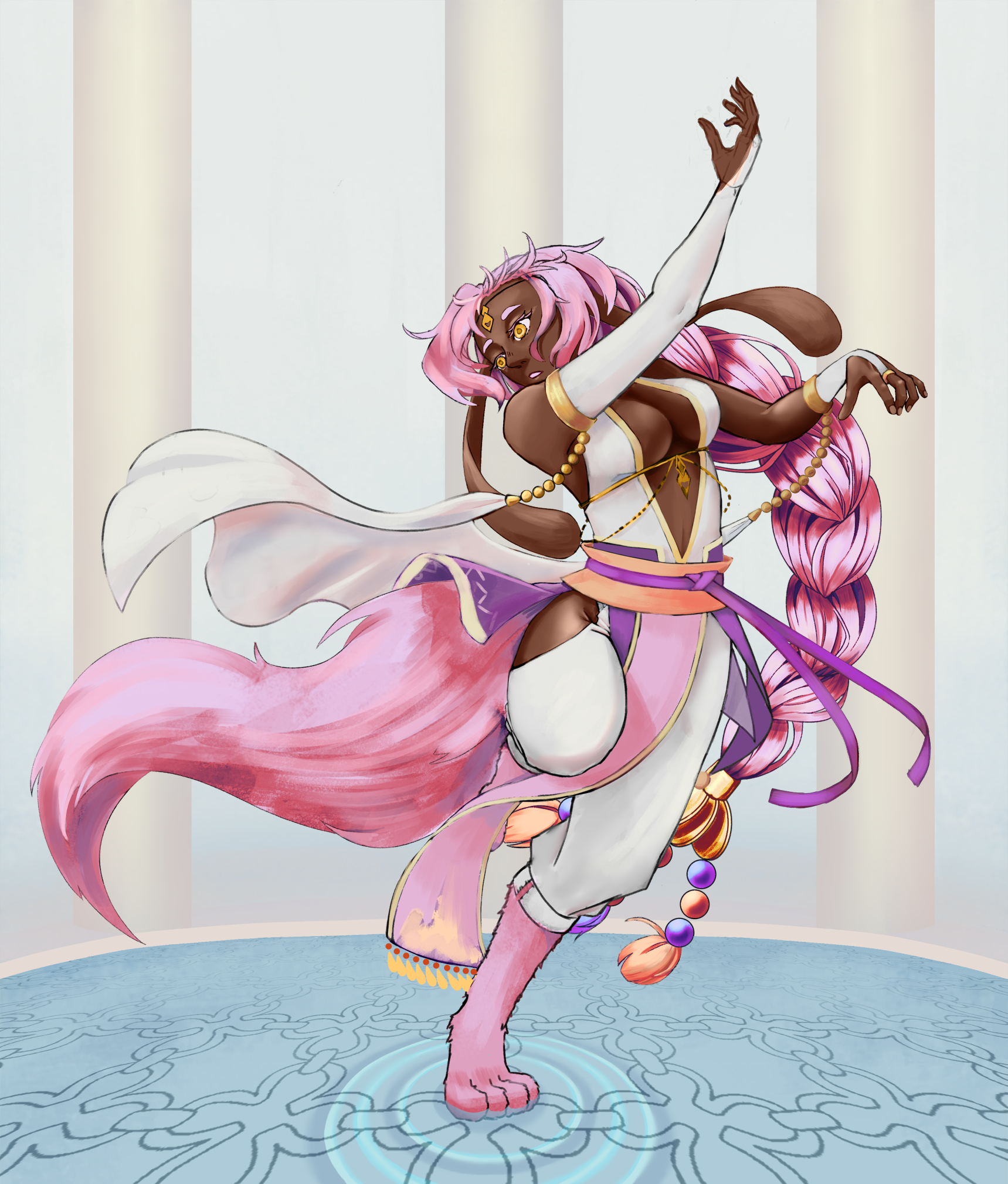
Working without a separate line layer tend to be hard for me, it’s easier when done that way with a lafloe… as strange as is it. So I pause the cleaning for Lotus and did the base for something else with a lafloe.
4 Likes
I like the final result, but when I look at the other piece I just finished and specially when I compare the time passed on it, it’s a bit disapoiting.
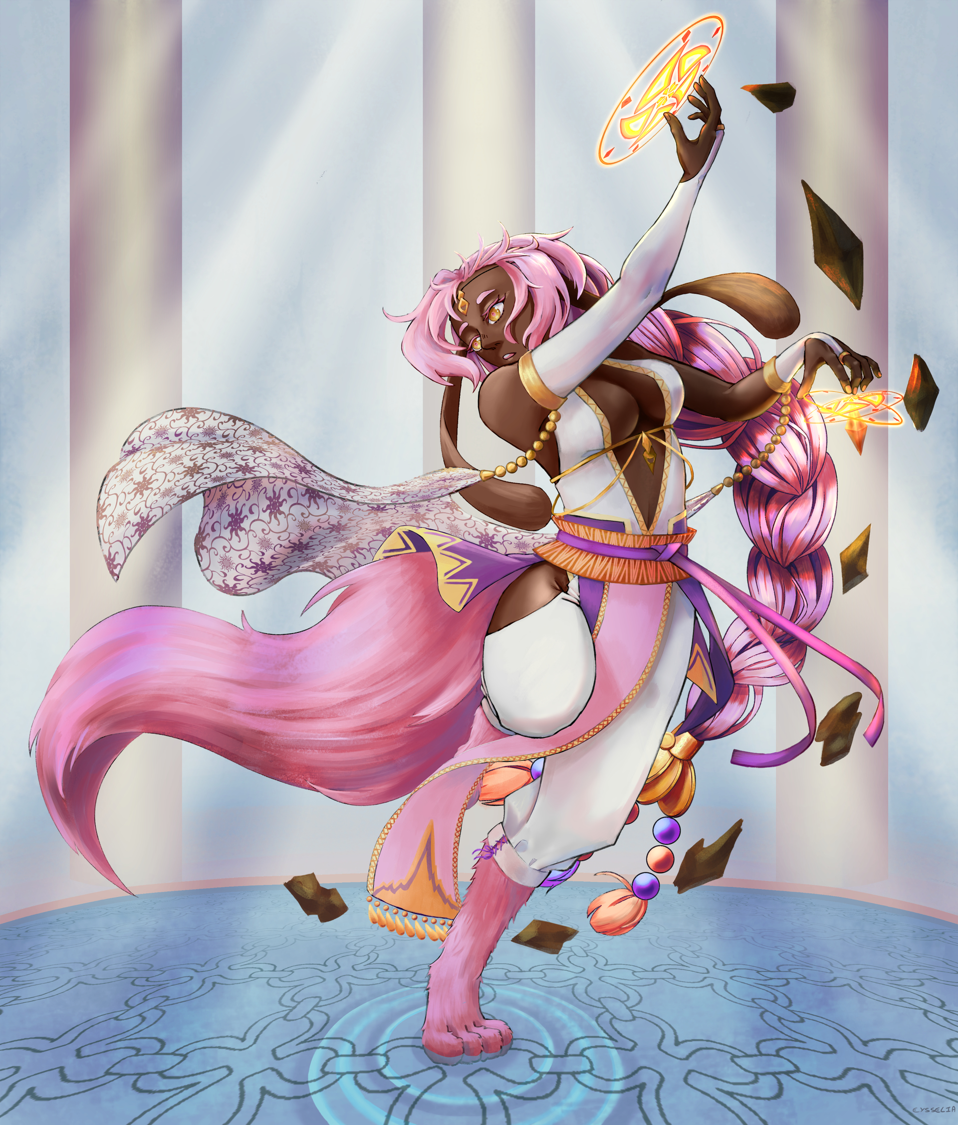
What I learned :
- Lotus’s eyes are difficult to make contrast in.
- Merging the “line” layer (or what play this role) with the base layer can’t be done to fast or it will make thing harder.
- The distoting tool for pattern : More point can be better, but it’s taking more time to make sur they’re good, it’s also faster than redrawing manually the whole pattern.
- Did I slim Lotus too much ?
- Clean draft/line are also better for painting over.
4 Likes
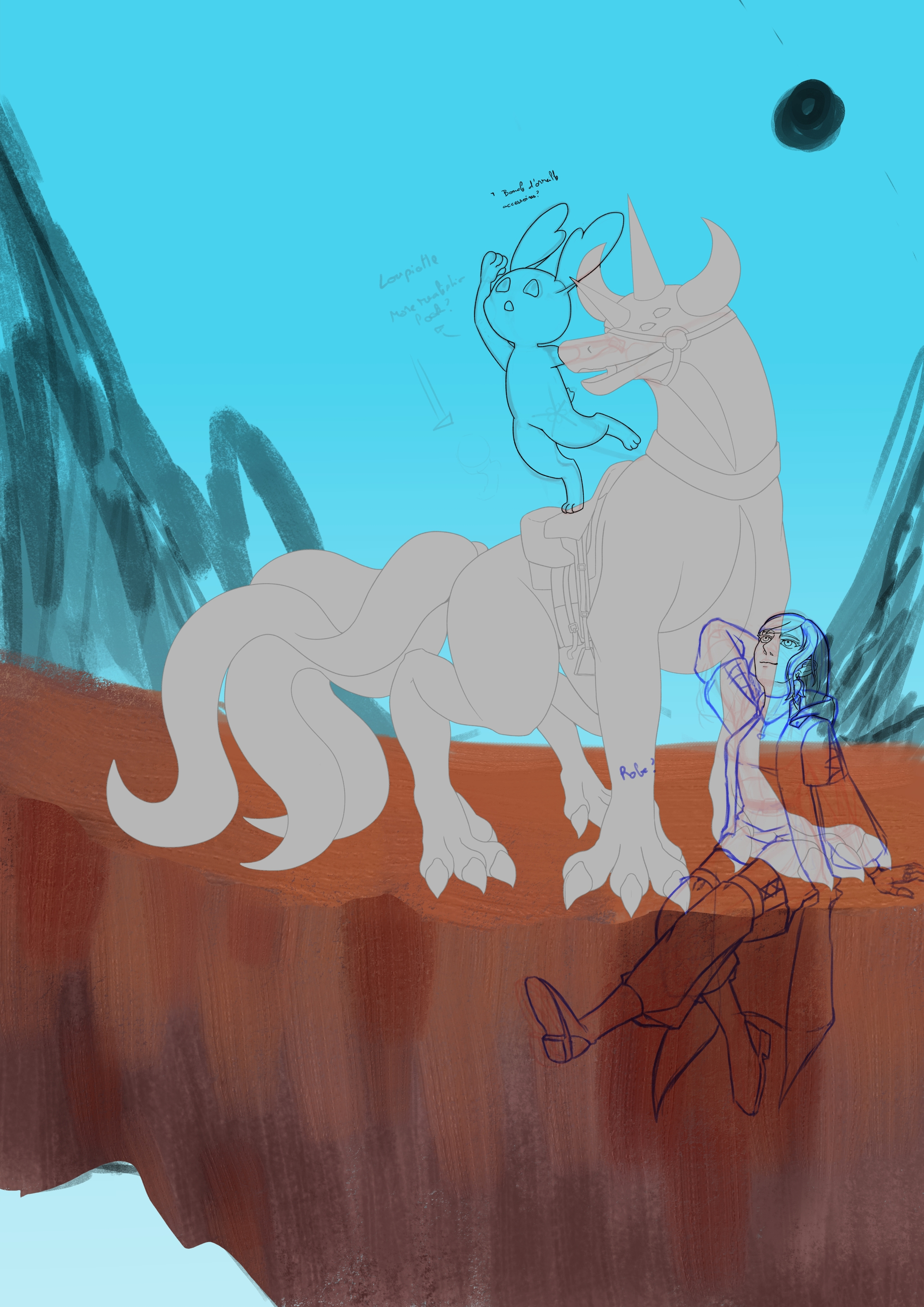
Let’s try to apply what I learned from the two last illustration and drawing facial muscle.
For the latter it helped with the nose even if I’m not sure I undestand the levator one, procerus and corrugateur are fine it’s easy to see how they work.
And for the former. I’m making a clean sketch/line and will need to be sure to not mrge it to fast. I realized that I will also need to find and aply a way to make color not clash with each other. When a background is used I struggled even more with warm tone and warm tone with some green or blue used for clothes and the like.
3 Likes
How wonderful - this lighthearted cheerfulness! I like this sketch.
Michelist
2 Likes
@Michelist Thanks, I hope to be able to keep this mood until it’s finished. But that’s not exactly going that way.
Well time to complain to help calm myself down and analyse a bit.
The theme is “Happy travel”.
What’s wrong :
- The color background/character don’t go well together.
- When I try to harmonize it the mood change to much. Or it lack contrast.
- The palette for the character keep clashing each other, making the whole thing more complicated.
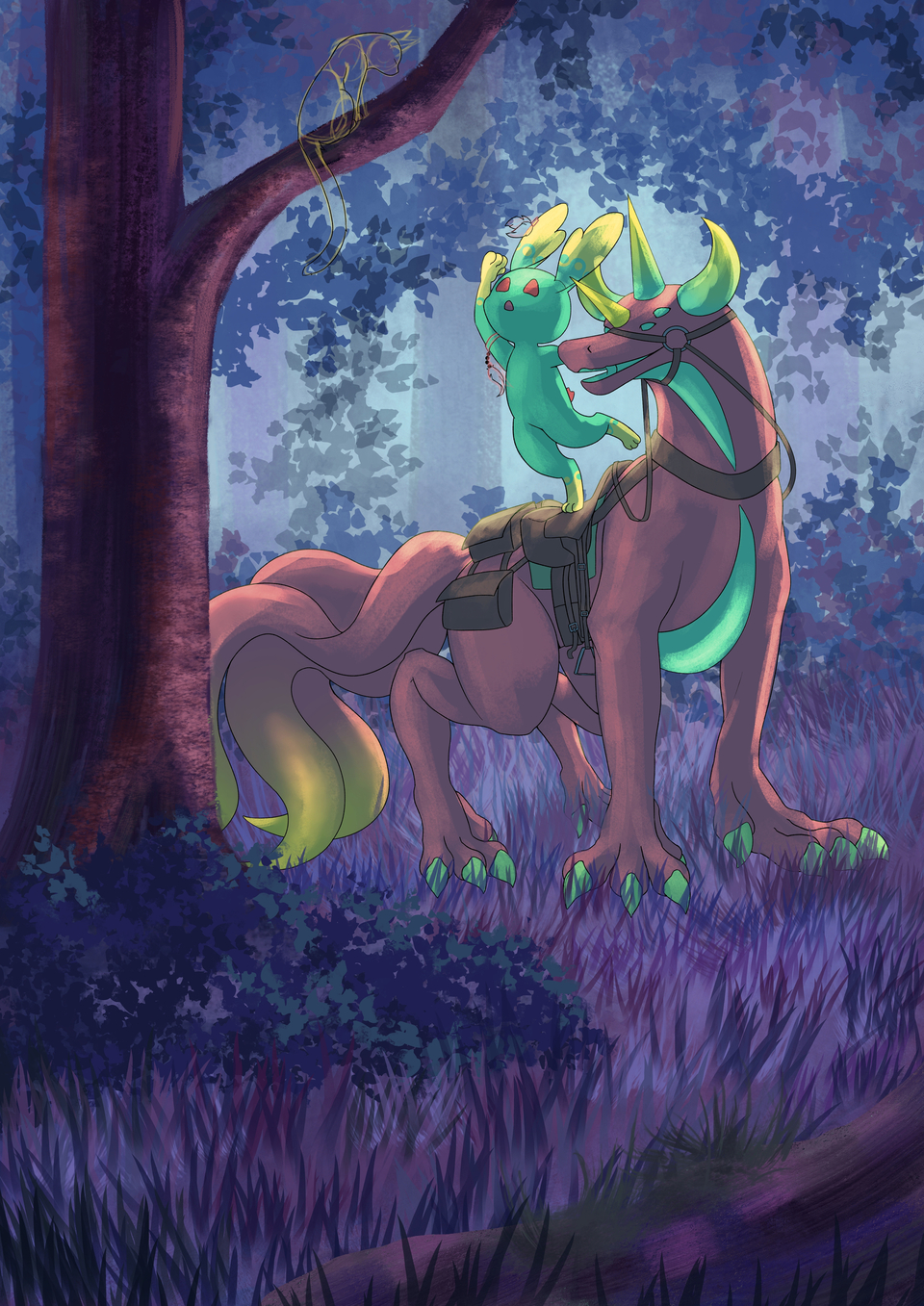
- So fine let’s even change Bernard (the big creature) color, I already modified the noze so let’s just change the character. And it keep clashing with the human character. And honestly he look sadder without pink.
- The human character have some palette for clothes to help marking the difference with another character. Witch is fine exept that this second character have for color green and red dominant and blue and black as complementary… so I can’t use green to harmonize with the two other. Basically the differentiate twin problem.
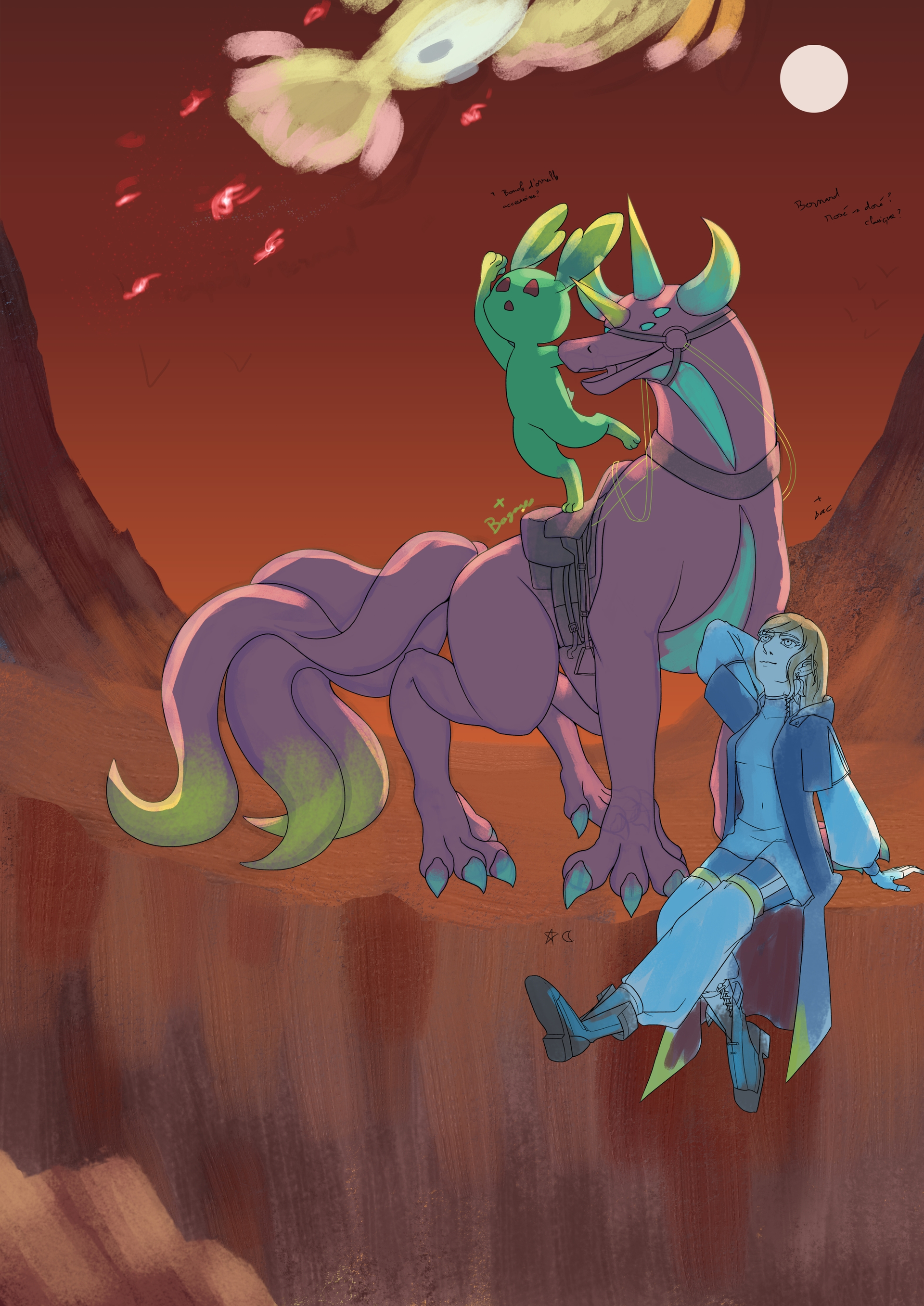
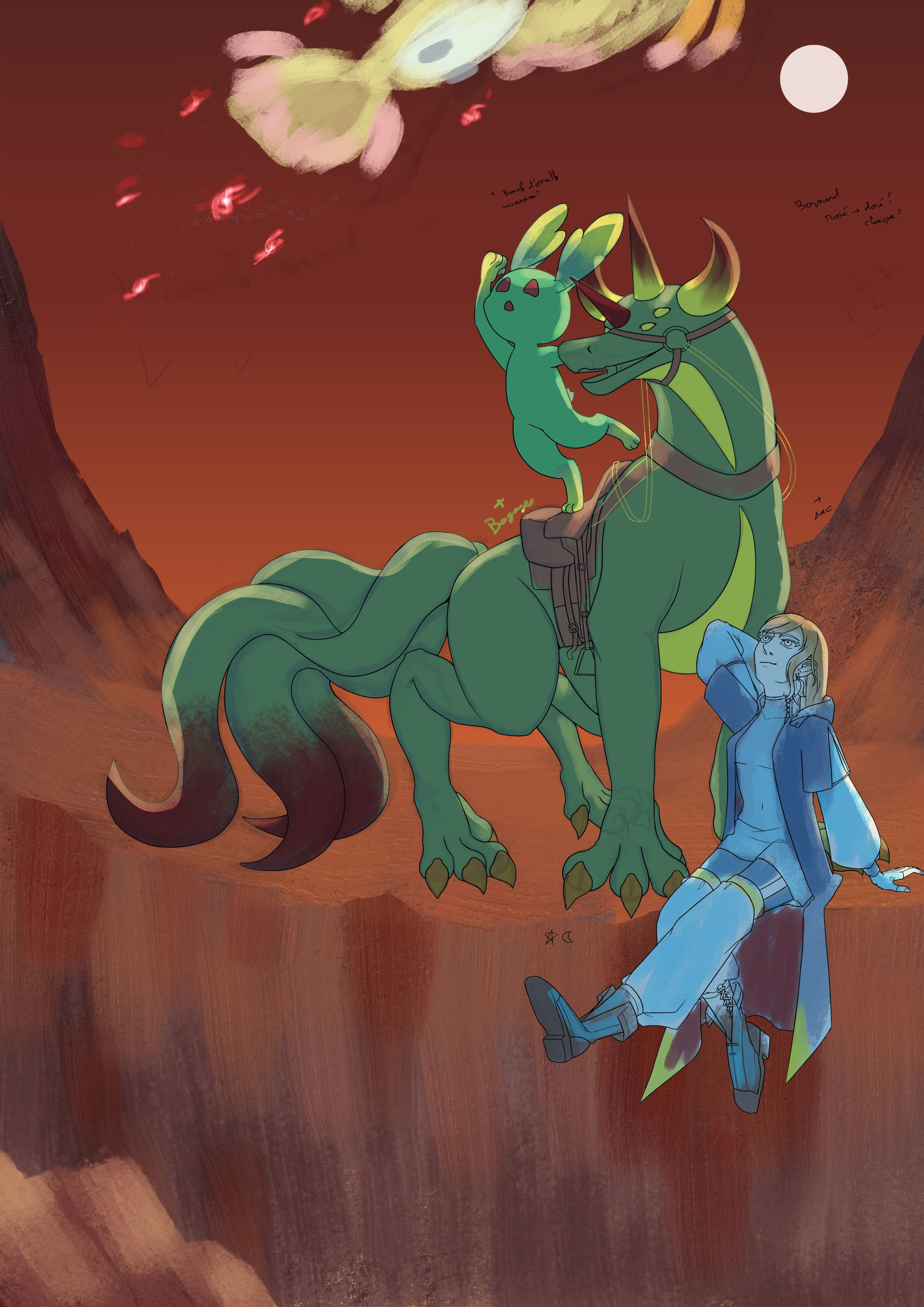
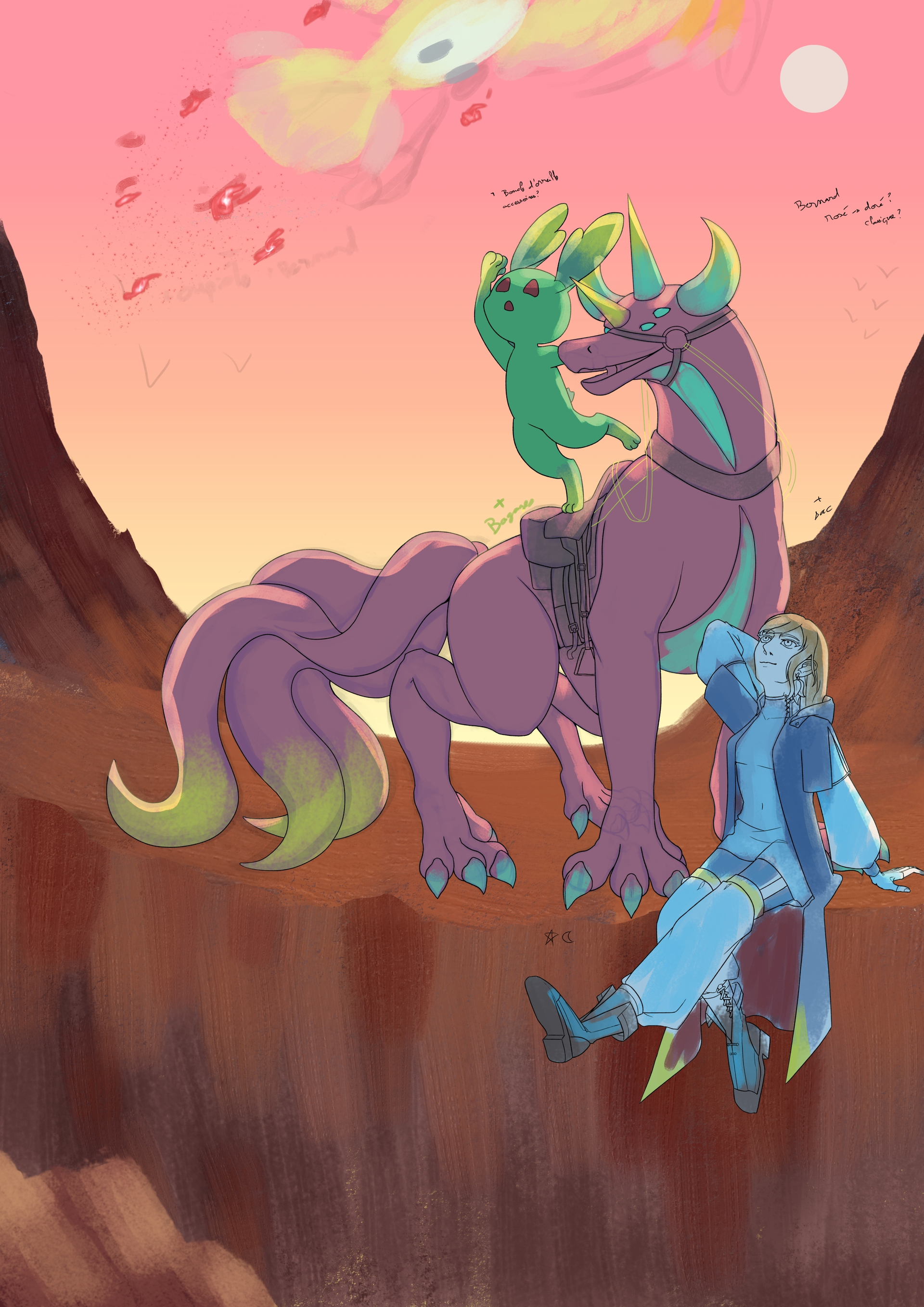
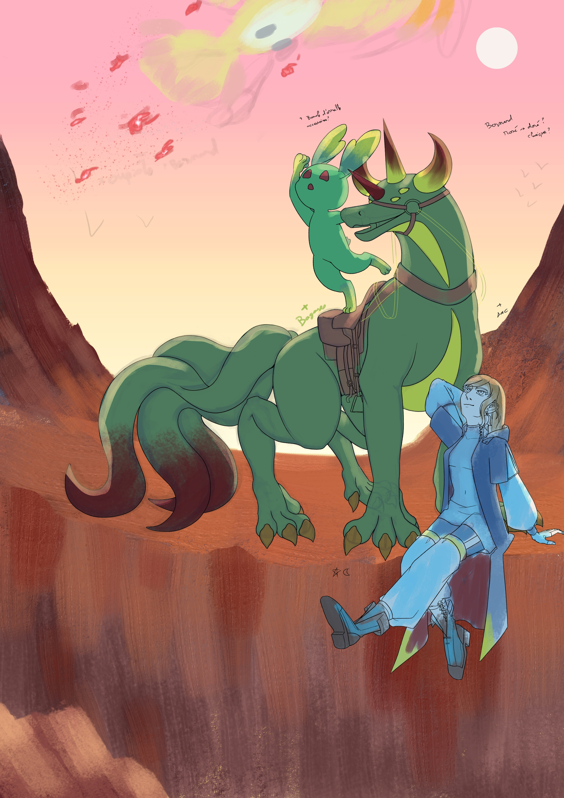
I think I’m swindling myself somwhere in this, but not sure where. Anyway the solutions ? :
- Change the whole background.
- To a black hole this clothes palette color thing, let’s attidute be the only difference.
- Suprime the human character.
- One and three together.
- Another solution ?
If I don’t resolve that now, it will be a disaster when cleaning the sketch. But writing did help see thing more clearly.
4 Likes
Good analysis! For my taste the first feels the most right, although that Bernard in the third feels good too.
Here I only can wish you to find your “calm down point” to then find your way through the clashing colors.
Michelist
2 Likes
I did calm down, complaining the eating something good and going to see cat did help.
In grey scale the one was indeed better, I rolled frome here.
Pink Bernard is in the end what works best, so I adjusted the lafloe slightly and they go well now. Then I tried to modify the background.
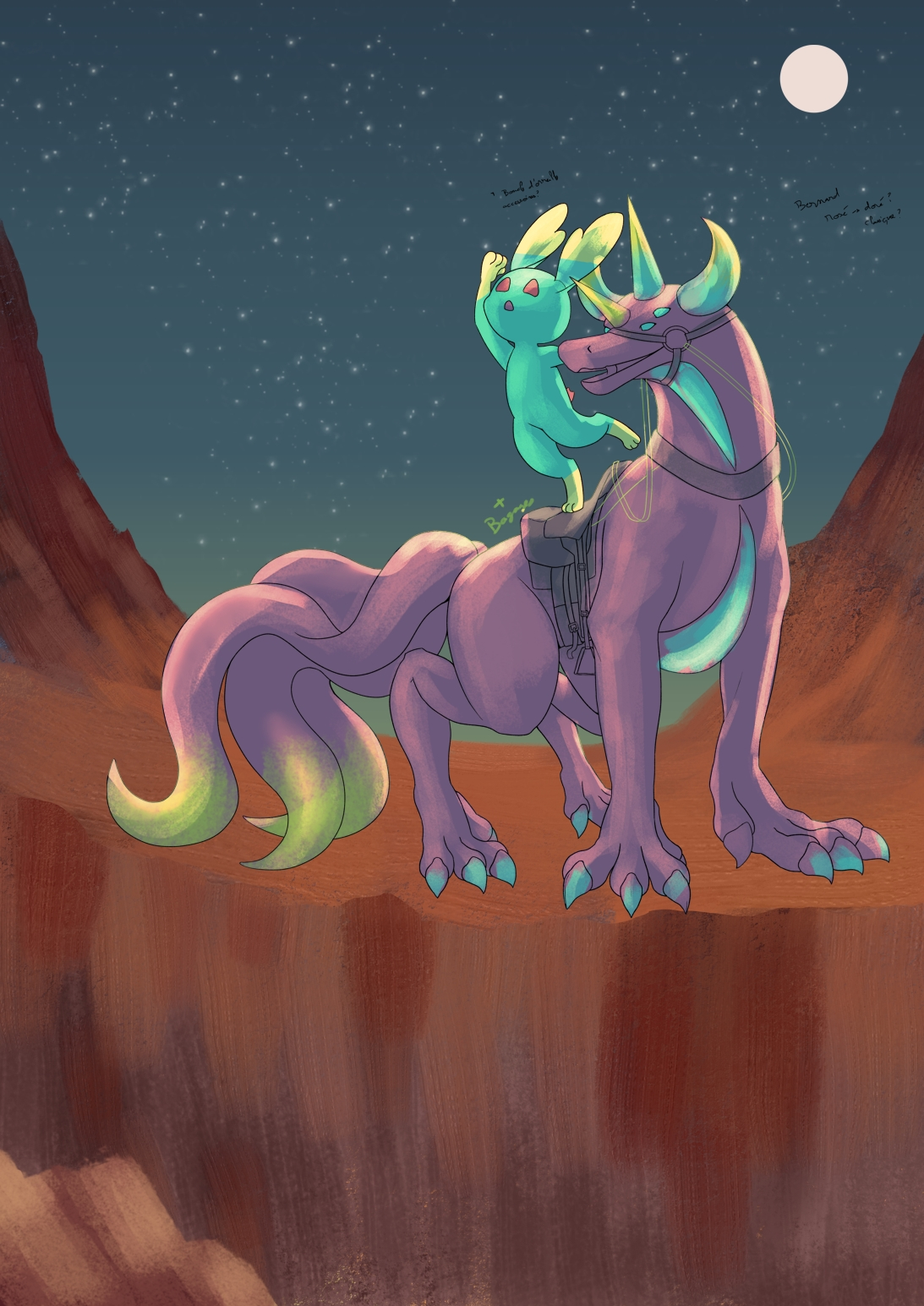
Nope it dosn’t work the way I want and it’s not just the color. The cliff itself work against the emotion I want and it to empty.
So I changed the whole background.

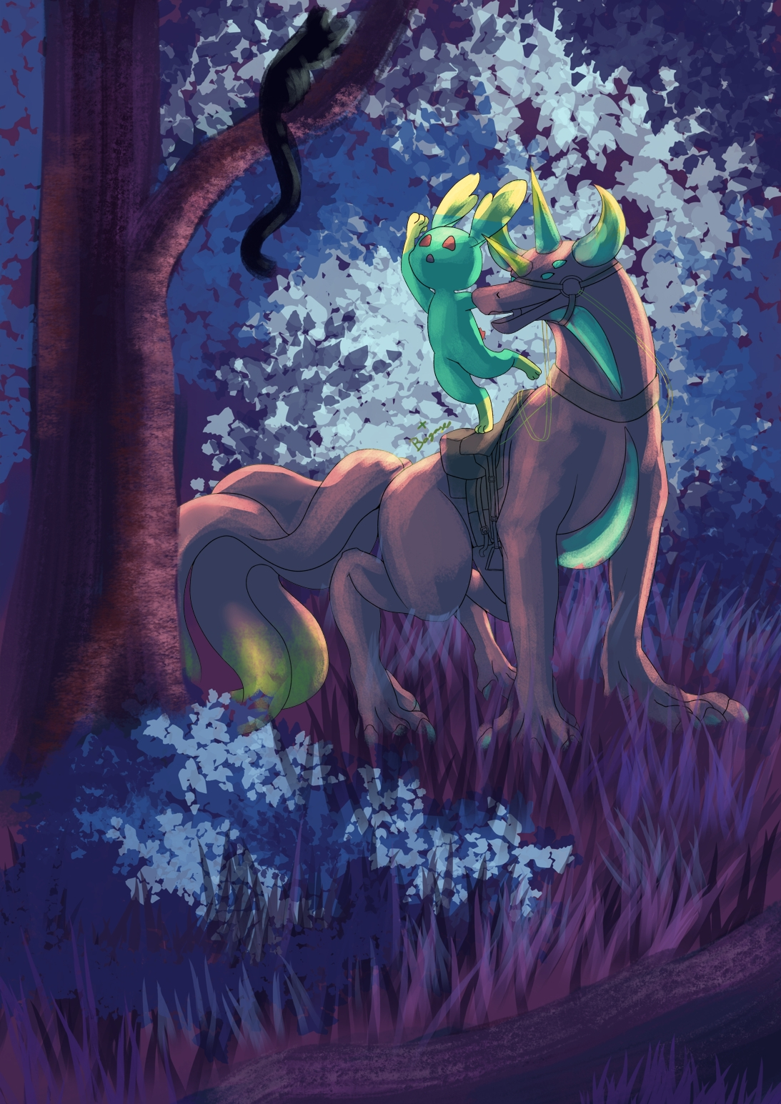
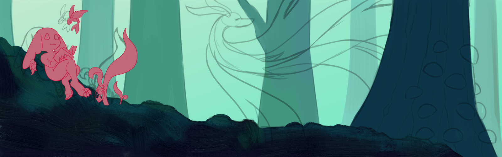
Way better, but slighty off. I mean it does say travel, but not carefree enought to my taste. Maybe, jsut maybe because it’s not the day ? It seem I have an inclination toward night scenery.
The color seem to merge and contraste more nicely in the second, but I did a blue forest pretty recently…
5 Likes
I hear your concerns, but these are absolutely okay, I like them. And if you dislike something with them, then you might sleep a night or two over them and may find points where you can put the lever at and push it forward?!
Michelist
1 Like
Good idea, that should help. Thanks.
1 Like
After reflection,not really it’s came after sleeping and doing something else, if I’m don’t like the blue forest background 'cause I had done one just before I can just let the file in pause before coming back later. With adding another light source would help with the mood. It’s the best for of three.
And I can use the background I prefer for something else.
I’m already recycling the human character for something else.
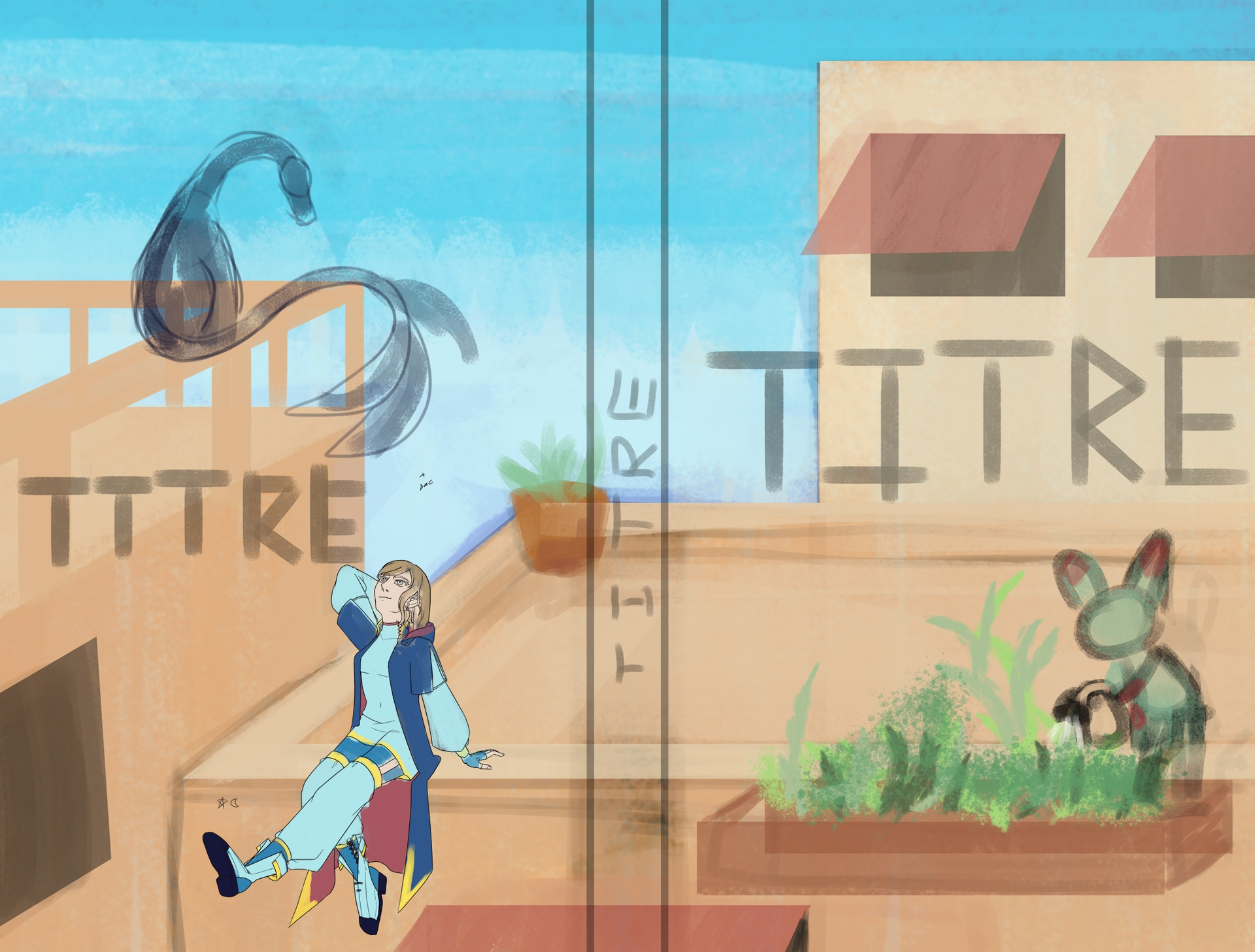
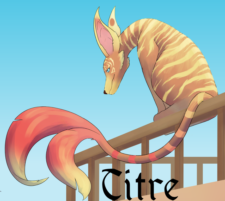
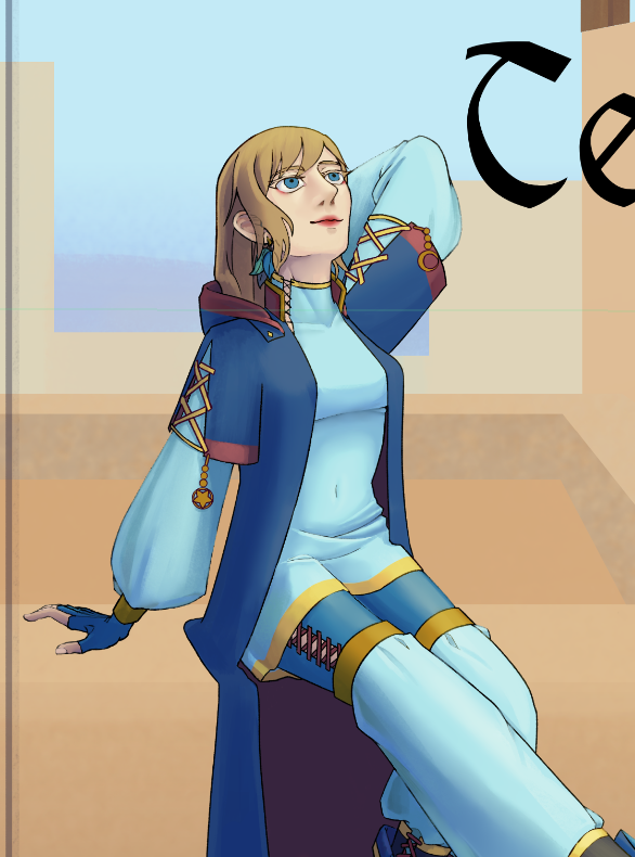
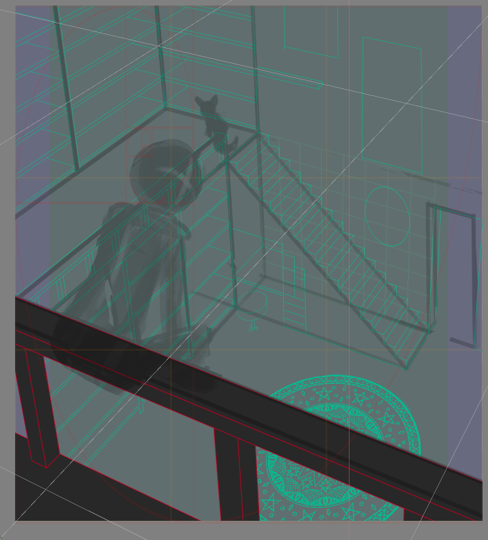
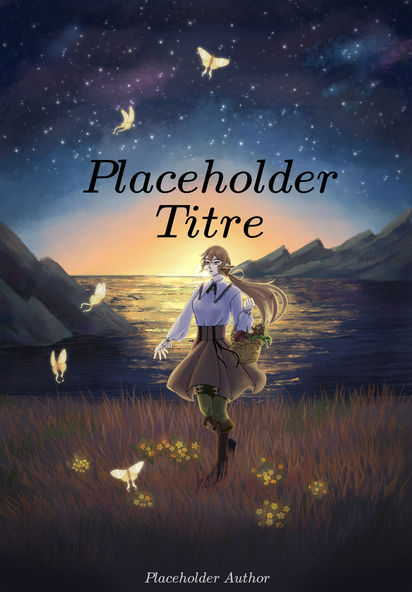
Trying my hand at book cover to have some fun is a good way to let time pass. Except I kind of inversed the front and back cover… Anyway I sketched some idea of cover theme a collection of fantasy novel.
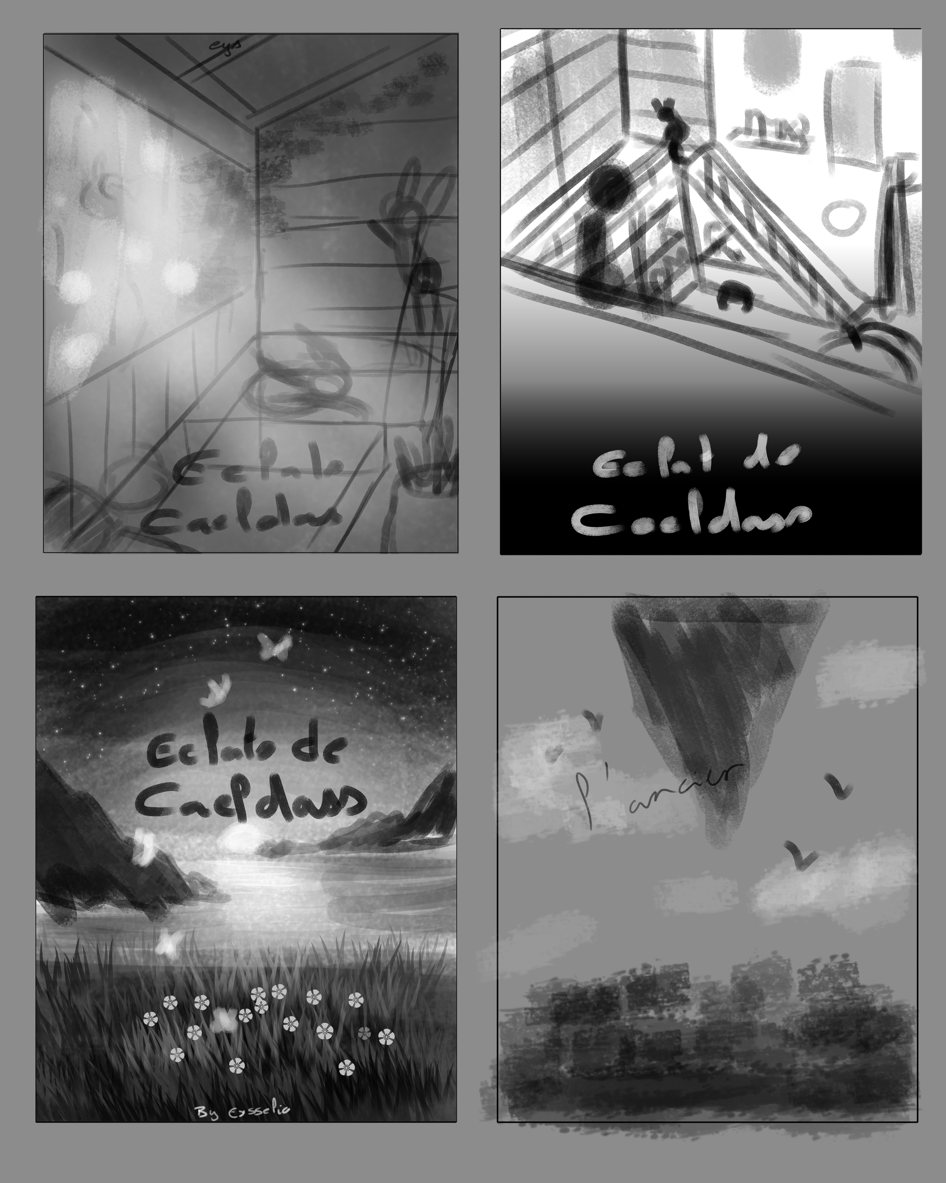
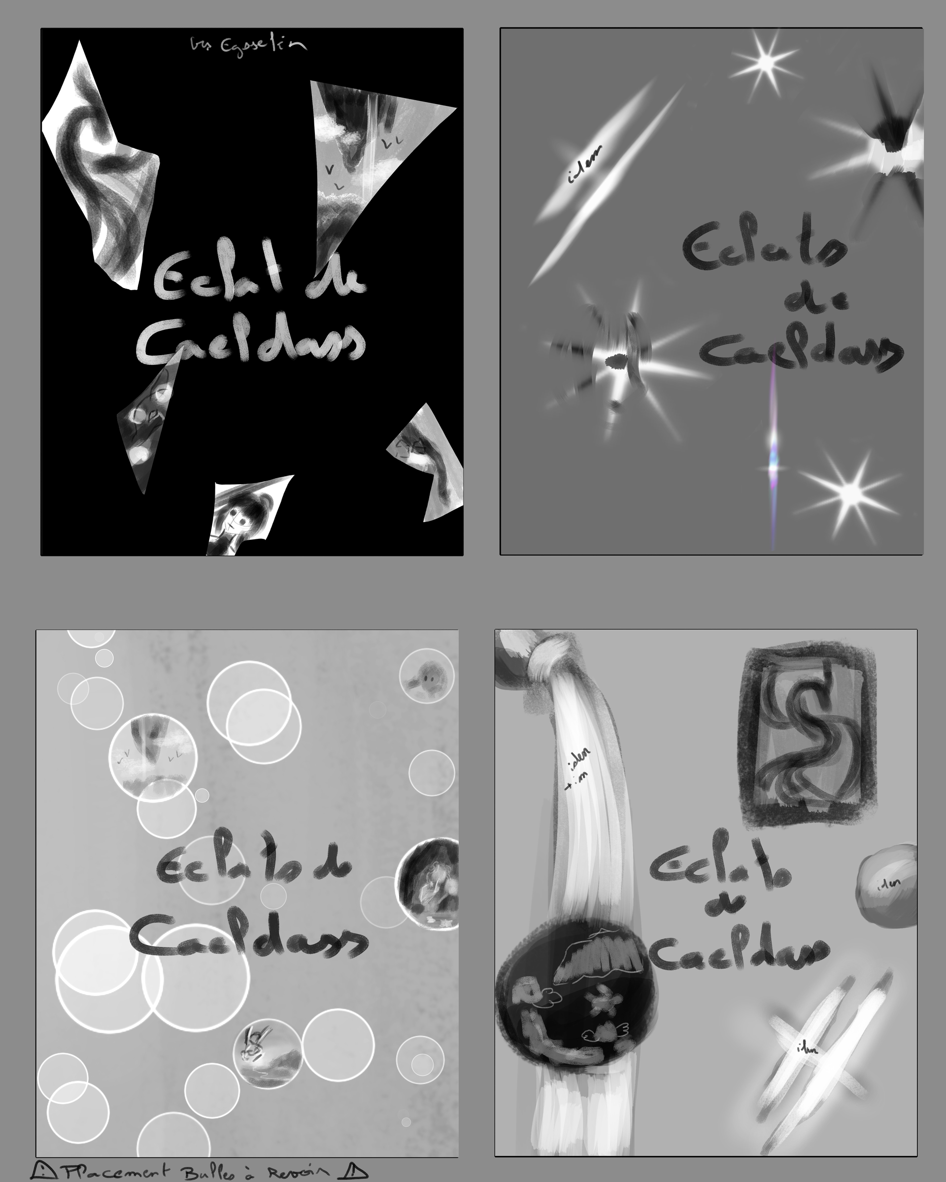
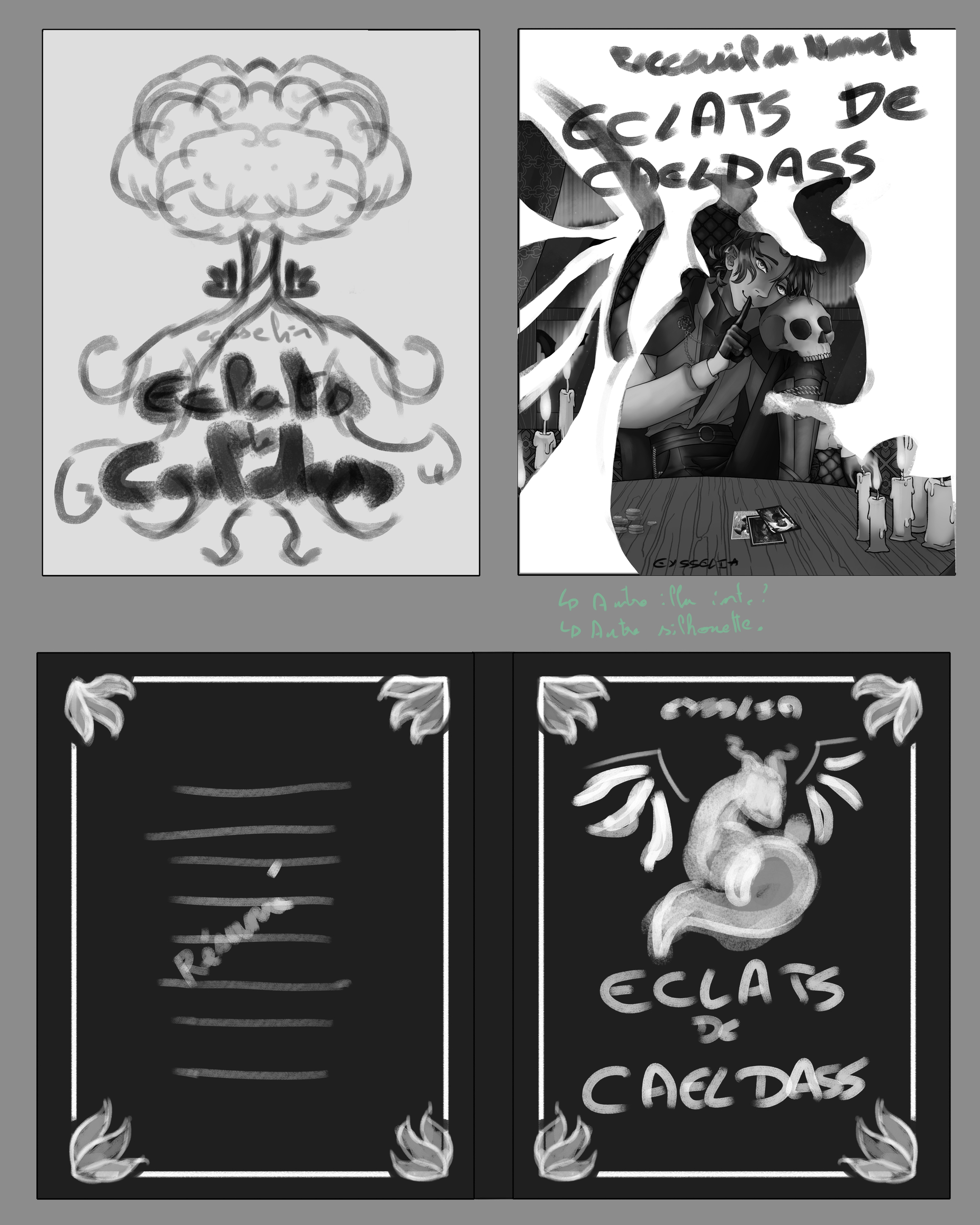
Some are so bad it’s funny, some could become something.
4 Likes
The front is now the front and the back is now the back, it advance slowly.

On another note this one is termined
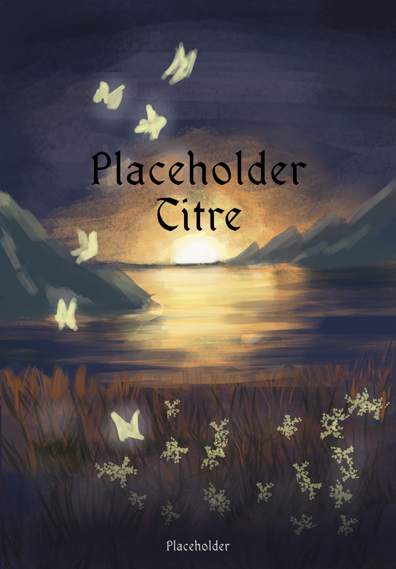
Without a character it’s empty, or more like I should adjust it a bit to make it interesting. The emotion is also different from the sketch… But this time I know were I diverged.

And now I motivated to advance with Bernard.
5 Likes