Ok, that was all my fault ![]() - I haven’t checked that this redesign looks very different in any other theme than my custom one. So far I couldn’t get mine to work, but I’ll be working on that. Maybe I’ll have to create my theme once again for this redesign specifically.
- I haven’t checked that this redesign looks very different in any other theme than my custom one. So far I couldn’t get mine to work, but I’ll be working on that. Maybe I’ll have to create my theme once again for this redesign specifically.
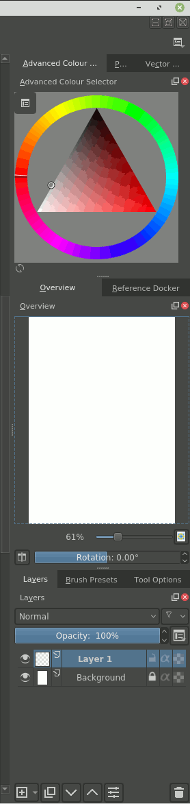
Now as I have seen my “buggy” theme, I kind of like some of things there - buttons in layer docker seem to look nicer without borders. Some of those buttons in tool options in my opinion don’t really need them too (like those 5 transformation modes for example). Maybe there is some area to simplification there ![]()
Anyway, here is my current theme without any changes yet, as I couldn’t make them work fast. I’ll tell, if I make any significant progress with accommodating it to your redesign.
EDIT: Ok, found it! View:background alternate and Window:background normal were nearly the same. I’ll make tweaks in my theme then ![]()
EDIT2: or maybe, I’ll actually stay with those two being the same (or barely distinguishable) ![]() I must say I really like how many of those elements have no borders or have the same background. It works quite well in majority of cases, so maybe it would make sense to start from here and then just add those changes only to areas that really, really need them. Anyway, thanks for help - maybe I’ll figure out some good solutions
I must say I really like how many of those elements have no borders or have the same background. It works quite well in majority of cases, so maybe it would make sense to start from here and then just add those changes only to areas that really, really need them. Anyway, thanks for help - maybe I’ll figure out some good solutions ![]()
EDIT3: I updated my theme to not have this issue - thank you for your help. Here it can be downloaded. I left this color to be very, very close to the usual background. It makes those border nearly visible, but they are there.
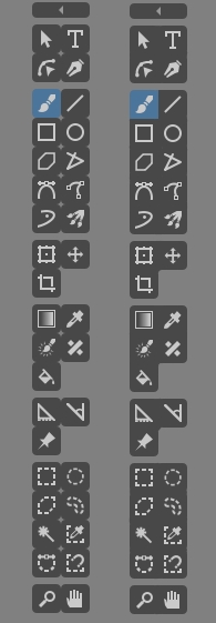
Another piece of feedback - sliders:
I’ve tried to remove this bright border around the slider, but it seems it’s not a single color taken from the .color file, but rather some style setting that possibly could be switched off in python. It’s there even without redesign on. It’s also visible in scrollbars (though I usually turn them off). What do you think about those white borders?