I’m trying to understand the differences between these approaches. The “smart canvas” approach seems way more complex and has a lot more layers involved. And to be honest, the end result looks very similar to my simple approach above.
Is the main benefit with the “smart canvas” just that it’s infinitely extendable? Or was this just an older approach that isn’t needed anymore? (I see the smart canvas video is from like 2020.) Or are there other aspects that I’m missing?
How do folks here generally add paper/canvas textures to their artwork?
I also looked at the smart canvas thing, but haven’t tried it yet. Very well done, but it does look complicated.
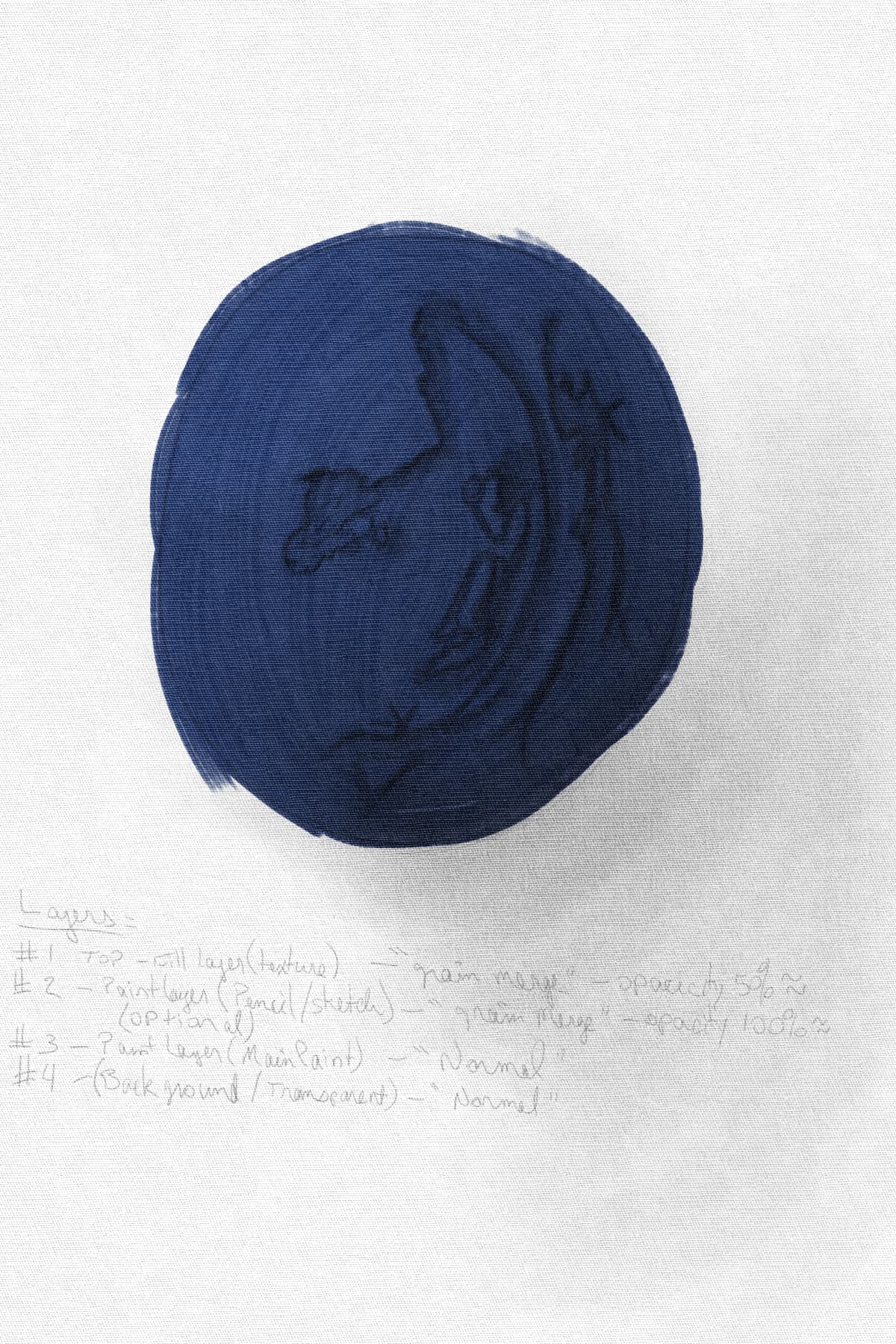
So far, I also use a top layer for the canvas texture. This is your standard fill layer set to whatever canvas type I am looking for. However, depending on the effect I am looking for, I use “grain merge”. This takes the grain/pixel and multiplies it down to the next layer. Opacity can be adjusted to make the texture less noisy depending on the strength of the effect, as usual.
In my case, that next layer is a paint layer (also set to grain merge) and is used as a pencil layer where I can sketch out what I need and shade my scene. This is optional, of course. For those that are not wanting to show the line work, it can be omitted. This layer is also merges down.
As this is its own layer, I can also use the kneaded eraser to soften the lines. This is so they dont show as much of the line work or where I find (after painting) that I have over-shaded an area without disturbing the paint layer or if the outlines are simply too bold and aren’t showing the right color for the shading at that part of the objects lighting.
This 3rd layer is my main paint layer (left as “normal”). For this particular use (with the pencil layer) I only really need to use one color pick for each region as the shading in the pencil layer (merged with the canvas texture) gets merged with the color here. The outlines then take on the color instead of being pencil black/gray with color inside the shape, while still carrying down the texture from the canvas.
Since the grain merge is a multiply function, it simply darkens what ever color I have picked and I dont have to mix shades. Kind of like older printed books with colored illustrations. It takes on a dithering type of look. It also makes it look more like the ink/paint has actually set IN the canvas.
This is a quick example of some pencil work and then one color on an RGBA brush
I do the same things, but either as a last step before exporting the image, or I leave the pattern layer invisible till the end, because it can mess up the canvas color picking.
Also if you want to resize the image on export, convert the pattern layer to a paint layer, because a fill layer won’t resize like the other layers.
edit: never mind my last point, I think they’ve fixed it
This is cool, I’ll have to try this too! Thanks for the explanation. I’m still pretty new to digital art, so I don’t really understand most of the layer modes yet.
Oh yeah, that is a great point, thank you for mentioning this. I actually ran into this issue (weird color-picking) and just kind of… dealt with it. Didn’t even occur to me for some reason to just hide the layer till the end, haha
Okay, cool! I’m glad to know I’m not crazy, I’m not the only one
As far as differences: I’ve tested a bunch of different images a bunch of different ways and they’re all just… a little different. Honestly none better or worse, just kind of depends on what that particular picture needs.
I do shy away from the additional complexity of the “smart canvas” though. I haven’t actually used it in a final image, just experiments. It gives you more “levers” to fine-tune the texture, I suppose, but I haven’t needed that yet. With a pattern-fill layer you can change the texture scale, opacity, mode, etc., and that’s been enough for me so far.
(Also, it’s pretty easy to extend a canvas even with a pattern-fill layer. IIRC you just have to re-fill in the BG color, but the pattern extends fine.)