I apologize for any errors in the text, I do not know English, and I use a translator
In Clip Studio Paint I like the interface more, it looks more minimalistic, unobtrusive.
1
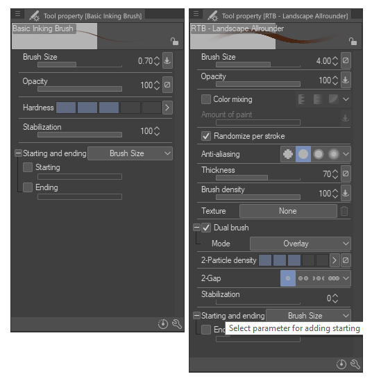
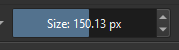
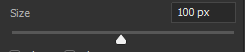
In Krita I don’t like the way sliders are made. For example, adjusting Opacity and Size for brushes. These sliders look too massive, cumbersome. I’d like to see them smaller. Photoshop and Clip Studio Paint are good examples of a minimalistic and unobtrusive interface.
For comparison I can attach only screenshot from Photoshop, because I already deleted Clip Studio Paint, but sliders there are more minimalistic than in Krita.
Krita Sliders:
Photoshop Sliders:
2
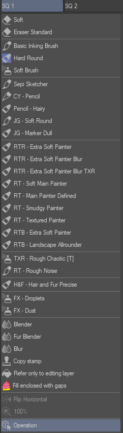
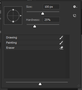
I also don’t like brush icons in Krita. I only switched to Krita yesterday, and I’m still adjusting the program to my liking, but at the moment I haven’t found a way to turn them off, only to reduce them to the minimum size I can.
Personally, I don’t understand why these icons are needed at all. What information about the tool do they report? For example, my workflow only uses 2 brushes, one for drawing and one for painting. I call them “Drawing” and “Painting,” and these names already tell me what characteristics each tool has. But the icons don’t give me any information.
Again, I can’t give you a screenshot from Clip Studio Paint as an example, but only from Photoshop, but in both of these programs the brush selection menus are done in a minimalist style.
Krita Brushes Panel:

Photoshop Brushes Panel (I really like the tool icons in Photoshop that are to the right of the title, but some of the rendered brush settings at the top of the panel are completely unnecessary to me here…):
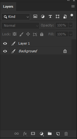
3
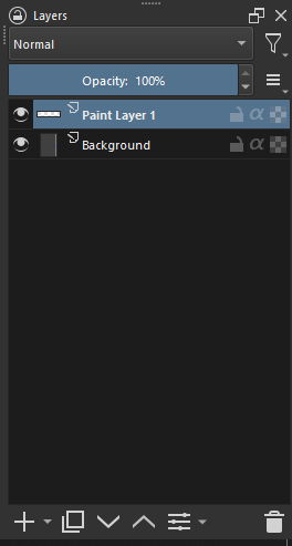
Also, the menus are confusingly Thumbnails of layers. I keep track of the order of my layers, and give them appropriate names so that I can easily navigate them. Thumbnail, on the other hand, doesn’t give any information about the layer because it is so small (I know it is customizable, but it will still be small) that seeing something in it to navigate my layers is no easy task.
In Clip Studio Paint and Photoshop, the Layers panel is also more minimalist, and you can turn off unnecessary elements like “Thumbnail” that don’t report any information, and leave only the information that really matters.
What I like about the Krita layer panel is that it doesn’t have any unnecessary features at the top of the layer panel. In Photoshop, on the other hand, there are too many unnecessary features that I don’t even use.
But in Photoshop, the icons at the bottom of the layer panel are less big and bulky than in Krita, and I like them better.
Krita Layer Panel:
Photoshop Layer Panel:
Afterword
I would like to attach screenshots from Clip Studio Paint instead of Photoshop screenshots to make my post more in line with the topic of this thread, but, as I said, it just so happens that Clip Studio Paint has already been removed… However, in spite of this, the essence of this message doesn’t change, the subjective flaws are the same as they were, no matter what program I’m attaching the screenshots from.
And so, in general, I like Krita. It has a few flaws, but none of them are critical. I think Krita is as good as Photoshop or Clip Studio Paint, and even better, because it’s free and open source. The desire of developers to provide a tool available to everyone, I appreciate much more than some minor features in other programs, which are made differently in Krita.