Recentry I did a serious look at the Krita 5.0 beta2 and I must congratulate the developers - you did an awesome job. Krita is definitely a viable alternative to Photoshop for professional digital painting. However there are a few small issues I have with it that are rather important:
1. Hotkeys / interface
There is a workflow, where you have only the canvas visible, popping open UI elements as needed and closing them. However that is not very viable currently, because of a few issues: 1.1. Toggling individual panels with hotkeys is impossible - you cannot assign a hotkey to that. This is the biggest issue of point 1. and something that would be super easy to implement. 1.2. (This is fixed)Toggling the visibility of all panels shows the top panel (if it was hidden) but it does not close it upon hiding the visibility of everything back again. It should either show it and hide it or never show it in the first place (if it was hidden to begin with). 1.3. (This is fixed)When panels are docked and you toggle them, they shift the canvas around. This is distracting and may cause issues for people with motion sickness. I propose that, like floating panels, docked panels should sit on top of the canvas, rather than making the canvas space smaller. At least make it so in full screen. 1.4. (This is fixed)The popups from the top panel can be opened with a hotkey, but cannot be closed with it. Also the brushes popup should automatically close upon selecting the brush, like it does from the right click menu.
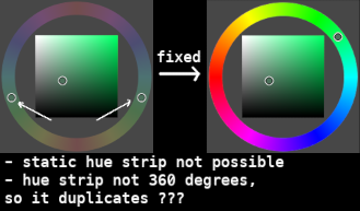
2. Color wheel
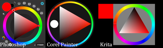
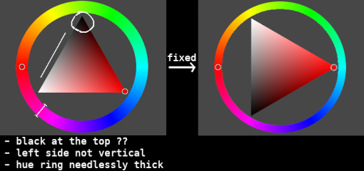
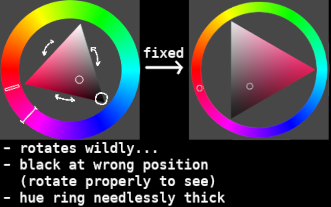
There are a lot of applications that feature a triangle color wheel. Most of them, especially the main professional ones have their color wheel looking the same. However Krita’s one is a bit different, causing unnecessary confusion and difficulties if you are used to those or switch between software. 2.1. The left edge of the triangle should be vertical, but is not. 2.2. The black color should be at the bottom. It even makes sense, because black is ‘heavier’ than white.
2.3. Additionally the right click one spins… Even more confusion. Just make it static like the other two. Bonus suggestion: If you look at the color wheel that can be initiated as a pop-up (not a panel) of both Krita and Corel painter, you will notice how much slicker the Corel painter one is (it is transparent and all…) This is of course not an issue, just a personal preference of mine.
This is all I have to say. I think these things won’t really cost much development effort at all, but I am sure many people would really appreciate these changes.
Thank you for the feedback and welcome to the community
Yes it would be nice to have shortcuts for dockers as we call them in krita
I believe you are talking about the brush preset editor and the brush preset list dropdown with the hotkey F5 and F6. I too want this to be closed when you press the hotkey again. I believe @Lynx3d was checking about possibility of this?
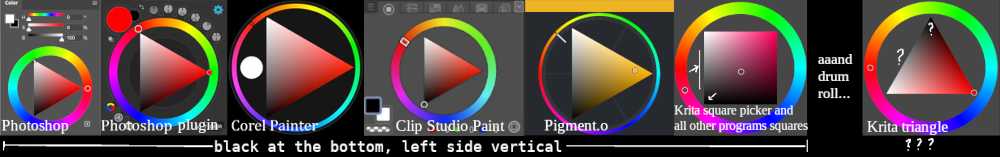
Can you please add the screenshots of color wheels of other software. It will help to highlight and demonstrate if the change is too drastic so much that you can’t adapt.
Krita has many type of color wheel shapes perhaps trying the other versions of the color wheel would make it somewhat easier for you to use it or even if it doesn’t may be it will give you some alternatives. You can access these shapes by clicking on the settings icon in the advanced color selectors docker. You can read more about it here in the documentation - Advanced Color Selector — Krita Manual 5.3.0 documentation
Are you a developer by any chance? If yes we would really need a helping hand since our development team is less than we can count in two hands. Additional volunteer can really make a difference in our mission to make Krita more awesome.
I have added a screenshot.
I know it does not look like much, but it is really confusing when you use the Krita one.
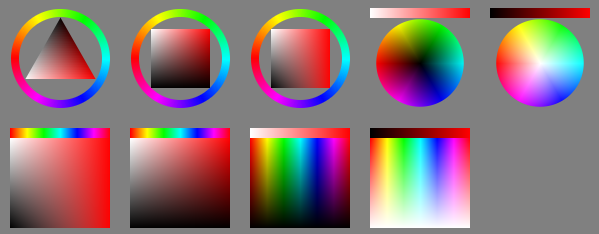
Also I was talking only for the triangle one, the square ones are consistent with other places. But using them is not the same as using the triangle one - the places where you pick color are completely different. Color travels in different curves when it changes, etc.
Thank you for updating the screenshot. I think I have a good alternative for you. Check out Pigment.O plugin it is an awesome plugin with the exact same triangle that you are accustomed to. It is much more powerful with many other features too. It is developed by @EyeOdin a member here on KA.
As for the developer question, I would be glad to contribute to krita, but I have no idea how. I am not a developer. Even if I can find and change the code somehow I have no idea of the processes related to contributing, etc.
You are welcome. I hope some volunteer/developer checks your suggestions for shortcuts and gets interested in implementing it. Your suggestions about shortcuts etc seem sensible to me.
No problem about not being a developer. I just got curious assumed that you are a developer since you seem to have made a guess that it won’t really cost much development effort to implement your requests.
Also you do not have to be a developer to get involved. We always need helping hands from non developers too. You are already contributing by giving feedback. if you want to step it up you can help in discussions and non code related things. Like triaging bugs, writing documentations, translating Krita and its documentation, helping new users, spreading awareness about krita to others etc. Of course this is not a requirement, after all the precious thing here is the time required to contribute. If you don’t have time for this that is understandable.
Pigment.o plugin does not work for me on new versions of Krita, underlining the importance of prioritizing base functionality over plugins. Who knows when it will be fixed, or how many times it will break with krita updates.
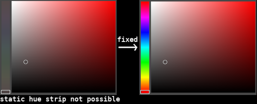
So I have been using the Advanced Color Selector. However I have noticed that they plan on removing that in the future in favor of Wide Gamut Color Selector. So I thought it is time to revisit what is wrong with color selectors in krita, specifically Wide Gamut Color Selector and the right click color selector, because they will at some point become the only ones of this type.
This needs to be fixed before then.
First, the Wide Gamut Color Selector, square version, no ring.
This one is the most space efficient, so it is my preferred one.
However here is the problem:
Please understand, Krita is in the wrong here. And not only that, but there is no consistency among the different selectors of Krita itself, as seen above!!!
Please understand, Krita is in the wrong here. And not only that, but there is no consistency among the different selectors of Krita itself, as seen above!!!
[ /quote ]
You forget, that those where implemented by volunteers. It is a free software, which grew over the time. And so the volunteers did the best they could at that time. So you being emotional and frustrated ( that’s how I interpret your statement ) is not really appropriate.
Do not get me wrong, your points are valid and I would second those features.
Personally I’m all for having the option to have light ontop and dark on the bottom. And the sideways orientation of the triangle makes the most sense since the most saturated version of any color is somewhere between the lightest and the darkest colors.
I managed to turn off the rotation somewhere in the latest version of Krita though I’m not sure how. I personally found that very disorienting.
Just wanted to throw in a features I’d love to see based on my favorite color picker, coloorus plugin for ps
-Luminance locking, togglable option which as you spin around the hue ring the selector adjusts the value to maintain the perceived value. For example, blue 50% saturation 50% value appears much darker than yellow 50% sat/ 50% value. So this option would adjust the value dynamically as it goes around the hue ring to maintain percieved value. So if the image were made black and white if you changed the hue the strokes would be nearly or completely indecernable.
Interesting question. I know the triangle color selector since Metacreations painter 6 (The invented it) And yes it was like described, fixed with White on top and black on bottom. I don`t know really why this have been changed since then.