By the way.
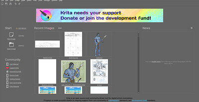
Is it possible to get rid of the banner or to reduce its size?
I feel like it’s a little too distracting.
The donate button is already visible and takes less space.
I’m happy with the size of this new donation banner. It disappears as soon as you start working.
I’m not sharing the same feeling.
You might be fine with it, but I prefer the little heart shaped “support button”.

Imo, taking that extra space wasn’t necessary.
… Maybe it’s also because of the strong contrast with the background due to the bright colors.
Well, the idea is that it be remarkable, many may not like it, but it is more than anything to raise awareness that Krita is a project that also needs financing to continue working.
The welcome screen is quite different on my screen. Wow
A post was merged into an existing topic: First Beta for Krita 5.2.0 Released - please help by testing and reporting bugs!
But it seems like it is not effective hence the banner. I think there are talks to remove the banner for users who have purchased krita.
I’m not regarding the effectiveness. I’m just questioning whether it’s possible to remove it or not in the app.
Also, Blender has something similar, but it shows only right at application’s startup in a pop up window that can be closed.
And so Blender didn’t need to do something like this to get tons of support. And was more ergonomic.
I am telling you that the small button was not effective since you said there is already a button. Hence the big banner when something is not effective there will be steps taken to address that.
That is not a logical argument. Blender is not krita it is like comparing apples with oranges. There may be other factors at play for blender’s success. Everytime it is compared to say that “hey see blender did this so it must work for krita too” “blender did that so it must work here too” “Blender did a redesign we must too”. While it is good to imitate blender to reach success but it is also good to keep in mind that there are different things and strategies which will or will not work for krita. Blender also has a lot of corporate sponsor and a lot of developers does krita has those? no right? Is Blender foundation running krita, no right?
I do not know if there is a way to hide the banner right now. so you might have to bear with it for now. may be devs will take the feedback.
A post was merged into an existing topic: First Beta for Krita 5.2.0 Released - please help by testing and reporting bugs!
I do not agree with this. This argument is most definitely logical even with the different factors at hand.
The strategies may differ, and I’m not saying you must necessarily imitate at 100%. But at the very least, do something you know that works regardless of whether it’s an apple or an orange, and experience is the way. Whence my suggestion. Either you know what to do or you seek the right answer.
Well I will leave the debate with you by saying let us agree to disagree.
We are trying the banner to see if it works or not, without trying we won’t know. As for hiding the banner no it is not possible now. You can compile krita to remove it or use blender since as per you krita and blender are the same. I say this as a normal user and not a dev.
What does using Blender have to do with removing or hiding the banner in Krita?
Don’t be off topic.
I said there is no option to remove it now. That is the answer to your question. I already answered you three times.
I am not the one who brought blender in this debate. It was you who cited that blender doesn’t have such banner, hence I asked you to use blender.
Whatever @raghukamath .
Blender has a popup, not a banner.
And this popup can be closed.
And I honestly think Krita can do the same.
Just for the app’s ergonomics.
However thanks for your solution contribution.
I might either get over with it in the meantime or compile myself a version with the removed banner.
I like the new welcome page layout with the recents at the top, it feels cleaner to me and I appreciate the larger thumbnails ![]()
For the 5-30 seconds I usually spend there, the support banner isn’t going to break my workflow either.
I stopped consciously noticing the old donate link after the first few uses, I think this will at least draw your eye to it while you’re there.
I downloaded the portable version and this is the first time I realized you could specify a workspace in the windows explorer shortcut. I see now that 5.1 supports that too, but it’s still cool ![]()
I paid for krita and i dont have problem with Donation link being on the front page (krita is free but work that goes into ongoing development is not).
I would say that current banner feels littlebit like cheap web AD (probably it was put pretty quickly as proof of concept) so some redesign would be welcome to fit more with theme.
Or maybe some Cute Kiki art “Support us” could be there.
I eventually got used to it and it didn’t bother me anymore.
I guess it was psychologic. It was kinda irritating to me at first, but then it was fine.
I really couldn’t do anything about it other than try to wait first. But, it’s fine.
Though i must say, that the look on the nightly build is better than what is present on this thread.
I really don’t like the UI look of the new homepage from the build linked in the current thread.
The welcome page will eventually be redesigned. Here is the initial exploration for the designs -
note this is the initial exploration of what can be done and what is not possible this is not final design.
