I honestly think this would’ve made a better background for the banner.
Better colors. Less distracting contrast(balanced contrast?).
My two cents on the banner. First, it is a good idea to put this type of message upfront. I would even think that this Krita loading front page is a good place for more educational content about unique aspects of Krita: FLOSS, size of the Krita team, percentage of donors VS percentage of downloads, etc… It’s not a company, it’s a foundation with a community and believe me: I’m pretty sure a large percent of user still think it is a product done by a company.
I do not have a problem with the banner. It only has slight problems with inconsistent padding/margins around the text and the Krita logo being too close to the edge of the image. If someone still has the source, it can be fixed very quickly.

Alignment / padding / margin / framing problem, highlighted by guides drawn over the banner
@Deevad the image you shared is the first iteration of the banner, the release has a new image.

I also had one more option with kiki

That’s the one I had on Krita 5.2beta1. Good to see the improvements are already done.  perfect.
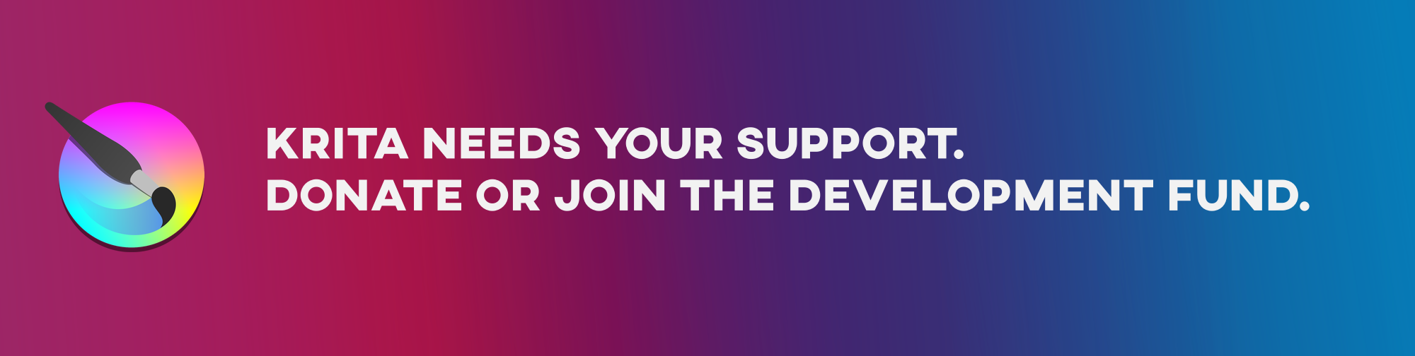
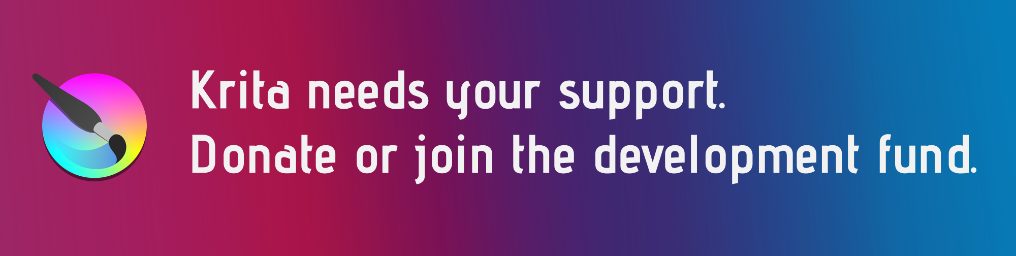


Really good effort. I like the last one. Are the fonts used open source? We can’t use the fonts if they need license purchase or if they are proprietary.
I really like Kiki’s.
They are very good options especially because they combine very well with the default dark color of Krita.
The AXIS font is totally free( the last one I used, which only has capital letters ).
I like the last image @novames00 posted, to me it feels more balanced, but personally, I’m drawn to cooler palettes. I like the one @raghukamath posted as well.
There’s no reason you can’t rotate out the banner every so often either. In fact, it might be a good strategy to regain attention to it. I’m thinking like once a month maybe, if you do it too often it loses any visual impact, as people will come to expect the change and ignore it easier.
That’s my 2¢ worth 
Sorry for the messages were messed up in the move to new topic. I cleaned it up now.
I tried to search for this font. I got some website which says it is for personal use only and some say it is okay for commercial use but they do not state clearly the license used. So please i request you to use only Open font licensed font. I even searched for the license in the website of the font’s creator but could not find anything. May be my search is bad. Free fonts website surely give fonts free for download but some of them can be illegal.
There is a kiki donation image on the krita website. May be in future we can use that too.

Wow, this is so cute and your idea to use it is great, we really should consider doing this!
Michelist
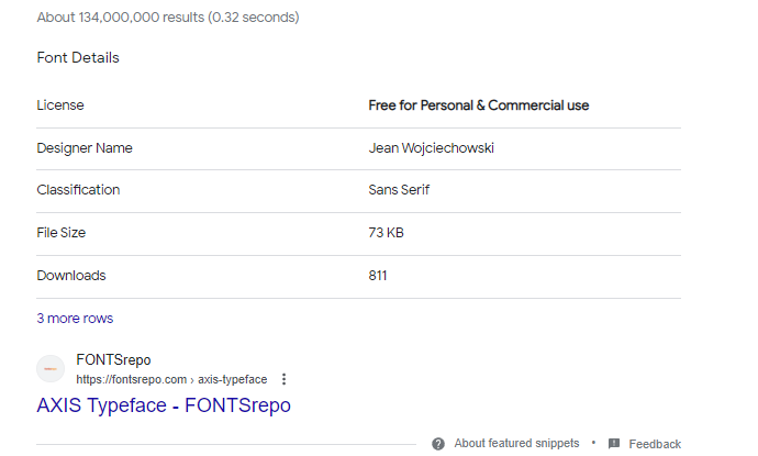
Sorry unless there is a clear text of license of the font from the author or a reputed font website I would not use it.
In any case let us leave the decision to krita devs.
That Kiki is perfect!
Thanks @raghukamath , @sooz and @Michelist ! It’s a Kiki drawing I made in 2021 : Kiki piggy bank by David Revoy - Viewer - Pepper&Carrot
Very nice 