Wow looks really great. Thank you for your hardwork.
I love it  , I think it’s perfect, the interface is not full of options and I think it’s very intuitive.
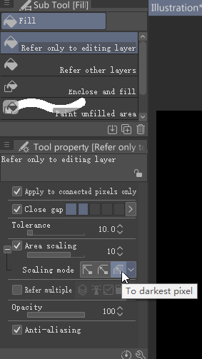
This is awesome👍🏼. I really like the colour label checkboxes. What are different paper/pages icons for the reference layer?
Those icons are for “current layer” and “all layers”, but suggestions are welcomed.
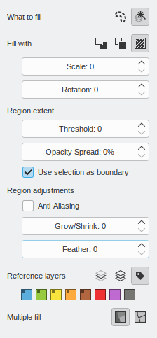
I’m going to make a standalone merge request changing the “softness” to some better term. Thinking about it I think “spread” alone can also lead to confusion and be mistaken by threshold, since some users may think it refers to the spread of the region itself. Should it be named “opacity spread” or something else? What do you think?
I’d describe it as ‘Opacity Roll-Off’.
There’s a central peak or plateau of Opacity = 1.0 and then it rolls off to 0.0 at the edges. Where it starts to roll off depends on the percentage setting.
When the current ‘Softness’ setting is 0%, there is zero roll-off and the entire area is Opacity = 1.0.
‘Opacity Spread’ works equally well as a descriptive name.
Amazing work on this mockup, I feel like its much more intuitive and simple. I also really liked your solution for the color labels.
One thing I think it could be tweaked are the button icons for the modes, i feel like having both the selection and the contiguous modes having both selection icons might be confusing, maybe combining a layer icon with the magic wand might be a bit easier to distinguish?
It would be more situational but I dont see any reason to not have it, as we have a shortcut to fill with background color already, would make sense for it to be in the fill tool too.
I made the merge request that changes “softness” to “opacity spread”. But I’m open to other terms like “opacity roll-off” or “opacity fall-off” or something like that. English is not my native language, so…
Edit: I forgot to say that in the mr description there is some explanation of the softness/spread option. Let me know if that’s clear enough.
Great work with the UI so far, I like it a lot. Makes it simple, yet very user friendly.
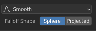
Falloff is an often used term in other Software. I suggest that one. ![]() It is correct both ways, fall-off and falloff. As one word looks nicer I think.
It is correct both ways, fall-off and falloff. As one word looks nicer I think.
Here, for example a screenshot from ZBrush and one from Blender.
after having looked into the mr the functionality is a lot clearer to me now
opacity spread is fine to me. perhaps “spread” could be replaced with a word like “ratio” or “proportion” but im not sure what would sound the best.
“falloff” has the inverse meaning to me so i wouldnt use that (100% falloff = 100% softness = 0% spread of the opaque area).
The change from “softness” to “opacity spread” got merged (we can look for a better name for when this mockup gets implemented). You can test it using today’s nightly build. Also you will be able to test the “continuous fill” feature, since that got merged as well.
About the “opacity spread”:
The effect of changing the “softness”/“opacity spread”. As can be seen it is just like a contrast adjustment on the mask, and when the spread is 100% the effect is the same as thresholding the region with a threshold value equal to 0 (the region would be a mask with black as transparent and white as opaque). This option doesn’t change the actual extent of the region, that’s what the “threshold” option does. This only changes how the opacity inside the region is mapped.
I’ll try to implement a proper antialiasing for the fill and contiguous selection tools before trying to materialize this mockup.
Thanks for your work, here are the parts that I find inconvenient with the fill tool.
I don’t know if this counts as off topic.
Do you plan to make the “Grow Selection” of the Fill Tool smarter?
Such as automatic expansion to lines.
This eliminates the need to manually increase the “Grow Selection” value in most cases.
And it can avoid the problem of lines being covered by manually increasing the “Grow Selection” value when the lines are too thin.
My English is very poor, so I made pictures to help explain.
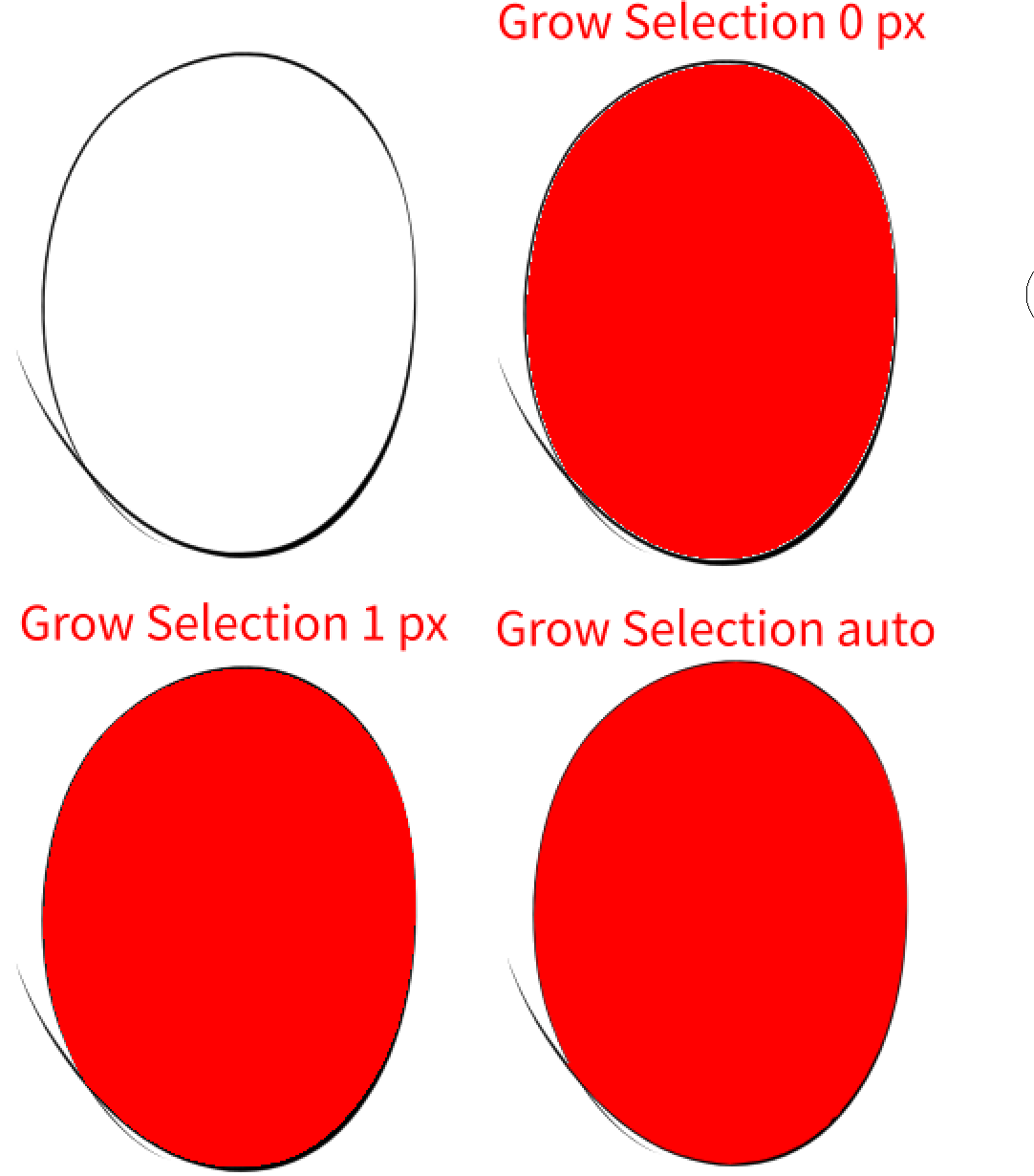
Please zoom in to see the lines.
I have no plans to add more features right now (besides antialiasing and the revamp of the options). I want to focus on the “enclose and fill” tool as soon as possible.
But I’m curious what that option should do. Can you explain to me how should it work? Is that some feature on csp? My guess is that automatic expansion to lines is ambiguous unless some edge detection algorithm is used, but I think that would require to modify the base flood fill algorithm used, which I want to avoid at the moment.
Yes, this one exists in csp and sai.
During the painting process, you need to fill the color after drawing the line.
The default “Grow Selection 0 px” will result in the “Grow Selection 0 px” effect in the image above when filling with the fill tool.
It’s just that there is some space between the fill color and the line, (the antialiased part of the line is not filled with color.) This looks ugly.
So generally increase the “Grow Selection” value (such as 1px) to avoid this bad looking effect.
However, since increasing the value of “Grow Selection” increases the overall value, and the drawn lines change in thickness, the effect of “Grow Selection 1 px” in the picture above may appear.
Part of the line is covered by the fill color.
And if there is that function, the situation mentioned above will not occur. (Refer to the “Grow Selection auto” part in the picture)
This is what it does in the actual painting process, in simple terms a prettier fill color effect.
(Please zoom in on the above image and carefully compare the color of the fill and the effect of the line contact part.)
I don’t know how they (referring to csp and sai) implement this, but they are still different in terms of software setup and usage.
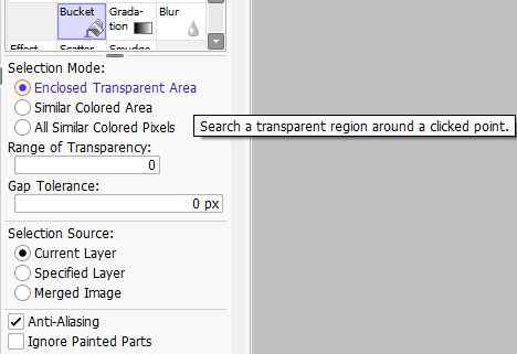
Looking at the options provided by sai, it uses transparency to identify the range (provides a threshold for adjusting the range of recognition transparency), and provides fill anti-aliasing (fill anti-aliasing is enabled by default).
The option provided by csp says to expand to the darkest color of the line, and also provides fill anti-aliasing (fill anti-aliasing is enabled by default).
Ok, one more update to the mockup. I changed this:
- remove the fast mode option. Internally it could be still used if the options are set with the right value:
- no selection used
- no pattern fill
- no antialias, grow or feather
- refererence layer is set to the current layer
- changed the “what to fill” icon for “contiguous region”
- changed the “current layer” and “all layers” icons in the “reference layers”
- changed the “reference layers” section layout a bit. I think in the end I should reuse the color labels widget used in the layers menu or the layers properties dialog (maybe change it a bit).
- added icons for the “multiple fill” buttons (I can’t say I’m happy with those but I wasn’t able to come with any better ones yet)
- added tooltips (please comment/suggest the text)
- EDIT: almost forgot… I put a button for testing purposses and let me switch between left/right alignment for the button groups. I think right align looks better, what do you think?
This week I plan to implement the antialias option and once that is merged I’ll try to implement these changes, so if anyone has suggestions regarding the icons, layour, texts, etc., please comment.
Also pinging @tysontan so that they can give an opinion before making the changes.
I leave a video and an image to better see the icons:

Bravo @Deif_Lou , it’s really a big cleaning, and that’s great.
Here is my tiny nitpickings (very optional) :
(edit: Also: just random thought: I wonder if “Anti-Aliasing” is not a bit too technical/digital-image-science vocabulary? I mean, I grew with it since the 90s, no problem for me; but for younger generation of user… )
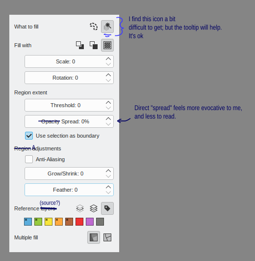
The icon for contiguous region is the best I could think of, but I’m open to suggestions.
Just “spread” and “adjustments” sounds good to me.
Reference source vs layers, I don’t have a strong opinion. Both sound good to me.
I thought of “smooth”, but then there is an action in the selection menu with the same name which applies a 1px radius feather/blur (internally it’s optimized). One possibility would be to use that name in fill tool and change the smooth selection action to perform the new (still wip) antialiasing, and use the old, optimized, smooth selection as a special case in the feather selection action.
How about something like ‘blurred edge’ instead of ‘spread’.
It looks really good i like how the fast mode now only activates when it’s necessary.
About anti-alising i don’t see a problem in fact many other programs use the same vocabulary, so it actually makes sense to me to keep it like that.
Though i think the tool tip text can be tweaked a bit. As if someone doesn’t know what anti-alising is they probably don’t know what aliased edges are. So maybe changing it to something like “smooths jagged fill edges” would be better.
I kinda like the icon for the layer sample to me it is describes well what it means, at least i can understand it as selecting from layers.
While the align right looks a bit more clean i think align left would be more practical, as i feel like it’s it’s a better flow from reading the text and seeing the buttons than reading the text, blank space, buttons.
Another thing that makes me lean towards left alignment is when resizing the docker the buttons get too far away.
Also a question how the buttons aligned right would behave with a narrow column? Would it adjust itself to fit? Unless that’s the minimum size in that case is ok.
But i think overall looks really nice. And the tooltips look good.
@Deif_Lou : Good! I have no better proposal for the icon. The magic-wand + layers is smart, it just require a bit to get used to it. With all this many options, btw, do you think a ‘Reset to default’ button on bottom could help beginners who mess with option and then wants to go back to pristine settings? Note that I have no idea how complex something like that is to insert, and I don’t want to give you more work. Just an idea in case it’s a good one for user friendlyness and if it is a low-hanging fruit to catch while focusing on this part of Krita. ![]()
About my doubt for anti-aliasing, thanks for the feedback @LunarKreatures . I’m ok then for the GUI to use the word if it’s not too expert-terminology (and tooltip on hover will help in any case). Another idea I had: the checkbox could tell something like: “[x] Pixelated edges” and the problem be inverted (and tooltip saying ‘This option desactivate the anti–aliasing, revealing pixels on edges, eg. for pixel art.’ ).