+1 from me, in my eyes it is a good idea to have such a reset-option. ![]()
Michelist
+1 from me, in my eyes it is a good idea to have such a reset-option. ![]()
Michelist
Yes, it is possible and easy to add. Now the question is: what are the best default values for the options?
This is really clean and looks intuitive. I have small suggestions on the cosmetic side which can be subjective. I would suggest moving the icons near the text , because it will make it easy to associate them with the text and also in case the docker gets expanded there is no long space between the text and the icons. I would also suggest removing the indentation padding for the contents of the subsection and add a line with sunken style between sections like it is now in tool options of other tools. Here is how it would look (I have not recreated the exact sunken style of the hr divider like in Qt)
I agree with raghukamath suggestions. removing the identation is actually for the best for people who want to make the docker smaller as possible and also looks more uniform.
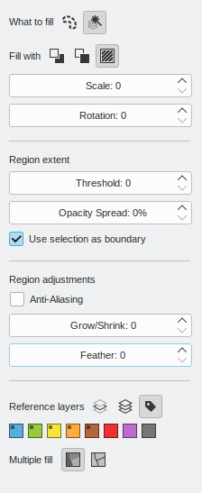
one suggestion i can give is setting grow/shrink to 1 pixel, as one of the most common questions i see people asking is how to get rid of fill tool gaps.
Here are my counterpoints (it’s not that I don’t want to change it, just the reasons I did it like that):
Ok, I just added the anti-alias option to the fill and contiguous selection tools:
Next step is to make this mockup a reality. So please, if you really don’t like something, now is the time to give your opinion.
well considering anti-alias, if it could fill up to the full color somehow would be nice.
I have seen artists changing from PS to SAI just to fill properly because of that. I say only this because I have not tested anything yet.
If with that you mean something like what @Eranthis_stellata suggested some posts above, well, that would have to wait for another round of improvements.
oh it is yes.
In mobile the width is limited but while in desktop the width may be longer. Aligning it near the text won’t have any problem in mobile as well as desktop. Currently I find the space making it hard for me to associate the text in connection with icons and due to habit I read the text as title of the section and then see the icons as their own thing. Currently it reads like this
Fill with________________________ pattern
Currently indentation in the tool option is inconsistently used in Krita. We have divider line to specify sections in tool options and we also have indentation. But I see divider line used more.
Both the points are subjective so I am okay with whatever call you take.
PS. we might need to choose one style and make everything consistent across tool options of different tool but that is for another thread
In mobile you have landscape mode which makes the spacing large, but for what I see from my experience usually the options are in rows separated by some visible line, so maybe that makes the row contents read better as a group. I’ll align the icons to the left. It’s not like I have a strong opinion, just pointing out the possibilities.
If we are going to redesign something, we cannot right now try to make it consistent with the other tool options, because they are a mess. We should stablish some pattern and apply it to the rest of the tool options as you say. I think I prefer padding over the lines, but as you also said that’s subjective.
Maybe other people can give their opinion.
I am glad you opted to align the buttons left. Like i said before feels much more readable. I checked some mobile apps (ibis paint, medibang, huion sketch, artflow, pixiv sketch) and while i noticed the behavior you said in some of them, seem to contain it in floating menus of fixed size.
Even in landscape mode the spacing wasn’t that big cause the floating menu seems to always adjust to the minimum size needed to show the options. So i think thats why it works well on mobile, but just my theory.
About how to group the options together. I would prefer lines over padding, as to me at least its easier to notice what is separated. And like i said before makes things more uniform when reducing the size of the docker.
One of the complaints i saw before in the forums was about the padding in the layers docker. i understand that scenario is a bit different from this, but i think this is an indication that padding can become a problem.
If we take padding as a way to group things as a whole in krita we may end up increasing the minimal size for the Dockers, which i think it’s not a good thing.
Even if by a small amount, if we can reduce the size needed to show all the options in the tool options docker i think it’s for the best.
Ok, I’ll make a new mockup with the left-align and the lines.
One last take (I hope). The things I changed were:

Super changes, it looks now super polished.
Great work @Deif_Lou . Thank you. ![]()
I like it, to me looks very intuitive and organized. the 5px padding doesn’t look disruptive and i really like the color labels. Great job!
Ok, merge request done.
A video of krita in action:
With the system I made, it can be easily applied to other tool options and as a side effect it looks great horizontally, so if this is implemented through all tool options then maybe we can have a tool option toolbar:
And merged.
Thank you everybody for contributing.
Hello, there seems to be a problem, in the latest nightly version, the option of the fill tool does not seem to work
What option?