I agree that the most convenient thing would be to access all resources straight from the application.
However I see two additional benefits from having resources on an external webb:
Promoting Krita. An external webb would show the world all goodies you can access as a Krita-user. Search enginges will be able to map the site and lead users there.
Sharing. A user could easily share a link to another user (say, ie. on social media) to recommend a resource.
Clip studio paint has some sort of browser which just shows their web page. So the resources have website and the same website can be accessed through the application
Personally, while I think having easier access to bundles would be nice, I think it would be great to have more access to individual resources on demand. Cause thing with bundles is you look for bundles you like and install them before drawing, but during drawing, sometimes you find that none of the brushes you have meet your need and are just looking for a specific brush and sorting through entire bundles to find that 1 brush can be a bit frustrating.
It would be nice to have a brush search by characteristics. Then you can download the brush pack once you find that 1 brush you need.
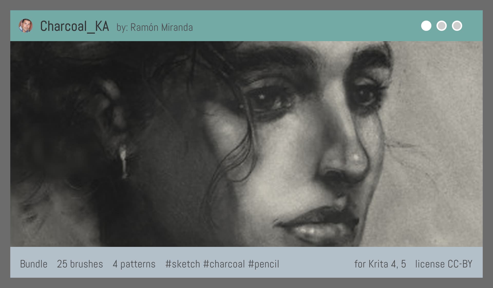
I like that that last mockup lists the number of brushes, but keep in mind brushes aren’t the only thing. Ideally it would be nice to list what types of resources (Brush Tips, Brush Presets, Patterns, etc) and how many of each a bundle contains. (I was even wondering whether having Krita display this information in the Resource Manager would be possible/useful.)
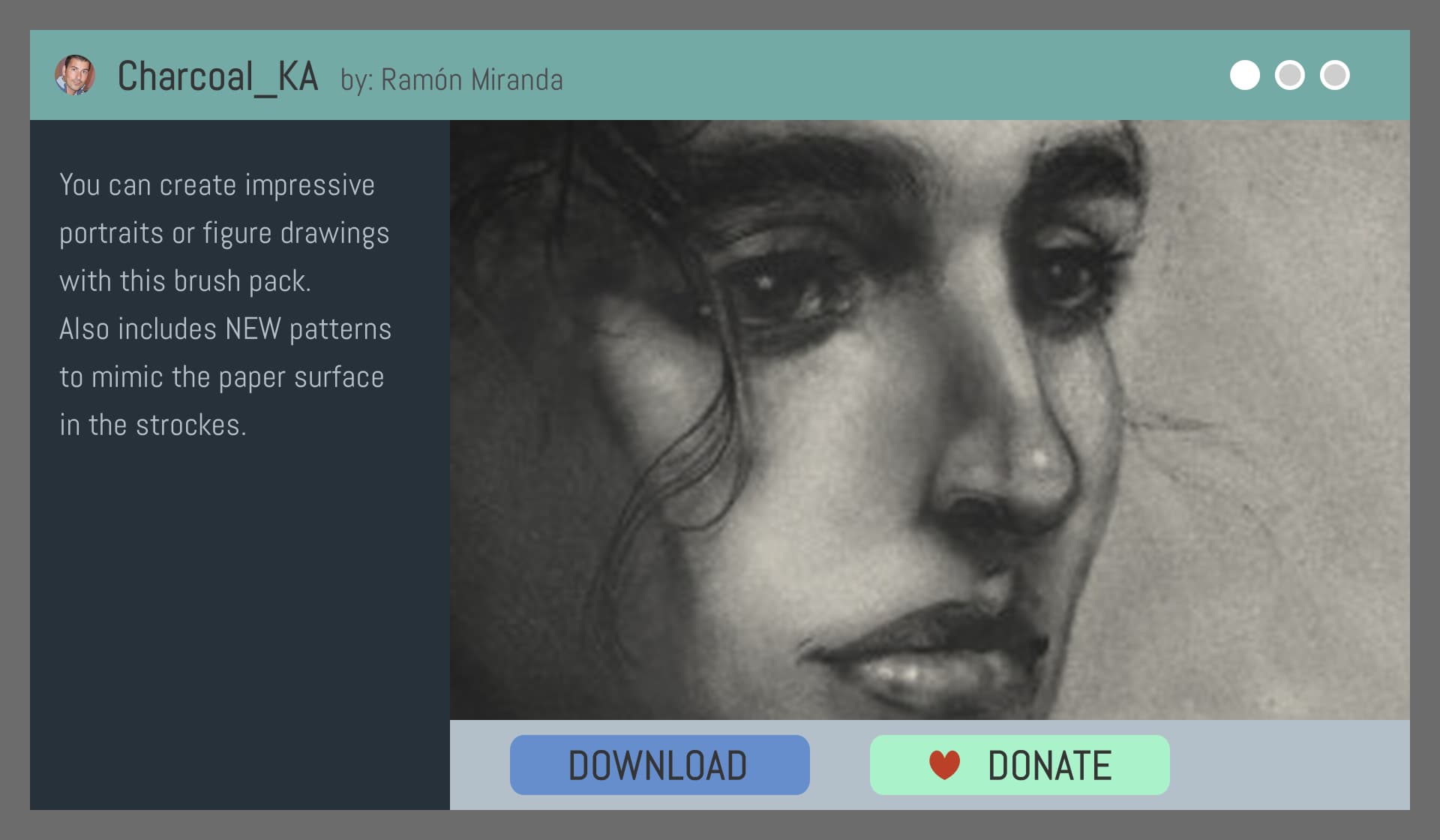
This sort of technical information (along with filesize, when the file was last updated, etc) isn’t exactly eye-catching but still important to know before downloading something. That’s why separating the “eyecatch” and the detailed description can be useful… deciding what the user should see first and what they see when they look for “more info”.
Re: hovering, I see the benefit of hiding info and displaying it on demand, but perhaps a collapsable drop-down menu would have more user control.
Oh let me do a small tweak to the mock up. I had another image in mind.
Edit:
just ignore the brush area overlapping the interface just imagine it just isolated inside the right block giving an animated example of what is inside.
Hello, i discover this subject today and i think it’s a really great idea, not only to brushes but also to plugins and themes !
This is one of my favourites things, to look what new creations are in “Resources” or old one when a new message put a usefull or pretty tool above the previous one.
Before any creation of a usefull library, i was thinking that a direct link on the homepage of Krita to the “Resource” forum could be a nice start.
This way, users of Krita would have more chance to discover the possibility of personalise this wonderfull software and discover the fabulous community of open source.