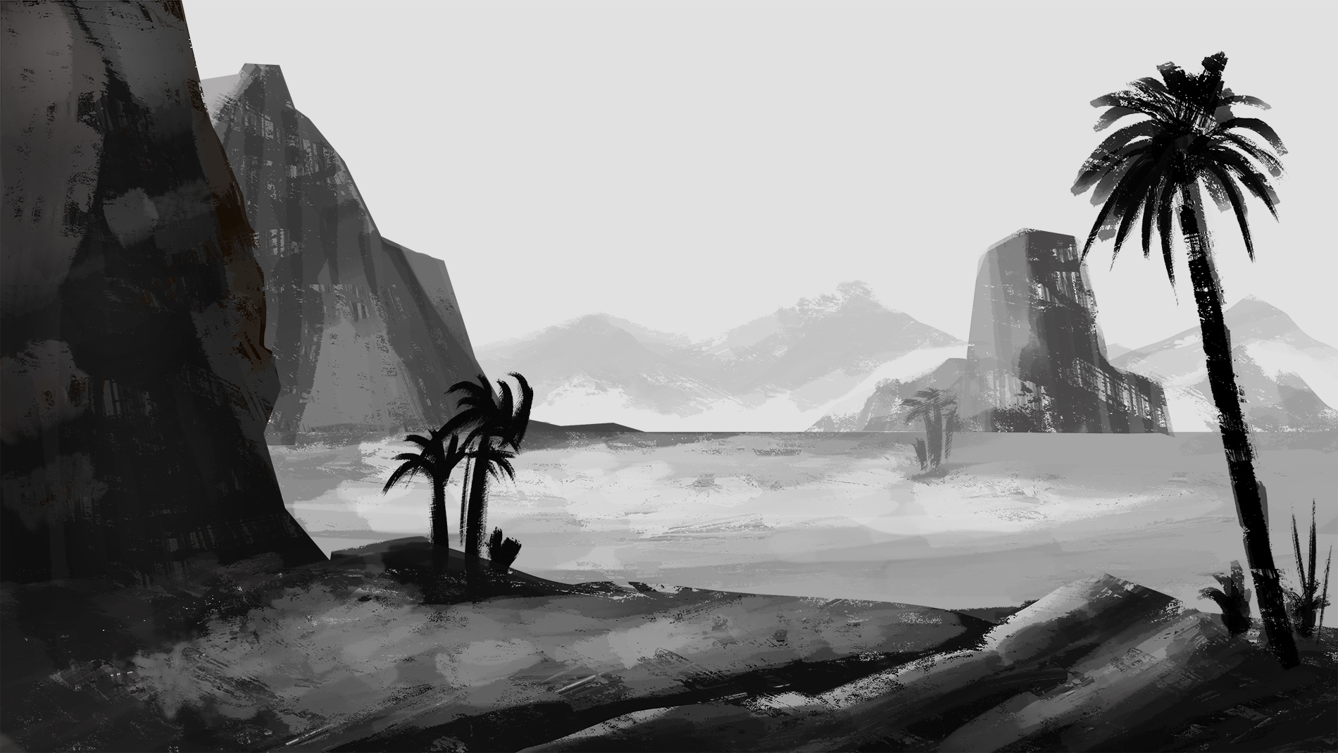
I have an image that I started painting in grayscale.
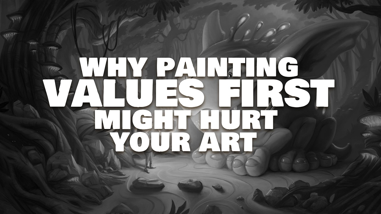
I learned that we can define the good readability of the image by working very well with its values in grayscale.
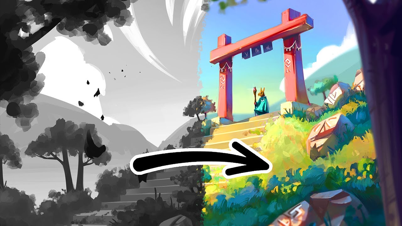
Question: What is a simple method for coloring after this first phase? Do I put an empty layer on top in COLOR mode? If I do that, the color looks a little strange. A little washed out.
Hi there I’m actually interested in finding out how too, since throughout the years been testing and felt the greyscale painting probably better be used as base to put colored paint on top or as a ref. Since in my tests darker value areas, and texture areas are quite hard to manipulate with just filter even stacked filters, but it could be just my lack of experience talking.
As far as a good example of artist that able to do this with what I think a great result would be Ariabba’s
You probably need to bumped up your overall value to lighter value first before attempting the filter and paint layer stacking like in the video.
My personal opinion about this is the amount of brain power and overall effort is not that different than doing normal painting iterations where the greyscale piece is used as reference, or the greyscale intentionally left in basic form (no texture, no complex shapes. no too dark values) to then build a colored painting on top of it.
Would love to know what’s the OP and others’ opinion about this.
Hi there! I find that the Color blending mode makes some colors a little muddy, so I go for Hard Light or Addition depending on the value/hue I’m working with and/or the effect I want to achieve. I also recommend the freehand selection + gradient map fill layer combo (self plug for resources)
Oh, and check out the videos already recommended, they’re really helpful!
I think value studies may be better suited for thumbnails and concept sketches… but some people do use the grayscale to color very well. It’s never bad to try different ways to create, anyway.
I know some uses gradient maps for a base and then color over as well, maybe that’s an idea?
I can highly recommend reading Devin Korwin’s ebooks on art fundamentals, and I’ve had good luck with the “Artists’ Master Series” from 3dtotal. Alternatively, Alla Prima II by Richard Schmid has also been extremely enlightening!
What I do if I really, really am unsure what values my image has, I just make a new layer, fill it with black/white, and set it to “color”. That way you can quickly check your values when painting in color ^^

 )
)