Disambiguation: This a half tone selector plugin for painting. It is not related to the halftone artistic filter.
I didn’t want to be distracted by picking and managing tones when I’m practicing geometry and form, so I created a simple plugin to deal with the half tones for me.
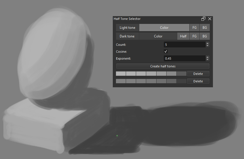
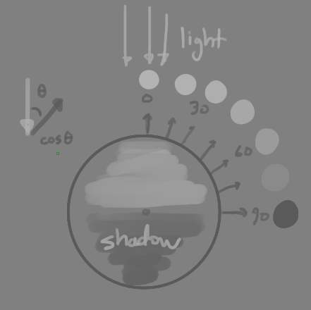
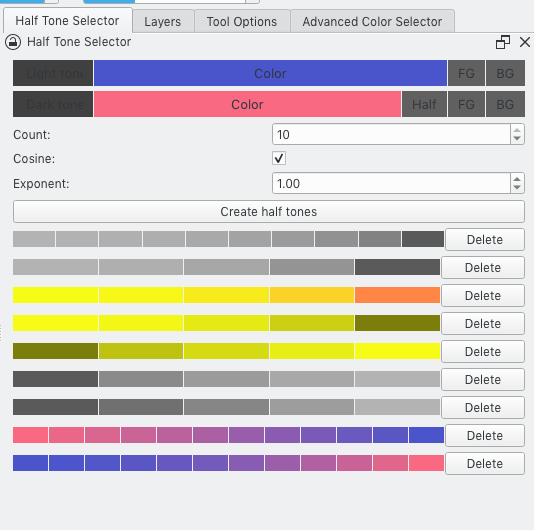
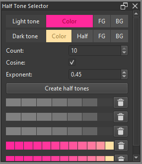
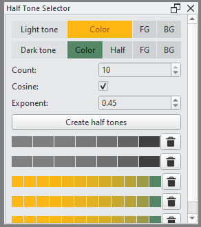
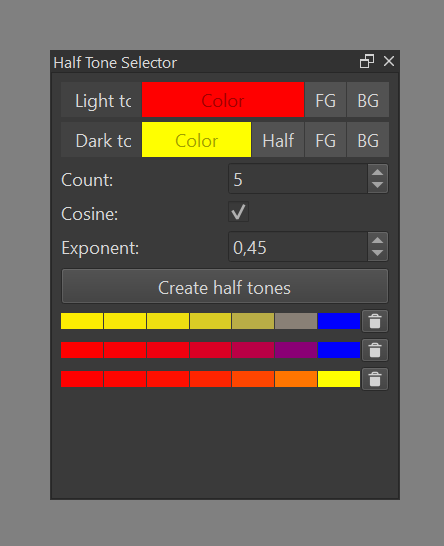
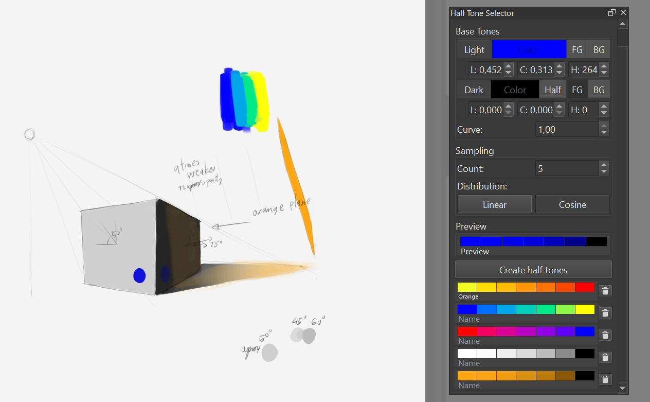
This plugin generate half tones from user defined light and dark tones. It is useful for shading and practice. If you know the angle between the light rays and what you are drawing, you will know which tone to use. By default, 5 half tones are generated at 15, 30, 45, 60, and 75 degrees.
To install, drop the zip in [Tools]->[Scripts]->[Import Python Plugin from File...]. After restarting, you may need to toggle the docker view in [Settings]->[Dockers]->[Half Tone Selector] if it is not visible.
Hello!!
I tried using install it.I feel that the plugin creates a graduated palette with complements between two specified colors.
This palette is available immediately.
RGB colors are also supported.
It is convenient because can instantly create the colors need.
There are two issues I’ve noticed.
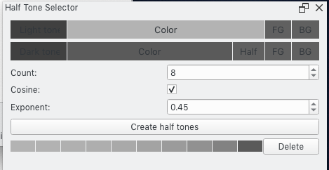
It can’t see some UI strings.
This happens when using Krita’s light theme.
There was no problem with dark theme.
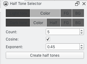
Another one is that when too increase the count value,
the dialog itself becomes,
It is forced to stretch sideways and cannot be smaller.
This is not a concern as long as it is used with count=5 or so.
I really like this plugin. Gave a little test, and truly enjoyed it.
It adds a nice and simple way to maintain color schemes during work. A great complement to Pigment and Warm and Cold Palette.
However, the palette is not saved, do you think in implementing something like that?
So, a little suggestion, If you could add the spectral color mixing it would be perfect, because if you realize this, use the additive. Because like all the painting softwares blue and yellow isnt green (which also mix box would be good to use but I think it’s closed source)
Thanks for the suggestion! I was thinking about this too. The current model assumes a white light source. You can think of the “light tone” as the color when fully lit and the “dark tone” as the color when in shadow (fully unlit). I want to be able to change the color of the light source, and spectral color mixing, like you suggested, is a good way to do it.
Edit: I’m planning to do implement this in the next release. I’m going to normalize the luma using BT.709 and add a separate control for light intensity as well.
Well looking forward to the update :3, This would complete a realistic way to represent the variation in color depending on how a surface is illuminated and the angle of incidence of the light. So good luck!
I made an update. You shouldn’t need to do anything to upgrade, but if you have a lot of half tone sets, it wouldn’t hurt to backup the half_tone_selector/_data.json file.
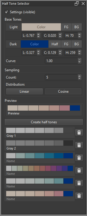
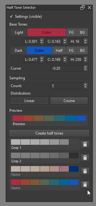
Switch from sRGB to Oklch. This applies to interpolation of colors and internal representations.
Add numerical inputs for LCH.
Add input for selecting a curve. See diagram below.
Add ability to add and edit names for half tone sets.
Remove exponent input. The exponent is supposed to approximate the non-linear function to convert from sRGB to linear RGB and back. A more accurate version of the non-linear function is being used instead.
Add preview.
Replace cosine checkbox with a choice between linear and cosine distributions.
Figure out spectra unsampling so I can convert colors into waves of light. This will allow more physically accurate spectral color mixing and lighting effects. Initially, I did try using linear RGB but I didn’t feel like it was good enough.
Add a color wheel to better visualize the base tones and curves.
Figure out a cleaner model for curves in color space.
Thanks for this awesome plugin ^^!
Now it would just be to see how Inverse square law could be implemented. Because light also decreases with distance. But don’t worry, it’s a great plugin as it is!
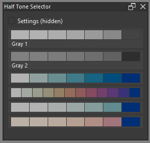
Minor update: The settings visibility toggle isn’t very useful when you have to manually rescale the widget every time. The plugin now remembers visibility state and the associated height and width with that state.
I haven’t used it in anger yet, but had a bit of a play. I have a couple of comments if you are willing to hear them.
It’s a very cool plugin.
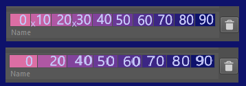
I think it could be useful to label the colours with numbers or angles. This would make it easy to work out which one to use for a given angle.
For a Cosine sequence of more than a few colours I can hardly tell the difference between the initial ones, so I would be unlikely to use a number of them. Something that would work well with suggestion 2 would be if you could delete some of the colours in the sequence. The numbers or angles on the remaining ones would tell you what angle they belong to.
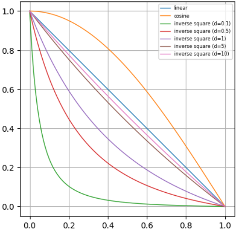
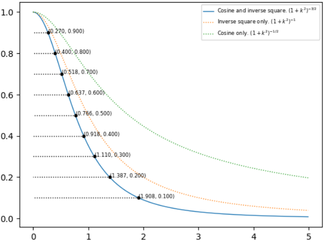
Note that the curves above are normalized to [0,1].
Inverse square is complicated since the curve depends on the distance from the light source. The question is how to make it intuitive for artists and how they might use it in tandem with cosine.
As the distance increases, the falloff approaches linear (after normalization) but the actual slope approaches zero. For far light sources, inverse square can be ignored. Everything gets more complicated for closer light sources.
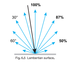
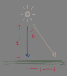
One example is lighting a plane from a point source. Y-axis is lightness relative to the brightest point of the plane. X-axis is the distance on the plane from the brightest point. Inverse square is more influential than cosine in this case. The falloff is quick and is even more extreme the closer the light source.