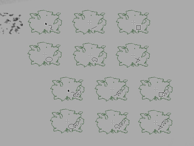
It is quite difficult to find one modified type of contour that will be “easy to perceive”. This is due to the presence of different complexity of brush shapes , brush sizes, (as well as various combinations of dynamic changes in shape and size and rotation) not to mention the color and complexity of the canvas itself. Even this animation record_000003.avi - Google Drive may not be suitable for working with very small brushes.
But I would be happy to see the cursor change as an indicator when the “eraser” mode is enabled
And +1 for the eraser indication on the cursor, although truth be told that cursor is not an outline; maybe it could be possible to get No Cursor + Outline + cursor eraser indication? (It will show outline lagging after cursor more but…)
I’ve been thinking that another option could be something that calls attention on the interface, like turning red the “set eraser mode” button, even when it’s not right where we look, it’s in the field of view and noticeable.
Anyway, I think a change in the cursor design would be a better indicator.
I personally don’t make use of brush outlines, so none of the choices would work for me. I use the small triangle right-handed. I think it would be nice to have the option to just have a small eraser icon next to it? If it’s not too bothersome
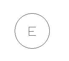
I still think a cursor change to a letter or sign would be a good option to consider too:
-it would be super easy to implement with Qt.
-it would maintain brush outline clarity.
-New users could see that it was a E and easily understand the relation between “Eraser” and “key input E” giving clarity for new users (similar to the “-” minus when your subtracting selections.)
-you could flip or rotate the letter around to mean different types of eraser modes(it would just be a change of character and not actually performing a transform to it).
-would maintain consistency in interpretation of what the cursor was showing with other tools behavior.
-would not imply weird displays of the cursor by changing it too much.
i think adding a letter is too much, and make the display heavy. Plus what happen with small cursor…
The poll seems to proove that poeple are interrested in this feature and an alternate color seems to be the best and simplier choice. Hope this function would be added soon.
@Andreich_DMBL and @tiar : I’m against cursors, or anything that alter the silhouette of the outline suddently. I press often ‘E’ key while line-art. Changing suddently the silhouette would mess with my precision. Also, I already use a cursor + outline (mini circle) to emphasis the center of the stroke, I’m not sure how both could play together simultaneously.
@EyeOdin : The letter proposal would need obviously translation because ‘E’ doesn’t mean anything for many language (eg. ‘G’ for Gomme in French). I guess you would have complex rendering for non latin letter too. Also, +1 with @Mako_Matt for small brush, it doesn’t have room to write a letter; and what happens if the user has a brush-tip with the shape of a letter?
Anyway, I spent already a lot of time testing, building/compiling and writing on this topic in the MR and I feel a bit bitter about starting again a discussion here. Do anything you want as long as it can be optionnal.
I agree with @Deevad, this poll was made after a discussion here and was an echo of the discussion that David link in his post. I’ll just be very happy if this function came to life and according to the poll i’m not the only one
I totally agree, I love the simplicity of having the colour change! I want this feature so much!
I often find myself looking up at the eraser icon, or just forgetting what brushes I have turned on eraser mode for, since I have the “Temporarily Save Tweaks To Presets” turned on. This will make it much nicer!
I really don’t agree with those counter arguments but okay.
I just dont understand why you guys favor something that is even harder to implement and looks a bit on ugly side. My vote was acctualy on the least ugly one :\
@EyeOdin Well for one, it won’t work for small brush sizes. For the second it adds clutter to centre where you want to decently see what you are doing . I could imagine an E symbol or something to lower/upper right/left that would make more sense as it doesn’t compromise the view and doesn’t depend on the brush size.
@pablo Interface red button would work only for people who don’t work in canvas only mode, there are also huge display sizes (especially wacom) where interface at the top gets really out of view. So I think the change to shape/cursor is probably the most reasonable here
I personally think XOR which @Deevad has a gif of combined with something @ramskulls@Rebecca and @Andreich_DMBL suggest looks like the best option for me. Especially if you can turn it on/off in settings.
And if possibly you could turn on/off them separately - two options one for outline and one for cursor, there are already two options in settings for cursor and outline so it wouldn’t be out of line too much - this could satisfy: only cursor people, only outline people, cursor + outline people who would have option for cusor or outline or cursor + outline erase mode indications, it would work for other tools too - line, …, why I suggest both options being able to turn on/off separately is not only for this but also with smaller brush sizes the outline can easily get lost for some people especially if you have some problems with vision while adding an icon would be a particularly good option for these cases (but people who don’t want it could turn it off) while also working in canvas mode.
(a note from previous discussion in case someone doesn’t know, unlike outline the cursor are images)
So my vote would be for XOR + cursor icon indicator with both being optional in settings and definitely would love to see something happen, can we possibly add this to the poll please?
Now, whether this is feasible for the devs or not I’ll leave up to them I think that’s something only devs can tell us so I’ll be going with a generous option and maybe see what you guys and the devs think about it?
It was confusing to me that there is no difference on the cursor between a normal brush and a brush that is in eraser or erase mode.
I was wondering if there was a way to make the cursor change and came across this topic. It seems like this topic is already a year old, but I would like to reiterate my support for this idea.
Ideally, I would like to be able to set up a cursor (.cur) for each preset. It would be a lot of fun to be able to prepare and distribute my own cursors.
“Fill with foreground color.”
“Fill with background color.”
These two commands do not work literally if the brush preset is set to erase mode or if you are using an eraser-type brush preset. They both work to erase the image on the layer.
It is still understandable that “Fill with Foreground Color” is converted to erase since you are using an erase brush, but it seems strange that “Fill with Background Color” is also converted to erase.
I often make the mistake of wanting to fill with foreground color, but mistakenly erasing it, and then not knowing what happened.
I found out from this topic that there are other people who make the same mistake as I do, and that this problem is a common one.
Of course, some people would rather take advantage of this specification, as they can erase the image by using “Eraser” + “Fill”. I can’t help but agree that this is the specification of Krita.
However, in the current state of Krita, we cannot tell whether the brush preset we are selecting is in erase mode by just using the cursor, but we have to check the preset icon. This makes it easy to misjudge how the fill will work.
“The cursor should represent whether the selected preset is in erase mode.”
“That the fill command works independently of the preset that is selected.”
If at least one of these is not achieved, the fill command is in an inconvenient state.
Therefore, I wanted to support the idea of this topic.
Yeah I think erasing on fill to make sense not sure if it is the best or not but works in my head.
I re read this and I still think an E is the best option by far. And I don’t understand the counter arguments even less now.
If it is a letter it is vector so it is light weight, probably easy to implement, plays nice with colour switching for the background, easily scalable, you could mirror it to display mirror mode even.
For the counter arguments to it:
Regarding translating it you could do it if using a font but that is just a bad idea as advocating this makes no sense as you don’t type Eraser or anything to warrant a translation. Not to mention the fact that you should have your system in English, and if you don’t you probably should. Translated for me would be a B but that sounds bad just like a G. Regardless of language E key shortcut still stands and that does not change because of translations and pressing the key E and see a E appear on the cursor… Sounds logical. Also it is the E key because it is the Eraser. If you changed it, if it is a font you can change it if your that picky. But my thought would be to use lines, E is a simple shape to render for 1px straight lines and with great visibility even more than an icon even at smaller sizes.
And regarding scalability what about the other options are they not also visually impaired just as much, Is not everything small when you scale them down? Yes they are, all ideas here are hard to see when the cursor is miniscule… At 5px height you can still render a proper E and at 3px is still understandable. Is the thing here 2px below to be worthy? Only a square would be that worthy on a 2x2 px size.
As for it blocking the center that is the reason why you have the cursor over the stamp representation. Also you could make the end of the line in the middle end at the center.
Since it happens often enough that we get new “can’t draw anymore” topics where the issue was simply that the eraser mode was on because they accidentally pressed E on the keyboard, I very much think we could use some indicator on the brush. A small eraser icon next to the brush outline or cursor would be what I’d opt for. Putting a big E in the outlines would obscure the little dot that is visible when using weighted smoothing or the stabilizer in eraser mode, or when using brush outline with cursor for extra precision. And the letter E probably wouldn’t be obvious for non English users (even though its the shortcut).