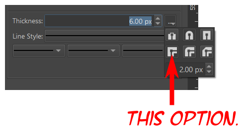
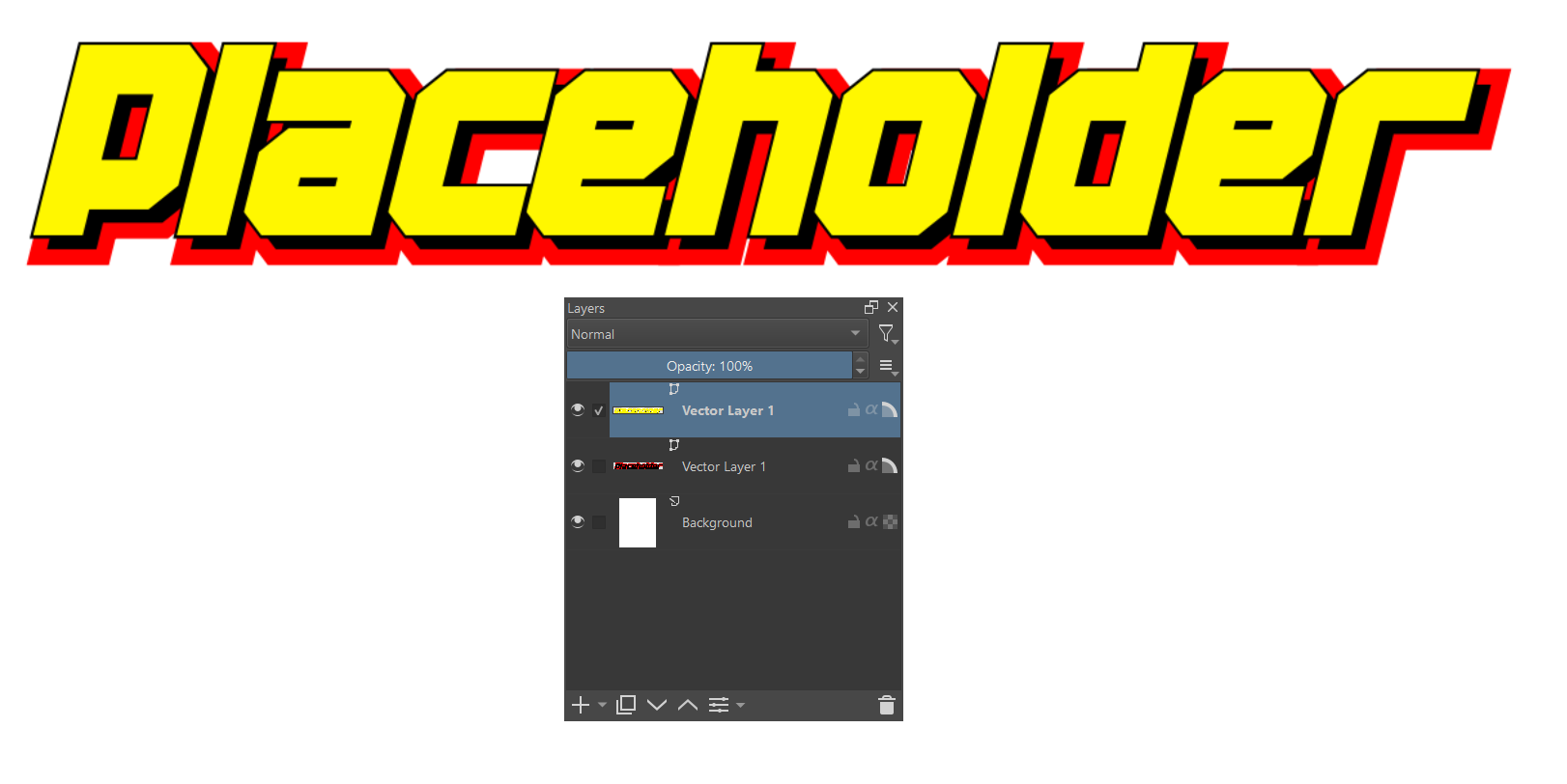
You can get that sort of effect by adding an outline to your text (as the text is a vector). Just select your text with the Select Shapes tool and then open your Tool Options Docker. On the Line tab of the Tool Options Docker, you’ll have the option to set the line for the text to be transparent, solid, or a gradient. Select the “Solid” option and set the thickness option to a level of your liking. To get a sharp edge, click the button with the three dots (to the right of the “Thickness” option, and select the “Miter Join” option (see image below).