Introduction
This is a wishlist of UX improvements that I’d like to see implemented. These are UX “papercuts” I’ve come over time while using Krita as well as while browsing this community site. So to be clear: This is NOT meant to be about bugs that are in need of patching or improving performance where Krita is slow. This is NOT meant to be about huge overhauls or shiny new features that I’m missing from other software. This is a matter of touching up and solidifying Krita’s existing UX and improving new users’ first impressions.
It needs to be said that I don’t use every feature of Krita in my workflow and my workflow doesn’t encompass everything that Krita has to offer. I’ve tried asking other artists who use Krita that I know personally and added their suggestions to my list if I hadn’t already. It is also possible that I might have overlooked something or that something on my list has actually been fixed over the time of me adding to it.
Additionally, I’m not overly familiar with the inner workings of Krita and don’t know how big or small these requests might actually be considered. I’m also well aware that manpower is a limited resource and I have full respect that sporadic UX polish can’t always be given priority.
The List
Miscellaneous
Canvas Input Settings on a per-tool basis
- When using the Photoshop Compatible configurations the Activate Line Tool canvas input is set to ‘Shift + Left Button’. The problem here is that it clashes with a lot of other shortcuts. For example, the “Shift-mouseclick” shortcut to end a line specified by the polygon/-line tools, and the shortcut to make selections additive. I generally try to avoid requesting more configurability since it tends to add a bunch of complexity, but i believe there is a need to be able to control which tools these kinds of invocations does/doesn’t apply to.
- Side note: Canvas Input Settings seem to be in need of polish in general. For example it’s not always clear what an input will do or affect once invoked. This issue is worsened by the fact that the documentation page for Canvas Inputs is barebones for something that’s arguably key to using Krita effectively.
- Disclaimer: I am aware that the Canvas Input system is a bit of a beast within the code (perhaps another indicator that some refinement is needed). This is not a small request even on a surface level but probably even large once you take this fact into consideration.
Unify color/source sampling for Clone brushes
- Right now the way you choose a new source with Clone brushes is (from what I can tell) hard coded to be Ctrl + Left click. This works for Krita’s default shortcuts where the Color Sampler Tool is quickly accessed with the Ctrl key. But if you change that canvas input setting things get confusing. I would make sense for Clone brushes to treat their source as their colour and in turn use the same shortcut as invoking the Color Sampler.
“Restore Defaults” button for Onion Skins
- A friend who works with animation in Krita has brought up that he misses a way to quickly restore the vertical sliders in the Onion Skins docker to their original values. A ‘Restore Defaults’ button would be helpful here as it gets tedious to
Horizontal Mode for the Brush Presets Docker
- If you make the Brush Presets docker very short but wide it becomes difficult to scroll through with a tablet pen as the scroll bar. It would be useful if the docker at certain dimensions could switch scrolling direction from scrolling vertically to horizontally. That way you could have your Brush Presets docker horizontally along the top or bottom of the screen while also being able to scroll through the preset list with precision.
- A bonus to this horizontal layout would be if the buttons and dropdowns around the list widget would rearrange to be on a single row above the list
Missing features for working with wider colour ranges
- I’ve been told by a friend that the Specific Color Selector is currently lacking some capabilities to work with colours of higher bit-depths. When the 16-bit and 32-bit floating point modes are used the docker only allows the user to work with a granularity of 1% which is even less precision than the 8-bit mode allows for.
- The same friend misses being able to adjust candela-per-square-meter (cd/m²) in other colour selectors than the Small Colour Selector docker when working with HDR colour (missing it from the Specific Color Selector to be specific).
- There’s also a request to be able to adjust cd/m² even on non-HDR monitors. One suggestion would be to have a checkbox in the Color Management settings to enable HDR settings even if no HDR display is being detected. Brighter-than-white colours can still be useful even if a display cannot directly output them. For example: when the layer blend mode is set to Multiply, colours brighter than white can be used to lighten layers underneath or blend across brightening and darkening on the same Multiply layer.
Tools Menu Redundancy
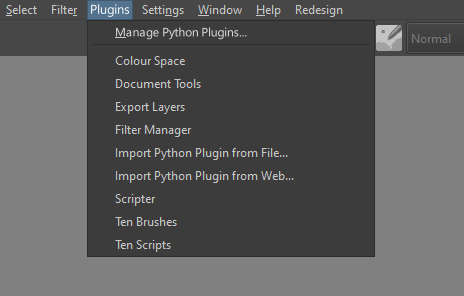
- The Tools menu on Krita’s main menu bar only has one entry: Scripts. It seems to me it would be better to turn the Tools menu into Plugins (or Scripts) instead and skip an unnecessary menuing step. Furthermore there’s an argument to be made about confusing the Tools menu and the Tools Docker.
- By having a Plugins menu you could also extract the Python Plugins section from Krita’s configuration dialog and make it into its own dialog. This would then be accessed from the top of the Plugins menu as Manage Python plugins….
- This raises a question if plugin dockers would be placed under this new Plugins tab or remain under the regular docker menu. There’s valid arguments for both in my opinion and perhaps a matter of personal preference. My suggestion would be to have Scripts and Dockers submenus under this Plugins menu so it is clear they aren’t entirely native to Krita and managed as python plugins.
Improving Subwindows
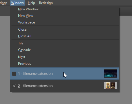
- One thing that would enhance the experience of using subwindows/views is thumbnails for each view in the Window menu. Useful in cases where two documents have a similar name or you have multiple views of the same document for soft-proofing purposes. It would also hopefully reduce the need for including the entire file path in the menu entry.
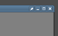
- A ‘Pin’ (
 ) icon on the title bar of subwindows would be useful to make the option to have them stay on top more discoverable. Hopefully this is within the possibilities of the default Qt subwindow system.
Docker Menu Categories

- The Dockers menu is getting pretty lengthy and I believe it’s time to start organizing it into categories based on the kinds of utility or workflow they are intended to facilitate. My suggestions would be Animation, Color Pickers, Document(Layers, Comics Manager, Undo History…), Layout (Overview, Grids and Guides, Compositions…) and Resources (Brush Presets, LUTs, Gamut Masks…). There could be a Basic category for dockers like the Toolbox, Tool Options and the Touch Docker, but I believe they might benefit from remaining above the categories in the dockers menu.
- As an addition to the point above regarding plugin dockers: One idea would be to have a Plugins category that third-party dockers would default to. I also think it would be beneficial if entries for dockers that are python plugins were decorated with the python logo as an icon. It would signal to users that they can be managed as python plugins.
Improving Krita’s Configurable Toolbars

- Krita has fully configurable toolbars but the feature is suffering from a bit of neglect. First off, users can’t easily create additional toolbars to add to the list of existing ones. That is to say, there aren’t any toolbar resource files that can be imported and/or exported.
- The toolbar configuration dialog could do with some love as well:
- The names of the toolbars in the configuration dialog lists them with weird internal names as opposed to the names they have in the Toolbars Shown menu.
- Reconsider the use of icons as it makes for an inconsistency between list entries (and affects entry spacing).
- The Current actions list doesn’t really warrant a search filter.
- Organize the actions into categories similar to the list of properties in the brush preset editor.
- Clean up the list of available actions. You could afford to blacklist entries like About KDE, Themes, and probably Switch Application Language… as these are unlikely to be actions a user wants quick access to. Other actions like Smooth or Adjust are in need of a renaming or a description, but putting them in relevant categories would help as well. And as a final little addition, please capitalize the —separator— entry, or rename it into just Separator.
- The arrow buttons to move actions around are charmingly old school but it might be worth considering replacing these with instructions to drag and drop the actions instead. In this case you would probably want a clickable ‘X’ on the right end of each action currently in the selected toolbar, in order to remove them.
The Toolbox
Dynamic Brush Tool and Brush Smoothing
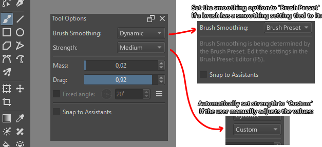
- Turn the Dynamic Brush Tool into a smoothing mode for the regular Freehand Brush Tool. I can’t see any reason for there to be a separate brush tool when the only apparent difference is that the former offers an additional mode of brush smoothing.
- I also want to suggest extending the brush smoothing feature by offering preset levels of strength for brush smoothing. Not only is this helpful to artists who are just starting to use the feature and are still figuring out what’s comfortable to them, but it also serves as a way of resetting the smoothing settings to a default/working state. The options for the Dynamic Brush Tool in particular are fully open to be set to a virtually unusable configuration with no obvious way for a user to reset them. It’s also helpful to users who are transferring from other software that only does brush smoothing strength this way.
- I’ve also seen users suggest to let brush presets have their own respective smoothing settings. The most obvious use case would be when artists want plenty of smoothing while inking a sketch, but little-to-no smoothing when adding colours underneath the inked drawing. I support this suggestion but would argue that streamlining the brush smoothing feature should come before hooking it up to more parts of Krita.
Polyline Tool and Polygon Tool

- I believe a simple checkbox in the tool options to toggle Connect ends automatically should suffice. An additional option would be to give the tool a right-click menu with an entry for End line and connect ends. And a big plus would be to add a Canvas Input shortcut like “Ctrl + Shift + Left Mouse Button: Ends the line and connects the ends”.
Similar Colour Selection Tool and Contiguous Selection Tool
- Like to the point above, its case where two tools are identical except for one minor difference in functionality. They both serve the purpose to select pixels of similar colours with the difference being that one tool only creates a contiguous selection while the other is free to select from the entire canvas area. Much like the Polyline Tool and Polygon Tool this difference should be possible to handle with a single checkbox in the Tool Options docker.
Shape Brush Engine and Freehand Path Tool
- While not entirely similar in purpose there is an argument to be made about the Freehand Path tool being able to fill the same role as the Shape brush engine. It’s currently teetering on the border of redundancy with the only real caveat being that it’s not immediately obvious that the Freehand Path tool can be used this way. Even so I’d like to propose extending the Freehand Path tool with the features of the Shape engine (while working on raster layers) and take its place.
Text Tool
Disclaimer: I’m aware of Wolthera’s work on Krita’s text handling capabilities (hugely appreciated!). I’m also aware that there is high demand for on-canvas text editing that will have to come sometime after Wolthera’s work is finalized. I fully respect that a pretty major rework of the Text Tool is going to take its time. But since we don’t have any good timeframe for this rework it would be greatly appreciated if some of the current problems could be remedied in the meantime.
Don’t preview the look of text in the text field of the Edit Text window.
- This causes problems if the text colour is set to one similar to that of the UI background, or if the size is set to a very large or small size. The text you’re editing becomes hard to read, and text size or automatic line breaks aren’t 1:1 with the text on the canvas. The text editor only needs a plain text field using the same text as the UI. Leave the richness for the actual canvas.
- This would be further helped with a ‘Preview’ checkbox similar to what exists in Filters and Layer Styles.
Fit text inside borders
- Sometimes you have a shape in an image like a text box or a speech bubble that you want to fit text inside of. In these cases it would be very helpful if you could draw a text field that doesn’t change size to fit the text.
Don’t automatically switch to the Select Shapes Tool after finishing editing text
- I’m not sure why Krita would do something like this. I think it’s a weird assumption that a user always wants to move their text around every time they’re done editing it. Maybe the user is editing a comic page, correcting spelling mistakes or grammatical errors, changing text colour for better readability, changing font sizes, etc.
- One idea would be to utilize Canvas Input shortcuts to allow the user to quickly access the Select Shapes Tool if the user so desires.
Use the Tool Options docker to edit text properties
- It would be handy to be able to click on a text object and quickly adjust its properties via the fields in the Tool Options docker.
Brush Preset Editor
Disclaimer: Once again a part of Krita that I know is being heavily reworked under the hood (Lager back-end by Dmitry. Again, many thanks!). Consider these suggestions as being intended for after that work has been finalized.
Inconsistent spacing
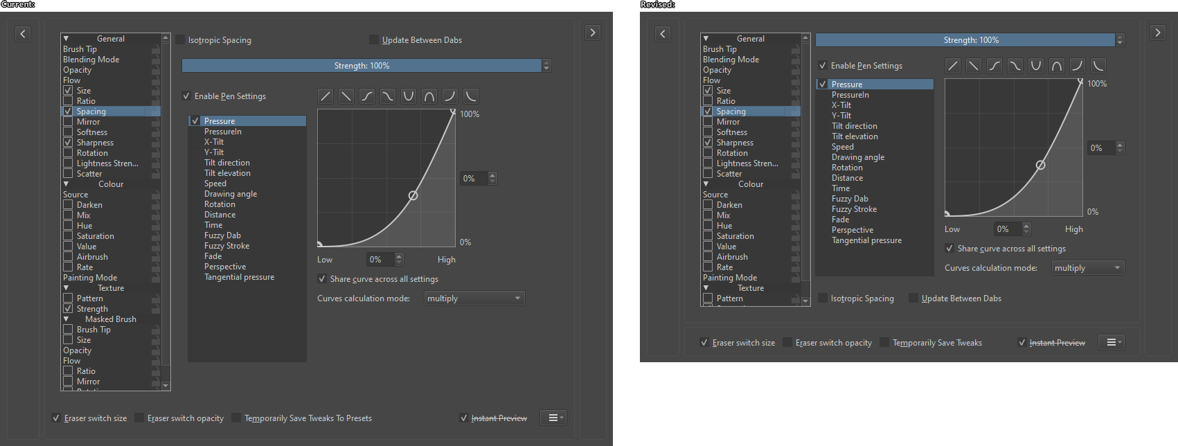
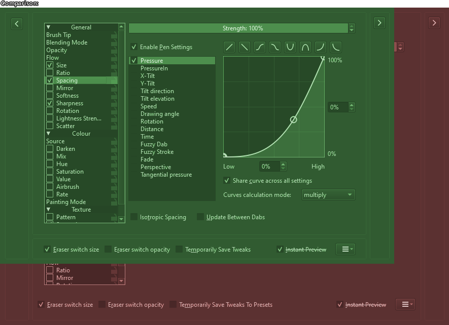
- The Brush Preset Editor has several inconsistencies in the spacings/margins of the UI. Not only does it make for a less polished look but this also means there’s space that could be better utilized or just saved. For example: open the Editor and select any brush from the Pixel Engine. Select the Spacing option in the list of properties.
- Notice how the two checkboxes up top, the Endable Pen Settings checkbox, and the list of options for pen pressure don’t align vertically along the left side.
- The ends of the Strength slider-spinbox, the Y-axis spinbox for the pressure curve, and the Curves calculation mode dropdown menu don’t align along the right side.
- The brush presets list, the brush properties section, and the scratchpad, don’t align horizontally along the top.
- The bottom row of brush settings (Eraser switch size, Eraser switch opacity, etc.) don’t align vertically with the list of brush properties along the left.
- And so on…
- Other notable UI inconsistencies includes:
- Some slider-spinboxes have their title inside the widget, others have them outside. A good example are the two slider-spinbox at the top when you edit the Sharpness property.
- The Fade sliders in the Brush tip property has a random title and frame that the other properties don’t.
- The UI for the Opacity and Flow properties are virtually identical but switching between them you notice some odd shifting around and resizing.
- Generated brush tips are displayed on top of a (non-functioning) button instead of a widget like the stroke preview. Why?
- Some brush presets properties have unique settings (Like Scatter having checkboxes for Scatter amount) at the top of the layout. I feel like they’re better suited to place in the empty space below the settings curve to avoid the UI shifting around when going through different brush properties.
Disable (or hide) options that don’t apply to the current brush
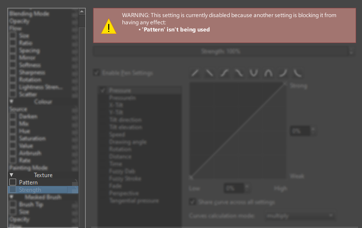
- If the setting isn’t applicable it may as well be disabled to clearly indicate that it doesn’t apply. To address why a setting isn’t available you would probably want a label of some kind telling the user what’s blocking it. Additionally, you could set the tooltip of that setting to be the same text as the label.
- Examples that I’ve been able to find:
- Flow when using Build-up Painting Mode
- Softness pressure settings when not using a Default or Soft generated tip (alternatively, enable it for the other types of brush tips)
- Strength when Pattern is unchecked.
Unify Fade/Softness in the Brush Settings
- Generated square brush tips in Soft or Gaussian mode are always extremely soft, especially in Soft mode.
- The softness curve for square tips in Soft mode is broken. The generated tip just disappears when the value towards the right is increased. Not at all consistent with how the same curve works for circular tips.
‘Spikes’ setting for automatically generated Square brushes is broken
- Default mode: Doesn’t work at all for any numbers beside 2 and 4. I think there might be a mistake with the generated tip always being mirrored. The top and bottom are also clipped if there are more than 4 spikes and the ratio is 0,30 or higher.
- Soft mode: Currently difficult to analyze because the generated tip is always overly soft.
- Gaussian mode: Works fine except for a 3 spiked shape where corners never meet.
Polygon Brush Tip
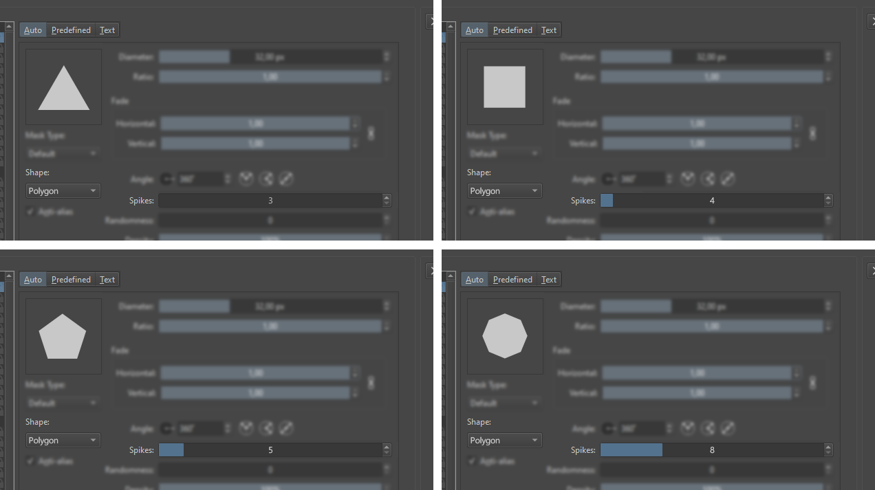
- Semi-related to the problematic spike parameter for generated brush tips. I’d like to ask the developers what their thoughts are on having a type of brush tip that generates a polygon with a variable number of vertices. This would be an alternative to how the current square tips tries to emulate polygons through rotating, duplicating, and mirroring.
- This could potentially be used to do away with choosing between a Circle and Square brush tip altogether. The user would instead use a slider with a range from e.g. 3-13 to choose the number of vertices/sides for their brush tip. Setting the slider to 13 would change the shown value to Circle and generate a perfect circle the way Krita currently does. I don’t know if this would cause any conflicts with the different mask types though.
Text Brush Tips
- Not actually an issue, I’m just hard pressed to find any actual use cases for this and would like to challenge its existence. Is there actually any widespread use of it today or is it a relic of Kritas past where the text tool wasn’t as usable as it is today?
- The only case I can imagine this being truly useful is if someone finds a specific glyph from a niche font that they want to use as a brush tip. I feel like this could be facilitated as an import option (“Import from font…”) rather than a separate tab in the brush editor.
Weirdly placed buttons
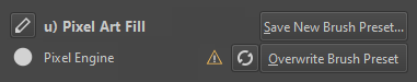
- The “Rename the brush preset”-button isn’t locked in place in the UI but instead centered between the brush preset name and the Save New Brush Preset… button. I can understand wanting to facilitate a longer brush preset name but then I’d suggest placing it to the left of the brush preset name instead.
- I’m willing to argue that the “Reload the brush preset”-button doesn’t belong to the right of the brush engine name. It’s much better to pair with the two buttons on the right as they also pertain to the values of the preset. Furthermore, I suggest adding a warning dialog for when the user clicks the button with unsaved changes (note: only the button in the brush editor). This would help avoid some unfortunate misclicks while editing a brush.
Click Icon to Edit
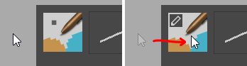
- It’s not very clear that you can edit a brush presets icon by opening the .kpp file in Krita. Clicking the brush preset icon in the top left should allow you to open the icon of the current brush preset as a document. Trying to edit the icon of an unsaved preset should probably open a dialog that tells the user they need to save the current preset before editing the icon and give them the options to Save New Brush Preset, Overwrite Brush Preset, or Cancel.
Remove the Scratchpad
- Over time Krita has made the scratchpad in the Brush Preset Editor less and less useful. Firstly, editing the icons by opening the .kpp file in Krita has (as far as I know) always been the most useful option to make a good icon. Second, the Save a New Brush Preset dialog has been extended with various ways for users to make a quick and effective preset icon. And with a recent update it was made possible to detach the brush window from the toolbar and make it a separate dialog. This lets you test your new brush directly on the canvas and how it feels to paint with directly on an image, as opposed to painting on perfect white. This means that there’s already better ways to make an icon, and there’s a better way to test the feel of your custom brush. That’s why I would like to suggest that the scratchpad in the brush editor should be removed entirely.
- (Implied here is that I would like Krita to commit to making the full brush editor into a separate dialog.)
Finishing Words
This is what I’ve got for now. Thank you to everyone who makes Krita and this community possible, and kudos to those who get through the entirety of this almost 4000 words long post.
If you have something you’d like to add to this list I’m open to listen to other people’s suggestions. I might repost this list in the future with changes and additions depending on what the future holds for us. Just try to remember: the idea is not to suggest explicitly new features, but rather to look at what Krita already offers and think “how can this be done in an easier and/or clearer way?”. In the words of Antoine de Saint-Exupery:
A designer knows he has achieved perfection not when there is nothing left to add, but when there is nothing left to take away.
As always, consider visiting https://fund.krita.org/ and putting a few dollars towards the continued development of a first-class digital painting software for everyone ![]()