Preface:
Yesterday while I was doing my write up for feature request of Angle Snapping being extended to other tools I realize some tools seems redundant or an alternate function of the other, and some can be help its discoverability by putting it as an alternate mode of another tool.
This is not UI redesign Feedback, but more of usage feedback [not really a feature request];
1. Make Dynamic Brush Tool as a mode of Brush Tool
Reasoning: Why move it to be under Brush tool?
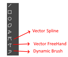
Current Dynamic Brush tool, despite being there, is not as easy to discover, it’s hiding in plain sight.
This is a tool popular to those who have experience in SAI, but newer user that come from have hard time finding that there is a tool that is like Sai smoothing mode. Most people recommend them the smoothing option of the current brush tool, but that doesnt work the same way. While all along this tool is there.
The icon is not much indicative that this is brush and not one of the vector tool options. It being position just below two vector tools doesn’t help and it’s icon being kinda similar doesn’t help too.
Which is a bummer its an amazing tool, that would save frustration for those looking for a more familiar smoothing experience on a brush?
Implementation of My Suggestion
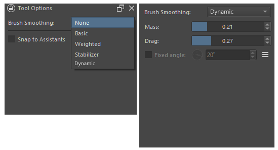
Move Dynamic Brush as Alternate Smoothing option under Brush Tool.
As far as I know it applies to all brush the same the other smoothing option is [Minus the assistant snapping], so um why not?
I think its easier to be find there and more discoverable - and once toggled, everytime the B key is press its active. Also free up a slot in the toolbar.
2. Consolidated Polyline and Polygon to one Tool → Polytool
They work almost the same way - the difference is that Polyline doesnt enclose and polygon encloses when you end. This is evident in vector mode.
Its kinda like a toggle between if it encloses at the end or not.
Both would still effectively be kept, but as option under Polytool.
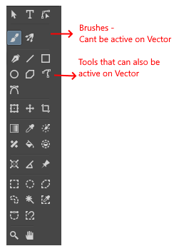
3. Move Multi Brush Tool Next to Brush Tool and Move Caligraphy Tool Closer to other Vector enabled Tool
The Brushes Tool Group [ Brush Tool, Multi-brush Tool, Dynamic Brush tool ] are tools that don’t work in Vector Layer.
They should be next to each other. Even if point 1 in this observation was not implemented. I think they still should be next to each other in their own neat group - I’ll call the brush tool group.
The Caligraphy Tool is a Tool that can be active both in Raster layer and Vector Layer only.
This Tool should be next to other tools that can do the same. Tools that can be active both in Raster and Vector layer. So it should be beside the line tool, square, circle, polyline/ polygon.
-*EDIT: @AhabGreybeard pointed that Caligraphy only works on vector. *
The Toolbar if with multibrush next to brush and caligraphy next to line, also with dynamic now tuck in under brush, and polyline and polygon combined.
Even if point 1 and 2 are not consider due to maybe conflict, I think point 3 should definitely be considered. It maybe just a re-arrangement but this makes tools of similar nature be next to each other.
Downside of this
I don’t know if that extra layer of Selection statement added to tools is worth it , in exchange of consolidation (point 2) and discoverability (point 1).
Also the Tool options not being very discoverable is a problem. That should be look into as well.
I don’t see downside for point 3.
^-^ anyway i just kinda thought of it when I keep hitting dynamic brush, while trying to remember what was polyline and polygon while i was writing that feature request the other day.
All good ideas. I had no idea the dynamic brush is what so many people are looking for. I’ve read many posts here and in Reddit and I did exactly what you said, I recommended brush smoothing, probably because I’ve never experimented with the dynamic brush. I’m so happy to know about this.
Love your other ideas, too. I wonder which ones would be easy vs. difficult to implement.
I always forgot its there. I need to thank previous Sai user who are very active here on reminding me that that one exist. Personally I line with no smoothing or just basic.
Dynamic is close to what sai has, atleast based on my testing on the version of sai I have. S-1 , S-5 smoothing.
It probably be good to tell those looking for smoothing to try it - might be more to their need.
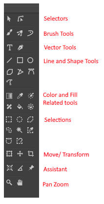
Come to think of it, I think selection group should be right below the shape group, since you paint select and then do operation such as transform etc on it. After selection there can be colour fill tool group and then the assitants measurement and last the pan tool group.
I wouldve look at trying to do atleast the re-arranging one. Was hoping to do some investigating after my morning meeting but nature currently disagrees. in the middle of typhoon and no electricity. Hopefully it goes back later so i can finish my work and get some time.
Please continue adding on if there is more suggestion and small things that you think improve the toolbar.
Yeah, definitely something I think helps streamline Krita. I had created this feature request to also help consolidate tools: Merge Select Shape tool with the Move and/ or transform tool
I think that adding some context sensitivity for similar tools and context dependant options (i.e. close a polygon when you click the startpoint, otherwise it remains a polyline) would also do the trick.
Offtopic: Also interesting that the manual notes a recommended mass setting of 0.02 for the dynamic brush, whereas the default is 0.01.
I completely agree with all of these, the toolbar could definitely use some rearranging and many tools which were developed separately should likely be merged together into one since they’re so similar in intention and use.
I’d like to add that it would be great if the move tool could be merged with transform. Currently, the move tool is much more optimized than a translation using the transform tool. It would be nice if the transform tool used the move tool’s translate function up until you do something more destructive with the transform.
While the idea is good and logical, I think move tool doesn’t degrade the result while transform tool does due to various types of scaling algorithm used. If possible move tools quality should be integrated in transform if we merge them. I think this will require more knowledge of instant preview and other stuff, it won’t be an easy task as compared to just re-arranging the tools. of course I am only guessing this based on my limited knowledge.
I noticed this and filed a bug report which was resolved, now both the move tool and the transform tool produce identical results with simple translations while using 2 separate function calls. This is why I suggest merging the two, as the move tool is completely redundant.
I would recommend removing the move tool altogether, but it has better optimization than the transform tool’s implementation, and I’m also not sure if the move tool has some other function besides translation I’m unaware of.
Then there is option to move the group by holding ctrl shift and drag. and ctrl drag, the radio buttons at the top is for these.
Hope these options get merged in transform tool. This made me think that it is not as simple as merging and replacing.
I think we can continue the discussion about move tool and transform too merge in the feature request that @Hologram made.
I think I would put the Vector tools and Line and Shape tools below the selectors. That way the distinction between raster and vector becomes much clearer (as they are grouped together then).
And I believe that moving objects should be possible with the selectors. So I would propose that you have one general selector that can also move and transform objects and one sub-object selector (for vector handles). Then, you have the crop tool that could be part of what is now the selector group and there would no longer be a Move/ Transform group. This then reduces tool switching by a lot, while also clearing up the toolbar.
And perhaps, as part of the toolbar, you could have a fore-background colour widget.
But that can be an optional preference for those familiar with it from Photoshp/ Illustrator/ Affinity.
I would also vouch for a icon change for the vector select icon, to me it looks like a fillet tool, because it is very similar to Affinity’s:
Could be me though.
As for tool presets, I think there shoukd be a system in which you can add either one letter or a number as part of the icon for the preset. While a flyout would help grouping them, I would personally prefer to have a second item slotted after the original tool.
So for example, this would then be the move tool with a quick preview preset (hence why I chose to add a P):
Should be in the same colour scheme, but I was lazy and used the Snippet tool.
Speaking of toolbar, im a sucker to saving space. Id like to have an on hover scroll to bottom button. And an on hover scroll to top. Ideally you would size the tools so it shows exactlt half of the tools so that each scroll buttons show all the rest.
Maybe the hover could be like 0.3 seconds so it doesnt accidently switch
I could definitely see us be able to sort them how we like them however. I would put my most frequently used ones on the top.