Wow, this is what i call interesting feedback. surprised finding a bit of time to read everything ![]() Thanks a lot
Thanks a lot
2 Likes
Hi! I’ve tested these brushes and I love it, even though I don’t use ink very often
The only weird thing I noticed is that some of the brushes don’t work by default as intended
At least these brushes:
Ink Big Brush.
Ink Medium Brush
Ink Pentel (all brushes in this group)
Ink Big Round (all brushes too)
Ink Rough Big (all)
I have a Xp-Pen Deco 01 V2 tablet (tilt support, 8k pressure levels)
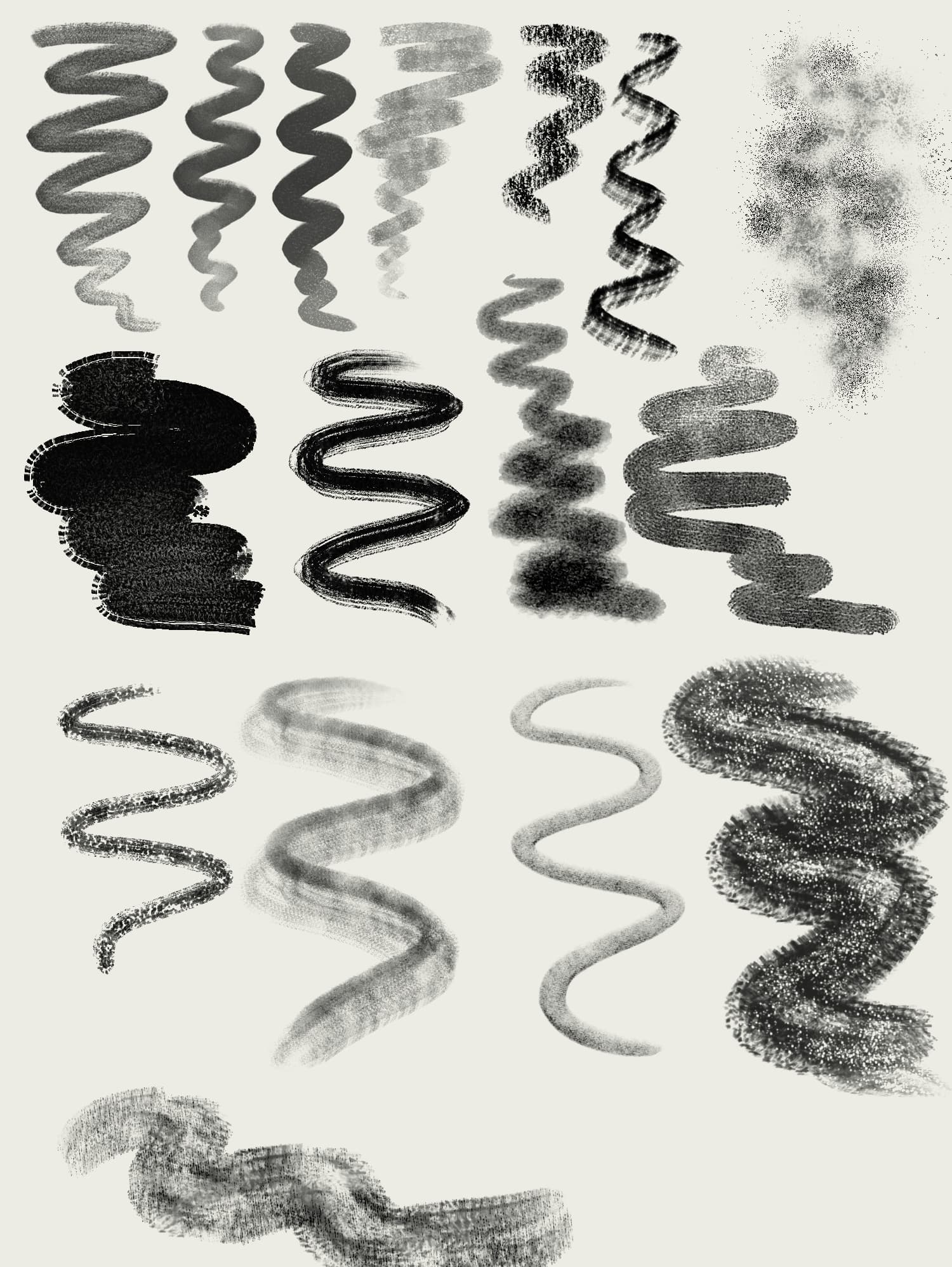
Here is an example of what it looks like:
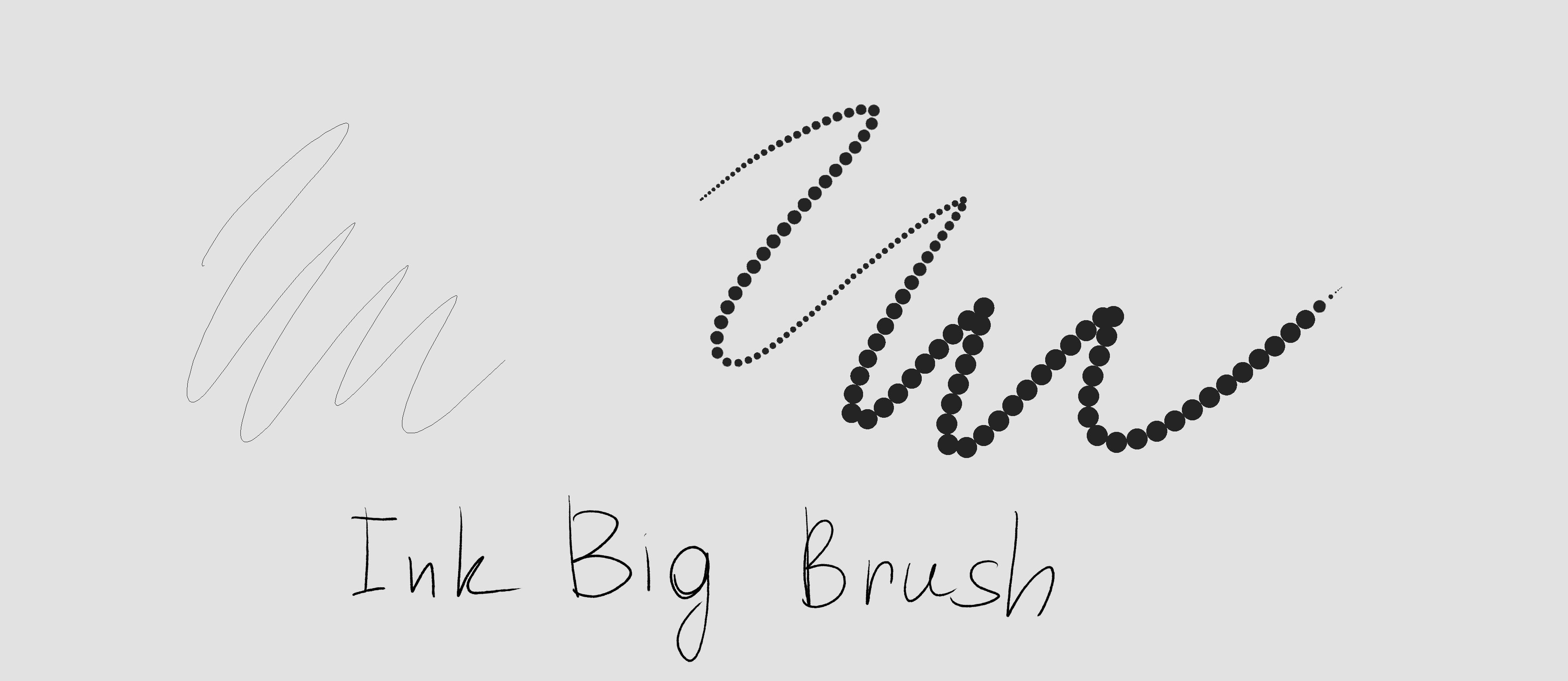

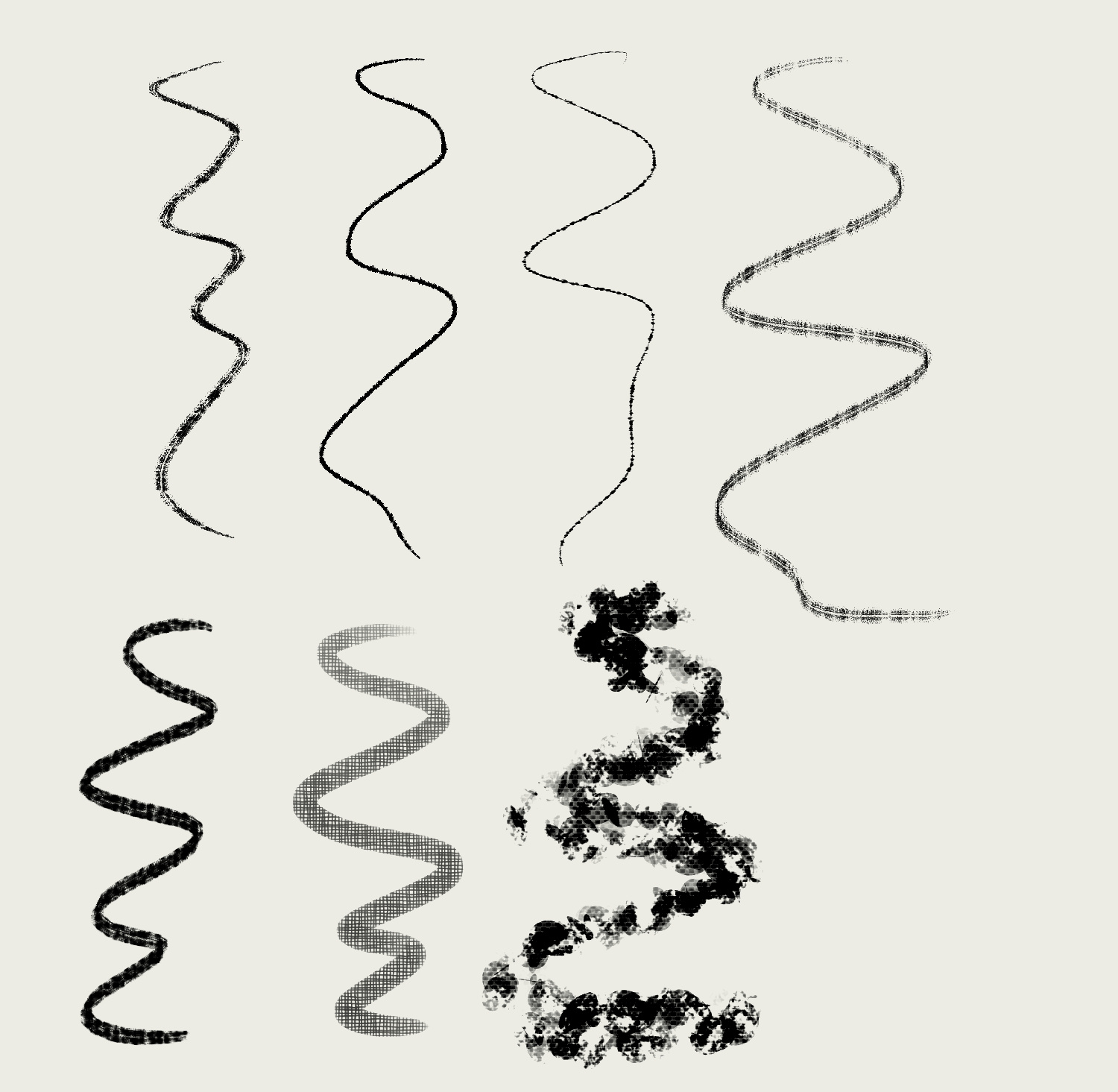
I have found that in the case of Ink Rough Big Brush and similar ones, changing the Spacing parameter helps, after which the brush starts to work fine
But in the case of Ink Big Brush, the brush stops painting altogether if I do this
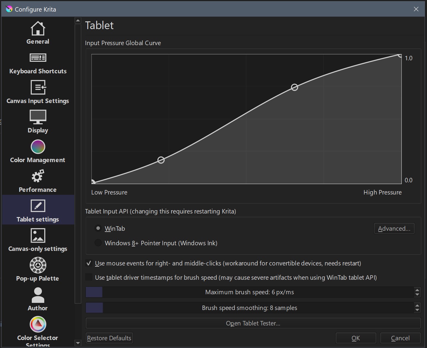
Here are my settings:
It’s not a big problem for me (I can change the brush settings to make it work fine), just keeping you informed if it turns out to be a bug
4 Likes
@just_scp_lover What a great way to review brushes! I especially love this item:
2 Likes

Inkers need something like this?

Maybe not but is really nice to use that brush
@SchrodingerCat Beautiful image. When i see artworks like this in testing, yes that motivates me more.
@just_scp_lover Supernice feedback Replied before but Thanks a lot. I have read each word. I analize to see what people find interesting and useful. That way i don’t create too much big bundles with nonsense brushes. And about your last sentences, i love to hear that users find useful my work. Yes Krita can create even undiscovered things. We just need more support.
@Linish That is the reason i share things in wip mode. thanks for the info. If the brushtip is 1 px and spacing is 1.0 is because it is not using the correct brushtip. Other users don’t have this issue. Wierd, I need to investigate that.
For all the users, If you don’t have tilt there are brushes that works very well. You can focus your attention in that ones. Thanks
18 Likes
yes this would be helpful. Some of the recent graphic style in illustration trend have these stippling or dots effect.
5 Likes
Yes, these brushes are indeed 1 px and spaicing 1.0. I have tested these brushes on another computer with a completely clean portable Krita and the problem persists
Apologies for the lack of feedback, Ramón. I don’t have tilt function, but we tinker around as we go. Putting in “Drawing angle”, then “Lock” work somewhat fine as substitute.
Let’s talk about these beauties…
First, congrats! What a great work this was. A lot of variety in textures, fill and pressure. Even though its just WIPs, im certainly not deleting them from my library.
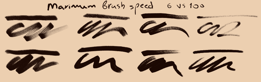
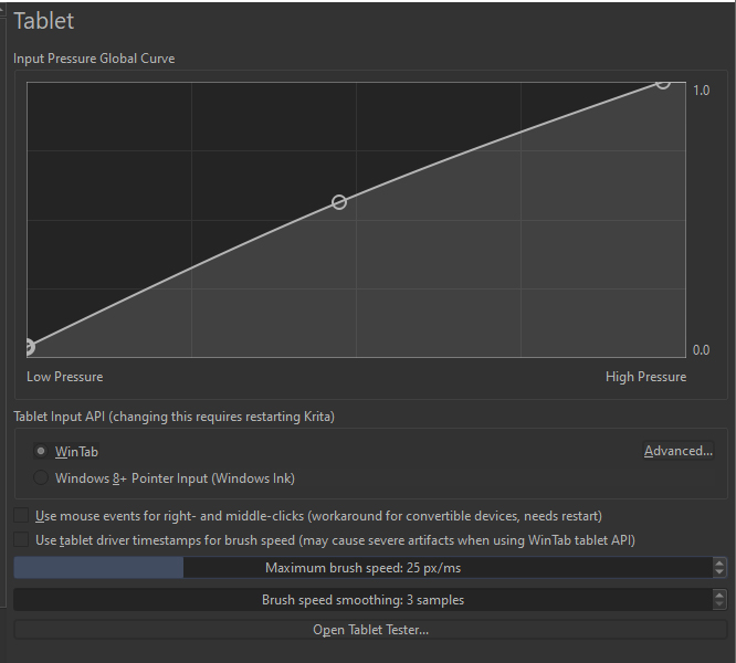
Second, i have and old beatup Bamboo Ctl-460. Settings pretty much similar to everyone here, in terms of brush speed and smoothing. But i did make changes on the fly, while testing…
Bic - No 'but’s, no ‘if’s’. I think you hit the nail on this one. Has a good weight, good texture. HOWEVER… I, in my humble opinion, would not call this a Bic pen. I’ll come back to this topic…
Dotted brushes- Personally not my cup of tea, but i think they their place. Even though, i don’t use these types, they are fun and provide a good texture in filling large spaces.
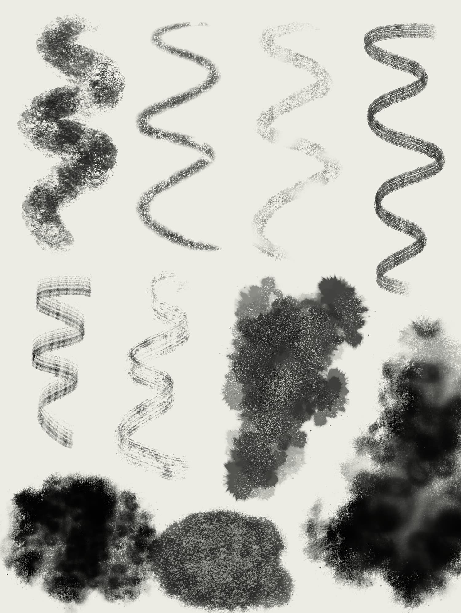
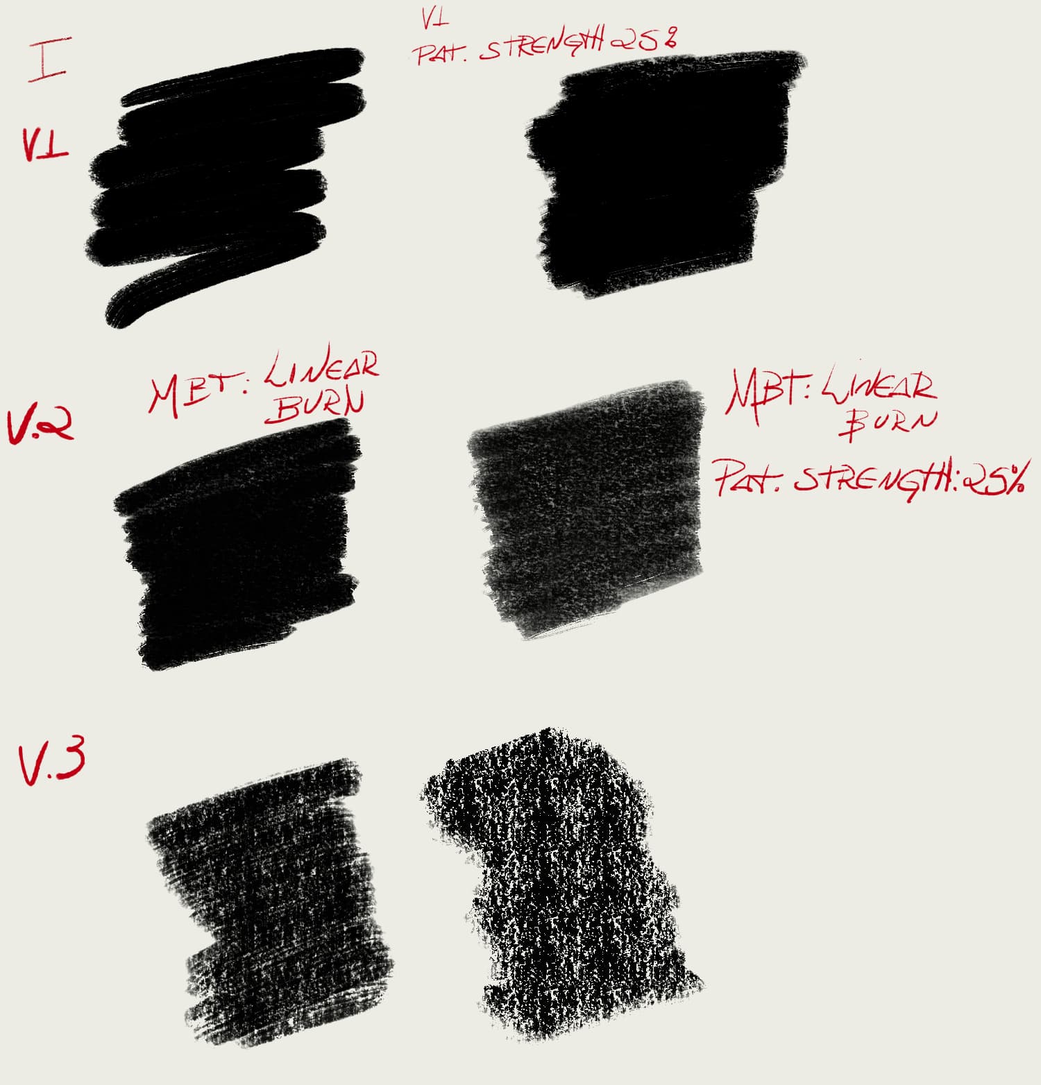
Big Brush - Love it. Although, to get a bit more of texture of the brush, i had to change some parameters (To those interested: Dual Brush changed from “overlay” to “burn”), plus some adjustments in the texture contrast, neutral point and strength. (Pic. I)
Mypaint brushes - No major comments. Not the biggest fan of plain brushes, but “mypaint v2” is quite interesting.
Ink Burn - It’s great. Sharp, great contrast, subtle yet defined texture. Inking digitally might be great with this one.
Gaps - I love the old-school comics that it gives. Good filler, nice texture, good contrast. Maybe some adjustments on the weight and speed are required, mainly on the “Big” one.
Medium Brush - Perfect balance between “bic” and “Big brush”. Definitely among my prefered of the pack.
Ink pen - This is what i would call “bic”. Gorgeous brush. Nice to sketch, nice to ink with. Allows a small, but decent variety of pressure.
Pentel and Wasted - I think they’re gold. Certainly, my favorites. Beautiful textures, varieties of handling. Again, you nailed these ones. “Black penv2” however, i could do without.
Rakes - Somewhat conflicted. They’re very good, but i rarely go to rake type brushes during work. They flow very well, have pretty textures, but seem to lack something, especially “dusty”.
Roughs - Beautiful. Up there with “Pentel”. Great textures, great fillers. However, i also had @just_scp_lover problem: Had to adjust tablet parameters to work with, or lower the patterns “strength” to make them appear more. Another way was enabling “Sharpness” and lowering down. (Pic. II , III)
Tremble - Fun. The “soft” version is fantastic. Simple but very efficient.
Wasted - Need some work. I played around with the “fade” parameter, got some minor fun results, but need some extra research.
Damaged - Need some work. I like the gritty feel, but lacks balance between stroke and texture in my opinion.
Precision - Gold. Chef’s kiss. No more.
Luma - Decent. Good work-horses brushes.
Hatching - Maybe for mangas they’ll shine. Although, “text2” is really pretty. I don’t use these type of brushes often.
Splats - Also, fairly good. But i think you could a bit more crazy with the splats. Use a bit more variation in depth and scatter.

As for the graphics style brushes. LOVE them. Personally, i like to think INK as some variation in Watercolor, and not just line-building and pens. It allows a more vast and playful approach to making and using brushes.
Lee Bermejo and Bill Sienkiewicz are two of my favorites in this regard.
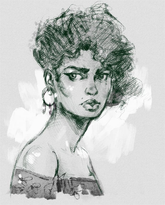
I have some brushes, which i transfered from PS, here some samples:
6 Likes
@Linish Thanks for the feedback. The next bundle will be better.
@Tamoha good feedback and interesting brushes you show here. I need to change some things indeed.
I agree first BiC is not exactly a Bic . +1 i will put it in another category.
Bigrush seems to be very well received and your advice to change it to Burn seems interesting. Can you share the adjustments to test exactly the same please?
My paint brushes i am changing some things too. For example The tracking doesn’t follow you untill the end of the stroke…
2nd “bic” i need to change the blending mode from gamma dark to multiply. Because gamma dark can´t work in a filled layer. Multiply can.
Pentel and Wasted i am reviewing them. I am not convinced yet (85%). Probably i will merge some of them.
Rakes are like digital

They have a lot of grey tones, not good for B/W printing. but maybe fun for sketching. What do you think? Everybody can give their opinion.
Damaged, is one of my favs. You need more Black in the stroke? more continous line?
Luma are almost exact at real size devices. a lot of work there.
Splats I agree, i would need more real splats.
Thanks also for the references.
I would like to test these brushes too.
Now i am sorting the brushes. First Textured Effects

15 Likes
Glad to help when possible, Ramom.
I completely agree with you in regards to printing. But i think even brushes with grayish areas have their value; i believe a lot of people might use Krita to make webcomics and such, and maybe that especific concern might not apply, necessarily.
I think it would be a waste to leave such interesting brush out of a pack. An artist i came across recently which applies these types of brushes very well in his work is Richard Flaptrap Anderson. Don’t know if rings a bell to you, maybe it can give some ideas.
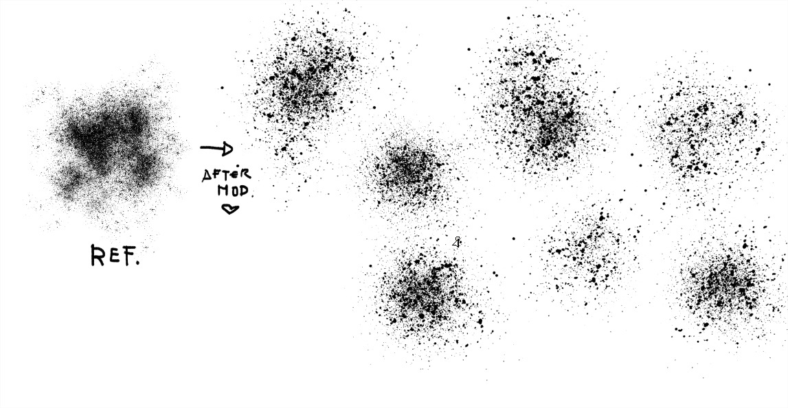
As for “Big Brush”, here an example: MBT, stands to Masked Brush Tip:
From “Big” i was able to create something very similar to what i have (V3).
I took the liberty of playing a bit with the material in your bundle, trying to replicate some of my brushes and create a few new ones. Take a look, see if you find something of interest.
Also everyone is welcome to try, but download and install Ramon WIP Bundle first.
Be well, everyone!
5 Likes
Everybody can create his own experiments. Is not a closed project but collaborative. So explore! We can create even a better bundle together.
I have changed a bit the brushes. I am retouching and organizing now.
I would like to create real splats now or somebody can create it too and share it. Volunteers
I have been playing with your bundle @Tamoha and the results are Supercool. I have changing some things and i get this ![]()
Maybe an animated Splats from here? I like it and you?
8 Likes
Oh i like it!
I was trying something between spray and droplets, but couldn’t land on the right grain.
This looks super nice. Has good fill, randomness and grain .
By animated you mean like stamps? I would give it a shot.
2 Likes
1st post in the forum I´m a krita user for more than year
More splats and dry brushes would be great
2 Likes
Welcome to the forum, @Kinght_Wolf.
1 Like
Thank you
@RamonM: Where is the link to your latest set? There was one that said the bundle is in the trash. ![]()
1 Like
Link?
This one says that the file is in owner’s trash INK_WIP_01.bundle - Google Drive
So, what is the link to the most recent bundle? ![]()
Try now please. Yes, it was removed
2 Likes