I just choose 4 because it is the default value of prongs so any one using it would be like: “oh yeah it looks like that”. I will do 3 to see how it looks.
Something like this (made quickly and dirty ![]() ), a brush + a ruler?
), a brush + a ruler?

Grum999
it can be a pencil and a ruler ![]() we don’t have a pencil icon in the toolbox so it won’t be confusing.
we don’t have a pencil icon in the toolbox so it won’t be confusing.
but assistant tools is applied on brushes no? ![]()
Grum999
Well yes, technically everything is called brushes in krita even the pencils are brushes. but asistants are mostly used for drawing precise things rather than painting. They are mostly used with ink or pencil brushes may be. SO we can take the creative liberty to use a pencil (which is also a brush in Krita) to denote this I guess
Ok I understand your point of view
But for me it will be less confusing to have a brush than a pencil because with a brush, I understand that I can use the tool with a brush (whatever the style of brush is) and having a pencil to refer to brush might more confusing… ![]()
![]()
Grum999
Multibrush Tool
 .
.  .
. 
I really prefer this one, it’s more visual
And I have to confess that for the initial one:
I didn’t understood the meaning ![]()
Grum999
you know that having every icon with a variation of the “brush” is not very iconic for the “freehand brush tool”. if you go by the logic of those tools that use a “brush” you could place the brush image on at least 10 icons… ![]()
I was already against having a brush to begin with as the rest of the drawing tool icons display what they do and the “freehand brush tool” shows something else that does what it does setting it completely a part, but it is legacy on what is expected and I am cool with that.
But brushes everywhere feels like the wrong way, there should be another way to convey “Multibrush Tool” and “Assistant Tool” idea, so they have their own identity too.


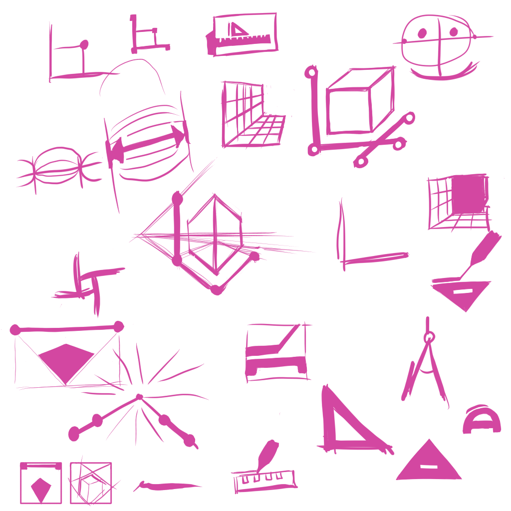
Some previous sketches I did before, maybe you guys would like to see those too.
Ahah ![]()
This is just because I find this icon cool:
- Visually, it’s simple and beautiful
- From a use rpoint of view, it’s easier to understand usage than the other ones
After I’m not a designer and I’m not able to think about all the small things, I just give my opinion (Like / Don’t Like with if i can, some arguments ![]() )
)
For this, use the same border width on all cube edges?
The ‘bold’ edges on the face gives a strange result
Otherwise, I like the idea
It remind me Google Picassa logo… ![]()
Grum999
Multibrush Tool


Colorize Mask Editing Tool


Please keep one thing in mind - the more icons would change, the more trouble beginners will have because all the previous tutorials and screenshots will show different things from what they see on their screen. I know newcomers might like cool, but I think they might like easily understandable over cool. And I, as a user supporter, definitely like the easily understandable more. Freehand Brush Tool would be much less obvious, even though it would indeed look more “modern” if we agreed on this. I’m torn about the multibrush with the brushes (all others are useful only if you know what the tool is doing already). But I would say, let’s stay on the side of caution and just not change anything that doesn’t need to be changed.
The only thing I might consider useful would be a change to Measure Tool, since it’s less used than Assistant Tool and I always mistake them one for another. (Maybe the caliper idea? I like that.) Only if there is no way to change it, maybe the Assistant Tool could be changed. I liked the idea with the brush with the ruler.
I wouldn’t guess what the Colorize Mask Editing Tool does. I would agree that the current one is not exactly clear either, though. But I feel like in this case the icon should have a variant of the brush in the icon later anyway not because it’s the best idea, but because users already got used to it, they find the first brush in the Toolbox after the Freehand Brush Tool and get the Colorize Mask Editing Tool. Or at least, I see it that way.
But still, keep in mind that for example all screenshots in Krita Manual would have to be changed, people will keep coming, asking where to find this and that tool they’ve seen on this Youtube video and so on. The same goes for radical UI changes, too, although I guess that changing the roundness of the dockers wouldn’t confuse users as much as changed tools icons.
Like, there should be very good arguments if anyone was going to change anything of such importance like Freehand Brush Tool icon.
out of 35 I proposed 5(+1) to be changed as I had noted:
Caligraphy - I made a letter case use that came out good but I can equally just re-touch up the pen. However I think a “Pen” to be the Bezier Tool instead.
Freehand Brush Tool - I had a suggestion but I am good either way, that is why there was two on that spot inicially. I am really neutral towards changing it, logically it should be changed as all others show “what they do” except the brush tool that shows “what does it”. however if anyone should be different it should be the brush tool.
Polyline - disregards all the shape language of all other icons and is chaotic while other are very orderly. Result is still similar and very comprehensible.
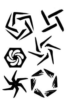
Multibrush Tool - if you stack a bunch of brushes like that it will all make parallel lines and not concentric symetry. Unless you are just making a messy piramid out of brushes (is that a thing?)
Colorize Mask Editing Tool - Banging your brush into a table? or maybe the brush glows? Here however there is not a very good way to explain a filter without using it before hand and I am very doubtfull whatever you do will ever be good enough. Not to mention if anything it should have the fill icon over it instead of a brush if there should have a dual icon.
Assistant Tool - I am still to decipher what is this icon even. A triangle with uneven teeth? This one has annoyed me since I came to Krita I still dont get it.
those where my thoughts on them when I choose to make a change.
However i should add that placing a “brush on everything” is a poor choice. like you can do it but it does not mean it is good. And you guys know a icon becomes less iconic the more you use it right? People will instead of looking for a “brush” will look for the “other thing” that really distinguishes them from the other brushes, and then you have a useless brush section on the icon, that literally does nothing and should not be there as a consequence.
Not to mention that having it on the “Multibrush” and “Colorzie Mask” makes no sense at all considering other tools around in comparison.
Multibrush Tool


Assistant Tool
 .
.  .
.  .
.  .
.  .
. 
I love the new discussion for the icons, great to see development and improvement. I don’t want to be a downer, but I get some swastica and crosshair aim feeling looking at the Multibrush Tool suggestions. Just be aware of it, that’s my 5 cents.
Also, it might be confused with the Crop Tool. I think a more distinct approach for the multibrush tool would be good. ![]()