oh shoot now I see it too~~ ![]()
I need to think of something else then.

sorry ![]() but better to mention it I thought…
but better to mention it I thought…
@Troken oh no I am thankful for you pointing it out.
I tested it before but I was unsure of its importance.
It had some critics so I was exploring more on that end. to see if I find find something nicer. I did like the square quite alot, but you never know what might come up if you dont try it out.
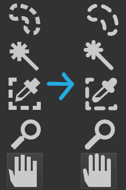
Has there been any discussion of the order of the icons? Since I started with Krita many years ago I’v always found it weird that the Shape Selection Tool is first. It has not much purpose for most users, I’d guess. And some other questions about the order and grouping. Maybe it’s another discussion though… ![]()
I understand the implications of changing order, correction manuals etc. Not a small task. But still, it could be important to do it one day.
That’s mostly historical reasons. After the KOffice 2.0 rewrite, all KOffice applications used the same toolbox, and the tools common to all applications were placed on top of the toolbox, for consistencies sake.
And now I am afraid people are so used to where the various tools are that I don’t think it’s possible anymore to change the order.
The same goes for the idea to group similar tools under one button with a popout to select the current one from the group: I don’t want to toy with people’s muscle memory, so I don’t see that happen either.
Measure Tool
 .
. 
Even though it is important to maintain people’s muscle memory, is there any openness to add some tweaks to the icons? Mainly in terms of consistency and uniformity?
And to add more fuel to the discussion, what about making the icons more rounded?
This is just a simple test:
I think gradual minute changes over a period of time may help us in making the transition without making it jarring to the users.
Regarding round corners, if the other elements in the Krita Ui have round corners then it is good to have consistency, but Will it be noticeable since most icons are viewed on average at 16-32px size
To be honest, I don’t think redesigning the silhouettes of the icons really changes much. What I suggest, and I think would matter a lot more, is an option to use icons with more distinctive colors and/or values.
The current Krita UI icons are all just the same light grey silhouettes, besides the Gradient tool for obvious reasons. Although there is an aesthetic to this, it would be nice if they were made more visually distinct with the use of different values or colors, even by doing as something as simple as adding black outlines to certain tool icons in certain spots. To me, when it gets down to picking a tool, the current visuals are just a light grey blur.
How Blender does icons is basically the simplest example of what I’d prefer.
Thank you for explaining. Perhaps a period where the user can choose between two toolbars could work?
The current ‘old’ one and the new improved one, where is up to every user to pick, with the new as default. It would let old users feel comfortable as long as they choose to stay with the old one, and let new users (and those who dare) to learn the new one.
I think many software are going through transitional phases like that now and then, and it’s probably necessary for developing the gui, even for old users.
Or maybe a poll, to get knowledge how users find the inconsistencies of the current toolbar. That could give valuable insights of it is an issue or not.
Not that I dont know you have other things to prioritize. ![]() I know we users are very creative in inventing new ideas all the time
I know we users are very creative in inventing new ideas all the time ![]()
Sure, though the main thing would be to work together with the author and maintainer of the current icon set – Timothee Giet. Though he’s pretty busy with what remains of the Libre Graphics Meeting right now.
Eventually this one, with graduation on rule maybe centered (currently graduation is left aligned)
Concerning other subjects I saw in this topics, there’s too much to give my opinion for all points, but the most important I saw:
This is why, 10years after the last floppy disk was produced, most software still use it as icon for Save action ![]()
I’m not sure that younger than 20~25yo really had one in their hands and used it ![]()
So I can understand that heavy modification could disturb users but it doesn’t means that interface can’t evolve…?
There’s might be a happy compromise we can find for this ![]()
I disagree for this point… I’m personally not fan of having multiples colors in user interface.
When I’m drawing, I prefer a neutral interface without too much distraction around my canvas.
But, it’s a point of view.
That’s the difficulty for designers and developer: there are almost as many views as users ![]()
May be, the solution could be:
- A theme with simple monotone and more modern and stylized icons like @EyeOdin made
- A theme with colored icons like @tom proposed, maybe the current one with slight modifications
And let the the user decide in settings which theme he prefer to use.
I know this solution could be disturbing too… and it may need some work, but it’s just an idea.
And if interface is completely redesigned as we can see in proposals from topic Krita UI Redesign topic, some changed icons won’t be the major problem for users, documentations and videos that already exist ![]()
Grum999
Colorize Mask Edit
 .
.  .
. 
I think you have some strong points. UI:s must change over time and is an important part of the process. Look what happened to i.e. Microsoft Word some years ago (2007?). Total revamp of the UI to the contextual ribbon menus. Today, nobody remembers how it used to look ![]() Users will adapt, and the new users are the least of problems, they wont have anything old to relate to.
Users will adapt, and the new users are the least of problems, they wont have anything old to relate to.
However, UI should not be taken lightly or be changed in every version since it tampers with users workflow. Users will adapt, but consistency is also important. Changes to the UI should be handled with silk gloves.
Assistant Tool (adjusted the ruler)

Interesting! It hit me, is the drawn line important? How about only the pen + ruler? Like an extention of the ordinary brush tool, but with added ruler? I think it might add clarity to the tools function. I noted that @Grum999 already proposed it earlier.

Well I made that considering @Grum999 proposal.
I was hoping to illustrate the snapping function of the assistant. I do come from engineering with technical drawing and a “brush” on a ruler really is not something that comes into my mind for me.
I will make more “brushes” next.
Assistant Tool

Multibrush tool
 .
. 
This one is more understandable than other one
This one is good too (centered yes it’s really better!)
Not so far than existing one, but more representative for the tool
The idea is not to always use “brushes”
I understood there’s different point of view, and I appreciate the fact you made effort to propose and draw something you don’t agree fully ![]()
But I think it’s more a proposal of different icons to be able to compare version, and then let’s vote for choosing ![]()
For example, for assistant tool I finally prefer the last one you’ve drawn ![]()
(this one: )
Grum999