I wanted to do a UI mock up but I ended up changing some icons and regulating most icons to the grid. Some just overlapping them are you able to see the differences. Also cleaned up some messy topology.
I thought before I send them to be proposed officially just check what people think to see if they need some touching up or not. I do like the current icons I do not aim to rebrand them or anything just make all of them seem more part of a single consistent krita identity while also enhancing some readability through the way if possible.
Toolbar icons:
How does it feel?
The new icons are:
Caligraphy
Freehand Brush Tool (new + corrected)
Polyline Tool
Multi brush Tool
Colorize Mask Editing Tool
Assistant Tool
I will keep checking out more icons and post them here.
I think the current freehand brush is good icon. it is less ambiguous and literally a brush. Same with multi brush. I like the calligraphy and assistant icons you have made. They can be improved a bit. Like the assistant can be a pair or set square/ T square or french curve ruler.
These are good, and I agree the original topology could be better .
It’s hard for me to really comment on the specifics of these without presenting some icons of my own, but I will say:
Polyline tool looks a bit like a ‘G’, perhaps it could more look like an unclosed Polygon tool? (I also feel the two tools could be easily combined into one tool, but that’s not for this topic.)
I feel the Bezier tools need to have connection between top and bottom segments, more for realism than anything else. The bottom curve could also be more rounded perhaps?
Multibrush tool could have brush tips at the end of each stroke, so the ‘brush’ feature is implied in the icon. Otherwise it could just look like a fancy ‘crop’ tool
*Colourise tool is a hard icon to convey simply. I understand what you’ve done already, maybe an incorporation of the fill tool icon would be suitable since they’re pretty related?
The Assistant tool could possibly implement some grids or ruler marks in the icon, since a lot of the assistants involve grids?
All-in-all this is a great start! For future iterations, it might help to number the icons/ create a grid so it’s easier for us to talk about specific icons, but I assume after this most of the icon batches will be smaller!
I agree. But since all other painting icons show what is the result of usage of that tool, the brush tool is the only one that uses another object to convey its usage result. But I guess it does not justify a change then.
Now that you say it it actually does :V
I will try and push that. it breaks the break line consitency but I see what you mean. I pondered over it a while.
But having lots of brushes is just sooo ugly. I choose simple lines for 2 reasons. it would show kinda the dynamic result of a line. it is not regular like other tools but if you do any squigly line you end up with a suastica. and if you increase the brush count it feel more like a star than a mirrored tool.
I could try that out. that happens on other tools too. like the color picker and the mouse arrow.
A Ruler is a bad idea as it is a finite number of blocks. I changed it because the other one did not make even divisions so the ruler becomes wonky there is only so much space and not to mention that much detail only makes much less readability when you scale it down. I never quite understood what the other icon even is. I opted by a simplified support that “helps” create the square. I know this is details but I used the same language for the transform tool to indicate it is a use node that helps the square. maybe I should increase the distance to it so it does not feel like they are together.
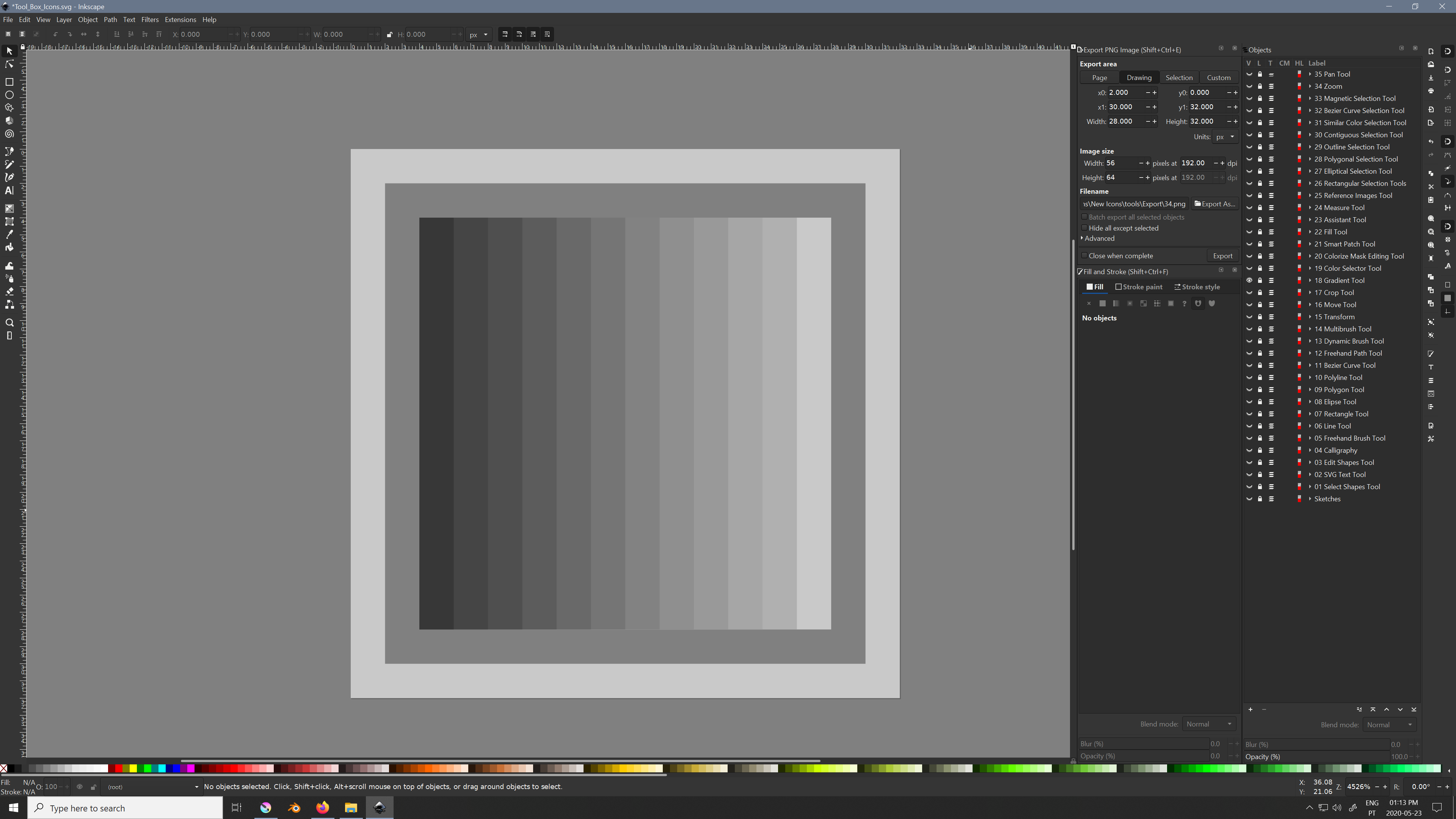
that is quite the nice idea. I did kill the gradient info in there if you look. I made like vertical scan lines that seperate the 2 theme colors. 22 to 79 black.
@Grum999
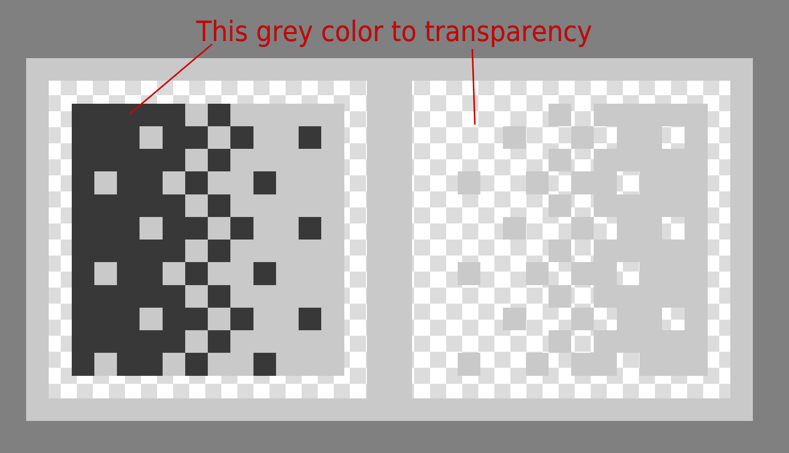
Like this? And yes the Gradient goes from 79 black to 22 black in order to not go more white or black than the actual theme. There is no transparency on either. You can swap your color theme now and check how the gradient color shifts.
@EyeOdin there are two icons needed, a light version and a dark version, there is no problem making one with one side transparent and the other one with the other side transparent, I guess.
That’s why I as thinking about for final result, what you show me is perfect
It seems in fact I didn’t understood how the final icons is used
For me I was thinking about one version white + transparency for black theme, and one version black grey + transparency for light theme