In fact the symbol alone is diffcult to understand
But with the brush it make sense (for me) to the icon.
Grum999
In fact the symbol alone is diffcult to understand
But with the brush it make sense (for me) to the icon.
Grum999
I opened up one of the original files (the square one) and made a copy and imported the rest into it.
They are currently 32x32 pixels. But I can scale them up they are all vector in inkscape like the original. super tedious to work with ~_~. But all is good for scaling. I have been exporting in 64x64 with just white because of the forum black background.
For now I have them all in a master file. once I get a consensus I will chop them up in seperate files with the colors and correct nomenclature. like that I could compare alot of the icons or reuse stuff.
Well, I can’t say I’m an expert on the subject, but I think it would be a reasonable idea to present the updated icons in a Google Doc, and discuss what changes you made and how this might increase legibility? So that developers can easily assess whether or not to use the icons. Or is that too far…
Perhaps I can make a google drive link so you guys can access and edit it too if you want.
it has enough stuff and guides to fiddle with good. all the variations are inside too.
Just a heads up since I’ve done a lot of work with vector icons: Always periodically see what they look like at the size they’re supposed to be seen at. You can make a beautiful icon only to realize that the details you put in aren’t really visible or at worst, turn your beautiful icon into a blurry mess. You almost have to treat them like slightly more flexible raster images. Let’s take your hexagon multibrush icon as an example. It looks very pretty right?, well if you shrink it down to 16x16, it doesn’t look quit right.
The way to fix the blurriness in the center gaps is to change the height and width so that the horizontal center gap is aligned to a row of pixels.

I can take a look into it
I made a small folder for now so you guys and access too:
https://drive.google.com/drive/folders/1R3jxM3e-_WAxQdxCc5YSjJf5LGkVrDqo?usp=sharing
that makes me curious about this one:
 .
. 
uhmm I guess you can still read it.
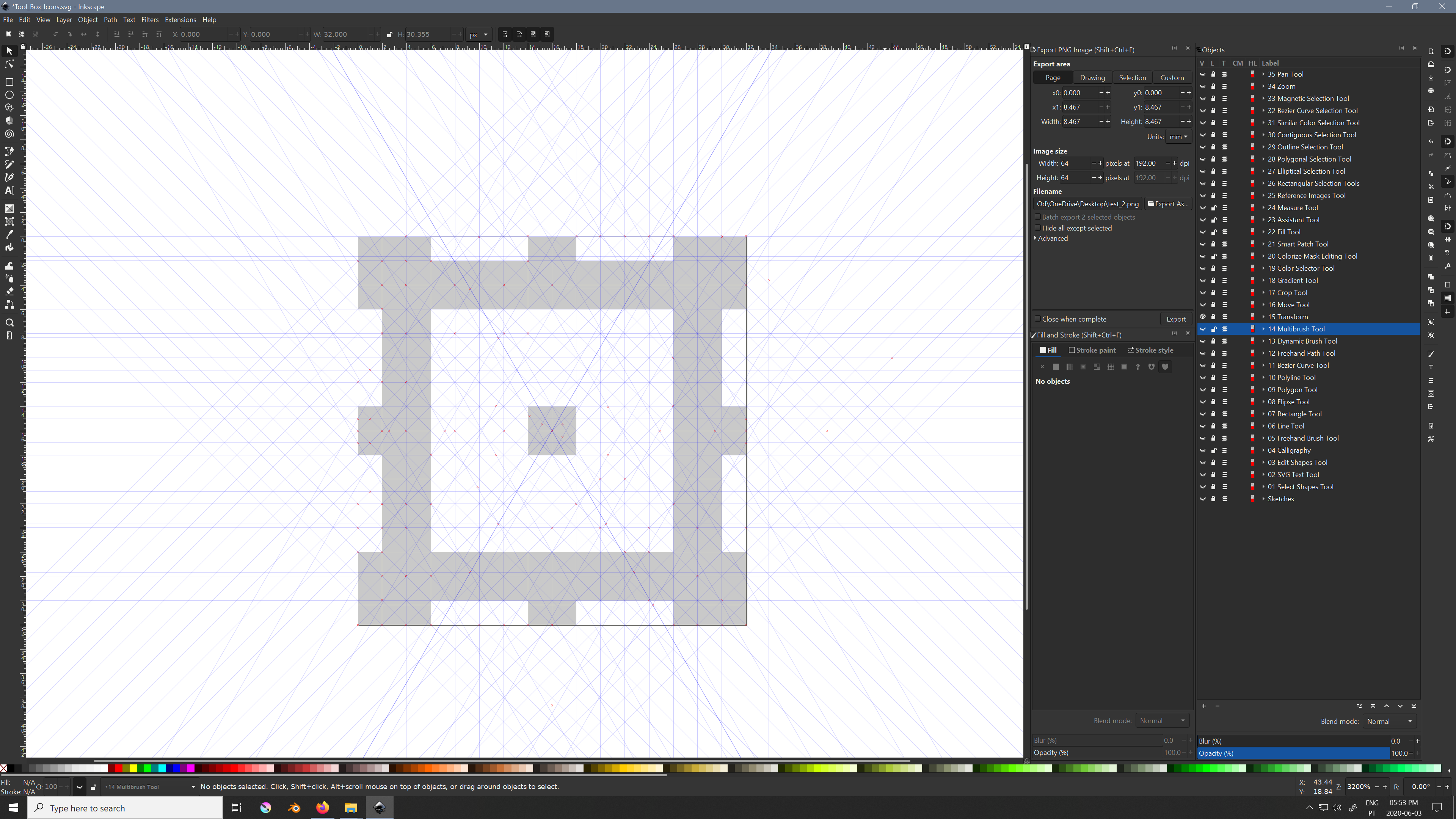
not sure what I’m supposed to be looking at tbh. I normally use Inkscape’s grid instead of making tons of guides.
it is a 16x16 grid >3>
testing some pixel shifting:
 .
. 
Perhaps the two adjacent chevrons near the brush can be removed, so that the brush outline is more readable?
There you go! Definitely check out Inkscape’s grid feature though. Then you won’t have to line up so many guides.
Perhaps the two adjacent chevrons near the brush can be removed, so that the brush outline is more readable?
Yes, it would be good to give the brush a bit more room. For the record, I still prefer the versions of the icon that use 3 brushes.
This isn’t aligned, just a test:

Maybe the adjacent ones could be moved a bit closer to the brush.
you kinda broke the mirroring effect there :\ maybe 3 would work better then.
it is aligned to the middle horizontal gap.
I kinda think the  to be better really.
That might look too similar to a hexagon shape (polygon tool) for new users though? Or any user even…
I think it would be important to have some sort of brush in there 
Cheers
I agree with fullerhill. The v-like shapes don’t really tell me anything about what the tool is about.
I think the original icon did a great job explaining what the tool was about.
Multiple brushes = Multibrush tool