Krita UI papercuts

Many of the issues listed here are probably pet peeves of mine and wether they get attention or not is obviously up to the developers, I just want to make the Krita experience as smooth and professional looking as possible.

I think most of the issues here stem from the fact that I’m using Qt on Linux and especially on Gnome, KDE users might have a much different experience than mine.

These issues have lingered on for quite a while and I wonder why they’ve never been addressed. So here are a couple of annoying small papercuts I’ve found:

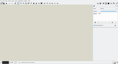
  1. Disabled News Feed

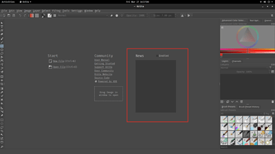
I think by default the news feed comes disabled when you first open Krita. It might be the way it is right now to enable discoverability but it looks weird when you first open Krita and it just shows a grey square with nothing on it. I think it’d be best if it were enabled by default and then if the user were to disable it, the grey box would simply disappear. Maybe you can add the option to enable/disable to the Krita settings?

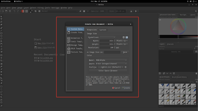
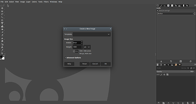
  1. Create New Document Dialog

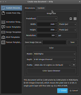
By default, the create document dialog is not wide enough which causes some of the text being cut off and looking just kind of ugly. No biggie here, just make it wider by default, there’s plenty of space to the sides, easy fix.

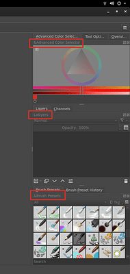
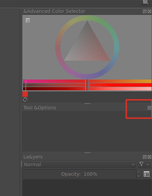
  1. Docker/Panel Name Ampersands

This too has been going on forever. The dockers show ampersands “&” all over the place. Easy fix?

  1. Duplicate Names on Dockers/Panels

Why does every docker with tabs have its name duplicated right below? Vertical real estate is always precious. Maybe the duplicate text could be removed when tabs are shown and the user could undock by dragging out the tab?

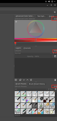
  1. Docker Close and Undock Buttons

I remember when these still had a nice icon. Why did they get removed and replaced by some sort of unrecognizable placeholder?

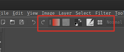
  1. Tool Docker

Why doesn’t it show the same close and undock icons at the top like the other dockers/panels? It used to be there before if I remember correctly.

Maybe you could use the same “braille dots” like the top bar.

  1. Tool Options Docker is missing its close button

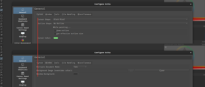
  1. Krita’s Configure Settings Lack Uniformity

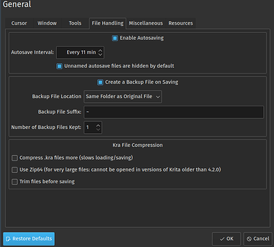
Most of Krita’s settings don’t align, jump all over the place and lack coherence.

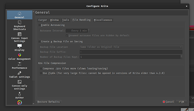
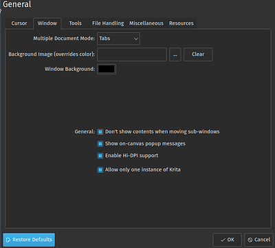
Example of a nicely laid out panel:

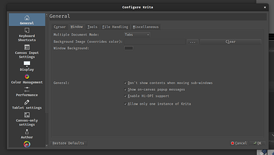
Against a not so nicely laid out panel (what’s with all the wasted space?):

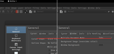
This header could use some padding to the left and maybe could be centered vertically too:
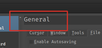
headerpadding

And that’s it. Whether it’s my OCD talking or valid concerns, I really think it would make Krita a little bit better if some of these could get addressed, some don’t seem that difficult to fix, others, I really don’t know.

Thanks
4 Likes

Thanks a lot for making this thread and listing the issues with screenshots

After seeing your screenshots , I am surprised to see the monospace font used in the UI. Did you choose monospace for the UI or is it because gnome is not handling the qt interface well?. For example here is how it looks for me on KDE plasma.

The screenshot of configuration dialog which in your system is badly laid out

The new file dialog

The close button on the docker

I agree about the duplicate header of dockers, the need to disable the empty grey box of the news update section. Also the toolbox can have the dotted drag area. +1 on these suggestions.

Overall it is mostly looking ugly in your system because of the bad font and may be the way gnome handles Qt interface. As I regularly see screenshots from windows users the UI seems okay. We need to figure out if it is only Krita or any other Qt app behave this way in gnome. If all Qt app behave this way then I would strongly suggest asking gnome devs to do something about this. We can may be file a bug report with gnome or gtk .

1 Like

Hello raghukamath, yes, I chose that monospaced font for the whole Gnome interface. It’s the Fira Mono Regular font and usually looks fine all over.

So I think I was right in assuming that Krita just looks like shit on Gtk and that’s too bad. I usually avoid Qt programs for the same reason.

I don’t know about this. If it is the case then we need to do something about it. May be ask the gtk devs to make it not look shit. Avoiding Qt programs is not the solution in my opinion, you will be missing out on some of the good apps unless gnome or gtk or some devs make equally feature gtk apps.

Since it looks okay on KDE, windows and macOS the only people suffering are the gnome users. I wonder why they should accept this.

Gtk/gnome devs need to to know that their users also use qt apps and they need to accommodate these users. For example GIMP does not look shit in KDE :slight_smile: And one thing that will make gtk and gnome devs aware of this scenario is when gnome/gtk users report such bugs to them.

1 Like

Some of your issues are genuine as well, like the duplicate titles on the dockers, the empty news box at startup etc and may be we need to polish some spacing etc. May be some devs who are interested to volunteer on polishing and removing paper cuts see this thread.

I use scribus regularly by the way, which uses Qt and everything looks quite correct.

I don’t know why that is the case. May be because it is KDE and scribus doesn’t use kde components. This is just a wild guess. Can you check other KDE apps like kolorpaint, kate or digikam?

I don’t have any of those programs installed, sorry. I checked them out and they have some many qt and kde dependencies that I think it’s just not worth the hassle of downloading and installing. I’ll just ride it out and hopefully one day everything will get better, who knows.

I guess this is what you get when using Linux where there so much choice that nothing every blends correctly together…

Now that I think about it, I brought up a similar issue a couple of years ago on the blender artists forums to Boud and it fell on deaf ears (regarding UI polish).

Thanks for your time though, I appreciate it.

Frankly this is a gtk thing since it looks correct in all other platforms. I suggested you to report this to the gtk devs, how can Krita devs improve the situation here?

The other issues can be solved i think like the empty news box and the duplicate title etc.

I searched reddit and got this thread. May be some of the solutions help making it look better in gnome.
https://www.reddit.com/r/gnome/comments/ad29ec/qt_apps/

Probably out of topic or tangent to this thread but just to provide a different view of how platform shouldn’t affect the apps, following are the screenshot of all gtk apps in my system which is KDE/Qt predominantly. I don’t have any problem running gtk or gnome app, I wonder why gnome or gtk users should bear such impediment. Kde guys have spent time making gtk apps look good under KDE I would request gnome guys do the same.

mypaint

gimp

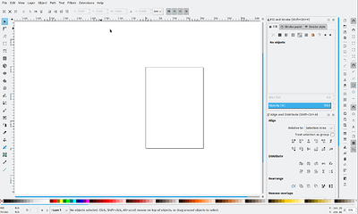
inkscape (In this case even the UI icons are provided by breeze which in my opinion are better and integrate well with the system)

1 Like

@raghukamath the screenshots @charbelnicolas posted is using Fusion style, while the ones you posted uses Breeze, which might be a reason why the later looks better.

Breeze was enabled in the latest version and probably should be the default now unless the platform forces something else.

Yeah that might be the case. But even fusion looks good. I think the close button looking weird is because of fusion?

Yes the close and restore buttons are bit less modern in Fusion when compared to Breeze. Switching to Breeze would surely make the UI a bit modern and trendy, :wink:

Very interesting to see how it looks on others computers. Generally it looks nice here on mine. I use Ubuntu, the ordinary gnome version. I have not tampered with themes, fonts or anything. The overall look is nice :slight_smile: No annoying ampersands to start with.

However, I agree on some of the issues. Like (1) enable the news. Or (4) duplicate names on dockers. And docker icons (5).

Also, generally, UI is more important than many would think to make a great user exeperience, I would’t take paper cut issues lightly in the matter. They can be a deal breaker for users, not only amazing features.

Said with respect to everybody who is contributing to Krita development! I think you do great things as it is and that you need to prioritize what you put your time on. :+1:

2 Likes

So ‘enable news’ is disabled by default because it does a call from your computer to the rss feed on krita.org. Which means that it could potentially be used for tracking. So, to show we respect the users’ privacy it is turned off by default, so that people who don’t want to have their computer make an internet connection really have to choose for it to have it actually happen.

7 Likes

I’m running Krita on Debian under Gnome, and it looks fine here. Sometimes the dialogue sizes aren’t ideal, that’s true, but it’s not as bad for me. I can imagine it gets worse with a monospace font because monospace font needs more horizontal space.

I have seen the ampersands once on someone else’s screenshot. Looks like the markers for mnemonics aren’t interpreted correctly. Is this the package of your OS? Because if it is that’s their build issue, not Krita’s. Try the appimage from the Krita website if you haven’t already.

1 Like

Yes, this is the package provided by Arch Linux.

Ahh Arch Linux, if you are on Linux, always choose packages in this order, Appimage > Snap/Flatpak > ppa > distro package

Alright, I’ll try the other alternatives, thank you.

I installed the Krita’s flatpak from Flathub.org and the weird ampersands & are gone, but that’s about it, everything else is pretty much the same.

Is it possible to show a screenshot of the Breeze theme. I also don’t see much difference between it and the other ones, apart from color changes.

By the way, how do you have the icons on the right? I still have the left ones…
icons 01

And, yes, I too agree with most of the ‘papercuts’ in this post, and 2 more:

  1. in my humble opinion, if the line that borders the toolbar is gone, the interface will look more modern.
  2. the same with the grey rectangle in the tools palette.
    Box on toolbar

Thanks for listening.

2 Likes