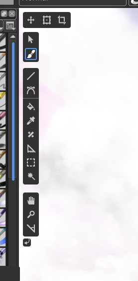
I didn’t see that all icons weren’t available here…
In fact, there’s another directory for pictures:
Grum999
I didn’t see that all icons weren’t available here…
In fact, there’s another directory for pictures:
Grum999
There we go! Found it thank you so much!
You could download them from the repo I shared, https://github.com/hellozee/blender-toolbox-qt
it is in the icons directory, but yes you will get all the icons in the source tree.
Haha, I instantly recognize a fan of Blender’s new design language ![]() This is a great concept, and I can tell you’ve put a lot of work in it!
This is a great concept, and I can tell you’ve put a lot of work in it!
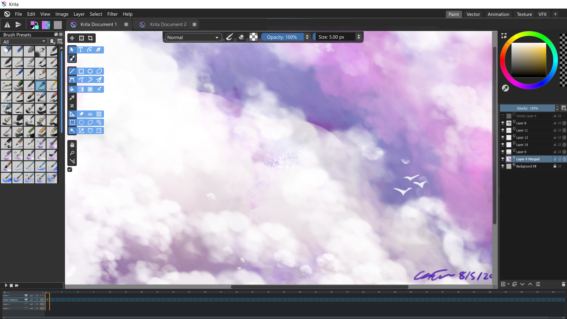
First thing that strikes me is that I’m not a fan of the semi-transparent dockers. Trust me, I’m all for showing as much of that canvas as possible, but I’m afraid I don’t think this is the way to do it. That being said, I really like what you did with the toolbar on top (size and opacity sliders, toggle eraser mode, etc.) A barely transparent background color with the main elements being fully opaque really works for me! ![]()
Adapting Blenders UI for switching workspaces is an interesting idea. I couldn’t tell you why, but I do like the tabs over the current drop down. Perhaps because (for me) web browsers popularized the tab as a UI element, and that each tab is a different web page. With tabs you’re not just changing the layout, you’re in a completely different section of the software. I’m not sure how Blender handles a lengthier list of custom workspaces though? With a drop down list that’s not a problem, but with tabs the solutions I can think of aren’t as straightforward.
Having tools hidden behind pop-outs… I’m a bit torn. I’ve learned to use this feature in other software and like how it helps minimize UI elements, but I do think the critique against it is valid. It isn’t very straightforward how to use and hinders discoverability. Heck, in Blender I use tools less when they’re hidden like that, and that was probably the case back when I used PS too. Something that potentially could be adapted from Blender, however, is the way the tools list are bound to the viewport. Imagine if the tools docker was bound to the side of the canvas and floating on top, and could then be toggled to be viewed/hidden with a button in the top corner of the canvas (or a keyboard shortcut). I think most of all I would love it if some UI elements didn’t have to take up the entire side of the screen, and instead was floating on top of the canvas (like you’ve done with the tools list and toolbar on top).
I can’t imagine how much work would go into a large scale UI rework like this though. 2021 fundraiser perhaps? ![]()
Thanks, that’s where I looked before but I don’t think I was searching for the right thing ![]()
Aha thanks for the appreciation! I wasn’t referencing too much else to be honest ![]()
Yea I’ve gotten rid of those aha! The low transparency would probably be better at the top like you said.
It appears the tabs reach a max display of 12, and then you scroll sideways to extra workspaces. But I don’t think there are 12 unique workspaces in Krita at the moment! I do think adding the scroll feature would be good however.
That’s a good point; mind you I spent years using Krita with the full toolbox and had no idea some of the tools where in there! I would say a reasonable balance between efficiency and discovery needs to be struck; for shape tools I don’t think this would be too much of an issue?
Perhaps a mouse-over of the toolbox can show up the hidden tools quickly, and then you’re always seeing the tools, just in a horizontal format?
Great idea! Especially if you only use one or two tools for extended periods of time.
That’s a good view, but then there will also be some users who have tailored shortcuts on the top toolbar, which can’t easily be removed. Again, a tradeoff.
This would be a long task to achieve, and would need quite a good proof-of-concept and extensive feedback/support from the community.
That’s not to say it can’t happen, but at the moment there needs to be more substantial work done on this before fundraiser ideas can be entertained ![]()
Thanks again guys! I’ll post another WIP soon.
Design 0.1.1
Started using the grid to get more precise spacings, focused more on the tool box at the moment.
Imported the Krita icons so the toolbar looks more believable.
I’ve also removed the transparency of the dockers per request, which does look better.
Tool box is separated into distinguished categories, which I’ll probably rework.
Added the hide toggle as per @Kapyia requested below tool box, but maybe it would work more as an eye/visibility toggle?
I also found extra icons in the library which don’t exist in the current Krita version. I added some of these, but there would need to be more confirmation of which icons are actually going to be used.
The segmented dockers are gone! But I haven’t gotten to the design of those too much yet.
Cheers!
Edit. This is the tool box without the popups:
Looks a lot more like something I’d want to use already ![]()
Btw, a while back I did ask Boud why we don’t just combine the Tab and Subwindow modes, because I switch back and forth ever so often, but he pointed me to QMdiArea and that pretty much answered it. Would be quite a bit of work do do a custom solution, but I’d support that.
One other thing that bugs me, the status bar in krita is pretty underused IMHO, it’s almost standard in other apps that it gives you info like what you can do with Shift/Ctrl/Alt modifiers when you hover tool icons etc. but krita gives zero contextual info really, almost wasted space for me.
The zoom info is really the only thing I actually look at regularly, and that could easily be made to just use the width of my dock area.
![]()
One thing I’m always searching (maybe exist, but never found it) is the current cursor coordinates, and selection bounds [width x height]
If it’s possible to have this in status bar (like Gimp does) ![]()
Grum999
Dude this is a wonderful idea to do. throws likes
I think your design really got even more amazing from the first version to the second. But I think a mix of the 2 would be pretty awesome actually. I will do a quick mix of the two to show how i mean.
A proper place for the timeline would be cool too, kinda like this that you could pull up or down ass needed, or be really tiny like one line or less. The play button above the timeline would make playback possible without showing the timeline layers in case your that good.
another note personally I like squares with rounded edges, but if the roundness is too much it feels, bubbly and not very serious.
About the Blender UI thing. you only ocasionally use the UI. your HUD is the keyboard. The HUD buttons are just a formality for all the commands you have. I made a custom shortcut set and I barely use Krita’s HUD tool docker anymore, just the tool options. I think a UI like this is tottally manageable and welcomed.
While we’re talking about a UI redesign, I’d also like to see:
More visual separation between the areas of the interface, especially between the dockers. This is my big complaint on visual UI, and part of the reason I think Blender’s interface looks sleek. Makes it easier to scan for dockers.
Theme customization would be nice. None of the existing themes do exactly what I want. Krita Darker is the closest, but the scrollbars have no contrast, which is my biggest peeve on the themes (the Krita blender theme, interestingly, is much brighter than Blender and unfortunately renders black text on gray, which is sometimes squint-worthy).
Icon coloration for easier visual navigation (the Blender 2.79 way) or make it possible to switch between icon sets (Blender going forward). Colorized icons can be done programmatically even across themes if the colors are determined in a perception-adjusted colorspace so that visual contrast doesn’t change as you cycle through hues.
Removing the outline around the undock and close docker buttons would be easier to process visually, I think. I couldn’t tell what these were when I opened Krita the first few times:
![]()
I’m seeing other possible UI issues as I go through the UI to write this, which I’ll try to remember to submit as a separate question tomorrow. Meanwhile, I’d love to know if there’s a place where someone is collecting these thoughts on UI so people can talk about it.
Wow so many great replies in such a short interval! You all must be keen to discuss this subject ![]()
Unfortunately I don’t have any experience in programming so I can’t really expand on that topic, but I am looking to learn more!
I would agree in that respect; especially after using Inkscape to make these mockups! Considering I am a beginner, it was very helpful to look at the status bar to see which keys controlled what, and made it quicker to establish a working memory of tools
I know the Overview Docker has something like that, but it would be better to have such a feature on the bottom status bar area are you saying?
Awesome idea! That would be a great addition to the status bar I think ![]() .
.
Yes that looks great! Perhaps a wish-list item would be to have the top toolbar movable around the workspace, for more customisation. This would be hard to pull off from a coding perspective I can imagine ![]() .
.
That’s an interesting idea, mind you the only workspace I think the Timeline would be needed would be in Animation? Would that work better as a workspace-specific feature perhaps.
I’ll keep that in mind, I think less rounded is more professional anyway.
That would be an ideal scenario for the toggle visibilty buttons then perhaps? To remove visual clutter for power users?
Yes, as in different base shades? That’s what I could gather from using Blender. Mind you the dockers in Blender are quite different in visual purpose, which helps to define borders easier.
This is apparently already a Linux feature if I recall correctly, however allowing customisation to be user-friendly and cross-platform would be an excellent addition! I know @Deevad was able to customise his themes, but I don’t know how that was done.
Would that be specific to the Toolbox? Without redesigning the layout of dockers, I can’t see too many other implementations of this. Blender might be different to Krita in that respect. But I can imagine this in the Toolbox and Layer Dockers, so that is a nice suggestion!
Colorised icons would also be nice from a customisation perspective! From what I gather in the Krita library files, the icons exist as predetermined colours i.e. dark or light. To change this would an interesting project, which no doubt requires a developer ![]() .
.
I am wholeheartedly with you on that one! This sentiment extends to the ‘Documents as Tabs’ Mode, where the same icons are used; it’s almost impossible to understand what each icon means without squinting or having pressed on each beforehand. This would be also good from a beginner view.
Me too! I tried looking, but so far I haven’t come across anything yet ![]() .
.
Definitely a great idea for beginners ![]() .
.
Thanks for the comments everyone!
It’s possible to make your own krita theme. You can grab my ones to see how they work, and how to import them to krita (a wrote a manual there). As far as I know, ktira only uses those 'Normal" values, where R, G and B values are the same in my themes. Color of the canvas background isn’t a part of it, and has to be customized separately in settings.
This is an interesting discussion! I wont throw any more suggestions into the mix - but I thought I’d share my current setup for reference…
I like to keep my interface pared back to reduce visual clutter and maximise the painting area. Vertical space is precious, so I use subwindows rather than tabs and switch off the rulers and status bar.
This is how I work most of the time, unless I’m in canvas only mode:
As far as I have looked, don’t you have to change the properties of an existing colour-scheme file? If that’s the case, would a more accessible option allow you to edit themes within Krita itself?
Awesome setup! I prefer to have dockers not hidden behind the other for some reason, I guess it’s one less click I need to make to edit properties. But your workspace is nicely arranged!
(I usually remove the ‘Open, Save, Undo/Redo’ toolbar at the top, because I never use it ![]() )
)
No, every .colors file in color-schemes folder (in resources folder) is read, and displayed as new theme in krita themes list.
I thought you would say that ![]() As always, it’s something it would be ‘nice to have’, but in my personal opinion it’s more work for developers than it’s worth it - I believe scheme editing isn’t the first thing most users would want to do, and those who can do it well, probably can deal with some file editing. I guess there are more higher priority things to add to krita, that would be easier to implement.
As always, it’s something it would be ‘nice to have’, but in my personal opinion it’s more work for developers than it’s worth it - I believe scheme editing isn’t the first thing most users would want to do, and those who can do it well, probably can deal with some file editing. I guess there are more higher priority things to add to krita, that would be easier to implement.
As we are sharing our current UI setups, that’s my most minimalistic one I could get.
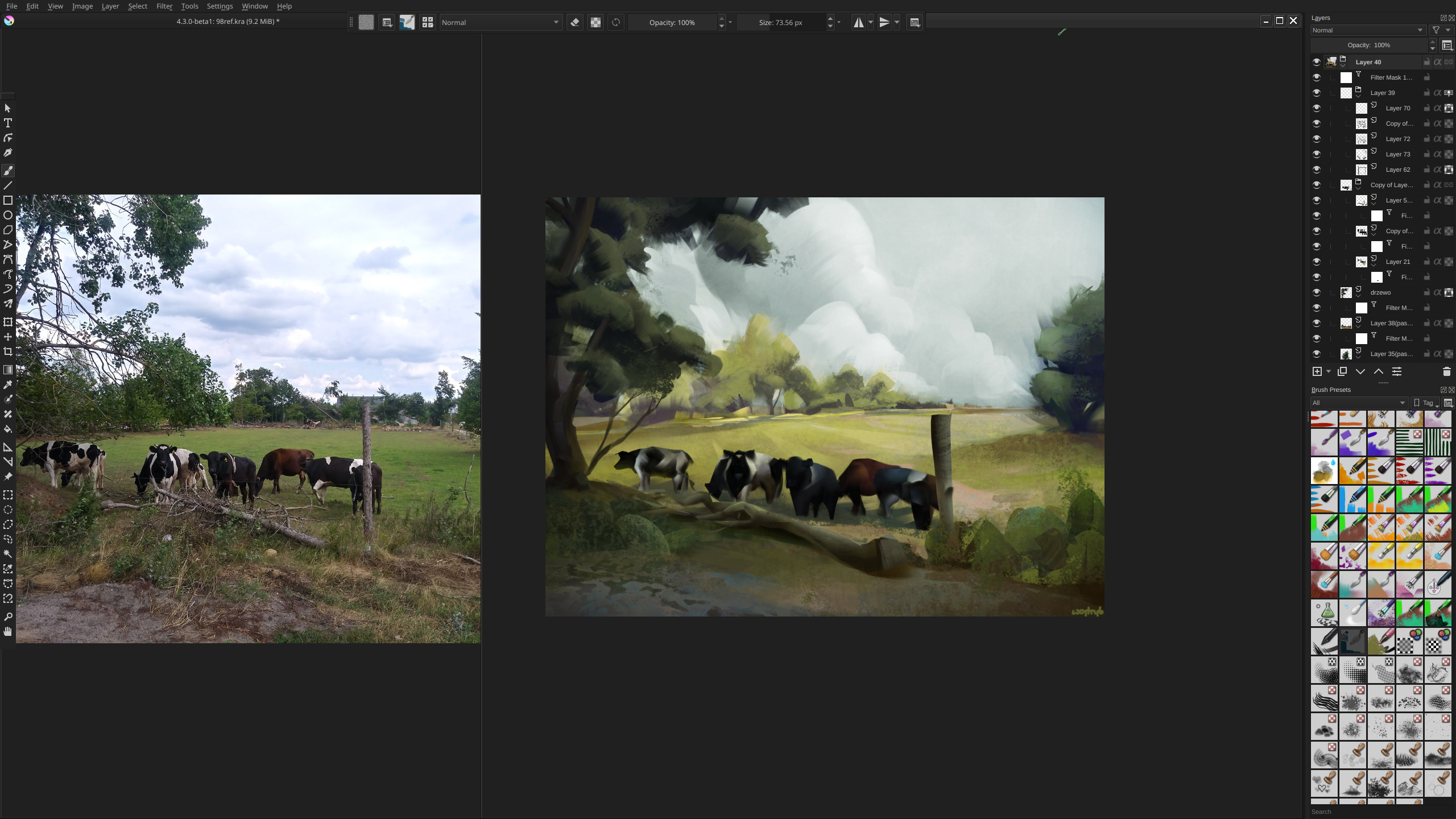
Note that with sub-windows you can pan and zoom canvas and reference images separately. There may be more people who use it this way, which is why I said, those also need some thought in redesign.
Yes that’s right, I was reflecting on how there’s a lot of effort to create new themes is all ![]()
You’re saying the truth here. At the moment even I wouldn’t be interested in creating new themes, because they’re simply ornamental. It’s definitely far down the wishlist ![]()
Puts my one to shame ![]()
The multiple windows and detached toolbox look great! How did you remove the scrollbar in the Brush Presets Docker, if I may ask? And I can’t help but respect your non-destructive workflow too ![]() .
.
It’s an intelligent feature for many different workflows, game texturing, concept art etc. Definitely should be considered in redesign I agree!
Settings > Configure Krita > General > Tools > Kinetic Scrolling (On). Then you scroll brushes and layers with middle mouse button.
Thank you! That looks so much better!
Also, I hope this is thread-relevant:
What is the best way to learn coding for a UI mockup? Similar to @hellozee’s interactive mockup he posted previously.
I’m a person who hasn’t touched an IDE, doesn’t know where good resources are; but I’m excited to learn more, and gain a better understanding of how UI works from a developer perspective. I don’t mind math either, if that’s a suitable requirement ![]()
(Feel free to move this to another topic if it detracts from the original purpose of the thread.)
Thanks!